
Over the past 40 years, the average individual income in the U.S. has grown by 65%. However, not everyone has reaped the benefits of higher wages. Income inequality is at an all-time high, and the combined wealth of the top 1% of earners is almost as much as the combined wealth of middle-class Americans. Interestingly, some metro areas of the U.S. have experienced severe income disparity more than others, as shown in our new visualization.
Q3 2019 hedge fund letters, conferences and more
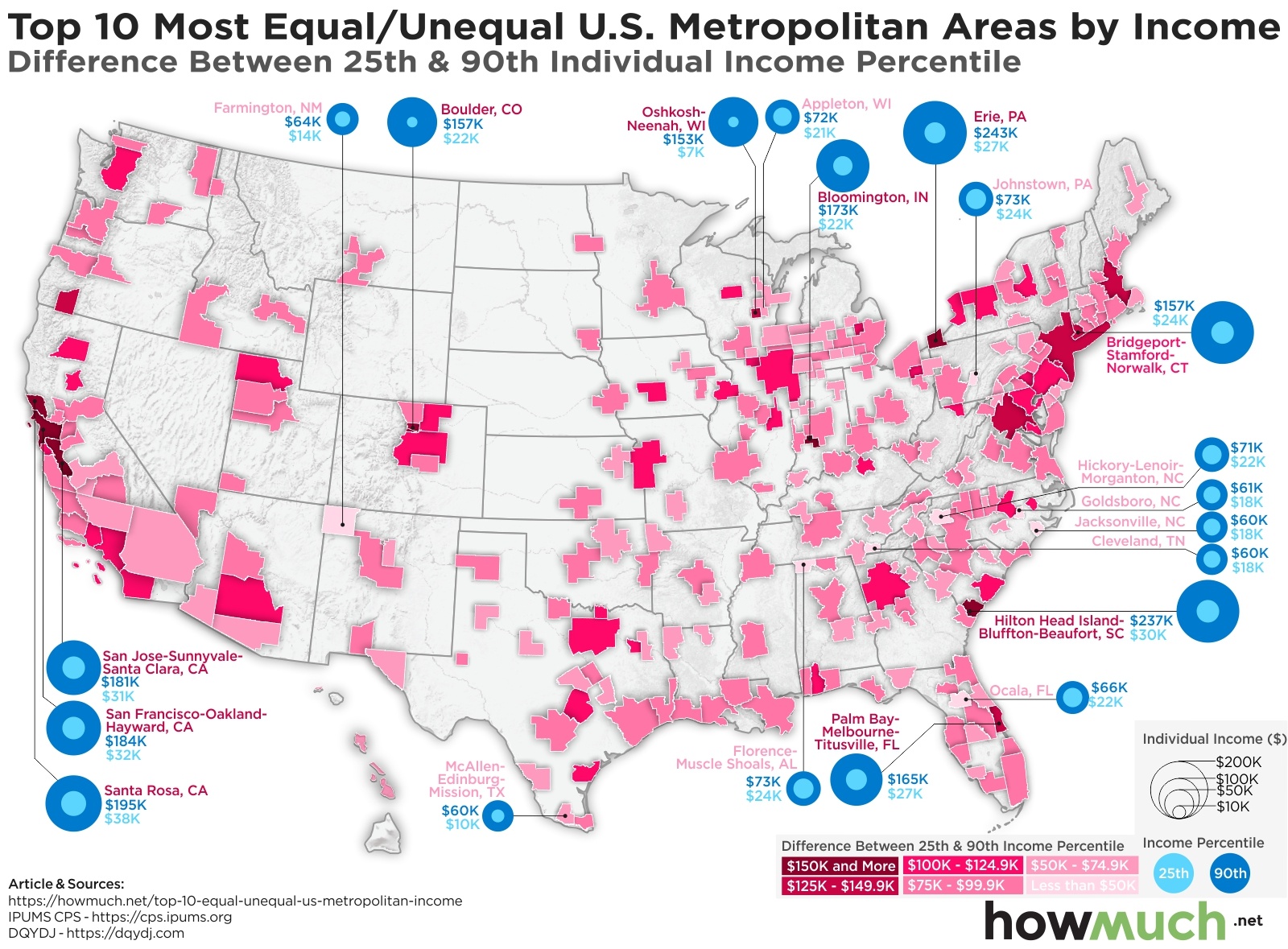
- Nationwide, the average individual income is $58,379.45 in 2019. The 25th income percentile is $22,000 and the 90th income percentile is $116,260.
- There are 54,659,267 Americans who are not classified in a metropolitan area. The average individual income for this group is $45,946, with a $20,000 income at the 25th percentile and $89,000 at the 90th percentile.
- The U.S. Census Bureau, one of the sources for this data, notes that “[geographic] estimates for the smaller metropolitan areas (those with populations under 500,000) should be used with caution because of the relatively large sampling variability associated with these estimates.“
We based this visualization on the DQYDJ Income Percentile by City Calculator in 2019, which takes income data from the IPUMS-CPS (Integrated Public Use Microdata Series – Current Population Survey) released by U.S. Census Bureau and the Bureau of Labor Statistics. We used the IPUMS definition of a metropolitan area for our visualization. Similarly, income in this visualization is defined as “total personal income” and includes all the types of income sources listed here.
The visualization is a map of the U.S., with 262 of the country’s major metropolitan areas color-coded in different shades of pink. The darker shades of pink indicate that there is a higher disparity between the 25th and 90th income percentiles, while the lighter shades of pink show lower income disparities between the 25th and 90th income percentiles. In addition, the circles on the map list the income for the 25th and 90th percentiles in the 10 most equal metro areas and the 10 most unequal metro areas. Light gray circles are for the 25th percentile and dark gray circles are for the 90th percentile. The circles also correspond to the size of individual income, with larger circles representing higher incomes. At a glance, the most unequal metro areas will show a lot of dark gray and only a little light gray.
Top 5 Most Equal Metro Areas in the U.S. by Income
- Jacksonville, NC: $42,002 difference between 25th and 90th percentile
2. Cleveland, TN: $42,173 difference between 25th and 90th percentile
3. Goldsboro, NC: $42,830 difference between 25th and 90th percentile
4. Ocala, FL: $43,626 difference between 25th and 90th percentile
5. Florence-Muscle Shoals, AL: $48,602 difference between 25th and 90th percentile
Top 5 Most Unequal Metro Areas in the U.S. by Income
- Erie, PA: $215,559 difference between 25th and 90th percentile
2. Hilton Head Island-Bluffton-Beaufort, SC: $206,871 difference between 25th and 90th percentile
3. Santa Rosa, CA: $157,050 difference between 25th and 90th percentile
4. San Francisco-Oakland-Hayward, CA: $152,000 difference between 25th and 90th percentile
5. Bloomington, IN: $151,340 difference between 25th and 90th percentile
In general, metro areas in the South and the Great Plains region tend to have less income inequality when comparing the differences between the 25th and 90th income percentiles. By contrast, metro areas in the Northeast, Great Lakes, and California areas have greater income inequality. But it’s not only the U.S. that suffers from income inequality. It’s also a pressing issue on the international stage. We’ve talked before about great disparities in average individual wealth in different countries, as well as the percentage of the world population that lives in extreme poverty. On the other end of the spectrum, roughly 1% of the world’s adults are millionaires. The U.S. alone has 18.6 million millionaires, more than any other country in the world. As the gap between rich and poor continues to grow–both in the U.S. and worldwide–political leaders will face increased pressure to facilitate a more even distribution of wealth.
Why do you think income inequality varies so much across different parts of the U.S.? Let us know in the comments.
Article by HowMuch

