
In this article I take you through a selection of charts which show how a golden cross signal has lit up on both the S&P 500 and across Global Equities (and what it means for the market outlook).
Q4 hedge fund letters, conference, scoops etc
First, a quick word on definitions. A “golden cross” is when the 50-day moving average moves above the 200-day moving average. The opposite signal (when the 50 falls below the 200) is known as a “death cross”.
In simple terms, the signal is designed to identify up-trends aka bull markets (golden cross), and down-trends aka bear markets (death cross). Being comprised of 2 moving averages, the signal comes slower than say a simple price vs 200-day moving average crossover, but typically the signal will come with less whipsaws/false signals (i.e. there is some sacrifice of timeliness in order to reduce noise and focus on signal).
Therein lies one key weaknesses of this signal: the golden cross generally lights up later in the process of a market recovery, as indeed we can see right now with the S&P500 up about +22% from the bottom. And to be clear, this signal is not designed to get you in at the market bottom. There are plenty of other, much more suitable, tools for that.
The other key weakness of this indicator is when you encounter a ranging market (i.e. when the market trades in mini-cycles within a relatively tight range over an extended period of time). As I noted, the indicator is used for identifying trends. If there is no trend, the indicator will provide a false signal by telling you that there is one.
To sum-up, if you are investing on the basis of a golden cross you are basically expecting this indicator to keep you invested through the belly and last gasps of an up-trend. In other words, you will be slightly late to the party, but you will stay to the end.
With that all said, let’s get on with the charts…
The key takeaways on the golden cross trackers are:
- Both the S&P500 and the MSCI ACWI have seen a golden cross (50dma>200dma).
- Looking across the industries of the S&P500, 60% have put in a golden cross.
- Across the 70 countries we monitor, 64% (or 45) have seen a golden cross.
- While there are many examples of false signals, the golden cross appears to perform its simple task of staying long during a bull market most of the time.
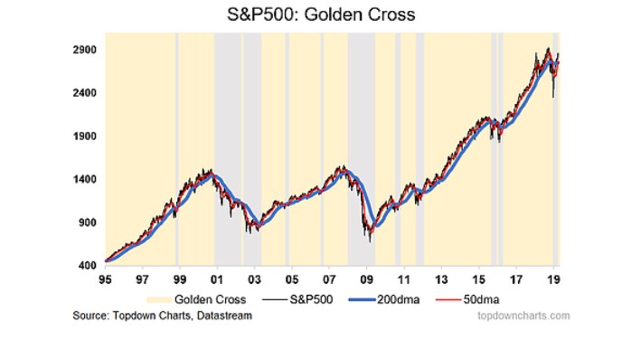
1. S&P500 Moves to a Gold Cross: The first chart is fairly simple, what we’ve got here is the S&P in the black, and 50 day and 200 day moving averages in the red and blue respectively. The shading shows golden crosses in the yellowy color and death crosses in the gray. What I mentioned at the start of this article should make perhaps a lot more sense when you look at the chart.
You can see clearly some of the false signals e.g. the death cross false signal in 1998 and the golden cross false signal in 2002 (to name a couple). You can also see clearly how the transition from gold to death cross would have kept you out during the worst of the post-dot-com bear market and even most of the 2008 collapse. Likewise on the upside, the golden cross would have kept you long through most of the up markets.
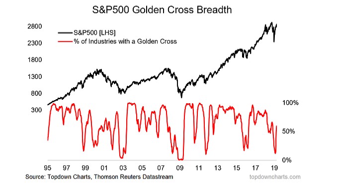
2. S&P 500 – Proportion of Industries with a Golden Cross: Taking a different angle, this chart shows the breadth of golden crosses across over a hundred industries and sub-industries (i.e. proportion of industries that have recorded a golden cross).
The standout in this chart is how that indicator dropped to the worst level since the 2011 correction, and indeed, at this point seems to display more hallmarks of a correction than a bear market. Most notably, the rapid recovery makes it look more like a correction.
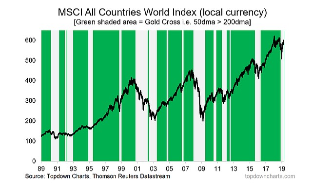
3. A Golden Cross for Global Equities: Moving on to global equities (in this case we are looking at the MSCI ACWI – All Countries World Index), we’ve also seen a golden cross light up here. Notably, on the historicals here, for global equities the post-09 bounce period (2009-13) was a much more distinctly ranging market, so you can see here how the signal chops around and doesn’t really “work” per se in that kind of market.
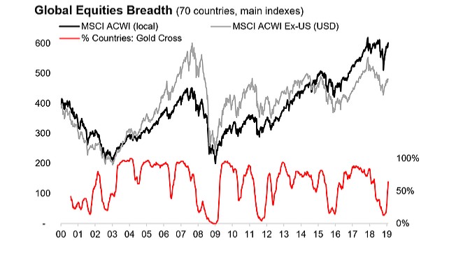
4. Global Equities Breadth – Countries with a Gold Cross: The final chart, one of my favorites, shows the breadth of golden crosses across countries. Of the 70 countries we monitor, 64% (or 45) have seen a golden cross. Out of interest, 81% of EM countries have seen a golden cross (vs 72% for DM) – EM was the first to collapse, and the first to recover.
Again, the pattern of a complete collapse in breadth, followed by the significant turnaround is about as bullish a signal as it gets with this indicator. So while it is indeed possible that we end up in a ranging market, at this point the odds are on the side of the bulls (looking strictly at this set of indicators).
Did you know we offer a world-class multi-asset investment research service?
Why not take a free trial for an extra level of insight and service…
Article by Top Down Charts

