
If you walk down the streets in the United States, the odds are that one in every four people you’ll see is an immigrant, or was born to immigrant parents.
Q3 hedge fund letters, conference, scoops etc
While those odds might seem high, the truth is nearly everyone in the U.S. hails from someplace else if you look far back enough.
Visualizing U.S. Immigration
Today’s intriguing visualization was created by professors Pedro M. Cruz and John Wihbey from Northeastern University, and it depicts U.S. immigration from 1830 until 2015, as rings in a growing tree trunk.
The researchers turned registered U.S. Census data into an estimate for the total number of immigrants arriving each decade, and then the yearly figures in the visualization. One caveat is that it does not account for the populations of slaves, or indigenous communities.
From the Old to the New World
The pattern of U.S. immigration can be explained in four major waves overall:
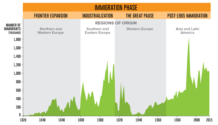
The origins of U.S. immigrant populations transform from era to era. Which events influenced each wave?
Frontier Expansion: 1830-1880
- Cheap farmland and the promise of economic growth in the first Industrial Revolution spurred large-scale immigration from Britain, Germany, and other parts of Central Europe.
- The Irish Potato Famine from 1845 to 1849 drove many immigrants from Ireland over to the U.S.
- The 1848 Treaty of Guadalupe ended the Mexican-American war, and extended U.S. citizenship to over 70,000 Mexican residents.
Industrialization: 1880-1915
- Immigrant mobility increased with the introduction of large steam-powered ships. The expansion of railroads in Europe also made it easier for people to reach oceanic ports.
- On the other hand, the Chinese Exclusion act in 1882 prohibited Chinese laborers from entry.
- In 1892, the famous Ellis Island opened; the first federal immigration station provided a gateway for over 12 million people.
The Great Pause: 1915-1965
- The Immigration Act of 1924 enacted quotas on immigrant numbers, restricting groups from countries in Southern and Eastern Europe, and virtually all immigrants of Asian origin.
- The Great Depression, and subsequent World Wars also complicated immigration matters as many came to seek refuge in the United States.
Post-1965 Immigration: 1965-Present
- The Hart-Cellber (Immigration and Naturalization Act) of 1965 overturned all previous quotas based on national origin. Family unification and an increase in skilled labor were two major aims of this act.
- This decision significantly impacted the U.S. demographic makeup in the following decades, as more immigrants of Latin, Asian, and African descent entered the country.
E Pluribus Unum (From Many, One)
While others have mapped two centuries of immigration before, few have captured its sheer scale and impact quite as strikingly. The researchers explain their reasoning behind this metaphor of tree rings:
This idea lends itself to the representation of history itself, as it shows a sequence of events that have left a mark and shaped the present. If cells leave a mark in the tree, so can incoming immigrants be seen as natural contributors to the growth of a trunk that is the United States.
It’s no wonder that this animation showing U.S. immigration won Gold for the “People, Language, and Identity” and “Most Beautiful” categories at the 2018 Kantar Information is Beautiful Awards.
Article by Iman Ghosh, Visual Capitalist

