
If you had to sketch a world map, you’d probably start with a place that is familiar.
Q1 hedge fund letters, conference, scoops etc
Perhaps you would begin by drawing your own continent, or maybe you’d focus on the specific borders of the country you live in. Then, you’d likely move to drawing the outlines of neighboring countries, eventually working your way to far and distant lands.
This would be a logical way for anyone to think about such a task, and it gives some insight as to how humans think about the world.
We start with what’s familiar, and build it out until it’s a complete picture.
Assembling the World by Economy Size
What if we assembled a world map in a completely different order?
Today’s two animations come to us from Engaging-Data, and they approach the world map from an alternate angle: assembling countries on the map in the order of their economic footprints.
GDP (Nominal)
The first map, shown below, uses nominal GDP to assemble countries in ascending order:
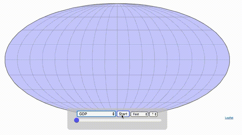
This version of the map shows the smallest economies first, with the larger economies at the end.
For this reason, the first economies appearing on the map tend to be developing nations, or nations with smaller geographical or demographic footprints.
For example, even though the Falkland Islands are wealthy on a per capita basis, the British Overseas Territory has fewer than 4,000 people, which gives it a minor footprint on a global stage.
GDP per Capita (Nominal)
Now, let’s take a look at the same map, constructed in order of GDP per capita:
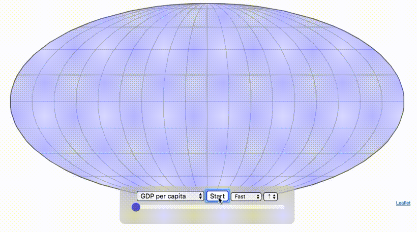
This animation is more cohesive, given that it is not dependent on population size. Instead the order here is based on economic output (in nominal terms) of the average person in each country or jurisdiction.
In this case, developing nations appear first – and at the end, more developed regions (like Europe and North America) tend to fill out.
Note: All rankings here are in nominal terms, which use market rates to calculate comparable values in U.S. dollars, while omitting the cost of living as a factor. GDP rankings change significantly when using PPP rates.
Other Ways to Assemble the World
While assembling nations based on GDP provides an interesting way to look at the world, this same approach can be tried by applying other statistics as well.
We recommend checking out this page, which allows you to “assemble the world” based on measures like population density, life expectancy, or population.
Article by Visual Capitalist

