
Bond yields have started to break down, and if today’s chart is anything to go by, it’s entirely possible we see a further push lower in yields.
Q1 hedge fund letters, conference, scoops etc
The May round of flash PMIs brought mostly disappointment, with all the majors undershooting expectations, and falling on the month. Europe fell a further -0.2pts to 47.7, Japan fell -0.8pts to 49.6 and US dropped -2pts to a barely expanding 50.6. This placed the composite for developed markets down significantly, and unwound some of the green shoots in last month’s results.
The chart comes from my latest weekly report where I talked about the global macro data pulse, and it shows the inter-relation between the PMI and US treasury yields.
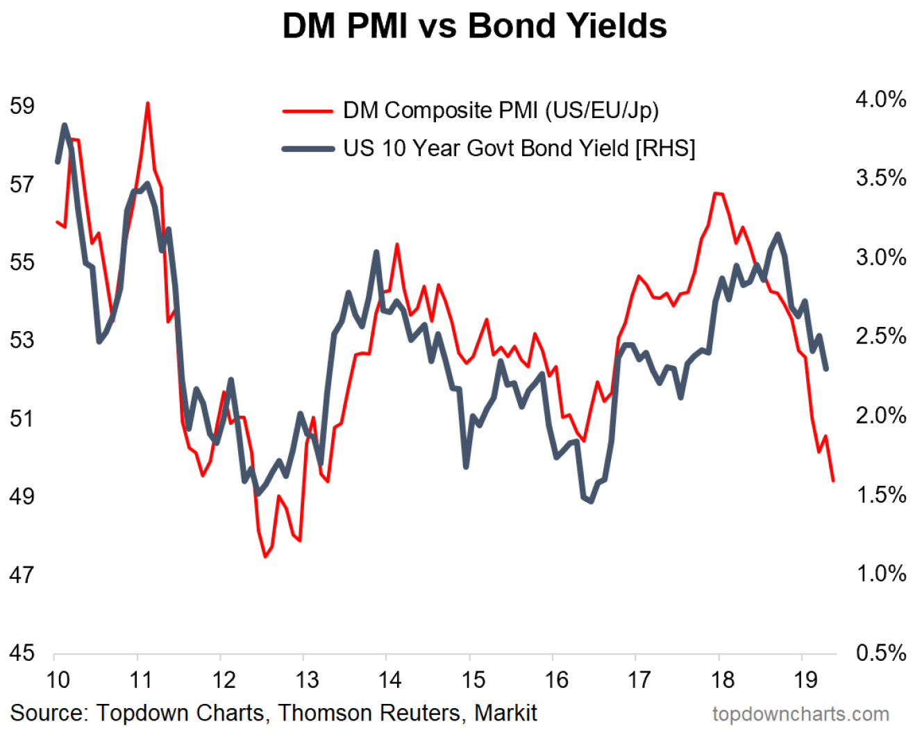
As alluded to the chart shows the GDP weighted DM flash (flash = early reading) PMI (using the Markit manufacturing PMIs). Readings below 50 indicate contraction, and readings above 50 indicate expansion, but it’s often the case that the most important info comes in the momentum i.e. it’s one thing for the indicator to be above 50 but it’s another thing for it to be on an improving path vs a falling path.
Importantly, the chart also shows the US 10-year government bond yield, and for a couple of good reasons there’s a fairly good fit between the two.
The first reason is bond yields typically follow the expected/actual path of growth and inflation (i.e. bonds tend to do well when growth is slowing, and poorly when growth is accelerating). The second reason is the central bank aspect: i.e. softer growth in recent years has led to central banks doing quantitative easing – which introduces a flows tailwind for bonds.
But probably the big unanswered question here with this chart, is do we take it literally?
If we take it literally then theoretically the US 10-year government bond yield should be trading down around 1.5%.
In all fairness, it has already broken down through a few key levels, and if it breaks a little further down then the path to 1.5% looks fairly open. So I wouldn’t count out a possible further run down in yields. All else equal this should be positive for equities in the form of a larger equity risk premium, but then again, very rarely is it the case that all else is equal in an interconnected reflexive economic and financial system.
Last thought I will leave you with is a remark on bond market volatility (I didn’t cover this in the report, I just noticed it in my markets monitor on Monday and thought it’s quite interesting given what we’ve talked about here).
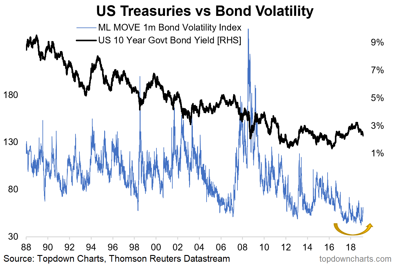
Bond market volatility is starting to pickup, and this comes after the MOVE bond volatility index made an all time record low in March this year. It’s a bit of a cliché, but a fair rule of thumb is that low volatility is a good predictor of future higher volatility. With bond yields on the precipice this is something to keep in mind!
—
This article originally appeared as a submission at See It Market
Article by Top Down Charts

