
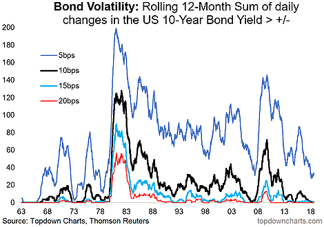
Following on from yesterday’s post on Cross Asset Volatility, the chart of today is a focus on bond volatility. Specifically what we’ve got here is a look at the rolling annual sum of daily changes in the US 10 year treasury bond yield which exceeded varying hurdles (the smallest hurdle being 5 basis points). What the chart shows is a collapse in bond volatility. What’s interesting about this is that the smallest hurdle indicator is starting to turn up, and typically when these types of indicators turn up from such low levels it can mark a major turning point. The issue is that a rise in volatility can come in a falling yield environment as well as a rising yield environment.
[timeless]
Q2 hedge fund letters, conference, scoops etc

BONUS CHART: To illustrate that point, we also show bond market implied volatility in the bonus chart for today. As you can see here we’ve got examples where a turn up in volatility came with both a spike e.g. 2013, and plunge e.g. 2015 in bond yields. The current outlook for yields is quite nuanced as shorter term the risk of a drop in yields is elevated given sentiment and positioning, while further out we continue to expect higher yields based on our indicators of valuation, longer term macroeconomic trends, and central bank policy.
Looking for deeper insights? Try taking a free trial of our institutional research service
Article by Top Down Charts

