
With all the high frequency data available these days, like weekly economic data, and market pricing by the second, it can sometimes be good to tune the noise levels down and take a look at some longer term trends to help keep things in perspective. This article looks at 5 charts which map out the longer term growth trends across a number of key macroeconomic and market variables in America. After a period of stagnation and decline, it seems the US economy is at a crossroads.
[REITs]
Q1 hedge fund letters, conference, scoops etc, Also read Lear Capital:
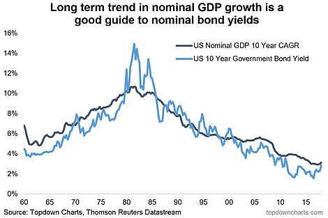
-Bond yields tend to follow long term GDP growth, and both have bottomed.
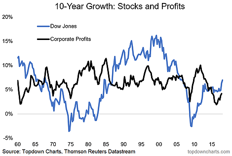
-Looking at the path of stocks and corporate profits, the recovery still looks to be in the early stages.
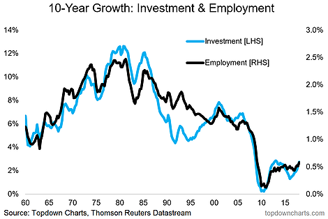
-Investment and employment growth are turning up after a period of truly depressed growth.
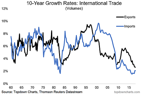
-Both import and export growth are at staggeringly low levels and it remains to be seen what path the country takes.
- Long Term Growth and Bond Yields: This is the chart which triggered me to write this article. It simply shows the long term rate of nominal GDP growth in America against the 10-year government bond yield. We know that aside from other short-term factors like flows, sentiment, and seasonality, that bond yields tend to be driven by economic data – the expectation of higher growth and inflation fuels the rise of bond yields.
This chart shows that the bottom in bond yields is lining up with the bottom in longer term nominal GDP growth. The big question for the bond market will be as to whether this bottom in longer term GDP growth is a false dawn or a true trend. The key determining factor (just looking at the math) is going to basically be whether growth continues or recession hits – it’s that simple.
- Long Term Stockmarket and Profit Growth: Moving on to the next one, it’s the 10-year compound annual growth rate (CAGR or annualized 10-year growth rate) of the Dow Jones Industrial Average, and the Corporate profit numbers from the NIPA data. Strictly speaking it’s not apples and apples because the Dow is a fairly narrow group of companies and the NIPA data covers all companies in the economy (public and non-public traded). As you can see on this chart, on both counts the recovery still looks early stages.
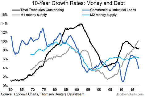
- Long Term Money and Credit Growth: There is a lot going on in this chart, it shows the growth in business loans, total treasuries outstanding (basically the net growth in government debt), and the growth in M1 and M2 money supply. One interesting interpretation of this is that the slower pace of growth in credit and money in the 1990’s and 2000’s could in part be a driver of the general slowdown in growth we have witnessed.
- Long Term Growth of Jobs and Investment: Aside from money and credit, the collapse in growth of investment and employment is another big factor – as these are the basic elements in productive capacity. It’s almost shocking how depressed the growth rates of both of these key factors of production went from a gradual decline to collapse and stagnation following the crisis. But on both counts we are starting to see a revival.
- Long Term Growth in US Trade Volumes: Final one, perhaps somewhat topical, is the decline of American international trade. The contrast between booming export growth in the 1990’s vs booming import growth in the 2000’s is amazing. A big part of that boom in imports in the 2000’s was to do with China entering the WTO, and becoming a major trading partner with the USA. And now America finds itself at a crossroads in trade, with export and import growth at or near historical lows. Will it be exports, imports, or both which lead a revival from here? That will probably have as much to do with policy as it will with economic growth and investment.
Want another level of insights and service? Take a Free Trial now.
Follow us on:
LinkedIn https://www.linkedin.com/company/topdown-charts
Twitter http://www.twitter.com/topdowncharts
Article by Callum Thomas, Top Down Charts

