
Posted each Wednesday, Trade Signals looks at several of my favorite stock, investor sentiment and bond market indicators. Market trends persist over time and stem from changes in risk premiums or the amount of return investors demand to compensate them for the risks they take.
Q3 hedge fund letters, conference, scoops etc
Risk premiums vary a great deal over time in response to new market information or changes in the economic environment or even changes in investor sentiment. When risk premiums increase or decrease, stocks and bonds and other assets have to be priced again. Investors react to the changes gradually and this creates trends.
Rules-based trend following strategies don’t predict, they react to what prices are telling us about supply and demand. More buyers than sellers or vice versa. Trend following strategies, in general, seek upside potential via an investment process that offers downside protection.
Trend following trading seeks to capture the majority of a market trend, up or down, for profit. Such strategies work in all major asset classes — stocks, bonds, currency and commodities. Click here for our education series piece “Trend Following Works!”
Trade Signals is organized into four sections:
- Trade Signals — Dashboard
- Commentary — Notable This Week
- Charts with Explanations
- Update on CMG Investment Indices
For informational purposes only… Not a recommendation to buy or sell any security.
- Trade Signals — Dashboard
- Equity Trade Signals
- Investor Sentiment Indicators
- Fixed Income Trade Signals
- Economic Indicators
- Select Recession Watch Indicators
- Gold:
- Commentary
- Charts with Explanations
- Investor Sentiment
- Economic Indicators:
- Select Recession Watch Indicators:
- Gold:
- Update on CMG Investment Indices
Trade Signals — Dashboard
(Green is Bullish, Orange is Neutral and Red is Bearish)
Equity Trade Signals
- Ned Davis Research CMG U.S. Large Cap Long/Flat Index: Buy Signal – 100% U.S. Large Cap Equity Exposure*
- Long-term Trend (13/34-Week EMA) on the S&P 500 Index: Buy Signal – Bullish Cyclical Trend Signal for Equities*
- Volume Demand (buyers) vs. Volume Supply (sellers): Buy Signal – S/T Bullish for Equities*
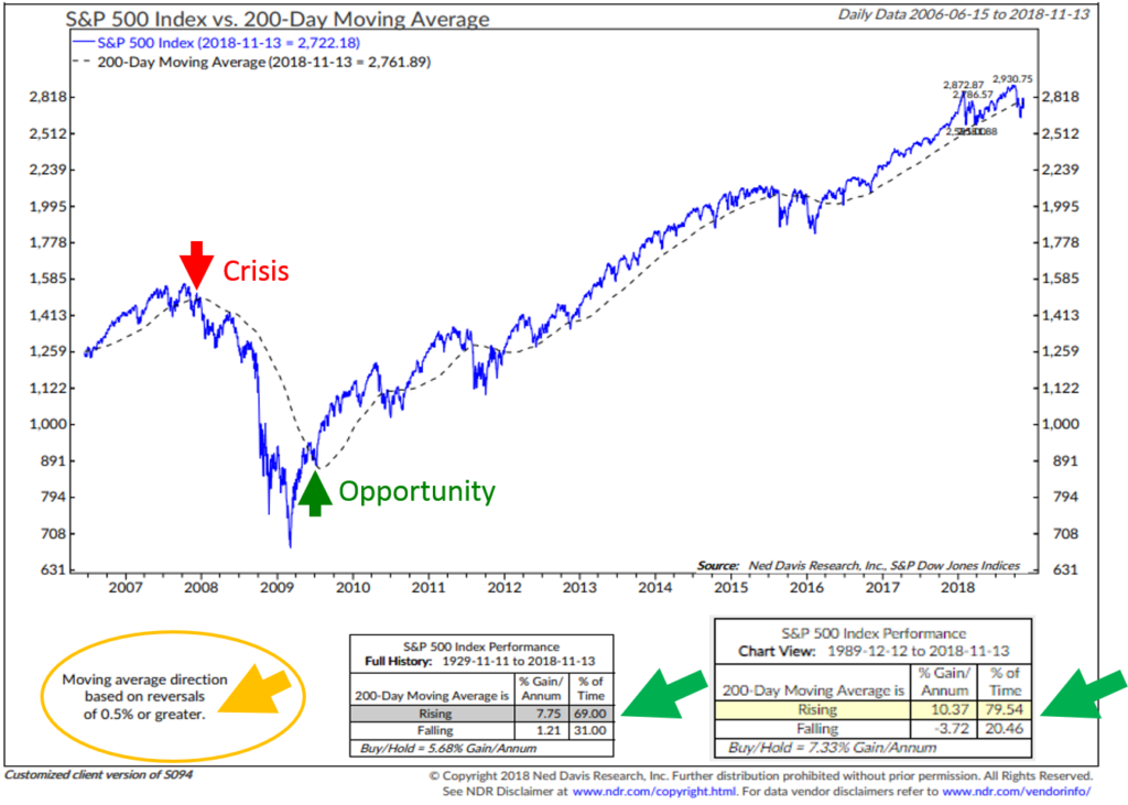
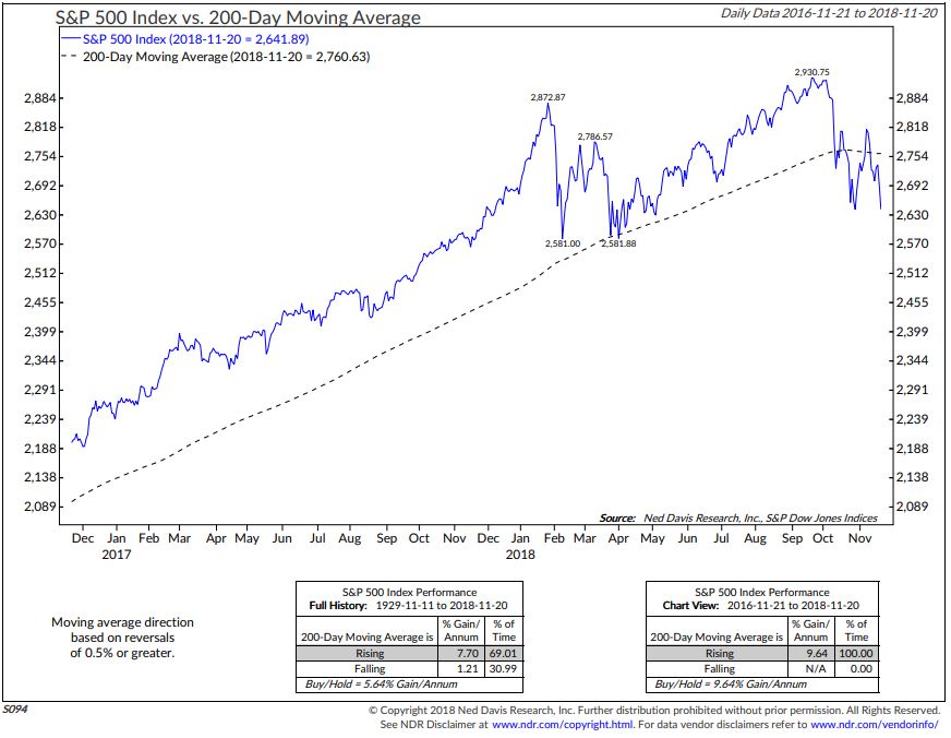
- S&P 500 Index 200-day Moving Average Trend: Buy Signal – 100% U.S. Large Cap Equity Exposure*
- Don’t Fight the Tape or the Fed: Indicator Reading = 0 (Neutral Signal for Equities)
* Denotes trend is weakening. Please read below.
Investor Sentiment Indicators
- NDR Crowd Sentiment Poll: Extreme Pessimism (S/T Bullish for Equities)
- NDR Daily Trading Sentiment Composite: Extreme Pessimism (S/T Bullish for Equities)
Fixed Income Trade Signals
- CMG Managed High Yield Bond Program: Sell Signal — Bearish on HY
- CMG Tactical Fixed Income Index: Bullish on International Bonds and Cash
- Zweig Bond Model: Sell Signal — Bearish on High Quality Bond Market Exposure
Economic Indicators
- Global Recession: High Recession Risk
- U.S. Recession: Low U.S. Recession Risk (Next Six Months)
- Inflation Watch: Neutral Inflation Pressures
Select Recession Watch Indicators
- Global Recession Probability Indicator: High Recession Risk
- The Economy Based on the Stock Market Indicator: Low U.S. Recession Risk
- Recession Probability Based on Employment Trends: Low U.S. Recession Risk
- Credit Conditions – Recession Indicator: Low U.S. Recession Risk
- U.S. Economy vs. Yield Curve: Low U.S. Recession Risk
Gold:
- Long-term Indicator – 13-week vs. 34-week exponential moving average: Sell Signal
- Short-term Indicator – Daily Gold Model: Sell Signal
Commentary
Notable this week:
It’s been a challenging period for equities. The S&P 500 Index peaked at 2,940 on October 3rd. It was up over 10% on the year and is now down 1%. Approximately 10 stocks accounted for more than all of the gain that 10% gain. Collectively 490 stocks were negative on the year through October 3rd. It felt much like 1999. Since the high, tech has sold off aggressively. A number of the big players are down more than 20% from their highs. Our Trade Signals equity market indicators are trending down. (Take a look at today’s dashboard of equity market indicators. Most are nearing a change in signal. See asterisks above.)
I believe it is probable the post-2009 bull market top has been achieved. A cyclical bear market has likely begun. The 13-week vs. 34-week trend indicator is approximately a week away from registering its first major sell signal since August 2015. 13 weeks is 65 trading days. 34 weeks is 170 trading days. Sell signals trigger when the shorter term 13-week trend line declines below the 34-week trend line. This indicator did a great job signaling a sell signal in early 2008. You can see the buy and sell signals in the chart below. What this is likely telling us is that short-term rally attempts will likely face selling pressure. The longer-term trends are weakening.
The Ned Davis Research CMG U.S. Large Cap Long/Flat Index is nearing a bearish signal. The process looks at the trend activity across 24 sub-industry sectors. Most are in decline and the model equity line is trending down. The model equity line plots the moving average of the daily model score smoothing the price trend over 63 days. It is purposely slower moving as we want to give the upside the benefit of doubt. You may be familiar with the 50-day or 200-day moving average rules. Below, I’ve added the the 200-day chart (signal) to Trade Signals and will continue to update it monthly. If you are a long-time reader, prior to the NDR CMG U.S. Large Cap Long/Flat indicator, I favored NDR’s Big Mo as my go-to risk-on/risk-off indicator. It remains in a buy signal through like our process, it is weakening and nearing a sell signal.
In our client models, we have 10% allocated to large-cap equities. We allocate to an S&P 500 Index ETF and use the NDR CMG U.S. Large Cap Long/Flat signal for that exposure. Some clients have more large-cap exposure, some less. It depends on their risk tolerance/profile, goals, and investment objectives. Our other portfolio exposures utilize different downside risk management processes. The idea is to diversify to several disciplined processes and strategies. No one process is perfect. My best two cents is to find several that you trust and can adhere to. Above all, have some form of loss protection, risk management process in place on every asset.
Why? The average market decline in recession is approximately 37%. The last two got us -50% each. I believe the next recession will bring us -50% to -70%. We have tripped down on the policies that lead to the 2008 great financial crisis. Seventy-five percent of investable funds, by the year 2020, will be in the self-directed hands of pre-retirees and retirees. That money can’t afford the lost years it may take just to get back to even (net of inflation). Sixty-five years of age becomes 75 or 80. Some form of active risk management is prudent if not mandatory. We are late cycle, overvalued and investors are fully invested. Key word: process.
I’m on record saying that absent any other process, put a 200-day stop-loss exit and re-entry rule on everything you own. Here is a look at a 200-day MA process. I like it because it looks at the 200-day trend line and if the most current price is lower than the high by 0.5%, you get out. Over time, that rule has done well. Here is a look at the chart and a look at the growth of $100 since 1900.
The bottom section of this next chart shows the growth of $100 invested (hypothetically) in 1900. The red line shows the growth following the 200-day rule trading in and out of the DJIA. The blue line shows the growth buying-and-holding the DJIA.
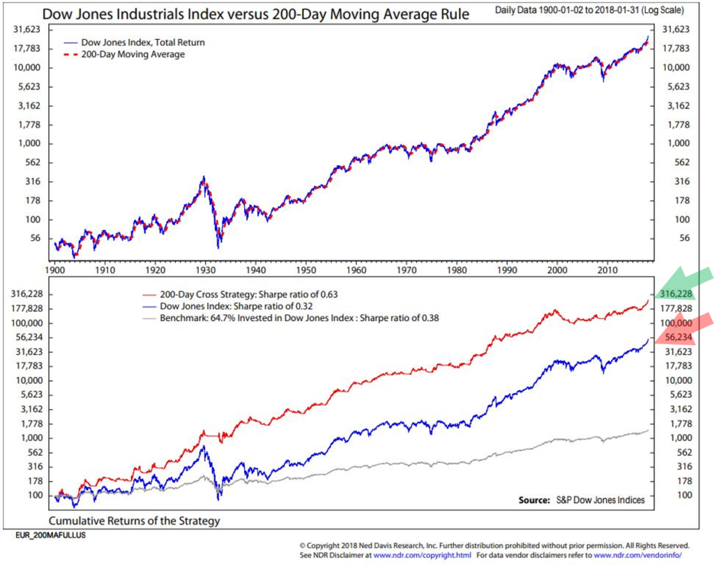
Hypothetical data. See important disclosures. Used for educational purposes only. Not a recommendation to buy or sell any security.
Investing is a probability game. Limit downside: In the long-run, it’s about the math.
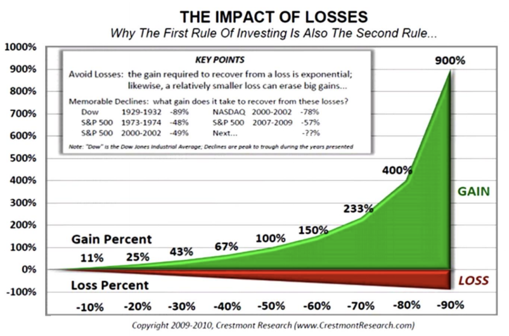
I wrote a paper entitled, “The Merciless Mathematics of Loss.” You can find it here.
You’ll see in the Charts with Explanations section that follows the individual trade signals equity charts. You’ll also see the high yield and high-quality fixed income signals remain in a sell. Gold remains in a down trend. The lone positive is the extreme level of investor pessimism, which is short-term bullish for equities.
As the great Art Cashin says, “Stay wary, alert and very very nimble.” Amen Art…
Important note: Not a recommendation for you to buy or sell any security. For information purposes only. Please talk with your advisor about needs, goals, time horizon and risk tolerances.
Charts with Explanations
- Ned Davis Research CMG U.S. Large Cap Long/Flat Index– Buy Signal (Bullish for Equities) – 100% Exposure to Large-Cap Equities
The Ned Davis Research (NDR) CMG U.S. Large Cap Long/Flat Index measures “market breadth.” Market breadth is simply market activity, such as advances and declines, new highs and new lows, advancing and declining volume and price momentum and trend based upon the number of stocks in uptrends and downtrends. Technicians like “breadth” measurements for two main reasons:
- Breadth thrusts are often present at the start of major bull markets.
- Breadth nearly always weakens before prices do at a major peaks.
(Source: Ned Davis Research)
The NDR CMG U.S. Large Cap Long/Flat Index process measures market breadth by analyzing the overall technical strength across 22 Industry Groups (GICS). The process individually measures the trend of each of the industry groups, evaluating the rate of change in price momentum over short-term and long-term time frames and directional trend as determined by intermediate-term moving average crosses (for example, you may be familiar with the “golden cross” that compares the 50-day moving average price vs. the 200-day moving average price). The Index process also considers several mean-reverting indicators, such as deviation from trend and relative strength.
The most important line to follow in the red, white and blue chart below is the blue model equity line in the middle section of the chart. It is the combined total score across the 22 sub-industry sectors. Think of it as a “market breadth” combined weight of evidence measurement.
Here is how you read the chart:
- Markets do best when the model equity blue line is moving up. Breadth nearly always weakens before prices do at major peaks… fewer and fewer stocks are moving the market higher (recall tech stocks in 1999 and financials in 2007).
- When the model equity line is above 70, the index stays 100% invested.
- When the model equity line is between 60 and 70 and the trend is moving higher, the index stays 100% invested. If the trend is lower, the index moves to 80% invested with 20% moving to T-Bills.
- When the model equity line is between 50 and 60 and the trend is moving higher, the index stays 100% invested. If the trend is lower, the index moves to 40% invested with 60% moving to T-Bills. With greater breadth determination comes greater risk.
- When the model equity line is below 50 and the trend is moving higher, the index is 100% invested. If the trend is lower, the index moves to 0% invested (“Flat”) with 100% moving to T-Bills. The most significant periods of risk comes when the majority of sub-industries are breaking down.
- You’ll find the model’s statistical data at the bottom of the chart.
- Down arrows show levels of exposures. Up arrows mark “B” or long signals.
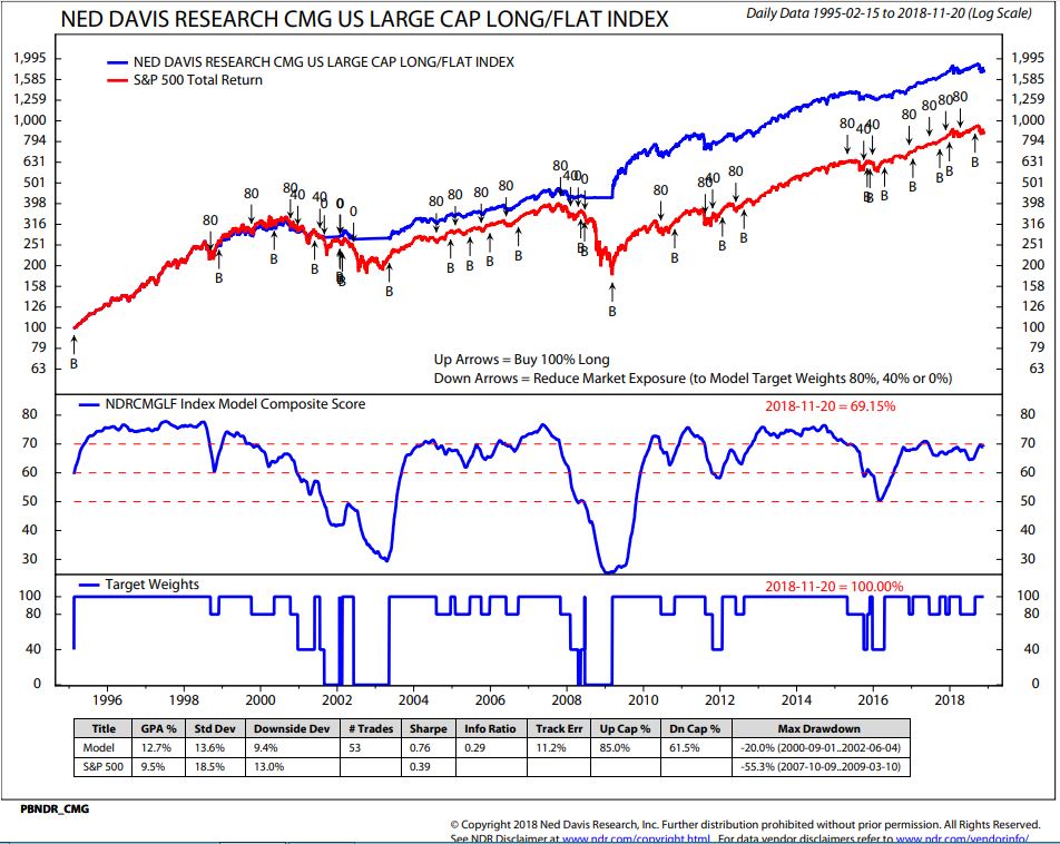
Legend:
Up Arrows with “B” Label = Buy Signal (100% long)
Down Arrows = Reduce Market Exposure to Model Target Weights
S&P Dow Jones Index Data, 1995 to present
Source: S&P Dow Jones Indices and Ned Davis Research. Click here to learn more about how it works.
We created a Long/Short version of the Index and the data is favorable. The model goes from 100% to 80% to 40% invested in the same way as the NDR CMG U.S. Large Cap Long/Flat Index; however, when the model trend line moves below 50, the process goes short U.S. Large Caps or short S&P 500 Index exposure.
- Here’s the data (note in the lower left-hand chart the model returns – a several hundred basis point improvement in model return):
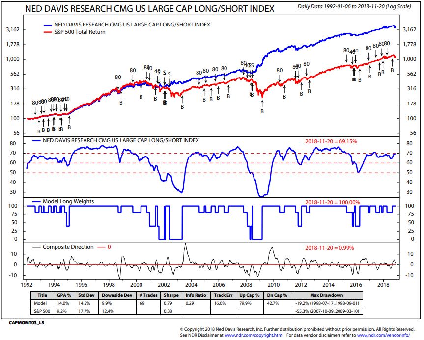
Source: Ned Davis Research (1992 to present). Note: S&P Dow Jones Indices does not calculate Long/Short Index.
- 13/34–Week EMA Trend Chart: Bullish Cyclical Trend Signal for Stocks
Note (in the chart below – upper right-hand corner) that the 13-week Exponential Moving Average (“EMA”), represented by the blue graph line, crossed above the 34-week EMA trend (red graph line) late first quarter 2016 (a trend buy signal). The Cyclical Trend for Stocks is bullish by this measure. You can see that this trend process has done a pretty good job at identifying the major cyclical (short-term) bull and bear market trends (note small red and blue arrows). In terms of risk management, a good stop-loss level may be at the point when the 13-week drops below the 34-week EMA.
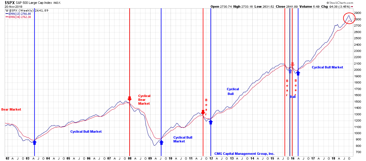
Click here to see “How I think about the 13/34-Week Exponential Moving Average.”
Bottom line: The 13-week shorter-term trend line is above the 34-week longer-term trend line = bullish signal for equities.
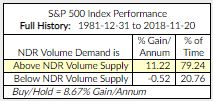
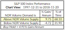
- Volume Demand vs. Volume Supply – Buy Signal (S/T Bullish for Equities)
When there are more buyers than sellers, prices move higher. When there are more sellers than buyers, prices decline. Supply and demand works that way in all things – real estate, oil, stock prices and all goods in a free market.
This process looks at a smoothed total volume of declining issues versus a smoothed total volume of advancing issues using a broad market equity index. The performance, reflected in the chart below, is better when Vol Demand is better than Vol Supply. More buyers than sellers. This is a relatively slow-moving but important indicator.
Nearing a cross lower which is a bearish indicator for equities:
- Red arrows indicate periods when Volume Supply (sellers) exceeded Volume Demand (buyers) which is bearish for equities.
- Green arrows indicate more buyers than sellers which is bullish for equities.
- Red arrow shows where we are today.
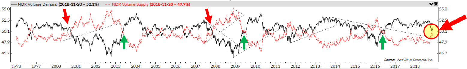
Yellow highlight shows the current signal. Currently in a buy signal. Here is the model’s data 1981 to present (which includes the great bull market and the two bear markets since 2000):
Here is the model’s data 1997 to present (which includes the tail end of the great bull market and the two bear markets and the bull market that started in 2009):
Source: Ned Davis Research
NDR Disclosure
Click here for additional information about the indicator.
Bottom line: Volume Demand is weakening and Supply strengthening yet Demand remains above Supply = a bullish signal for equities.
- S&P 500 Index 200-day Moving Average Trend:Buy Signal – 100% U.S. Large Cap Equity Exposure
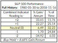
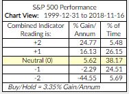
- Don’t Fight the Tape or the Fed – Indicator Reading = 0 (Neutral Signal for Equities). Current readings highlighted in yellow below.
- The indicators that comprise this reading are a combination of NDR’s Big Mo and the 10-Year Treasury yield. It highlights just how important Fed activity is to market performance. Readings range from +2 to -2.
- Bottom line: when both the trend in interest rates (lower yields) and the trend in the overall market (the tape) are bullish, the market has historically performed best.
- +2 readings have occurred about 12% of the time since 1980.
- +1 readings have occurred approximately 25% of the time since 1980.
- -2 readings have occurred approximately 6% of the time since 1980 and the performance during those periods, as shown in the chart is poor. “Watch out for -2!”
Source: Ned Davis Research
NDR Disclosure; CMG Disclosure.
Click here for additional information about the indicator.
Investor Sentiment
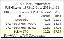
NDR Crowd Sentiment Poll: Extreme Pessimism (S/T Bullish for Equities). Current weekly sentiment reading is 56.8. It was 59.1 last week.
- Best buying opportunities occur at “Extreme Pessimism” readings below 57.
- Gain/Annum for the S&P 500 Index (data from December 1, 1995 to present).
- Current indicator score highlighted in yellow:
Source: Ned Davis Research
NDR Disclosure; CMG Disclosure.
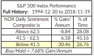
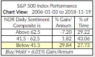
NDR Daily Trading Sentiment Composite: Extreme Pessimism (S/T Bullish for Equities). Current reading highlighted below.
- Current daily sentiment reading is 35.56. It was 36.67 last week.
- Best buying opportunities occur at “Extreme Pessimism” readings below 41.5.
- 1994 to Present and 2006 to Present below (current indicator score shaded below):
Source: Ned Davis Research
NDR Disclosure; CMG Disclosure.
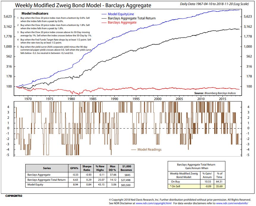
The Zweig Bond Model: Sell Signal – a bearish signal for high quality fixed income bond funds and ETF exposure.
Current indicator score highlighted in yellow (bottom right section):
NDR Disclosure; CMG Disclosure
- The bottom section of the above chart details the drawdown (“Max DD %”) history and a few other statistics. For example, if your $100,000 investment declines 10% to $90,000 before it again moves higher, your drawdown is 10%.
- Barclays Aggregate Bond Total Return has a max drawdown of -14.12% vs. a max drawdown for the Zweig Bond Model of -5.06%.
- You can compare the Barclays Aggregate Bond Index Total Return Max DD to the Model’s Max DD. Hoped for is a higher return and a lower DD. Also listed is the hypothetical growth of $1,000.
- GPA% shows the hypothetical comparison of the Zweig Bond Model and the Barclays Agg Total Return index. The Model outperformed buying and holding the index by a wide margin.
- Finally, you can calculate the model on your own – detailed in the upper left section of the chart. How to Track the Zweig Bond Model.
- Click here for more info about the Zweig Bond Model.
Economic Indicators:
- Global Recession – High Recession Risk
- U.S. Recession – Low U.S. Recession Risk (Next Six Months)
- Inflation Watch – Neutral Inflation Pressures
Select Recession Watch Indicators:
The average decline in the S&P 500 is approximately 37% during recessions. The last two have given us greater than -50% each. I believe, given the fact that we have tripped up on very same thing that caused the last recession (debt/leverage/Fed policy), the next recession will be equally or more challenging that the last two. Thus, my recession obsession. Following are my favorite recession watch indicators.
Bottom line: We are likely in a global recession. There is no current sign of recession in the U.S. in the coming six months. I remain data dependent.
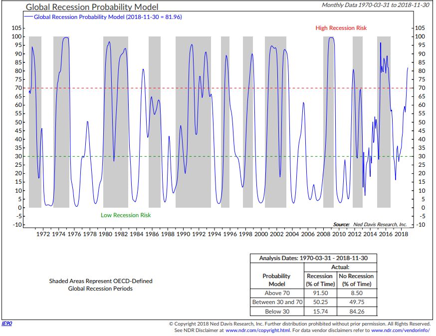
Global Recession Probability Indicator – High Recession Risk
- First, focus in on the blue model line. It plots the probability of recession based on leading indicators from 35 different countries (non-U.S.). The current reading is 81.96, meaning there is an 81.96% probability that we are in a global recession.
- Note the red dotted line. Note the grey shaded bars that show periods in which the OECD said there was global recession (something known more than six months after the fact).
- Bottom line: When the blue line rises above the red dotted line, the global economy was heading into or already likely in recession. A global recession has likely started,which is unfavorable for global equities.
- Finally, focus in on the data box in the lower right section of the chart.
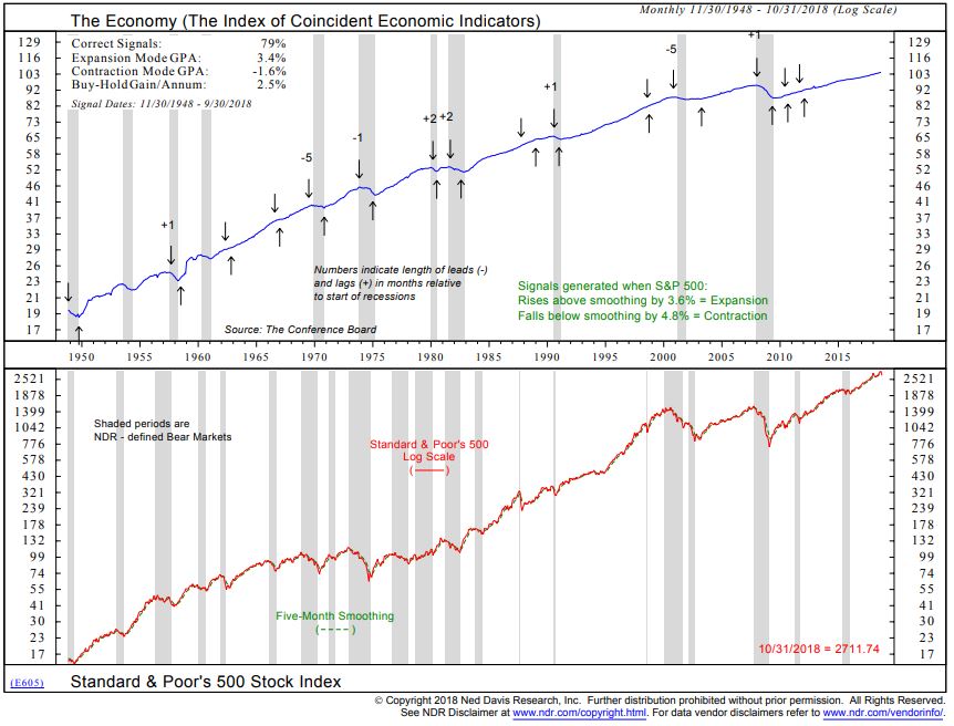
The Economy Based on the Stock Market Indicator – Low U.S. Recession Risk
- Focus on the up and down arrows. Economic expansion signals (up arrows) are generated when the S&P 500 Index rises by 3.8% above its five-month smoothed moving average line. Economic contraction signals are generated when the S&P 500 Index falls by 4.8% below its five-month smoothed moving average line.
- Currently, we’re in an economic expansion period.
- Note the 79% “Correct Signals” in the top left corner of the chart. We are watching for a down arrow. Note this process has done a good job at signaling prior to recessions. Not perfect but pretty good.
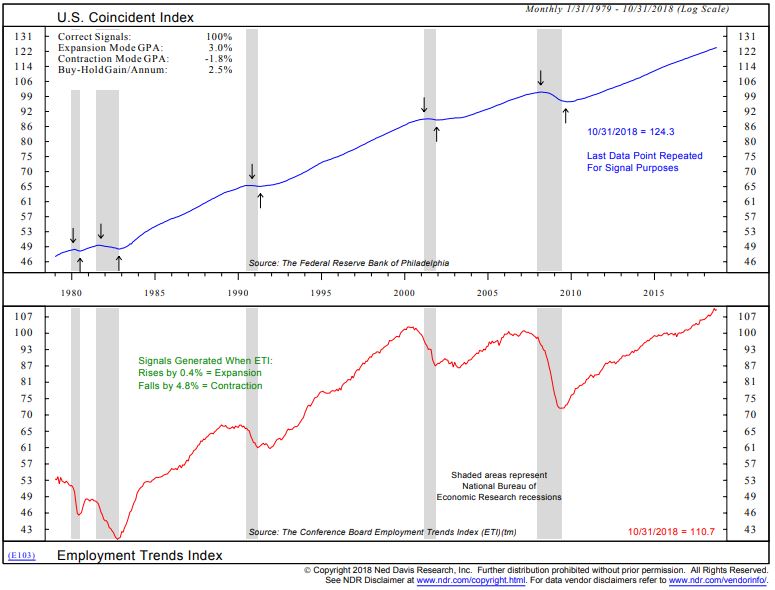
Recession Probability Based on Employment Trends – Low U.S. Recession Risk
- Focus in on the up and down arrows. Down is a recession signal. Up is an expansion signal.
- Expansion signals are generated when the Employment Trends Index rises by 0.4% from a low point.
- Contraction signals are generated when the index falls by 4.8% from a high point.
- Current signal indicates expansion. Last signal date in 2009.
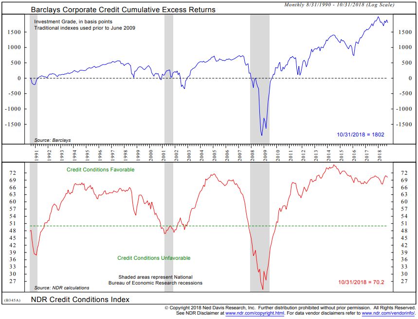
Credit Conditions – Recession Indicator – Low U.S. Recession Risk
- Focus in on lower section of chart. A drop below the green dotted line has preceded the last three recessions. A relatively small data set but the idea is that when lending tightens up “Credit Conditions Unfavorable” recession tends to follow. Grey bars indicate periods of recession.
- Currently, lending conditions are favorable.
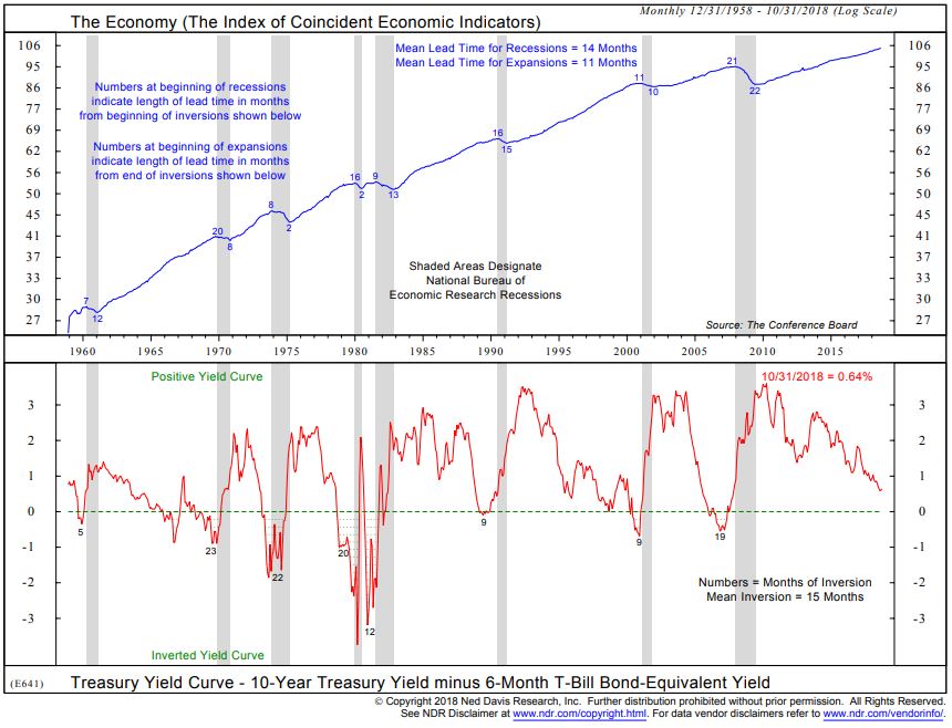
U.S. Economy vs. Yield Curve: Low U.S. Recession Risk
- Watch for a drop below the dotted line, which has preceded every recession since 1958 (lower section of chart).
- Currently above. No current signal of U.S. recession.
Gold:
- 13-week vs. 34-week exponential moving average: Sell Signal
- Daily Gold Model: Sell Signal
Chart 1: 13-week vs. 34-week exponential moving average: Sell Signal
First, a look at the long-term cyclical trend in gold: Buy signals occur when the 13-week moving average trend line (blue line) crosses above the 34-week moving average trend line (red line). Sell signals occur when the 13-week moving average trend line (blue line) crosses below the slower moving 34-week moving average trend line (red line).
Green arrows indicate buy signals, red arrows sell signals. Note green arrow far right. NOTE – The intermediate 13-week MA has crossed below the 34-week MA. An intermediate-term sell signal for Gold.
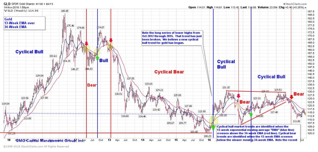
The next chart is a shorter-term gold trend signal.
Chart 2: Daily Gold Model: Sell Signal
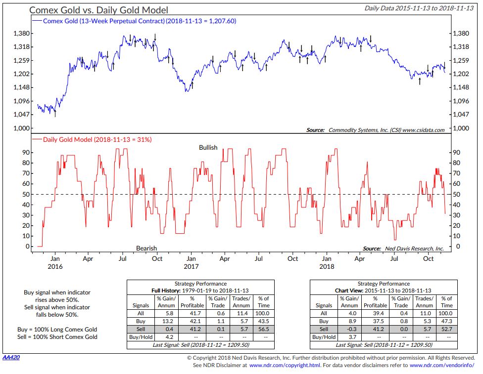
Source: Ned Davis Research
Update on CMG Investment Indices
Equity Markets:
- NDR CMG U.S. Large Cap Long/Flat Index is positioned 100% invested in the S&P 500 Index; however, the model equity line is trending down and nearing a signal.
- CMG Beta Rotation is currently allocated 100% to a Utility sector ETF.
Follow the daily, weekly, monthly and annual performance of the CMG Tactical Equity Indices here.
Fixed Income: Signals and current positions as of the date of this post. Subject to change.
- CMG Tactical Fixed Income Index is currently positioned in an International Bond ETF and Treasury Bills.
- CMG Managed High Yield Bond Program is in a sell signal. Currently positioned in Treasury Bills.
- The Zweig Bond Model is in a sell signal. Currently positioned in Treasury Bills (cash).
Follow the daily, weekly, monthly and annual performance of the CMG Tactical Fixed Income Index here.
Tactical Equity and Tactical All Asset Strategies:
- CMG Tactical Equity Strategy — Currently 100% defensively positioned in Treasury Bills (cash) via ETFs.
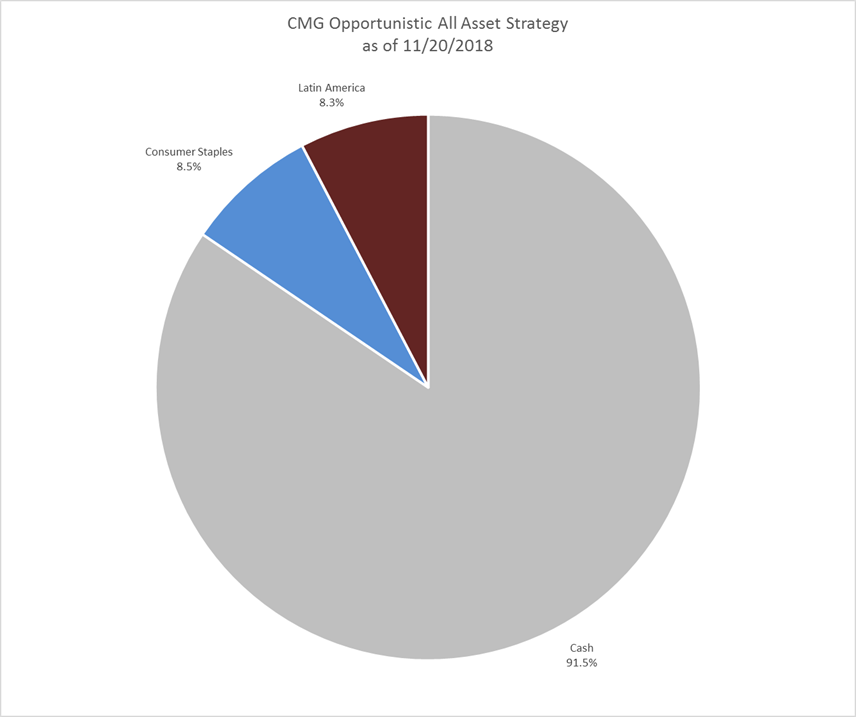
- CMG Opportunistic All Asset Strategy — Currently positioned in Consumer Staples (8.5%), Latin America (8.3%) and the balance defensively positioned in Treasury Bills (cash) via ETFs.
Follow the daily, weekly, monthly and annual performance of the CMG Tactical All Asset Index here.
Liquid Alternatives:
- Gold
- Currently, the short-term and long-term gold signals are in a sell.
- I generally favor up to 5% in gold with an increase to 10% for more aggressive investors. 0% exposure when both S/T and L/T indicators are bearish.
Important: Not a recommendation to buy or sell any security. For information and discussion purposes only. Consult your investment advisor regarding investment objectives, suitability and risk tolerance.
Thank you for your interest in this weekly post. It is appreciated.
♦ If you are not signed up to receive my weekly On My Radar e-newsletter, please subscribe here. ♦
With kind regards,
Stephen B. Blumenthal
Executive Chairman & CIO
CMG Capital Management Group, Inc.
Philadelphia – King of Prussia, PA
CMG Advisor Central – Educational Pieces and White Papers
Several client educational pieces:
- When Beating the Market Isn’t the Point
- Trend Following Works!
- Correlation, Diversification and Investment Success
- The Merciless Math of Loss (this is about how compound interest works for you and significant loss against you)
- Here is a link to our Advisor Blog page
- Here is a link to our Advisor Resource page
CMG is committed to setting a high standard for ETF strategists. And we’re passionate about educating advisors and investors about tactical investing. We launched CMG Advisor Central to share our knowledge of tactical investing and managing a successful advisory practice.
You can sign up for weekly updates to Advisor Central here. If you’re looking for the CMG white paper, Understanding Tactical Investment Strategies, you can find that here.
Advisor Central is being updated with new educational resources we look forward to sharing with you. You can always connect with CMG on Twitter at @askcmg and follow our LinkedIn Showcase page devoted to tactical investing.
Ned Davis Research:
For years, I have subscribed to Ned Davis Research. They are an independent research firm. Their clients are institutional (professional) investor clients like CMG. They are one of the most respected research firms in the business.
They offer several levels of subscription. You can contact them directly at Ned Davis Research at 617-279-4878 to learn more. Please know that neither I nor CMG are compensated in any form. I’m just a big fan of their research and their way of thinking. As a side, Ned Davis authored one of my favorite books, Being Right or Making Money. A great book full of sound, practical advice.
Trade Signals History:
Trade Signals started after a colleague asked me if I could share my thoughts (trade signals) with him. A number of years ago, I found that putting pen to paper has really helped me in my investment management process and I hope that this research is of value to you in your investment process.
Every week, I share with you research I find valuable. No one indicator is perfect, but we believe risk can be assessed and should be managed. Some of this research helps to shape our thinking around risk management and it helps us think about how we might size various risks within the construct of a total portfolio. For example, overweight or underweight equities/fixed income and how much one should consider allocating to tactical/liquid alternative exposures (such as managed futures, global macro, long/short equity). When and what to hedge? Shorten or lengthen bond maturity exposure? We believe such risks can be managed and, to us, broad portfolio diversification is important. If you’d like to talk to us about how we use some of these indicators within our various investment strategies, please email me or email our sales team.
Click here for “The History Behind Trade Signals.”
Investment Process:
From an investment management perspective, I’ve followed, managed and written about trend following and investor sentiment for many years. I find that reviewing various sentiment, trend and other historically valuable rules-based indicators each week helps me to stay balanced and disciplined in allocating to the various risk sets that are included within a broadly diversified total portfolio solution.
My objective is to position in-line with the equity and fixed income market’s primary trends. I believe risk management is paramount in a long-term investment process. When to hedge, when to become more aggressive, etc.
Using Options:
For hedging, I favor a collared option approach (writing out-of-the-money covered calls and buying out-of-the-money put options) as a relatively inexpensive way to risk protect your long-term focused equity portfolio exposure. Also, consider buying deep out-of-the-money put options for risk protection.
Please note the comments at the bottom of this Trade Signals discussing a collared option strategy to hedge equity exposure using investor sentiment extremes is a guide to entry and exit. Go to www.cboe.com to learn more. Hire an experienced advisor to help you. Never write naked option positions. We do not offer options strategies at CMG.
Visit http://www.theoptionsguide.com/the-collar-strategy.aspx for more information.
Diversification – Suggested Client Talking Points:
A diversified investment portfolio is designed to meet pre-defined investment goals. It is often hard to stay the course when stress presents. That is when many investors make mistakes. Diversification means that not all investment risks perform at the same time. For example, managed futures and long/short funds have underperformed the last several years but are outperforming recently. We’d all like to be in the best performing areas all the time, but that is just not possible.
Major market events tend to present one or two times per decade. It is for this reason that a longer-term view can provide a useful perspective. We know that many investors incorrectly sold out of the markets during the tech bubble in 2000-2002 and again with record selling at the height of the 2008 great financial crisis. No one knows exactly how the current distress will play out.
For some time, I’ve been talking about the following: the issues in the high yield bond market, issues that can present post-QE and zero interest rate policy, issues with unmanageable debt in Europe, Japan and China and the issues a rising dollar may trigger as it relates to the $9 trillion in EM debt that was borrowed in dollars. As much as I’d like to think I do, I don’t know for sure which or how and when any of the above risks present and the degree to which they might play out.
What we can do is build portfolios that are diversified across a number of risk factors and market environments. We can identify periods in time to become more or less aggressively positioned (overweight when valuations are cheap and underweight when they are expensive). We can manage risk not only by the collections of ETFs and funds selected but also how we combine them together. Diversification brings meaningful improvement to portfolios designed to achieve a return objective over a long-term period of time.
I see the world of investing through a lens of risk and reward. Ultimately, it is far more important to minimize losses than to capture the best gains. Find me someone or some way to always capture the best gains – impossible, doesn’t exist. I’m friendly with some of the world’s greatest investors and none of them see themselves as perfect.
Over time, it’s really about understanding the power of compound interest. To this end, I wrote a paper entitled, The Merciless Math of Loss.
Article by Stephen B. Blumenthal, CMG Capital Management Group, Inc.

