
Those that follow my personal account on Twitter will be familiar with my weekly S&P 500 #ChartStorm in which I pick out 10 charts on the S&P 500 to tweet. Typically I’ll pick a couple of themes and hammer them home with the charts, but sometimes it’s just a selection of charts that will add to your perspective and help inform your own view – whether its bearish, bullish, or something else!
The purpose of this note is to add some extra context beyond the brevity of Twitter. It’s worth noting that the aim of the #ChartStorm isn’t necessarily to arrive at a certain view but to highlight charts and themes worth paying attention to.
So here’s the another S&P 500 #ChartStorm write-up!
1. The Euphoriameter: First up is a look at what’s down and that’s the Euphoriameter, it has fallen 0.31pts off the high, and while it remains elevated, we have seen a clear reset here from what were arguably too frothy levels. The big open question remains whether this is the peak or just a pullback, and for now it looks like a pullback.
Bottom line: The Euphoriameter has reset from frothy levels.

2. The Investor Movement Index: On a very similar track, the TD Ameritrade “Investor Movement Index” has likewise seen a reset, in this case a much more substantial reset. So we are certainly building up the view and evidence that there has been at least some clean-out in sentiment – the next chart also adds to the case.
Bottom line: The investor movement index shows a reset in investor sentiment from extreme levels.
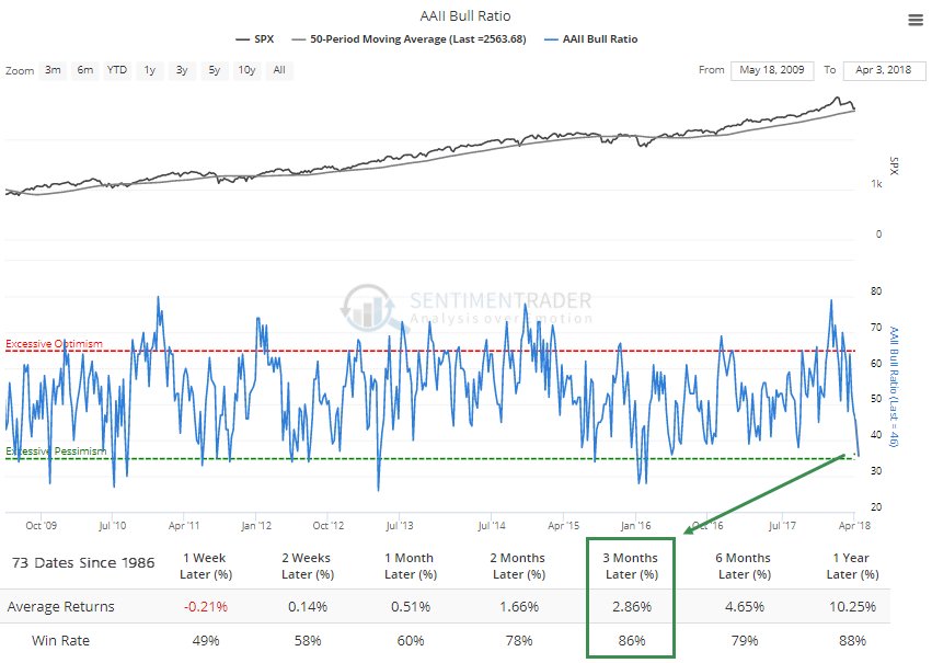
3. AAII Survey: This chart from the ever excellent Sentimentrader shows bulls vs bears ratio from the AAII (American Association of Individual Investors) and the bottom line is that it has reached the bottom end of the range. My rule of thumb when I think about sentiment is that through the range it carries momentum information, and at extremes it carries contrarian information, and as you might guess I would say at this point it is carrying contrarian information… i.e. investors have switched over from too optimistic prior to the correction, to now too pessimistic. Lines up with the overall picture of a clean-out/reset in sentiment.
Bottom line: The AAII bull/bear ratio has gone from too optimistic to now too pessimistic.
4. Valuation Reset: On the topic of resets, Jurrien Timmer of Fidelity Investments shows how the forward PE ratio has undergone a reset (while also showing that market expectations of Fed rate hikes are little changed… perhaps another way of saying the macro picture hasn’t really changed). Part of this is down to the fall in stock prices, but part of it is also down to the increase in forward earnings as analysts have factored in the impact of tax cuts and the bullish broader macro backdrop for earnings.
Bottom line: Valuations are looking cheaper on a forward PE basis.
5. Median Trailing PE: But it is still a nuanced picture, on a trailing PE basis (trailing PE was always going to be higher because the last 12 months of earnings barely show the impact of tax cuts) things still look expensive. This chart from NDR, shared by Willie Delwiche, shows the median PE across S&P500 companies and while it has pulled back it’s still in the expensive zone. But if earnings can meet the elevated expectations we have seen in the forward earnings and if price stays the same then you will see this ratio steadily drift down.
Bottom line: Trailing PE ratios are still in the expensive zone.
6. Cash Allocations: I talked about this chart in the video on the Global Risk Radar, specifically I talked about this alongside the chart which showed valuations as expensive for the major assets (property, stocks, and bonds), and how it reflects the trend where central banks have bullied investors out of cash and into other assets. In many ways it’s a rational/logical response to the conditions that investors face. But I would note that it certainly looks like it is at a cyclical low – this is the sort of thing you see towards the end of a cycle, not the beginning.
Bottom line: Cash allocations are at a cycle low.
7. S&P500 Correlations: This interesting graph shows the change in average stock correlations, shared by Tiho Brkan of the Atlas Investor. Interestingly it seems that correlations on this measure tend to spike during a panic selloff and in many ways could be interpreted as a contrarian signal (i.e. spikes in correlations as a buy signal). It makes sense to see this because in a panic investors “sell everything” and drive up correlations. You also have the impact of passive investing where investors dump passive exposures to raise cash and end up selling indiscriminately.
Bottom line: The spike in correlations could be a contrarian buy signal.
8. Implied Correlations: On a very similar note, this chart shows the CBOE Implied Correlation Index (note: this is my continuous index which switches between the various vintages of the index to provide a more analytically useful version of the raw indexes). The key point is that much like the previous chart this indicator seems to function in a contrarian manner (so I have displayed it inversely to line up with that logic). Seems when implied correlations spike it often functions as a buy signal… it seems to be more of a rate of change thing though vs levels in terms of how it produces said signal.
Bottom line: The CBOE implied correlation index seems to be generating a short term buy signal.
9. Fear of Missing Out? The term FOMO (Fear Of Missing Out) is often used to describe investors behaviour, but in this case I’m referring to some interesting statistics shared by Christie on Twitter. Turns out if you missed the 10 best days in the market your long term returns would have been almost cut in half. In this case I would call it a rational fear of missing out!
Bottom line: Missing the best days in the market can have dire consequences for long term returns.
10. Sustainability Reporting: Final chart in this session looks at the proportion of companies which have adopted “sustainability reporting” – it speaks to the emerging field of ESG research where there is a growing acceptance and body of evidence which says that ESG (Environment, Social, Governance) factors are also relevant and can particularly be useful in filtering out companies that are at risk of brand impairment, legal liability, and general backlash due to inferior ESG practices and ratings. Certainly food for thought.
Bottom line: More and more companies are getting into sustainability reporting.
So where does all this leave us?
This week there are 3 standouts:
1. Sentiment
We saw a partial reset in the Euphoriameter, a substantial pull back in the TD IMX, and a shift from extreme optimism to extreme pessimism in the AAII survey.
2. Valuation
On valuation we saw how the forward PE ratio had pulled back quite a lot, while the median trailing PE still remains elevated, and in the expensive zone.
3. Correlation
As for correlations, we saw how big moves in average stock correlations in the past have occurred around major market corrections and panics, and how the implied correlation index may be implying a buy.
Summary
Bringing it all together, while charts like the cash allocations picture and trailing PE valuations look late cycle, the pullback in sentiment presents a view which could be interpreted as a cleaning out of froth or a reset. Given the macro backdrop has really not changed, and given how sentiment and valuations (at least the forward PE) are evolving it looks like we could be nearing the end of the correction. The news/noise flow is almost constant so it even raises the question as to at what point investors become numb to headline risk. Something to think about…
See also: Weekly S&P500 #ChartStorm – 8 April 2018
Follow us on:

