
“Excesses in one direction will lead to an opposite excess in the other direction.”
“Markets are strongest when they are broad and weakest when they narrow to a handful of blue-chip names.”
“Bull markets are more fun than bear markets.”
– Bob Farrell (Rules #2, #7 and #10 of “Farrell’s Ten Market Rules to Remember”)
I asked my good friend, John Mauldin, if I could share with you his recent article in Thoughts from the Frontline entitled, “Economy with a Fever.” One of the things I appreciate most about John is his ability to communicate complex thoughts in a way that we can better understand.
John stories to teach economics better than anyone I know. This from John:
Getting a fever is no fun. You likely get chills, you sweat, and you’re just generally uncomfortable. You get tired easily and need to rest. But here’s the weird part: Fever isn’t the real problem. It’s a symptom of something else. You must treat whatever that is to relieve the fever.
Economic indicators are similar. Lately I see a lot of talk about the flattening yield curve and speculation it might invert as the economy enters recession. If that happens, the inverted yield curve won’t be the culprit. It will point to another culprit, or combination of them.
This is something I watch carefully because a recession is long overdue, if history means anything. Some argue this time is different. Maybe so, but I’m not inclined to bet on it. Today we’ll explore some reasons why.
In late 2006, when the yield curve was last in the process of inverting, I put in a call to then New York Fed’s Dr. Fred Mishkin, who co-authored a seminal report reviewing 20 different indicators as recession forecasting tools. They found only the inverted yield curve had any true significance, and then it was generally a year early.
I had first used that signal back in 2000 to forecast a recession, using their research but just as important, what I learned from one of my earliest economic mentors, Dr. Gary North. Back in the early 1980s, Gary pounded into me the inverted yield curve’s importance in forecasting recessions. Later, Professor Campbell Harvey of Duke came along with his groundbreaking work, and then Mishkin and his New York Fed colleagues—which if I remember right was in 1996.
Anyway, Mishkin returned my call, and I asked his thoughts on the then-current inverted yield curve. Did this mean a recession? He was actually quite reserved and told me an unqualified “maybe, but not necessarily. This time could be different.” I pressed, but he stuck with that answer.
There weren’t that many of us in late 2006 ready to make the recession call. The market promptly rose another 20% after I said it was time to begin to move out of stocks. Two years later, I looked like a genius, but only after months of being mocked as another perma-bear gloom and doomer… along with Nouriel Roubini and a few others. Now everyone claims to have predicted the Great Recession. Memories are a funny thing…
Rough business… I can tell you there were few people who got it right.
“Excesses in one direction will lead to an opposite excess in the other direction.” Great rule… It takes great conviction to go against the crowd.
Bob Farrell was the Chief Stock Market Analyst at Merrill Lynch when I was a young broker. Farrell studied fundamental value investing under Benjamin Graham and David Dodd (authors of the researchers’ bible, Security Analysis) at Columbia Business School, and earned a master’s in investment finance in 1955. But Bob took to technical analysis (charts and investor behavior). He began his Merrill Lynch career in 1957 and served as the firm’s Chief Stock Market Analyst until his retirement.
Bob learned that investors (our crowd thinking) are wrong at market extremes and he found the investor data he had access to at Merrill Lynch measurable. He’d look at the charts and make his market calls. He became the industries’ very best.
Bob once wrote, “I wrote in a didactic style, explaining how I came to my conclusions and how contrary thinking was useful. My whole experience on the economy has been, if the majority of economists agreed on something, I knew I had to watch for something different.”
That’s why Mauldin, Roubini and, frankly, I were called perma-bears in 2006 and 2007. It is hard to go against collective group thinking. It was easy to write a piece in late 2008 called, “It’s So Bad It’s Good.” Truthfully, it was downright scary but that is just the way it is and I suspect will always be.
Back to the fever. Mauldin’s piece is important! I believe you will find it helpful. After you read it, you’ll find a short post on an article I came across in Bloomberg. It got me thinking about Bob Farrell and all those years sitting at my Merrill Lynch office desk listening to his monotone voice over the squawk box. He once said, “If the majority of economists agreed on something, I knew I had to watch for something different.” I think it will help you think through a few things.
Grab that coffee and find your favorite chair. When you click through and read Mauldin’s piece, think about Bob Farrell and then read, “There’s a New Curve in Town and It’s Flashing Red.” Maybe everyone is looking at the wrong thing. I’ll be keeping this new chart On My Radar. Thanks for reading. I hope you find the letter helpful for you and your work with your clients. Have a wonderful weekend!
♦ If you are not signed up to receive my weekly On My Radar e-newsletter, you can subscribe here. ♦
Included in this week’s On My Radar:
- “Economy with a Fever,” by John Mauldin
- “There’s a New Curve in Town and It’s Flashing Red,” by Joanna Ossinger
- Trade Signals — S&P 500 Index Fight at the 200-Day MA
- Personal Note
“Economy with a Fever,” by John Mauldin
Flattening Curve
Last week brought a little (at least short-term) good news if you’re worried about the yield curve inverting, i.e. short-term rates rising above long-term rates. The ten-year US Treasury yield rose above 3% for the first time in four years. This will be the opposite of inversion, if it persists. It makes the curve steeper unless short-term rates rise even more.
Nonetheless, the yield curve is still abnormally flat. The gap between two-year and ten-year Treasury yields hasn’t been this low since before the last recession.

Note in the graph how this gap dropped below zero—i.e. inverted—shortly before the last three recessions. We haven’t seen it yet in this cycle. But we certainly could see inversion within the next year or so if it keeps dropping at the current rate. That’s quite possible if the Fed keeps hiking because they have hit their inflation and employment targets.
The Fed is now walking a very tight rope. They know, deep down and viscerally, that they have to get rates back up so that they will have a few “bullets” for the next recession. It is likely they will keep hiking rates until we get to an inverted yield curve. Are they aware of all the literature and what they’re doing? Absolutely. Candidly, I can’t imagine accepting a Fed appointment knowing that we are this late in the cycle.
Does an inverted yield curve guarantee a recession? No, but inversions are strong evidence one is forming. Last month, yet another new San Francisco Fed study found an inverted yield curve, which predicted all nine US recessions since 1955, is still valid even in today’s low-rate environment.
However, yield curve inversion is a far-leading indicator, which is why my previous recession and bear market calls were early. Those nine recessions all began 6–24 months after the yield curve inverted. And, in the ones I’m old enough to remember, many experts spent those months telling us that this time was different. (Spoiler: It wasn’t.) And I expect the same again.
Look around at all the great economic news. I’m aware of it. But the economy was hitting on all cylinders in early 2000 and late 2006, too. The numbers always look great right before a recession. Then it all rolls over at once.
Like that fever I mentioned, an inverted yield curve doesn’t immediately damage the economy. It points to damage that’s already happening—an underlying infection. It means bond investors have lost short-term confidence in the economy and want to lock in longer-term interest rates. You don’t want to buy, say, one-year bills if you think rates will be lower when it’s time to reinvest them. That will be the case if, for instance, you expect the Fed to be lowering rates to stave off recession.
One point about that economic fever. I said that fevers don’t kill you, they are a symptom of something being wrong. Well, that’s not actually true. If a fever gets high enough or lasts long enough, it will kill you. Which is why hospitals work so hard to keep your fever down. A steeply inverted yield curve that goes on long enough is like having 108° fever. Both banks and shadow lenders go upside down on their “book” and stop making loans. That can freeze the economy and makes a garden-variety recession even worse. Which is why any central bank facing that scenario lowers rates and fights the yield curve.
The London Interbank Offering Rate (LIBOR) has for most of my adult life been the world’s most important private interest rate. By now you know that it is going away, and new substitutes are coming. But LIBOR is still out there for a short time, so let’s look at it.
(By the way, Dennis Gartman and I had an argument/discussion yesterday about whether the two-year Treasury yield is artificially depressing the Fed funds rate. I suspect that it is. I hope he can get to dinner with Art Cashin and friends in New York next Tuesday night and argue that to the table.)
But in any case, there’s now less than a 60-basis point spread on the Treasury 2/10 and half that if you’re using LIBOR, which I think of as more free market. If you go out the LIBOR swap market, you find a 20-year swap is not much different than a 10-year. The further out the curve you go, the flatter it gets. This is what happens at the end of an economic cycle and right before the yield curve inverts.
Source: Mortgage Equicap, LLC
M2 Growth or Lack Thereof
The next-to-last Outside the Box that we sent you on April 18 featured Lacy Hunt’s quarterly review. Among other things, Lacy talked about falling growth in M2 money supply. Here’s an updated version of his chart:
In that article, Lacy described how M2 growth decelerated ahead of 17 of the 21 recessions since the early 1900s. He then dug into the four exceptions (marked A, B, C, and D on the chart) to see if they disproved the rule and found they did not.
What is M2? It is a broad measure of the money supply, including cash, checking, and savings accounts, time deposits, and money market mutual funds. In a healthy economy, M2 should be growing. Diminution of that growth suggests recession is coming—but like the inverted yield curve, not necessarily soon. As he told me, broad measures of monetary growth can begin to decline two years or more before you have an actual recession.
Again, this symptom results from an underlying disorder. M2 money supply grows with bank credit growth. It falls when banks reduce lending growth. They do that when finding credit-worthy borrowers gets harder, as it does in a recession. So here again, we see a condition that isn’t itself problematic but points to one.
Lacy explained in his quarterly why this is a concern now. In the first quarter of 2018, M2 growth decelerated to just above a 2% annual rate. Year-over-year, M2 growth slowed to just 3.9% versus the 6.6% long-term average growth. Additionally, bank credit growth declined 0.6% at an annual rate. Loans continued to inch upward but only because the banks’ securities portfolios fell. Loan volume does not typically fall until an economy is in a recession because firms borrow to finance an unintended rise in inventories.
Note that credit growth doesn’t have to go negative. It rarely does, the main historical exception being the Great Depression. The key is its direction and distance below that 6.6% long-term average. The present 3.9% rate is the lowest since 2009. This again points to recession on the horizon. Not next month or even this year, but likely within 2–3 years.
My friend Richard Duncan from Singapore sent me a note on credit growth this week. The emphasis below is his:
When credit growth is weak, the United States falls into recession. Between 1952 and 2008, there were only nine years when total credit (adjusted for inflation) grew by less than 2%. Each time, there was a recession. In 2017, total credit grew by just 1.9%. This was the first time credit growth has fallen below the 2% recession threshold since 2013.
Total credit in the United States reached $68.5 trillion at the end of 2017. Given such an enormous base, it is difficult for credit to expand by 2% after adjusting for inflation. For instance, if the inflation rate is 2%, then total credit must grow by 4%, or by $2.7 trillion, just to reach the 2% recession threshold. If inflation increases to 3%, then total credit must grow by 5%, or by $3.4 trillion, to get there. Credit growth on that scale is not easy to achieve, especially given stagnant wages, the already high level of private-sector debt and, now, increasing interest rates.
The latest Macro Watch video forecasts US credit growth out for the next three years by considering the outlook for borrowing by each of the major sectors of the US economy. With inflation trending higher, it looks as though credit will expand by only 1.7% a year during 2018, 2019, and 2020. If those forecasts prove to be correct, the chances are high that the United States will soon fall back into recession.
Cycle Studies
According to central banks and some on Wall Street, the US and global economies are right on the cusp of breaking from the post-recession doldrums. They think their aggressive monetary policies are finally bearing fruit, helped by tax cuts and other factors. Hence, the Fed is now tightening policy lest this inevitable growth spark too much inflation.
My friend Lakshman Achuthan of the Economic Cycles Research Institute is not convinced. He recently sent some slides I want to share with you. (He will be at the dinner on Tuesday, and he was gracious enough to talk me through these this week.) This first one shows that the present, low-grade expansion phase is the latest in a series. By the way, the ECRI is as close as we have to “official” economic cycle watch service in the country.
Source: Economic Cycles Research Institute
Note, this is growth during times when the economy is not in recession, which should be considerably higher than the full-cycle averages. It has been falling steadily since the 1970s and is now below 2%. If the best we can do is 2% not counting recessions, it’s hardly time to proclaim victory.
The next chart looks at the ECRI U.S. Coincident Index, which is their alternative growth measure. The shaded areas are cyclical downturns, the three most recent of which did not reach recession status.
Source: Economic Cycles Research Institute
The important point here is we see little or no improvement in the growth rate. Since 2010, it has moved sideways in a tight range. In the last two years, it moved up to about the middle of the range, which is positive but doesn’t mean the US economy is off to the races.
Finally, and most ominously, Lakshman shows this chart of quarterly GDP growth in the three largest developed market economies.
Source: Economic Cycles Research Institute
We see in all three places that quarterly growth peaked in mid-2017 and then fell in the last quarter. Yet the experts tell us a synchronized global recovery is forming. Really? What I see here is a synchronized downturn. Granted, it’s just a couple of quarters but early data makes Q1 2018 look lower still.
If a recession is coming, GDP growth will decline from its present level to 0% or below. That process will likely unfold over a few quarters—and may already be beginning.
Debt Gap
On top of all this, we have a fast-growing federal debt. I realize some readers are of the “debt doesn’t matter” persuasion. With all due respect, the debt does matter for reasons I will explain below. Yes, we owe this money to ourselves and maybe it will all balance out eventually. But we must get there first, and the road is not necessarily smooth.
Let’s look at some data from my friend Luke Gromen, who runs a unique advisory service called Forest for the Trees. His informative letters are typically short, and I’m becoming quite fond of them. The most recent one had some fascinating points on the debt.
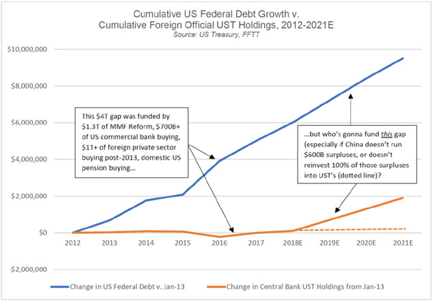
First, Luke says one of the least-noticed recent developments is that foreign central banks stopped net purchases of US government debt about five years ago.
Source: Forest for the Trees, LLC
This is important because someone has to fund our deficit spending, and the job is not getting easier. It’s getting harder, in fact, as Luke’s next chart shows.
Source: Forest for the Trees, LLC
By the way, this gap is conservative. It assumes the US will have no recession by 2021 and that foreign central banks will hold their Treasury portfolios to maturity. The recent trend line suggests they won’t. It also assumes China will keep running a $600B yearly current account surplus with the US and buy US Treasury securities with all of it. Those aren’t guaranteed either—and will certainly change if the Trump administration succeeds in reducing the US-China trade deficit.
To this point, the Fed and Treasury have filled the gap with assorted contrivances, such as forcing banks and money market funds to buy more Treasury bonds. These have run their course and no replacement tools are obvious.
That leaves one option: higher interest rates. People will loan their money to the government if it gives them enough incentive, and higher yields will do it. How much higher? We don’t know, but it won’t take much to further reduce bank lending activity, which will reduce M2 and push the economy closer to recession. Investors will further extend their maturities, inverting the yield curve.
That, my friends, is a fever that won’t feel good at all.
Recession Watch
By now, everybody knows we are in the slowest recovery on record. Lacy Hunt blames ever-increasing debt, which is a drag on growth. He has tons of academic literature to support his position, and I agree with him. That the next recovery will be even slower.
Go back to what Richard Duncan said earlier. When credit growth drops below 2%, a recession almost always follows. Lacy tells us that bank credit growth is down to 0.6% since the beginning of the year. That is ugly.
I now have to officially put my recession watch antenna firmly in place. The models that my four ETF trading strategists follow (using their significantly different quant models) are all beginning to de-risk their portfolios. Given the volatility of the market, that has been a good decision. Have they pulled all their chips off the table? No, not even close. But they are closer than they were one year ago.
In short, there is not enough data to have me predict a recession and the consequent bear market. But there’s enough data bubbling up all around me that it makes me very nervous, and I am paying close attention. You should be, too.
[You can subscribe to John’s free letter at subscribers@mauldineconomics.com. If you are not familiar with John, he is the world’s most widely followed newsletter writer. Oh, and he’s a very nice human being.]
“There’s a New Curve in Town and It’s Flashing Red,” by Joanna Ossinger
Ugh. Call the doctor, the fever may be spiking… This article from Bloomberg crossed my desk late Wednesday.
By Joanna Ossinger, May 1, 2018
- Private sector may give a more accurate signal for recession
- We are entering dangerous territory on credit indicators
The private sector may hold the real clues to recession risk.
While the flattening U.S. yield curve — the difference between short- and longer-dated Treasuries — has been closely-watched as a potential indicator of a looming contraction, investors might do better to watch a measure of the cost of private credit, according to Charles Gave of Gavekal Capital Ltd.Either a U.S. recession has taken place within a year of the private sector yield curve inverting, or a “financial accident” has occurred in other economies with currency links to the greenback, according to Gave’s data.
Prime rates below the natural rate of corporate credit have allowed banks to generate “artificial” money, kept “zombie” companies alive, and enabled other corporates to engage in “financial engineering” predicated on cheap borrowing costs that risk toppling over if the curve inverts, Gave said.
Based on this measure, “we are entering dangerous territory,” he concluded. If the private sector curve inverts “zombie companies will fail and capital spending will be cut, as firms move to service debt and repay principal. Workers will get laid off and the economy will move into recession.”
Source: Bloomberg
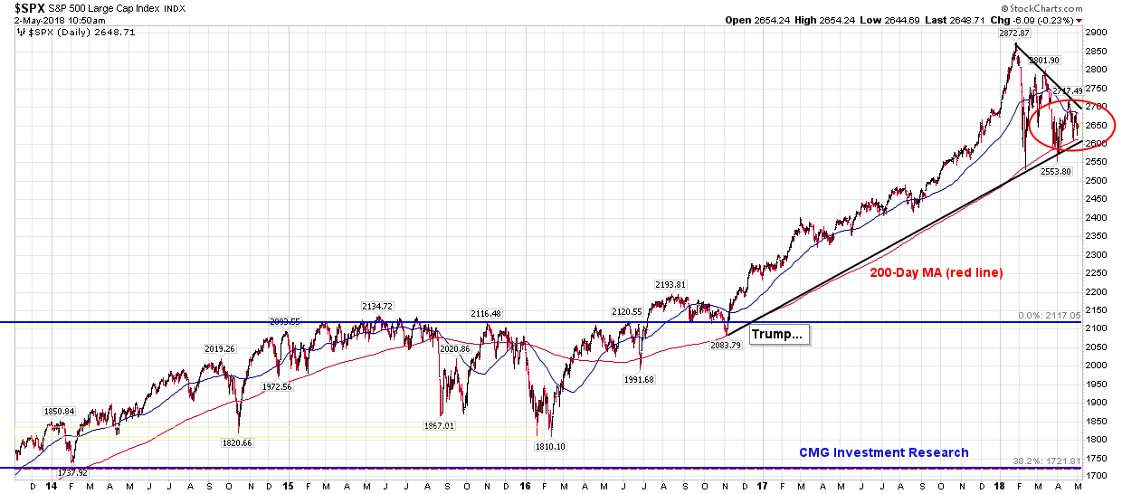
Trade Signals — S&P 500 Index Fight at the 200-Day MA
S&P 500 Index — 2,650 (05-02-2018)
Notable this week:
I thought I’d share with you a chart showing the current fight at the 200-day moving average trend line (red line and red circle next chart). The black line shows the trend line from the February 2016 low, the November 2016 election and the current indigestion around the 200-day MA. It has tested the line three times… I suspect a break of the 200-day sends the market to 2,400. We’ll see. Inflation pressures continue to mount and the Fed path for higher interest rates continues. Both are giving the market indigestion.
Below is a look at the 200-Day Moving Average Cross Strategy on the DJIA. The strategy recommends buying when the current price is above 200-day moving average and selling when it is below. Note the cumulative HYPOTHETICAL out-performance over time. Absent any other form of risk management, I believe 200-day MA cross strategy has merit. Not all trades are perfect, but the idea is to avoid the really big mistakes. This strategy can help.
The Ned Davis Research CMG U.S. Large Cap Long/Flat Index remains at an 80% large-cap exposure signal (down from 100%). The 13-week trend line vs. the 34-week trend line remains on a “buy” signal; however, the short-term 13-week moving average is rolling down. We’ll keep watch. Sell signals occur when the short-term trend crosses below the long-term trend line. Volume Demand continues to be greater than volume supply, which supports a bullish posture. The CMG Managed High Yield Bond Program is in a “sell” signal. Gold remains in a cyclical bull market trend. Finally, the Zweig Bond Model remains on a sell and the 10-year Treasury Note Yield continues to flirt with 3%.
One last notable change since last week, our favored Global Recession Watch Model has moved from low risk of global recession to a moderate 55% probability of recession. Let’s keep a closer eye on this signal as well.
Click HERE for the latest Trade Signals.
Important note: Not a recommendation for you to buy or sell any security. For information purposes only. Please talk with your advisor about needs, goals, time horizon and risk tolerances.
Long-time readers know that I am a big fan of Ned Davis Research. I’ve been a client for years and value their service. If you’re interested in learning more about NDR, please call John P. Kornack Jr., Institutional Sales Manager, at 617-279-4876. John’s email address is jkornack@ndr.com. I am not compensated in any way by NDR. I’m just a fan of their work.
Personal Note
The weather has turned in the Northeast. It’s been in the mid-80’s the last few days, and it’s been nice to have coffee outside in the morning and I see a nice glass of red wine in hand on the patio this evening.
All but one of our six children will be home this weekend. That’s good news for dad, since it’s time to bring out the porch furniture… more hands on deck. I sure do love this time of year.
Hope you have something fun planned this weekend.
Wishing the very best to you and your family.

