
“To refer to a personal taste of mine, I’m going to buy hamburgers the rest of my life. When hamburgers go down in price, we sing the ‘Hallelujah Chorus’ in the Buffett household. When hamburgers go up in price, we weep. For most people, it’s the same with everything in life they will be buying — except stocks. When stocks go down and you can get more for your money, people don’t like them anymore.” – Warren Buffett, Fortune, December 2010
Q4 hedge fund letters, conference, scoops etc
The goal of every investment portfolio is to capture growth while preserving capital, yet these two goals are at odds with each other. Taking on too much risk to increase returns (growth) risks large losses. Being too conservative to prevent loss (preserving capital) stymies growth. The trick is to find the right balance and know when to play more offense than defense or more defense than offense.
That’s where understanding equity market valuations and what they tell us about coming returns comes into play. Your initial starting conditions matter and can serve as a guide to help you know how to best position your portfolio for the period immediately ahead.
Today, let’s take a look at our initial starting investment conditions. We’ll look at the most current valuations and see what they are telling us about coming 3-, 5-, 7-, 10- and 12-year returns. And we’ll look at what they are telling us about the level of risk.
To set the stage, it is important to note that markets go through periods of bull and bear market cycles. We love bull markets and loath bear markets. Both happen. Here is a look at the bull and bear market secular trends since 1990. Annualized returns are noted in each period.
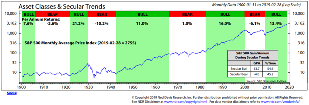
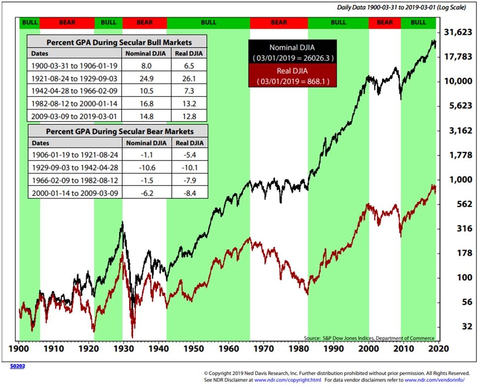
Next is a look at the DJIA over the same period of time as the chart above. From 1966 to 1982, the DJIA lost 1.5% per year before factoring in inflation. Sixteen years averaging -1.5% per year is a long and painful run. Compounding investor pain were the inflation pressures in the 1970’s and early 1980’s. My personal view is that the coming restructuring of the debt will lead to a period of high interest rates and higher inflation. That’s not currently factored into the 2.65% 10-year Treasury yield we see today. With valuations high and the bull market aged, the point I’m hitting hard is that risk is high and coming returns will be low. This year, next year? Don’t know. Over the coming five to 12 years, I think the data you’ll find below will be pretty close.
Now, if you are in your 20’s or 30’s, then simply find a good ETF that gives you the market at low cost, keep adding money every year and dollar cost average for the next 30 years. When the next recession resets valuations, add more, don’t worry and stick to the plan. However, if you are a pre-retiree or retiree, like me, unfortunately, we just don’t have the same time runway and can’t afford to wait the years it will take to overcome another 50% loss on our retirement savings. For us, I suggest a more adaptive investment approach. More defense than offense today. More offense than defense after asset prices reset lower. The next recession will likely create that opportunity.
It can take time to recover from a bear market. Especially when inflation is factored in. For example, imagine you are 50, 60 or 70 years old and it is December 1999, and you were planning to retire in the next 10 to 15 years. Look at the next chart and observe how long it took, after inflation, to get back to even. And inflation matters, since we need to grow our money in order to buy things. Our initial starting conditions matter. It took 14 to 18 years to recover from the two recessionary-driven market meltdowns that occurred. I’m turning 58 in a few short weeks. Age 58 to age 72 is a long gap with zero gain.
Here is how to read the chart:
- The pink zone in the following chart is the period of time spent underwater.
- The DJIA is the green line, the S&P 500 Index is the blue line and the NASDAQ is the red line.
- The “hamburgers” were expensively priced in 1999, suggesting that more defense than offense was the better game plan. I argue the same is true today.
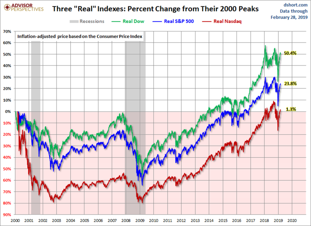
Note the gray bars in the chart. They were the two recessions and they reset valuations and improved initial starting conditions. Recessions tend to clean house and can create outstanding investment opportunities. You can buy much more for your money.
Should we play more offense than defense or more defense than offense? Valuations can help. Grab a coffee, find your favorite chair, and read on. You’ll find a number of different valuation metrics and compelling data I hope you find helpful as you map your offense/defense game plan for the period ahead. I conclude today’s OMR with a story about Alexander Hamilton, our first Treasury Secretary, the NYSE and a really great day.
♦ If you are not signed up to receive my weekly On My Radar e-newsletter, you can subscribe here. ♦
Follow me on Twitter @SBlumenthalCMG
Included in this week’s On My Radar:
- Stock Markets – Valuations and Coming Returns
- Global Recession Update
- Trade Signals – Investor Sentiment is Too Bullish, Recession Watch Update
- Personal Note – Alexander Hamilton and the New York Stock Exchange
Stock Markets – Valuations and Coming Returns
“Your and my clients are expecting 10% forward returns; however, due to extremely
high valuations they are likely to get 0% to 2%. Trouble spots?
There are many. It is the bubble in the bond market that has me most concerned.”
Steve Blumenthal, OMR, February 2018
Make that the corporate bond market. And it is going to be epic. But more on that opportunity in another letter, this week is about valuations and coming returns. So put your quant hat on and let’s get geeky…
Following are a number of different valuation charts, but you should be able to read through this section quickly. I do try my best to hit the high points and summarize “bottom line” what each means. Keep Buffett’s quote on hamburgers in the back of your mind as you’ll find consistency in the data.
Bottom line: The markets, by most measures, are expensively priced.
Chart 1: Compares the Shiller P/E Ratio (or PE10) vs. History
- Note the yellow dot vs. the 1929 and 2007 market peaks.
- The dotted orange line marks the tech bubble period.
- The market is currently in the 95th percentile of all P/E readings since 1900.
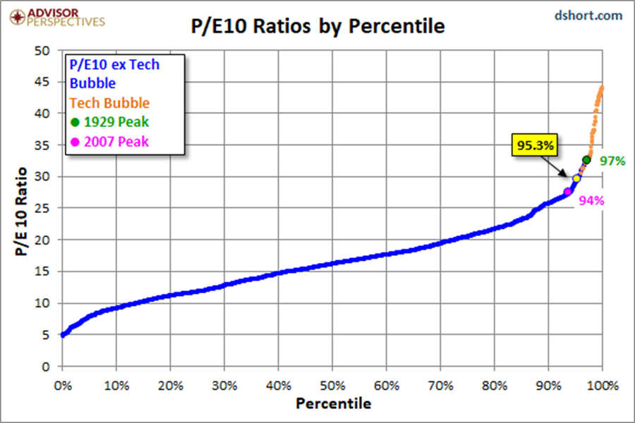
Source: dshort.com
My favorite valuation chart is median P/E. I like it because median P/E is the middle out of all the stocks in the S&P 500 Index. This method tends to eliminate one-time accounting gimmicks, etc. I also like it because we can then compare where we are valuation-wise vs. where we have been historically and then look at that historical data to see how the market did 10 years later. Meaning, putting real life performance stats to Buffett’s hamburger theory. Let’s look at Chart 2.
Chart 2: S&P 500 Index Median P/E
- Note the red “We are here” annotation. It is lower than it was in mid-2018 but remains higher than it was in 2007 and higher than the late 1990s and early to mid-2000s.
- Note the few times since 1964 where the market was this much overvalued.
- Take a look at the red arrow and red circle at the bottom of the chart.
- A good entry price (fairly valued “hamburgers”) is when median P/E drops to the dotted green line. That is the 55-year average median P/E. At the end of February 2019, median P/E was at 22.2. It would have to decline to 17.2 to move back to that 55-year average. Look for stocks to drop to 2152.41 to be at a level where the “hamburgers” would be considered “Fair Value.” That would require the market to drop by 7% from February’s S&P 500 Index closing level of 2784.49.
- Today, March 8, 2019, the S&P 500 is at 2730.30.
- Absent recession, 2152.41 is probable in my view. With recession, I’d expect the market to move to the “undervalued” level or 1489.70 on the S&P 500 Index (red circle, bottom section of chart).
- I also like how the data process considers levels of both “overvalued” and “undervalued.” Perhaps that is why the market has had so much trouble at the 2800 level.
- Bottom line: set your sites on the green dotted “Fair Value” line. More defense than offense until this metric improves.
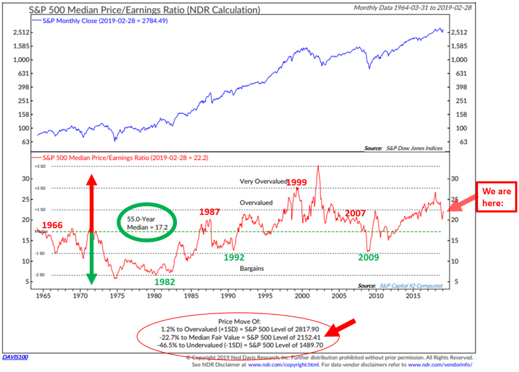
When I posted this chart last February, median P/E stood at 26.8 and the S&P 500 Index was at 2823.81. Our initial starting conditions and valuations do matter!
I mentioned that valuations are a great long-term predictor of the annualized returns we’re likely to get. Let’s look at that in this next chart.
Chart 3: What Median P/E Tells Us about Forward 10-year Returns
When valuations are high, forward returns are low. We have no idea as to the next one to two years, but we have a really good idea about the coming 10 years.
Here is a look at the data (1926 to December 31, 2014) and how to read it:
- Median P/E was sorted into five quintiles that ranged from lowest median P/E readings to highest. Quintile 1 is the lowest 20% of all month-end median P/E and quintile 5 is the highest incidences.
- Then what happened? Next to each quintile is the annualized return data. Shown is the annualized nominal returns (before factoring inflation) achieved 10 years later.
- Today, we remain in quintile 5.
- Bottom line: The stock market is richly priced, expect forward returns to be low.
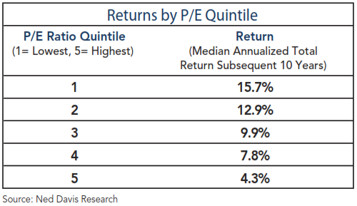
Chart 4: Shiller P/E Currently 29.84
- Data is from 1880 to present.
- The Shiller P/E is down from its 2018 high in the low to mid 30s, but still as high as the 1929 “Black Tuesday” peak.
- It still remains higher than any other time with the exception of the 2000 tech bubble.
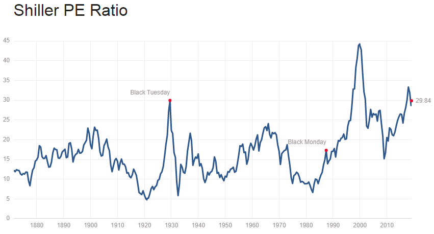
Source: http://www.multpl.com/shiller-pe/
Chart 5: What Shiller P/E can tell us about coming 10-year real (inflation adjusted) total returns
Here’s how to read the chart:
- We are in the highest quintile of all monthly valuation numbers since 1880.
- The chart details the returns that occurred 10 years after each month-end Shiller P/E reading. It then groups the numbers into five quintiles ranging from lowest P/Es to highest P/Es and shows the average annualized return after inflation based on each quintile.
- Note the average P/E for each quintile is shown at the bottom of each blue bar.
- Bottom line: you get much more return on your money when you buy low (valuations are most attractive) and least when you buy high (like today). Expect 2.4% real annualized returns over the coming 10 years (and likely a bumpy road on the way to those low returns).
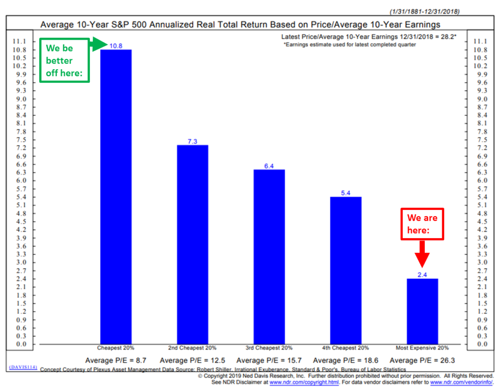
Chart 6: Stocks as a Percentage of Household Equity vs. Subsequent Rolling S&P 500 Index Total Returns
Here’s how to read the chart:
- Blue line tracks the percentage of household financial assets that are allocated to equities. The dotted black line is important. It tracks/plots the returns that were achieved 10 years later.
- The logic is that when investors are heavily invested into stocks, there is less buying power left to drive prices higher.
- The red boxes and lines mark certain dates when ownership was high and the arrows point to the returns that were forecast based on the percentage investors had in equities.
- For example, note 2000 and the forecast return of -3% per year for 10 years. The dotted black line shows what the actual return turned out to be. The actual return from 2000 to 2009 came in slightly better at -2% but you get the point.
- Now, take a look at the green boxes. Same concept but in reverse. Low equity percentage ownership means that there is more money available to buy stocks. And the subsequent returns tell the story.
- Simply, periods of high stock ownership correlate with lower subsequent returns and low stock ownership correlates with higher subsequent returns.
- As Sir John Templeton said, “The secret to my success is I buy when everyone else is selling and I sell when everyone else is buying.” This chart is a demonstration of Sir John’s axiom.
- Finally, note how closely the dotted black line (the plotting of the actual return over a rolling 10-year period) closely tracks the blue line (percentage of stock ownership)… We geeks look at something called a correlation coefficient to see how closely one thing relates to another. Since 1951, the correlation is 0.89. 1.0 is a perfect correlation. 0.89 is very high and with data back to 1951, that is a number not to be ignored.
- Bottom line: As of December 31, 2018, the potential return over the coming 10 years improved from about 1% to 3% before inflation. Better but not so great.
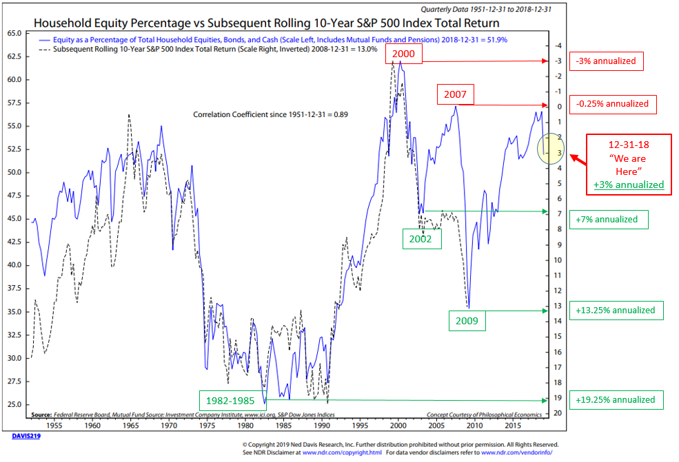
Chart 7: GMO’s 7-Year Real Return Forecast
- I added the red arrows for emphasis.
- Forecasting -3.7% for equities and -0.80% for U.S. bonds over the coming seven years.
- I have followed GMO’s monthly forecast updates since the late 1990s. You can learn more about how they calculate their forecast at gmo.com.
- Bottom line: Ugh! Remain patient. More defense than offense.
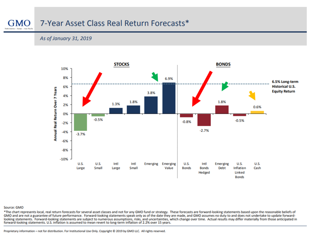
Source: GMO
Chart 8: Other Valuation Measures
- Bottom line: Most valuation metrics reflect a richly priced “overvalued” market.
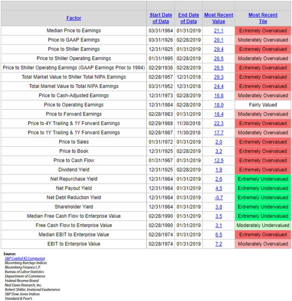
Chart 9: The Buffett Indicator — Corporate Equities-to-GDP
This indicator takes the value of corporate equities from the Fed’s Quarterly Z.1 Balance Sheet and compares it to U.S. Gross Domestic Product.
- Think of the U.S. as one big business and it produces a number. In this case, GDP is used.
- If your business produced $1 million and the value of all your outstanding shares times your current stock price was $2.38 million, the value of your business would be worth 138% more than what you produced.
- Think of it just as a baseline measure.
- You can then compare that baseline measure to points in time (history) and see just how richly priced you are relative to history.
- If I’m going to buy your stock, am I paying a lot or getting a good deal? Of course, that depends on your ability to grow your sales; I can estimate that…but I want to see how much I’m paying for your shares relative to your business growth over time.
- So think of all the stocks in the U.S. compared to where they have been historically. Since 1990, GDP has averaged around 3%. I suspect over time, as it has in the past, it will fluctuate between 2% and 4% with a few select periods above and below those numbers. See chart on GDP since 1990 here.
Bottom line: While slightly off from recent highs, the “Buffett Indicator” remains at the second highest level since 1950. We are not getting a lot of meat for our money. Also note the opportunities that presented in 2002 and 2008.
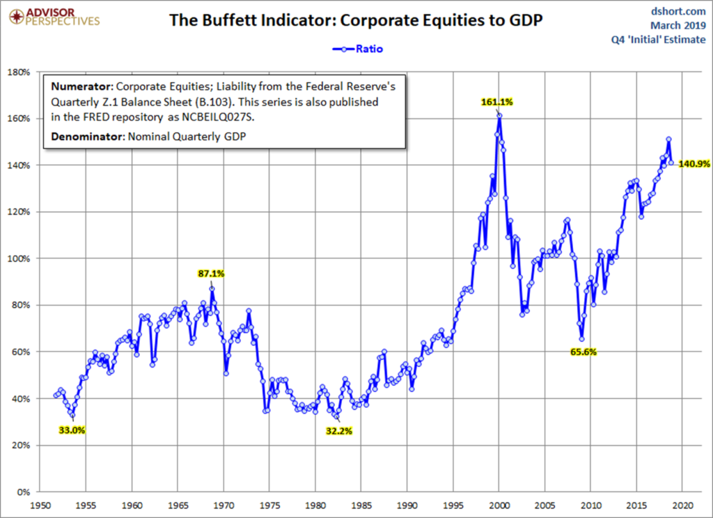
Source: Advisor Perspectives; dshort.com
Chart 10: Hussman 12-Year Forward Returns
Here is how you read the chart:
From John Hussman’s March 2019 post:
The chart below shows our MAPE (Margin-Adjusted P/E) on an inverted log scale (left) along with the actual subsequent S&P 500 average annual total return over the subsequent 12-year horizon. While the December decline briefly pushed our expectation for 12-year S&P 500 total returns above zero, the recent advance has driven that expected return back to negative levels, as indicated by the arrow at the lower right.
As I’ve often observed, the key feature of bubbles like 2000, 2007 and today is that, by the market peak, actual S&P 500 total returns over the most recent 12-year period outpace the return that one would have anticipated on the basis of valuations 12 years earlier. This is not an indication that valuations have failed, but rather an indication that prices are likely to do so.
Bottom line: Forecasting -1.25% annualized returns over the coming 12 years.
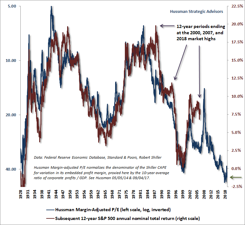
You can read his full piece here.
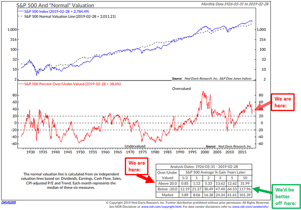
Chart 11: “Normal” Valuation
What I like about this chart is that it looks at four different valuation measures to come to what NDR terms “Normal” valuation.
Here’s how to read the chart:
- Focus in on the middle section (red “We are here” arrow). Note the current “Normal” valuation reading is above 20 and in the “overvalued” zone.
- Next look at the bottom right-hand section. It shows returns six months, one, two, three, five and 10 years later. These are not annualized returns. Returns are the % gain years later. So $100,000 grew to $126,200 or up 12.62% five years later.
- Now compare that to when the “Normal” valuation reading was below -20. $100,000 grew to $164,530.
- Bottom line: Wait for a pullback to below 0 and get very aggressive when below -20.
One last important point. Not only are returns greatest when valuations are lowest, risk is also lowest when valuations are lowest. The reverse is true as you can see in the next chart.
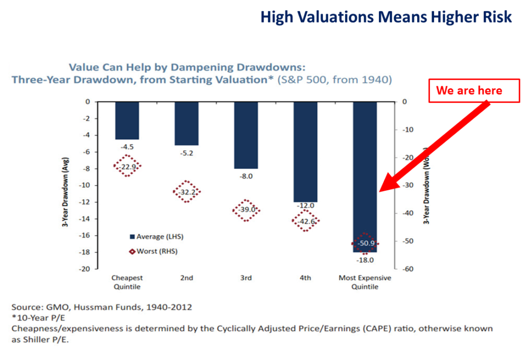
Bottom line: There are times to play more offense than defense and times to play more defense than offense. I suggest the playbook should be defensively minded today. Trade with stop-loss risk management rules firmly in place.
Global Recession Update
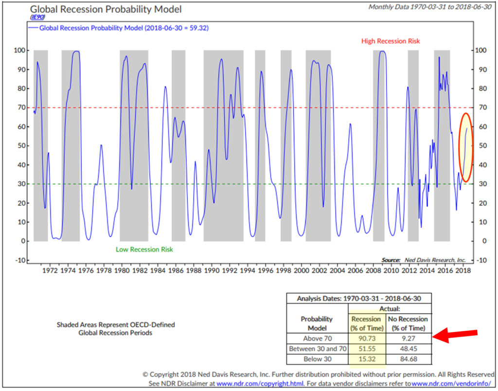
The next chart shows the NDR Global Recession Probability Model based on the Amplitude-Adjusted Composite Leading Indicators (CLIs) created by OECD for 35 countries. Each CLI contains a wide range of economic indicators, such as money supply, yield curve, building permits, consumer and business sentiment, share prices and manufacturing production. There are usually five to 10 indicators, which vary by type and weight, depending on the country, and are selected based on economic significance, cyclical behavior, and quality. The CLIs are normally released on the second Friday of each month for two months prior, or about a six-week lag. Meanwhile, the NDR Global Recession Probability Model is a forward-looking model using a two-month lead in the CLI data.
- Bottom line: A score above 70 indicates high recession risks while a score below 30 means low risks.
I shared this next chart in July last year. It showed the risk of a global recession at approximately 59%. Take a look and then look at the second chart dated February 2019. We are likely in a global recession.
Global Recession Probability – June 30, 2018
Global Recession Probability – February 28, 2019
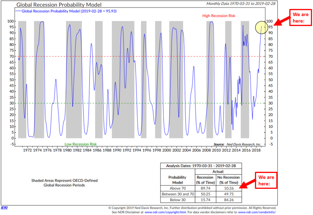
As for the U.S., the economy remains in ok shape but we are not immune to the global economy. You’ll find my favorite recession watch indicators in the Trade Signals section below. You’ll need to click on the link that will take you to Wednesday’s post. My two cents: I expect the economy to continue to slow into 2020. Risk of recession late 2019 into 2020. So we may not have to wait that long before another good buying opportunity presents.
Playing defense means risk managing for recessions. A lot of analysts are suggesting better returns owning emerging market equities and fixed income. That may be true, but EM won’t be immune to a U.S. recession, so I’d be patient and risk-minded with that exposure as well. Key word: Patience.
Trade Signals – Investor Sentiment is Too Bullish, Recession Watch Update
March 6, 2019
S&P 500 Index — 2,780
Notable this week:
No major changes or updates.
After having one of the strongest starts to a New Year in history, major stock indexes continue to test potential overhead resistance levels. Up nearly 20% from the Christmas Eve low, the markets remain over-extended. I previously shared the following chart highlighting the red zone. Then, investor pessimism was extremely high (which is a short-term bullish indicator for stocks) and I suggested the S&P 500 would recover from the December decline with a likely rally back to the “red zone.” It has recovered more than that and now sits with investor sentiment in extreme optimism (which is short-term bearish for stocks). I suspect we’ve reached a short-term top in equities. A logical pull-back is back to the red zone. Note the red 50-day moving average (MA) line remains below the blue 200-day MA line. One last short-term note, the red circle in the bottom right section of the chart shows something called MACD. It just turned lower, suggesting the market rally is out of gas. Given the level of extreme optimism, I suspect a correction of recent gains and with Fed support back on the table, a better buying opportunity at the 200-day MA line. A break above the black line will likely then see a test of the 2018 high. No guarantees. The economy remains late cycle, expensively priced and the bull market aged. More defense than offense.
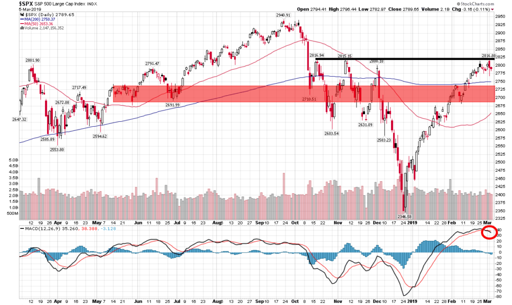
You’ll see below that the MA trend signals remain in sell signals as does the 50-day vs. 200-day MA signal. Notable is the 13-week vs. 34-week trend signal just turned bullish. The Ned Davis Research CMG Large Cap Long/Flat Index remains in a 40% invested position but the trend is improving. Global recession risk remains high; however, I believe the key is the U.S. and current U.S. recession risk is low. The really bad stuff happens in recessions so let’s keep close watch. The recession data updates monthly – the February month-end data is below.
Click here for this week’s Trade Signals.
Important note: Not a recommendation for you to buy or sell any security. For information purposes only. Please talk with your advisor about needs, goals, time horizon and risk tolerances.
Personal Note – Alexander Hamilton and the New York Stock Exchange
In March 1982, my father loaned me his big honkin’ 1979 yellow Lincoln Continental. I drove across Interstate 80 from Penn State to NYC. My destination was the New York Stock Exchange. The car totally fit right in on 42nd Street, if you remember how shady that area was back then. It really looked more like a pimp mobile with the long hood and ornament at the front of the hood. After coming through the Lincoln Tunnel, I found the first parking garage I could, jumped in a cab and raced downtown to meet a man named Freddie Block. Freddie was the institutional floor broker on the New York Stock Exchange for Montgomery Securities.
I spent the day shadowing Freddie and left mesmerized by how the stock exchange functioned. Freddie would carefully hide his hand (a large customer order to buy or sell a stock) from the specialist who handled that stock. All buying and selling met at that point. His job was to get the best price for his client. He’d tell me what he was trying to do, what he would say, the questions the specialist would ask, how he’d respond… a poker game of sorts with the sole objective to get the very best price for the client. One day on the Exchange and I knew the markets were for me.
This past Wednesday afternoon, I returned to the floor to watch my friends at Syntax Advisors and my daughter, Brianna, ring the closing bell. We arrived at 1:30 pm and before we went down to the floor, a historian gave us a brief tour and history of the Exchange.
Among many great things Alexander Hamilton did for our country, he created the first bonds. They were called the Hamilton Bonds. He had headed the first bank of the United States, which was located adjacent to the New York Stock Exchange. In the late 18th century, there was a buttonwood tree at the foot of Wall Street under which traders and speculators would gather to trade securities. The benefit was being in proximity to the bank. In 1792, traders formalized their association with the Buttonwood Agreement, which was the origin of the New York Stock Exchange (pictured above).
The idea of the agreement was to make the market more “structured” and “without the manipulative auctions,” with a commission structure. Persons signing the agreement agreed to charge each other a standard commission rate; persons not signing could still participate but would be charged a higher commission for dealing. In 1789, Wall Street was the scene of the United States’ first presidential inauguration when George Washington took the oath of office on the balcony of Federal Hall on April 30, 1789. This was also the location of the passing of the Bill of Rights. Alexander Hamilton, who was the first Treasury Secretary and “architect of the early United States financial system,” is buried in the cemetery at the top of Wall Street at Trinity Church.
We sit in a position of privilege. The world’s greatest capital markets system with the heart of the system beating in lower Manhattan at the world’s largest stock exchange, the New York Stock Exchange.
A fun day: Here is part of the very excited team from Syntax and the listing of their first ETF. Much more about Syntax in letters to come. Brianna is on the far right. Dad is on the floor just down below. Click on the picture for all the excitement. A big congratulations to Syntax Advisors’ CEO, Rory Riggs, his wife Margarete and the entire Syntax family. And a big hat tip to Mark Finn and his team at Vantage Consulting Group, the sub-advisor to the new Syntax Stratified Large Cap ETF. An exciting day and a very proud moment for dad to see Brie on the NYSC podium. I’m checking in happy.
Here are a few more shots from the NYSE floor:
I’m going to have to get next week’s letter done by early Friday morning. I’ve been looking at late business cycle profit margins and have a few thoughts on the subject to share with you. So look for that in next week’s letter. I’ll load up my computer and write on another plane ride. Son Matt is in a season-ending ski event in Jackson Hole, Wyoming next Friday. He does the freestyle event (jumps and rails) and it is great fun to watch. I fly in next Thursday so I can hang out on the mountain with him. It’s not such a quick in and out of Jackson Hole. Yes, skis will be traveling with me. I’m really excited to watch Matt and his teammates and it looks like we’ll have some time to ski together on Saturday.
March 22 finds me in Salt Lake City presenting at the Barron’s Institutional Advisor event. The calendar remains full. John Mauldin and I are speaking at a large advisor/client event in Austin, Texas on April 3 and again in Dallas for a dinner presentation on April 4.
If you have not yet registered for the Mauldin Strategic Investment Conference, it is nearly sold out. Over 575 people have registered. The max number is 650. Please send me an email if you are interested in attending and I may be able to get you a preferred rate. It’s not inexpensive, but it is easily the best conference I attend each year.
Mauldin Strategic Investment Conference in Dallas is on May 13-16. A strong line-up of speakers: President George W. Bush, Howard Marks, Feliz Zulauf, Carmen Reinhart, Jeffrey Sherman, Dr. Michael Roizen, Louis-Vincent Gave, Liz Ann Sonders, Bill White, Mark Yusko, Grant Williams, Lacy Hunt, George Friedman, David Rosenberg and more… Hope to see you in Dallas.
Speaking of Rosenberg. As I was enjoying the Syntax closing bell celebration, just behind me was good friend David Rosenberg mic’ing up for a CNBC interview from the Exchange floor. I tried to catch him and find the great Art Cashin but exit is swift and I missed.
Have a great weekend! Thank you for reading On My Radar.
Best regards,
Stephen B. Blumenthal
Executive Chairman & CIO

