
Those that follow my personal account on Twitter will be familiar with my weekly S&P 500 #ChartStorm in which I pick out 10 charts on the S&P 500 to tweet. Typically I’ll pick a couple of themes and hammer them home with the charts, but sometimes it’s just a selection of charts that will add to your perspective and help inform your own view – whether its bearish, bullish, or something else!
Q1 hedge fund letters, conference, scoops etc, Also read Lear Capital: Financial Products You Should Avoid?
The purpose of this note is to add some extra context beyond the 140 characters of Twitter. It’s worth noting that the aim of the #ChartStorm isn’t necessarily to arrive at a certain view but to highlight charts and themes worth paying attention to.
So here’s the another S&P 500 #ChartStorm write-up!
- S&P500 vs 10-Month Moving Average: First up for the first of the month is a chart of the monthly closing price for the S&P500. Notably it’s still trading above its 10-month moving average, which is a key momentum indicator and a very basic rule of thumb timing tool for avoiding major prolonged bear markets and avoiding missing out on prolonged major bull markets (and as with all momentum indicators: with due whipsawing and frustration in a ranging market). Interesting perspective to keep in mind amidst all the daily angst and volatility of late.
Bottom line: The S&P500 closed May above its 10-month moving average.
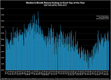
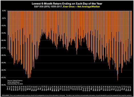
- S&P500 Seasonality by Month – Boring June: Moving on to monthly seasonality, the table below shows the average monthly return and a few other metrics for the time period 1964-2017. And well, June historically has been a boring month. The average return for June was 0%, and it had the worst best return (lowest best return at 5% – low bar to beat I guess you could say…), and the lowest standard deviation of returns. With all the volatility YTD, maybe investors could use a boring and mundane month!
Bottom line: June monthly historical return stats are relatively mundane and mediocre.
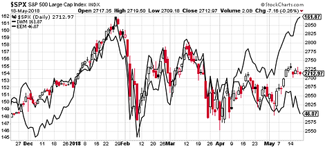
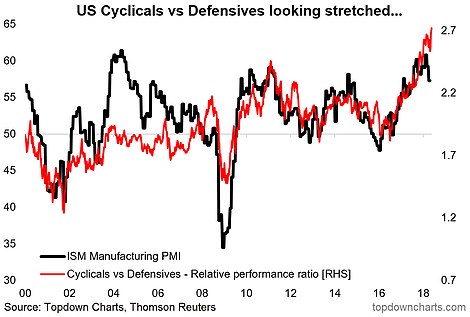
- Stuck in the Macro Middle: Keeping the “M” alliteration going, the S&P500 remains stuck in the macro middle, with small cap stocks saying “UP” and emerging market equities saying “DOWN”. As I noted last week, this is primarily a US dollar issue (and a monetary policy issue – but more on that later). Small cap stocks tend to benefit from a stronger dollar and emerging markets tend to come under pressure from a stronger dollar. So it’s going to remain a game of push and shove should this macro theme persist, and it’s worth keeping in mind that in aggregate S&P500 companies get about a third of their income outside of the US. Keep monitoring the macro!
Bottom line: The S&P500 is currently caught between macro crosswinds.
- Fear and Greed Index: Also caught in the middle is sentiment, with the CNN Money Fear & Greed Index likewise stuck in the middle of the range. Neither fearful, nor greedy. Again I would say this is a product of conflicting signals and macro crosswinds, and as usual – when the market breaks either way it will probably take sentiment right along with it.
Bottom line: The Fear & Greed Index is also stuck in the middle.
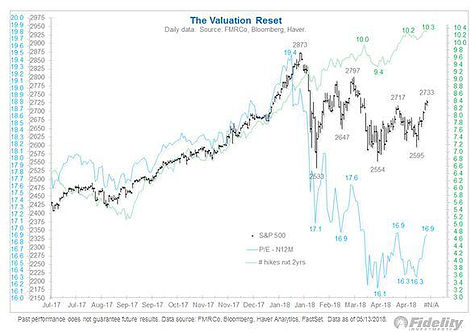
- The Euphoriameter: Keeping with sentiment, I updated the Euphoriameter indicator to incorporate closing May monthly figures. It is now down almost half a standard deviation since the peak in January. Probably most people would argue that this is not enough of a reset to make a compelling contrarian case, but it is a reset nonetheless, and if the earnings/macro backdrop does continue to hold up then it could make for an interesting second half of the year.
Bottom line: The Euphoriameter shows sentiment has undergone a material reset.
- Earnings Estimates: On the topic of earnings and macro backdrop, this chart from Credit Suisse shared by Sam Ro of Yahoo Finance, shows the progression of earnings estimates so far this year. As I’ve previously highlighted, the tax cuts put a rocket under forward earnings, but this was within the backdrop of a solid underlying economic trend. So with the context of improving earnings, while there is plenty to worry about, it’s hard to get seriously bearish on the market outlook yet.
Bottom line: The earnings outlook is solid thanks to tax cuts and solid economics.
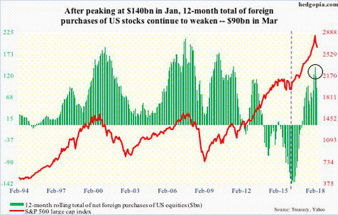
- Quantitative Tightening vs the S&P500: Where I would begin to get bearish would be with the chart below. Now there’s a lot we can say about this chart including some criticisms about how the chart is put together, but the key point is that we have come full circle from quantitative easing – central bank balance sheet expansion, to quantitative tightening – balance sheet “normalization”. Indeed, it almost seems as if market volatility has stepped up each time the pace of QT has stepped up, and if the Fed gets its way the pace of quantitative tightening will step up twice more until it reaches the full pace of a potential US$50B per month in Q4 (this compares to purchase of $85B per month during QE3). I said it before, be mindful of the macro, especially monetary policy.
Bottom line: Quantitative easing tailwinds have given way to quantitative tightening headwinds.
- Morningstar Median Fair Value Valuation: Moving on to valuations, this interesting metric from Morningstar shows their median fair value reading for the US stockmarket. (note there is a slightly glitch in the labeling of the axis). It mirrors what we’ve been seeing with the forward PE ratio as earnings estimates continue to march higher against stable/softer stock prices. The indicator is not quite at the lows of some of the previous stock market corrections, but it is clearly on the undervalued side of the line at this point.
Bottom line: Morningstar’s median valuation metric has moved to materially undervalued.
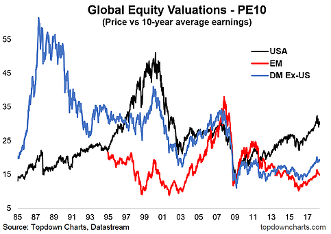
- Impact of Financial Crisis on the PE10: Staying with valuations, this chart answers the question “what would the CAPE (or PE10) valuation metric look like if you stripped out the substantial and prolonged crash in earnings during the financial crisis?” The reason this question gets asked is because the PE10 or CAPE uses the average earnings of the past 10 years and the logic goes that if the GFC crash in earnings was an outlier then arguably the PE10 valuation is overstated. As a thought exercise the logic is correct, by my calculations the overstatement is about 4 points. So if this effect washed out immediately the PE10 would be about 4 points lower. Which would be enough to make it look less expensive, maybe about neutral, but not cheap.
Bottom line: The GFC plunge in earnings is causing possible overstatement of the PE10 by 4 points.
- The CAPE Rollout: Looking further at the issue, and specifically about the rollout of this effect, in my calculations I’ve also substituted in the next 3 years of consensus earnings estimates and the bottom line is that the overstatement washes out completely by late 2019 (and if price stays the same and next 3 years earnings estimates prove correct then the PE10 would end up looking much more attractive). A lot of ifs, buts, and maybes, however it helps understand the key drivers of this valuation metric and what dynamics are possibly in play in the coming months and years.
Bottom line: The PE10 overstatement will washout completely by late 2019.
So where does all this leave us?
This week there’s probably 3 buckets of charts:
- Monthly Musings
On the monthly charts there was the S&P500 trading above its 10-month moving average, and the table of monthly average return statistics, and the reset in the monthly Euphoriameter indicator.
- Markets in the Macro-Middle
On markets in the macro middle we had the S&P500 vs small caps and EM, the fear and greed index in the middle of the range, while on the one hand there was the graph of improving earnings and the other the chart of quantitative tightening.
- Valuation Views
On valuation views we had the chart from Morningstar showing slight undervaluation, and the PE10 adjusted for the financial crisis showing potential overstatement of 4 points – with that effect set to washout by late next year.
Summary
The monthly charts helped bring some much needed perspective back into frame as the macro crosswinds drive increased day-to-day (and intra-day) volatility in markets. The macro crosswinds are very real, with some significantly positive underlying trends in force (earnings, domestic economy), yet some headwinds also presenting (fed tightening, stronger US dollar). In the short term this is probably going to mean more of markets in the macro middle as we move through the later phases of the market and business cycle.
See also: Weekly S&P500 #ChartStorm – 27 May 2018Follow us on:
LinkedIn https://www.linkedin.com/company/topdown-charts
Twitter http://www.twitter.com/topdowncharts
Article by Top Down Charts

