
“The End of Year Special Edition takes a different format to the usual weekly slide deck, and presents you with highlights, reflections, and some of the best charts of 2019. I sincerely hope you enjoy it!” — Callum Thomas, Head of Research and founder of Topdown Charts
Q3 2019 hedge fund letters, conferences and more
Topdown foreword: What a year. It was almost a case of something for everyone… Bonds did well, equities did well, central banks pivoted from tightening to easing, economic confidence went from booming to recessionary, the S&P made new highs, gold broke out (then down), political risk weighed-in (both ways), and many markets just swung around through the range.
Looking forward, I would have to say 2020 is almost certainly going to be more binary than 2019. It’s going to be a case of *either* bonds OR equities do well this time, not both. Those trading ranges are probably going to go out the window too. And the policy pivot is going to come home to roost. Noise levels will surely be as high as ever (and good charts will be as valuable as ever!).
For now, please enjoy this selection of charts which I have meticulously selected from reviewing all of the Weekly Macro Themes reports from the year 2019. As an exercise in reflection it’s been personally rewarding and insightful, and I trust you will likewise get a lot out of this special edition.
I look forward to catching up with you in the new year.
Section A. Charts That Worked
First up is a look at some of the charts and calls that worked particularly well during the year.
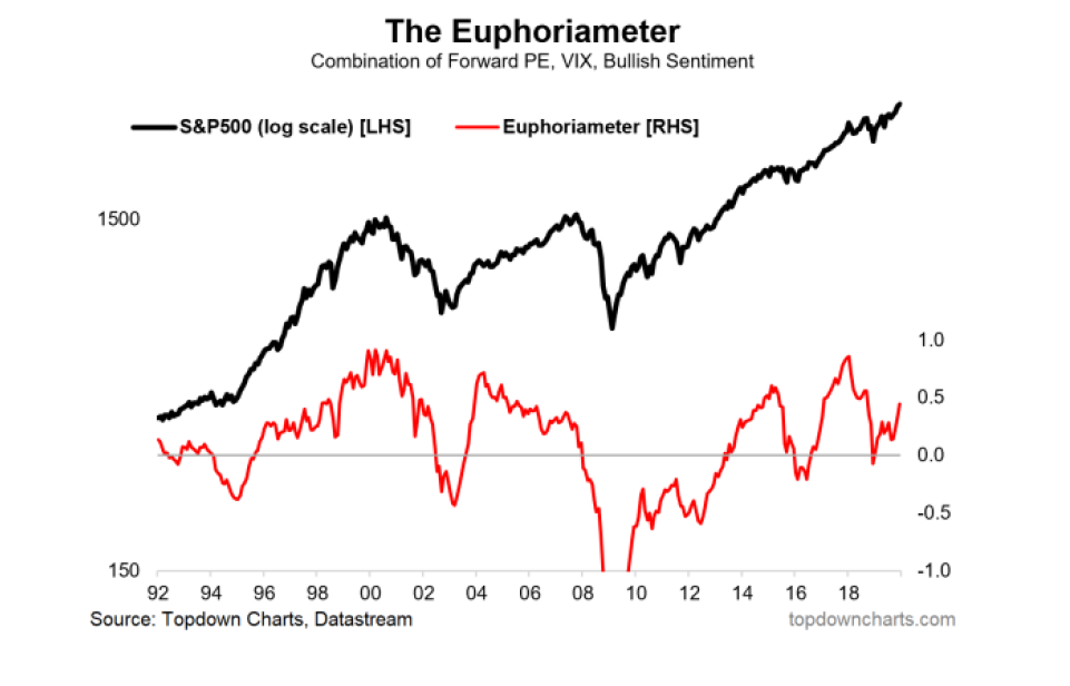
1. Back at the start of the year this was one of about a dozen sentiment/flows/positioning charts that helped lay out the bullish case for equities (along with the market breadth and valuations picture). Getting equities right this year was a key call, and the charts made it possible. (25 Jan 2019)
“The Euphoriameter combines the signals from the AAII II surveys, the VIX, and the forward PE ratio – basically a combination of market based and survey-based sentiment metrics. The key point is the high contrast between the start of 2018 (euphoria) vs the start of 2019 (dysphoria).”
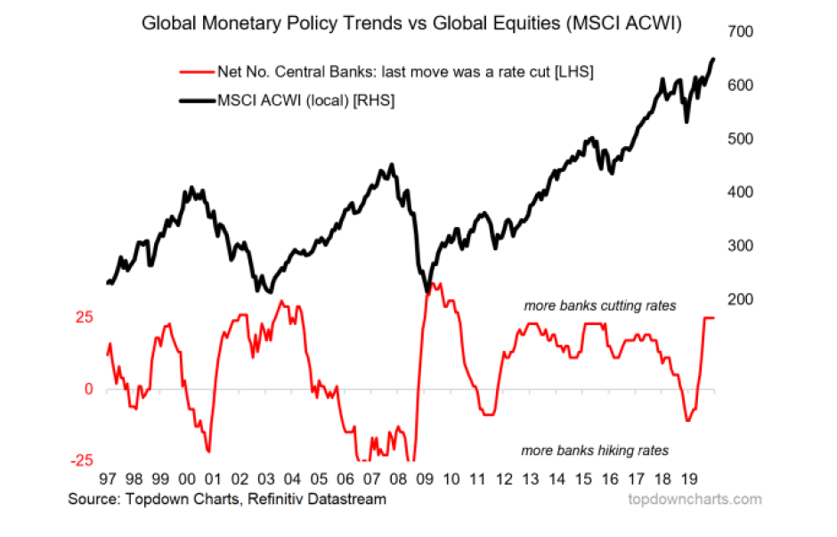
2. This indicator helped identify how overzealous central banks drove global equity markets into a correction (and pushed the global economy to the brink). Subsequently it helped identify the global monetary policy pivot. (25 Jan 2019)
“the elephant in the room is monetary policy. Looking only at (this) chart you could pretty much say that the global equity market correction was driven by the transition to monetary policy tightening (banks hiking rates went from the minority to the majority) … This is the part where we get to find out how sensitive the global economy really is to tighter (less easy) monetary policy. With the growth scare, perhaps a global pause/re ease is needed.”
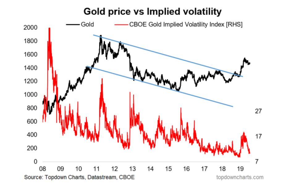
3. Gold (part 1): The first rumblings of the gold breakout showed up in this chart which helped identify the breach of the downtrend channel and the compression in implied volatility which preceded the surge in the gold price. (15 Feb 2019)
“the downtrend channel (from 2011), this is at risk of being breached to the upside (an upside breakout) – notably the near record-low in gold implied volatility means an upside breakout could end up being explosive since volatility crunches have a tendency to precede large moves.”
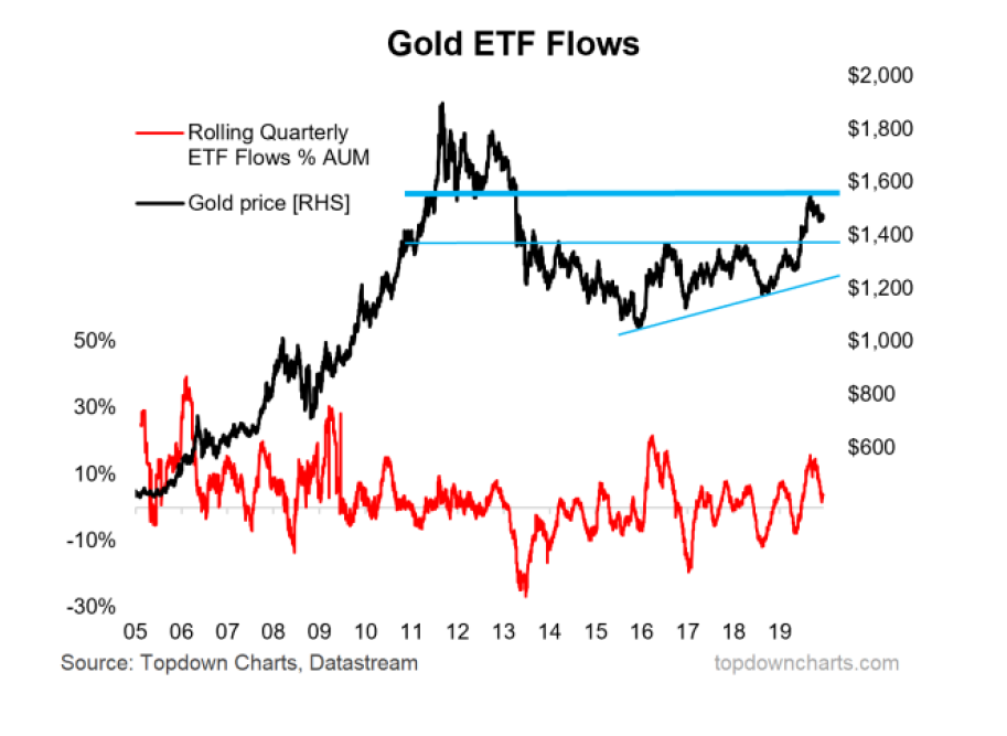
4. Gold (part 2): the gold ETF flows chart was a key element in flipping bearish on gold (sentiment, positioning, flows, valuations became stretched, overhead resistance came into focus, and real yields rebounded off a key level). At the time that was quite a tough and lonely call to make – as the best ones often are. (6 Sep 2019)
“Add to that the crowded longs and heavy ETF inflows it’s not hard to argue that gold takes a breather here at the very least. Indeed, it’s entirely possible that gold could undergo a 10-15% correction (and still be in a secular bull market).”
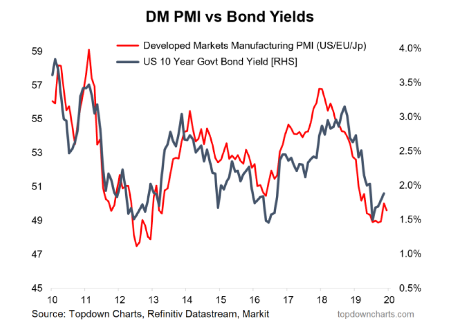
5. Treasuries (part 1): With the help of the PMI vs bond yield chart (and copper/gold, and copper vs CGBs) I highlighted the risk that bond yields would head lower – but it was with low conviction and I don’t think I would have imagined that they would go as low as they did. I also hedged it with my view that valuations looked expensive and sentiment quite bullish. So I give more credit to the chart than myself on this one. (8 Feb 2019)
“Given the softer DM PMIs and falling copper/gold ratio, the macro pulse at the margin says there could still be a bit further to go towards the downside for bond yields.”
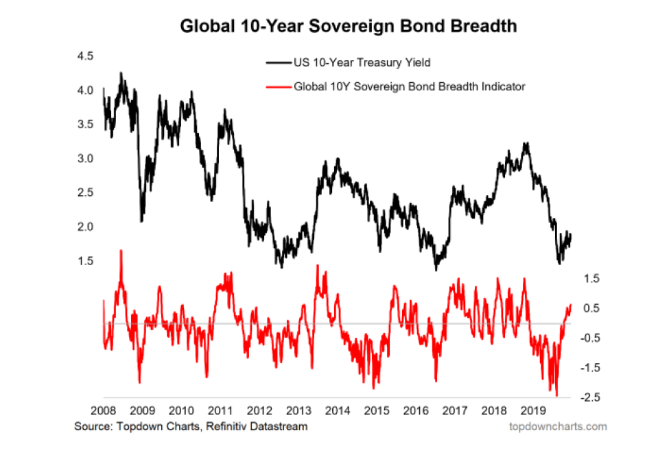
6. Treasuries (part 2): “overbought & overvalued”. Though I could say that they were overvalued for much of the year, the missing link was the tactical indicators needed to round out and finesse that view. This composite global sovereign bond breadth indicator put in the most extreme overbought signal in recent history. (9 Aug 2019)
“The composite global 10-year sovereign bond breadth indicator is lighting up as extreme overbought for government bonds. Aside from being overbought, on my indicators US treasuries are now extremely overvalued. The composite valuation signal is now at a record level”
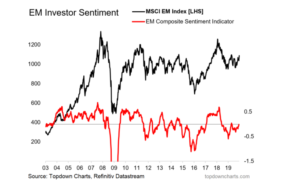
7. I turned bullish EM equities late 2018, and reaffirmed that call in January this year, a key part of this (along with cheap valuations, and supportive technical/macro indicators) was my composite sentiment indicator. At the time it was giving an extreme bearish reading – which I look at as a bullish contrarian signal. This helped in raising conviction at the bottom in absolute terms for EM equities. (18 Jan 2019)
“Moving on to investor sentiment, the composite sentiment indicator has fallen further, this tends to be a contrarian bullish signal”
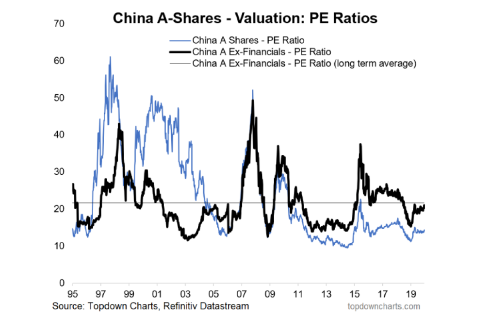
8. I talked about this one in the 2018 End of Year Special Edition as one to watch in 2019, but also highlighted it alongside what I thought would be a downturn in property that should have helped the case (more on that in the charts for 2020). In any case, this is one of those situations where if valuation gets cheap enough it can speak louder than the prevailing narrative/noise. (22 Feb 2019)
“Looking at the chart of China A share valuations, there’s a lot of room to move before they revert to the long-term average (let alone get back to expensive)”
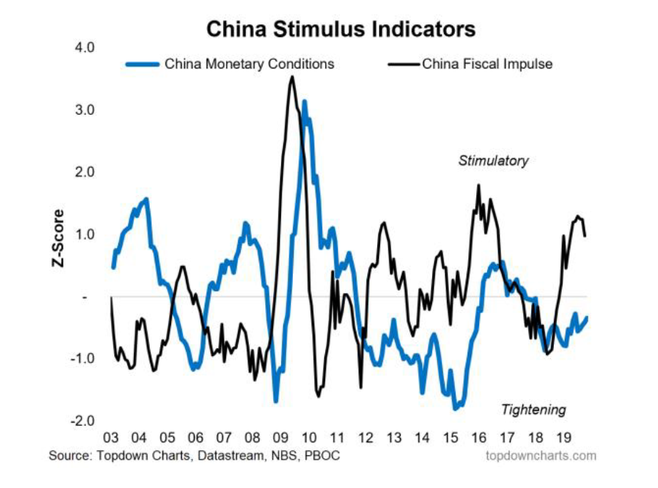
9. This one worked in so far as the tightening of monetary and fiscal policy indicators flagged the weakening macro pulse in China. Subsequently it also helped identify how although they had been doing some fiscal stimulus to help prevent growth from slowing too much, they had clearly been holding back on monetary stimulus. (18 Jan 2019)
“Moving on to the policy puzzle for China, clearly the inarguable softening in the China macro picture incrementally puts pressure on policy makers to shift to a more forceful stimulus stance – something that has not been forthcoming yet as shown by my China stimulus indicators. Hence economic policy uncertainty is understandably at a record high for China. For me, the question of more forceful stimulus is ‘when’ not ‘if’.”
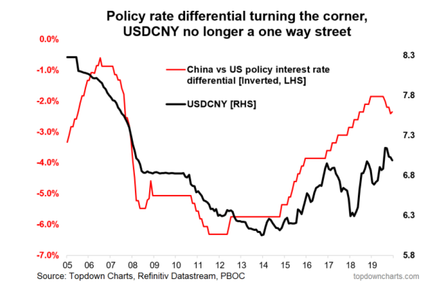
10. Back in January, USDCNY was trading around 6.8, it later peaked just below 7.2. To the extent that this chart helped flag the risk of devaluation, this chart certainly ‘worked’. (18 Jan 2019)
“One caution I would add is the USDCNY is not out of the woods Indeed, if they opt for further and more aggressive monetary stimulus this will most likely add to devaluation pressures and that’s the type of thing that would not sit well with Asian FX or EMFX (and hence remains a key downside risk to the bull case there)”
Section B. Charts That Didn’t Work
Of course, it wouldn’t be complete without a look at some of the charts that didn’t work (or shall we say the ones that worked “less well!”).
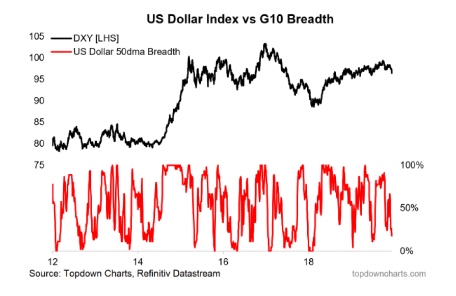
1. After (correctly) turning bullish on the US dollar in early 2018 I decided to abandon the bullish view early this year as market breadth indicators began to rollover (along with what I saw as unsustainable macro and rates divergence between the US and the rest of the world). I would say I was right to abandon the US dollar bull call since the DXY didn’t go up much, but to the extent that meant being bearish was wrong as the US Dollar traded in a tight but uptrending range with many false breaks in either direction. (18 Jan 2019)
“Market breadth is rolling over for the US dollar against G10 currencies. Looking at the recent history of 50dma breadth and further history on the 200dma breadth chart, this type of breakdown in breadth often shows up around the start of a major move and/or trend change. This is enough to abandon my previously bullish USD view”
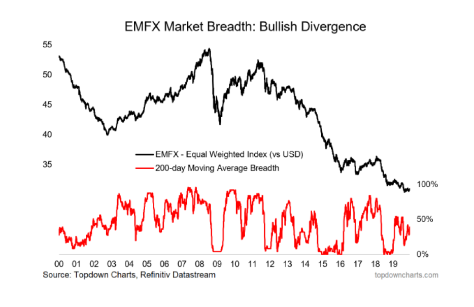
2. In many ways the other side of the coin so to say, I highlighted the bullish case for EMFX early in the year as the valuation, market breadth, and intermarkets seemed to line up. I was initially right, but ultimately wrong (albeit I did change the view later in the year). I would say though the outlook is much better going into 2020 (valuation, market breadth, macro). (18 Jan 2019)
“Looking specifically at EMFX market breadth, the 200dma breadth indicator has spiked in recent weeks from washed out levels, and the EMFX index has stirred from very tight range trading. This previous compression in price volatility is just the type of thing that can set the scene for an explosive breakout. The action in Asian FX and EM Equities breadth appears to be confirming the case for a turnaround here, so this is definitely one to have on the radar.”
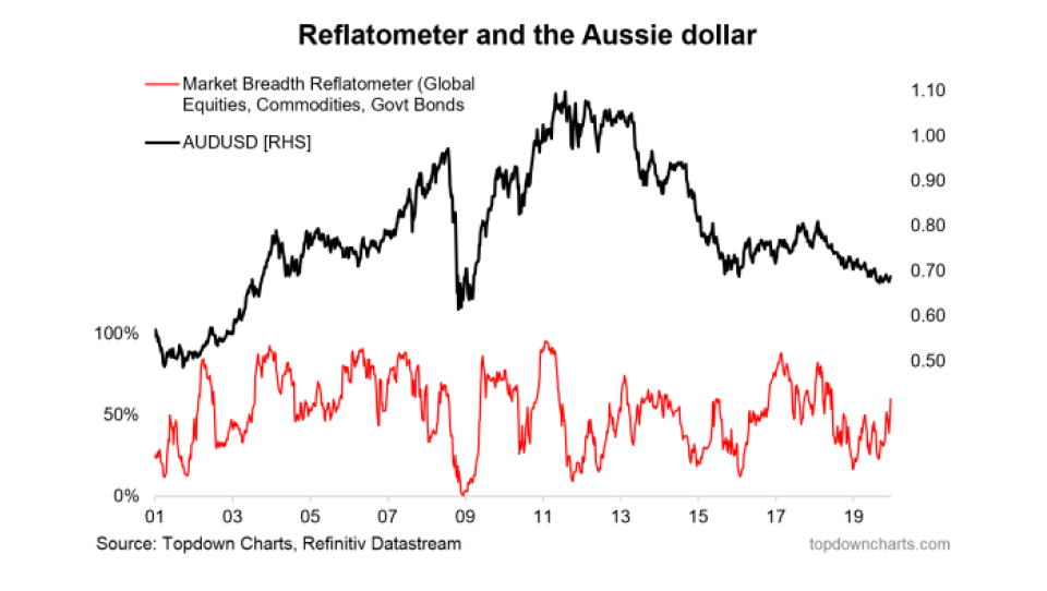
3. I turned bullish too early on AUDUSD partly due to the initial rebound in this indicator (along with improved valuations and contrarian sentiment signals). The domestic (RBA rate cuts) and USD resilience stymied that call. (19 Apr 2019)
“Typically the Aussie marches to a similar tune as China/EM/commodities/general risk appetite. The chart below of the reflatometer (200-day moving average breadth for global equities, commodities, and sovereign bonds [inverted]) has turned up significantly and this is typically a bullish sign”
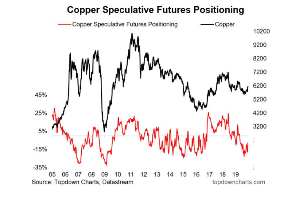
4. Similarly I got too excited with the initial rally in Copper, but that’s looking better now. (22 Feb 2019)
“After bouncing off support, copper is starting to show signs of life (and possible short squeeze)”
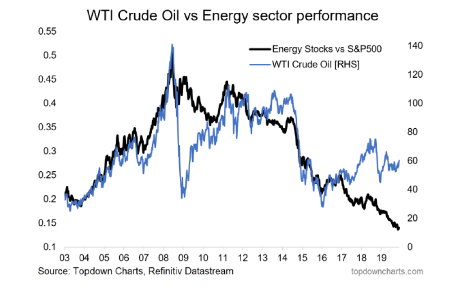
5. Energy stocks relative performance never caught back up to oil. Maybe the oil price needed to go higher, maybe all of those companies happened to be poor quality, maybe the rise of ESG has disproportionately punished the sector, maybe the hurdle of strong tech stocks is too high, or maybe it just needs more time. Either way it is one in the “yet to happen” pile. (22 Feb 2019)
“Should the bullish scenario play through for oil, energy stocks could be a key beneficiary after lagging substantially, and trading to still quite low absolute and relative valuations.”
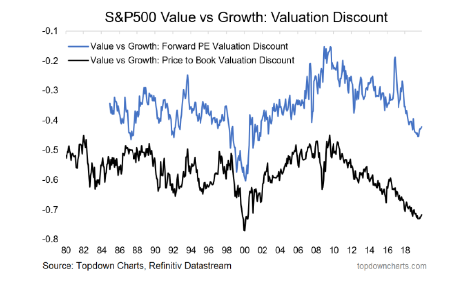
6. The value of value stocks: many similarities to the previous one, value stocks failed to gain the upper hand against growth stocks, albeit you could say there was at least a shot across the bows with the momentum meltdown. Not to be discouraged, I’ve got another chart on this in the ones to watch for 2020 section later in this report as some macro catalysts loom. (1 Mar 2019)
“Value is cheaper than usual vs growth (or said differently, the most expensive stocks are trading more expensively than usual compared to the bottom end of town). It could take time, but logic says this tilts the odds in favour of value outperforming growth”
Read the full article here by Top Down Charts

