
This is the fourth of a 10-part blog series where I will go through each of the charts from the 10 Charts to Watch in 2019. The purpose is to add some extra comments and context around the charts, as well as to explain some of the finer details of the indicators.
Q3 hedge fund letters, conference, scoops etc
This time we look at global cyclicals vs defensives (using the MSCI indexes). This was a key theme for us in 2018 (first started highlighting it in late 2017), because the strength in cyclicals had been driving much of the new bull market. But the extent of the relative performance became extreme, and stretched vs where we saw the fundamentals – which your inner risk manager should be getting excited about!.
So it was inevitable that cyclicals would move from a source of strength to a source of risk, and that’s exactly what we saw…
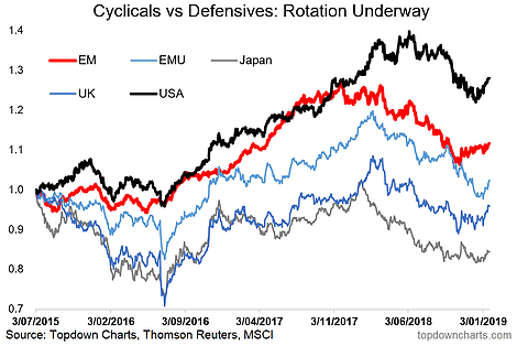
One particular chart was quite insightful and useful on a shorter term basis, and that was the view of cyclicals vs defensives across the major global equity regions/chunks. What’s clear in that chart is how they all began to rollover as 2018 progressed. This was an early warning signal to the next phase of the global equity market correction.
Interestingly though, it’s emerging markets taking the focus again. If you look carefully at the chart you’ll notice that it was EM that peaked first, this was then followed by the other major country/regions. And perhaps more interestingly, after this correction/reset we’re now seeing EM again as being the first to turn up… which as it seems, is being followed by the rest.
One reason we pay attention to cyclicals vs defensives is that their relative performance tends to map reasonably well to economic trends. So for those predicting an imminent global recession, I would ask – does the recent performance in global cyclicals vs defensives support that view? My first impression is that this does not look like a market which is pricing in an economic collapse, and maybe the market is wrong, but maybe some folk are simply too pessimistic on the outlook.
In any case, if you want to feel the pulse of global equities and the global economy, make sure you keep checking in on this chart – I have a feeling it’s going to remain an important one, and be just as useful/insightful as it was to me last year.
For more and deeper insights on global economics and asset allocation, and plenty of good charts you may want to subscribe to our institutional research service.
Click through for free look or a trial…
Article by Top Down Charts

