
“I don’t want to scare the public, but we’ve never had QE. We’ve never had the reversal. Regulations are different. Monetary transmission is different. Governments have borrowed too much debt, and people can panic when things change.” – Jamie Dimon, Chairman of the Board and Chief Executive Officer, JPMorgan Chase & Co.
It’s early Friday morning and the fishing is soon to begin. I’m sitting at the foot of a spectacular lake in Grand Lake Stream, Maine. Fifty-two new and old friends are here to share research, opinions and debate (passionately – it gets heated at times) the Fed the economy, and the markets. I’m attending the 2018 Camp Kotok a.k.a. “shadow Fed” fishing event.
Q2 hedge fund letters, conference, scoops etc
Imagine downtime with some of the brightest and well-known economists, industry analysts, former Fed officials and asset managers in the world. “Monetary transmission is different… Governments have borrowed too much… people can panic….” Jamie Dimon said. Right on point and I can tell you from the discussions so far here in Maine, we all are really trying to figure this out. I’ll share with you what I learn over the next few weeks.
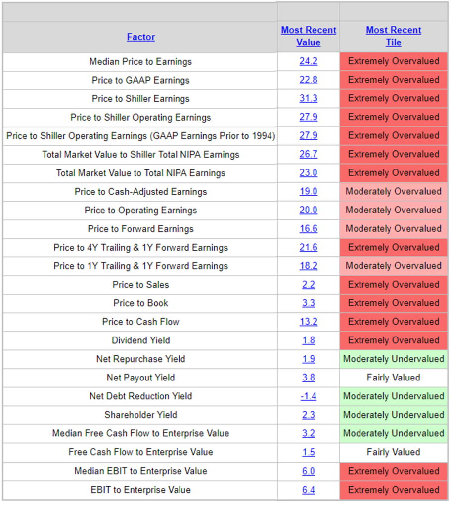
At the beginning of each month, I like to look at valuations. They remain high by most every measure (Chart 1 below), yet that doesn’t mean stocks don’t move higher. As one of the attendees argued yesterday, Quantitative Easing (QE) should be looked at in aggregate across all central banks and that the collective liquidity pot remains accommodative despite the Fed’s ongoing rate hikes and reductions in its balance sheet. The ECB and China (recently) continuing to provide liquidity. Until the ECB switches gears, my friend argued, we will likely see continued low volatility and support for risk assets. He may be right.
Chart 1 – High Valuations by Most Every Measure

Source: Ned Davis Research
The next chart is hard for me to ignore. It looks at the percentage U.S. Households have allocated to Stocks (including Mutual Funds and Pension Funds). Here is how you read the chart (I know it looks busy, hang with me):
- Currently households have 55.2% of their money allocated to stocks (“Highest Allocation to Stocks” – red arrow below)
- The subsequent 10-year annualized returns (nominal) when households had high allocations to stocks or largely fully invested were the lowest returns (red highlight below) = 3.90% annualized on average (see “We Are Here” annotation)
- The reverse is true when households are under-invested in stocks. Think in terms of buying power. (Green highlights below).
Chart 2 — Rolling 10-Year S&P 500 Total Returns and U.S. Household Stock Allocation

Source: Ned Davis Research
OK, no real changes in the story line. You’ll see in the Trade Signals post below that the trend remains modestly bullish. Interest rates are moving higher, which is not good news for high-quality bond investors. You’ll also find updated “Line in the Sand” 10-year and 30-year Treasury charts. Gone fishing – it’s time to find my fishing guide and jump in the boat. Fingers are crossed else lunch will be lean. Read on and have a great weekend!
♦ If you are not signed up to receive my weekly On My Radar e-newsletter, you can subscribe here. ♦
Follow me on Twitter @SBlumenthalCMG
Included in this week’s On My Radar:
- Trade Signals — What I’m Seeing Today
- Personal Note — Camp Kotok Maine Fishing Trip
Trade Signals – What I’m Seeing Today
S&P 500 Index — 2,809 (08-01-2018)
While the cyclical bull market remains aged and expensive, the weight of trend evidence continues to lean bullish. My favorite risk-on/risk-off indicator, the Ned Davis Research (NDR) CMG Large Cap Long/Flat Index, continues to signal 80% exposure to large-cap stocks. Aggressive signals call for 100% exposure, moderate exposure 80%, conservative exposure 40% and under when the trend is model reading is extremely bearish 0% exposure to large-cap equities is signaled. (Explained below.)
Also signaling risk-on is the 13-week shorter-term moving average trend line remains above the longer-term 34-week MA line and volume demand continues to be stronger than volume supply. More buyers than sellers, as they say. Though I do see some areas of concern. First, just a handful of stocks are driving the S&P 500 large-cap index higher. I tweeted the following chart from Goldman Sachs mid-week. It shows that the top 5 best performing stocks YTD through June 28 have contributed 92% of the markets gain and the top 10 stocks have contributed 122% of the return YTD. It’s concerning when just a few workers are doing the bulk of the lifting. Strong healthy markets are more broad based. Reminds me of the late innings back in 1999:

Another chart that caught my eye this week is the trend in investor margin debt. When margin debt is high (as it is today) and it begins to reverse, it’s a sign of selling pressure and as more selling occurs the risk of forced selling (margin calls) picks up. I see this as an early cautionary signal. Note in this next chart the return per annum when the current level of margin debt is above and below it’s trend line (shaded grey shows the current state). Also note the unwinds in 2000/02 and 2008/09:

Several weeks ago, I posted a Dow Theory chart. When both the Dow Jones Industrial Average and the Dow Jones Transportation Average current prices are above their respective 200-day MA lines, a Dow Theory buy signal is generated. That’s the case today.
Lastly, as it relates to the equity market, Don’t Fight the Tape or the Fed is reading 0. Call it a neutral reading. You’ll find that chart as well below.
As for the bond markets, the Zweig Bond Model remains in a sell, suggesting risk of higher interest rates. It has been a good indicator for me over the years and has done a good job YTD. Several months ago I suggested the line in the sand for interest rates is 3.07%. As you can see in the next chart, the 10-year treasury note is again at 3%. Let’s watch to see if the next push is above 3.07%.

While we are at it, here is a look at the 30-year Treasury Bond “Line in the Sand.” Note the break above the blue trend line; however, the current yield remains below the 3.22% threshold (red horizontal line).
It’s worth noting that the HY market had a nice move higher in July. Investors chasing into higher risk assets — seeking yield. While concerning, the trend in the HY bond market is bullish — the CMG Managed High Yield signal remains in a buy signal. Also, gold remains in a confirmed down trend — sell signal.
On the economic front, the economy is strong, inflationary pressures are high and our indicators see little sign of recession in the next 6-9 months.
I expect the next several months to be challenging. Stay alert and risk minded. Participate and protect… seeking growth opportunities while maintaining a level of protection in down markets. That’s where I believe trend-following strategies help.
Click HERE for the latest Trade Signals.
Important note: Not a recommendation for you to buy or sell any security. For information purposes only. Please talk with your advisor about needs, goals, time horizon and risk tolerances.
Long-time readers know that I am a big fan of Ned Davis Research. I’ve been a client for years and value their service. If you’re interested in learning more about NDR, please call John P. Kornack Jr., Institutional Sales Manager, at 617-279-4876. John’s email address is jkornack@ndr.com. I am not compensated in any way by NDR. I’m just a fan of their work.
♦ If you are not signed up to receive my weekly On My Radar e-newsletter, you can subscribe here. ♦
With kind regards,
Stephen B. Blumenthal
Executive Chairman & CIO

