
Inequality in America has become a major talking point in recent years. For many people though, the concept of inequality – the idea that wealth is spread very thinly at the lower end of the socioeconomic ladder – is still an abstract concept.
Q3 hedge fund letters, conference, scoops etc
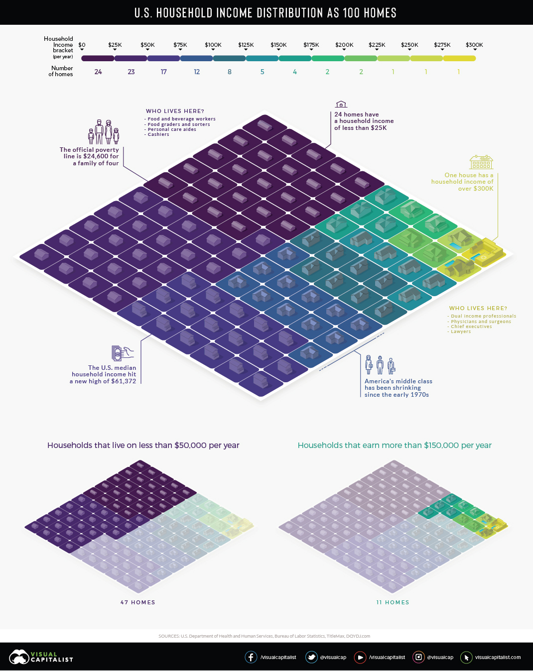
There are over 125 million households in the United States, each with their own unique structure and financial situation, so understanding such a complex issue requires reducing it to proportions we can understand.
American Households as a Neighborhood
In the visualization above, American households are distilled down into 100 homes, then color-coded into $25,000 income increments.
One house is allocated for those making $300,000 and more per year. On the other end of the scale, we can see that 24 of the households earn $25,000 per year or less, and nearly half of the households have an annual income lower than $50,000.
Here is a more granular breakdown of numbers, this time from a slightly different data source (U.S. Census Bureau’s 2017 Household Income Survey):
| Income Bracket | Households (Millions) | Share of Total |
| Less than $15,000 | 14.1 | 11.2% |
| $15,000 – $24,999 | 12.1 | 9.6% |
| $25,000 – $34,999 | 11.9 | 9.4% |
| $35,000 – $49,999 | 16.3 | 12.9% |
| $50,000 – $74,999 | 21.5 | 17.0% |
| $75,000 – $99,999 | 15.5 | 12.3% |
| $100,000 – $149,999 | 17.8 | 14.1% |
| $150,000 – $199,999 | 8.3 | 6.6% |
| $200,000 and up | 8.8 | 7.0% |
Households between $35,000 and $100,000 are generally considered middle class. That said, the geographical location of where a household is located also makes a big difference.
The Power of Place
Not surprisingly, cost of living strongly influences your household’s place on the income spectrum.
In El Paso, Texas, a $50,000 income places a household of four people in the middle class. However, in a more expensive metro area, like San Diego, that same income lands your household in a lower income tier. Here’s a closer look at the cost of typical expenses in the two metros:
| Expense | El Paso, TX | San Diego, CA | Cost difference |
| Home price | $239,285.67 | $755,273.67 | ⬆︎ 216% |
| Apartment rent | $945.92 | $1,961.55 | ⬆︎ 107% |
| Energy cost | $133.53 | $213.96 | ⬆︎ 60% |
| Dentist visit | $89.08 | $104.25 | ⬆︎ 17% |
| Coffee | $4.47 | $5.39 | ⬆︎ 20% |
| Hamburger | $3.56 | $4.35 | ⬆︎ 22% |
| Gasoline | $2.31 | $3.31 | ⬆︎ 44% |
Mixed Messages
The median household income in the U.S. continues setting new monthly records, and we’ve just seen this decade’s largest year-over-year increase in individual wages.
One side effect of this economic growth is that households in the top wage bracket – the well-appointed yellow square in our visualization – have a tendency to reap outsized rewards. So, for now, as America’s economy trends upward, so does its Gini Coefficient.
Article by Visual Capitalist

