
“So the reason why we raised interest rates [in late 1999-2000] is because—generally is because we see inflation as moving up—or, in danger of moving up significantly, and we really don’t see that now.” – Jerome H. Powell, Chair, Board of Governors of the Federal Reserve System (Transcript of Press Conference, October 30, 2019)
Q3 2019 hedge fund letters, conferences and more
Last week, we recapped the rules of supply and demand and their impact on price. This week, we’ll turn to inflation and explore its effect on stock market performance. We’ll take a look at the most recent data and talk about what it means for you, personally. (Hint: Much depends on what you’re spending your money on.)
While it may not seem like the most exciting of topics, inflation matters. And I think you will find, like I did, a few data points here that make things a little more interesting than you first anticipated…
Before we jump into the inflation fun, check out the next five charts, which I came across on the Advisor Perspectives website. They tie in nicely with this week’s topic for two reasons. First, inflation reduces your gross return, so it’s important to know what’s happening in that department. Second, the charts remind us that where we are in the investment cycle matters (especially for pre-retirees and retirees). Imagine not making money from the mid 1960s to 1980, or even from 2000 to 2015. Risk management matters—especially at elevated points in a cycle. Hat tip to Advisor Perspectives research director Jill Mislinski (great stuff, Jill). Note: you’ll see the charts show “real” returns. “Real” refers to your return after inflation is factored in. In other words, it’s what we actually have in our pockets to buy things with (you can see why that matters). Here’s a look at Jill’s recent post:
Here’s an interesting set of charts that will especially resonate with those of us who follow economic and market cycles.
Imagine that five years ago you invested $10,000 in the S&P 500. How much would it be worth today, with dividends reinvested but adjusted for inflation?
The purchasing power of your investment has increased to $15,968 for an annualized real return of 9.40%.
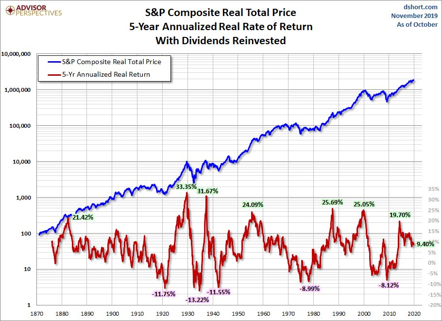
Had we posed the same question in March 2009, the answer would have been a depressing $6,654. The -8.12% annualized real return would have cut the purchasing power of your initial investment by a third.
Fun Runs of the Roller Coaster
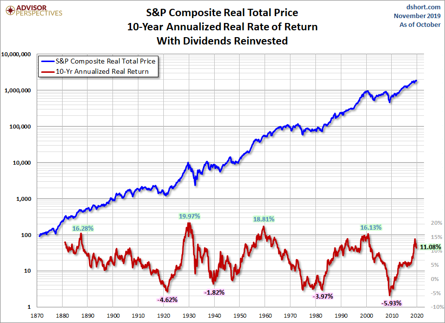
Let’s increase the time frame to 10 years. The annualized return is considerably smaller than the 5-year time frame. As of the end of last month, your $10K invested 10 years ago has grown to about $30.13K adjusted for inflation, an annualized real return of 11.08%.
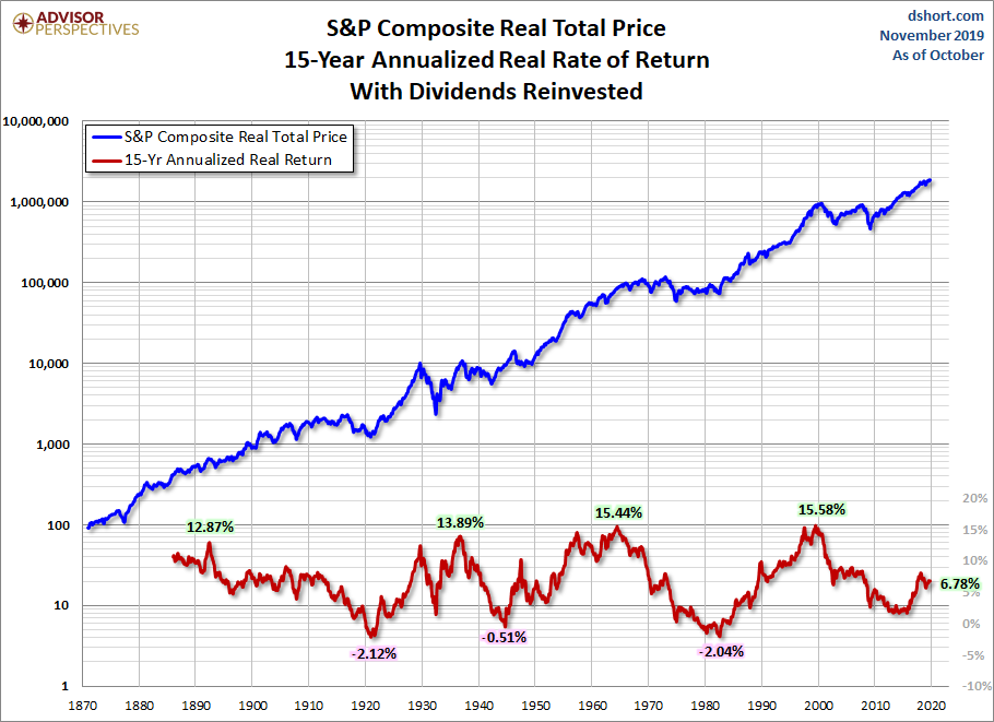
The 15-year time frame is only slightly more profitable. Your one-and-a-half decade investment of $10K has grown to about $27.5K adjusted for inflation for an annualized real return of 6.78%.
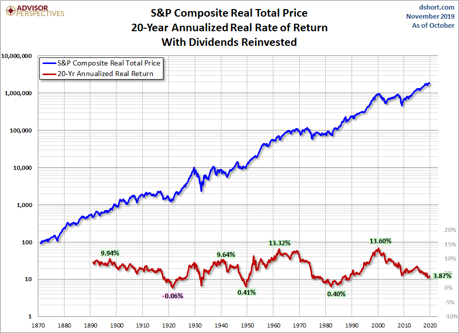
If we extend our investment horizon to 20 years, the roller coaster is less volatile with higher lows and lower highs.
The volatility decreases further with a 30-year timeline. But even for that three-decade investment, the annualized returns since 1901 have ranged from less than 2% to over 11%.
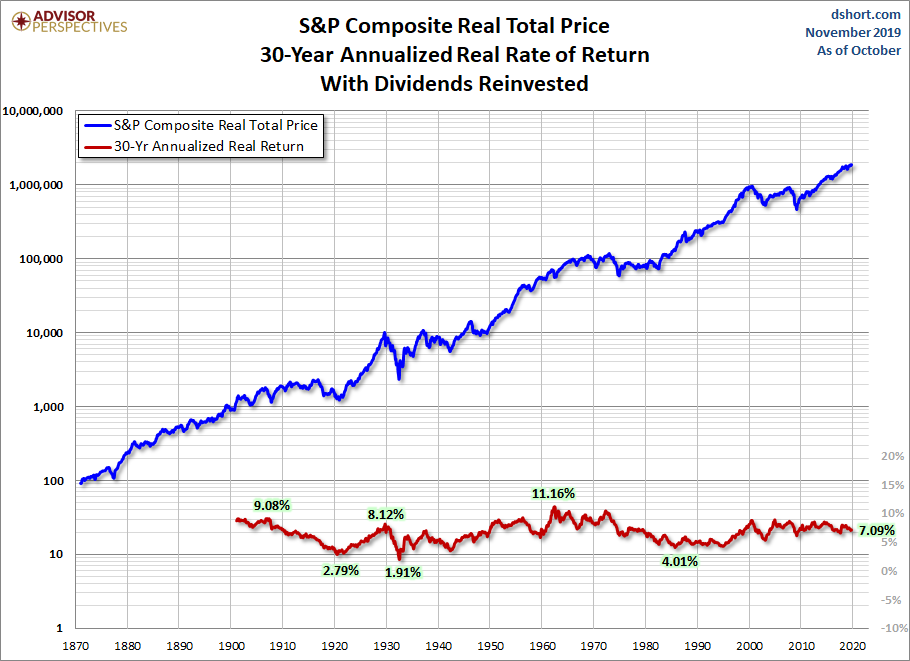
As these charts illustrate, and as many households have discovered during the 21st century so far, investing in equities carries substantial risk. Households approaching retirement should understand this risk and make rational decisions about diversification. In the past, we’ve suggested that they should also consider fixed income alternatives for that part of the nest egg that will pay non-discretionary expenses not covered by Social Security and pensions. Unfortunately, this traditional wisdom has been less helpful in recent years owing to the Fed Zero Interest Rate Policy (ZIRP) and various stimulus strategies, which have collectively shrunk interest rates. With the end of ZIRP in December 2015 and several rounds of Fed rate hikes, it will be particularly interesting to see how this slow-motion roller coaster plays out in the years ahead.”
Your age and where we sit in an investment cycle matters. For example, is the market aged and above trend (overvalued), at trend or below trend. If you were 60-years old in the year 2000 and earned nothing on your money until 2015, what would your retirement look like? If you were 60-years old in 2009 when the market was priced below trend (undervalued), you’d be happy today. The above charts tell us the stock market doesn’t always provide us with the return we think it should achieve and sometimes it does. Starting conditions matter! If you are young with many years to go before retirement, you’ll make money. Just save a lot and added to your stock market exposure every year… add even more when investors panic. That will present a few times in your lifetime.
The balance of this week’s missive is a one-coffee read, so heat it up and find your favorite chair. You’ll get a few insights on where inflation will hit you most. Click on the orange On My Radar button to open the full post.
Thanks for reading. I’ll be golfing with my kids next Friday in the annual Black Friday golf tournament at my club. Toe and heat warmers are purchased, and coffee will be in the Thermos. Wishing you a wonderful Thanksgiving Holiday.
If a friend forwarded this email to you and you’d like to be on the weekly list, you can sign up to receive my free On My Radar letter here.
Follow me on Twitter @SBlumenthalCMG
Included in this week’s On My Radar:
- Inflation – What It Means to You
- Trade Signals – Low Inflation Regime Remains
- Personal Note – NYU, PSU, and Thanksgiving
Inflation – What It Means to You
More from Jill Mislinski. Jill gives us a good look inside the Consumer Price Index:
Back in 2010, the Fed justified its aggressive monetary policy “to promote a stronger pace of economic recovery and to help ensure that inflation, over time, is at levels consistent with its mandate” (full text). In effect, the Fed has been trying to increase inflation, operating at the macro level. But what does inflation mean at the micro level — specifically to your household?
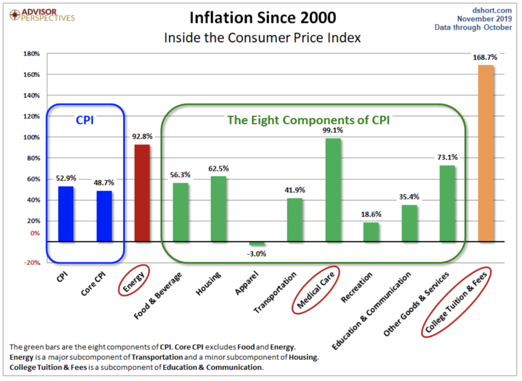
Let’s do some analysis of the Consumer Price Index, the best-known measure of inflation. The Bureau of Labor Statistics (BLS) divides all expenditures into eight categories and assigns a relative size to each. The pie chart below illustrates the components of the Consumer Price Index for Urban Consumers, the CPI-U, which we’ll refer to hereafter as the CPI.
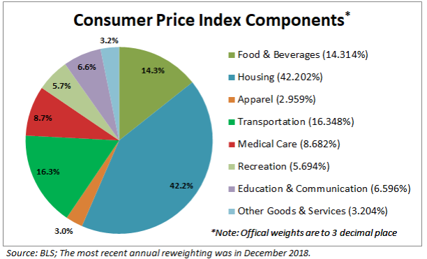
The slices are listed in the order used by the BLS in their tables, not the relative size. The first three follow the traditional order of urgency: food, shelter, and clothing. Transportation comes before Medical Care, and Recreation precedes the lumped category of Education and Communication. Other Goods and Services refers to a bizarre grab-bag of odd fellows, including tobacco, cosmetics, financial services, and funeral expenses. For a complete breakdown and relative weights of all the subcategories of the eight categories, here is a useful link.
The chart below shows the cumulative percent change in price for each of the eight categories since 2000.
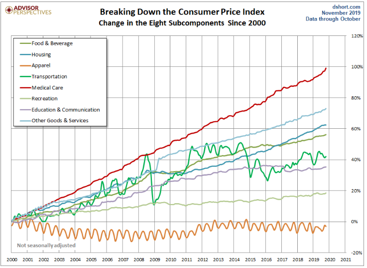
Not surprisingly, Medical Care has been the fastest growing category. At the opposite end, Apparel deflated since 2000 and has nearly returned to those levels in recent years. Another unique feature of Apparel is the obvious seasonal volatility of the contour.
Transportation is the other category with high volatility — much more dramatic and irregular than the seasonality of Apparel. Transportation includes a wide range of subcategories. The volatility is largely driven by the Motor Fuel subcategory.
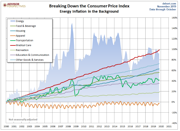
The Ominous Shadow Category of Energy
The BLS does not lump energy costs into an expenditure category. Instead, it includes energy subcategories in Housing in addition to the fuel subcategory in Transportation. Also, energy costs are indirectly reflected in expenditure changes for goods and services across the CPI.
The BLS does track Energy as a separate aggregate index, which in recent years has been assigned a relative importance of 7.347 out of 100. In other words, Uncle Sam calculates inflation on the assumption that energy in one form or another constitutes 7.4% of total expenditures, 3.8% goes to transportation fuels — mostly gasoline. The next chart overlays the highly volatile Energy aggregate on top of the eight expenditure categories. We can immediately see the impact of energy costs on transportation.
The next chart will come as no surprise to families footing the bill for college tuition. Here we’ve separately plotted the College Tuition and Fees subcategory of the Education and Communication expenditure category. Note that the steady staircase in this cost matches the annual cost increases in late summer for each academic year.
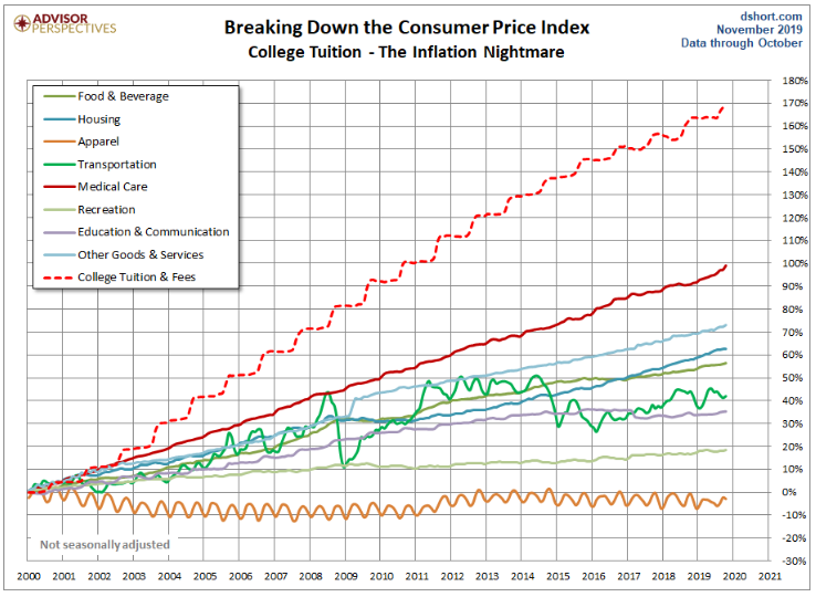
The tuition series in the chart above, however, is overly dramatic. The BLS calculates tuition based on the sticker price, which is higher than many, if not most, households pay. A New York Times piece, How the Government Exaggerates the Cost of College, explains that the government data ignores financial-aid grants which substantially lowers the real cost to consumers. For a more accurate view on college tuition, see the statistics at the College Board website.
Core Inflation
Economists and policymakers (e.g., the Federal Reserve) pay close attention to Core Inflation, which is the overall inflation rate excluding Food and Energy. Now this is a somewhat peculiar metric in that one of the exclusions, Energy, is an aggregate that combines specific pieces of two consumption categories: 1) Transportation fuels and 2) Housing fuels, gas, and electricity. The other, Food, is a major part of the Food and Beverage category. Note that “beverage” for the BLS means alcoholic beverages. So coffee and Coca-Colas are excluded from Core Inflation, but Budweiser and Jack Daniels aren’t.
The next chart shows us the annualized rate of change (solid lines) and the cumulative change (dotted lines) in CPI and Core CPI since 2000.
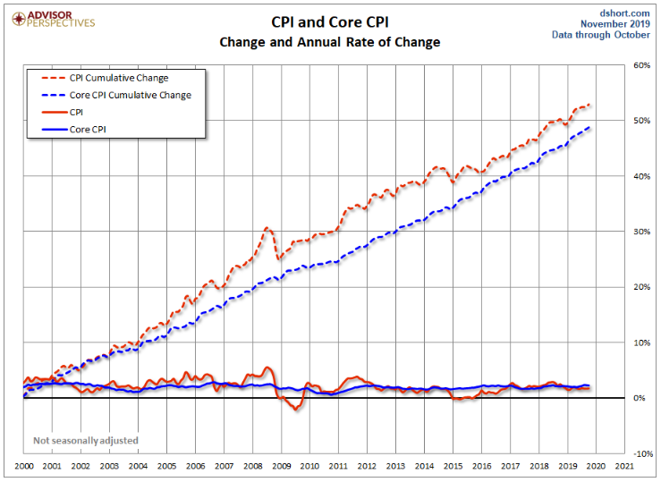
Consumers, especially those who’ve managed expenses over several years, are most closely attuned to the top line.
Inflation and Your Household
The universal response is to moan over price increases and take delight when prices are cheaper. But in reality, households vary dramatically in the impact that inflation has upon them. When gasoline prices skyrocket, a two-earner suburban family with long car commutes suffers far more than the metro family with short subway commutes or retirees with no commute. And the pain is even more extreme for low-income households whose grocery money shrinks when gas prices rise. And remember, Uncle Sam excludes energy costs from Core Inflation.
Households with high medical costs are significantly more vulnerable than comparable households with low expenses in this category.
The BLS weights College Tuition and Fees at 1.613% of the total expenditures. But for households with college-bound children, the relentless growth of tuition and fees can cripple budgets. Often those costs get bundled into loans that saddle degree recipients with exorbitant debt burdens. Of course, the Federal Reserve would point out that the right dose of Core Inflation (extended of course to wages) would enable debt-burdened college grads to pay down their loans with inflated dollars.
Which brings us back to the Fed’s efforts to manage the level of Core Inflation. At the macro level, the Fed can doubtless make a theoretical case for manipulating inflation. But have their efforts — ZIRP and Quantitative Easing — achieved the desired goal?
Inflation has been tame in recent years and slowly picked up, finally reaching the Fed’s target in March 2018. But the one thing we can be certain about is this: Inflation volatility has a painful effect on lower income households, those on fixed incomes, those with higher ratios of tuition, transportation, or medical costs … and all households whose discretionary spending is more dream than reality.
Source: Advisors Perspectives
Jill went deeper into inflation in another post. She called it an “X-Ray” view of the components. I know, really exciting stuff. Scratch what I said about this being a one-coffee read; you may need to grab a second cup today.
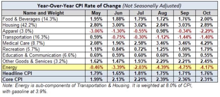
Here is a table showing the annualized change in Headline and Core CPI, not seasonally adjusted, for each of the past six months. Also included are the eight components of Headline CPI and a separate entry for Energy, which is a collection of sub-indexes in Housing and Transportation.
We can make some inferences about how inflation is impacting our personal expenses depending on our relative exposure to the individual components. Some of us have higher transportation costs, others medical costs, etc.
A conspicuous feature in the year-over-year table is the volatility in energy, significantly a result of gasoline prices, which is also reflected in Transportation.
The Trends in Headline and Core CPI
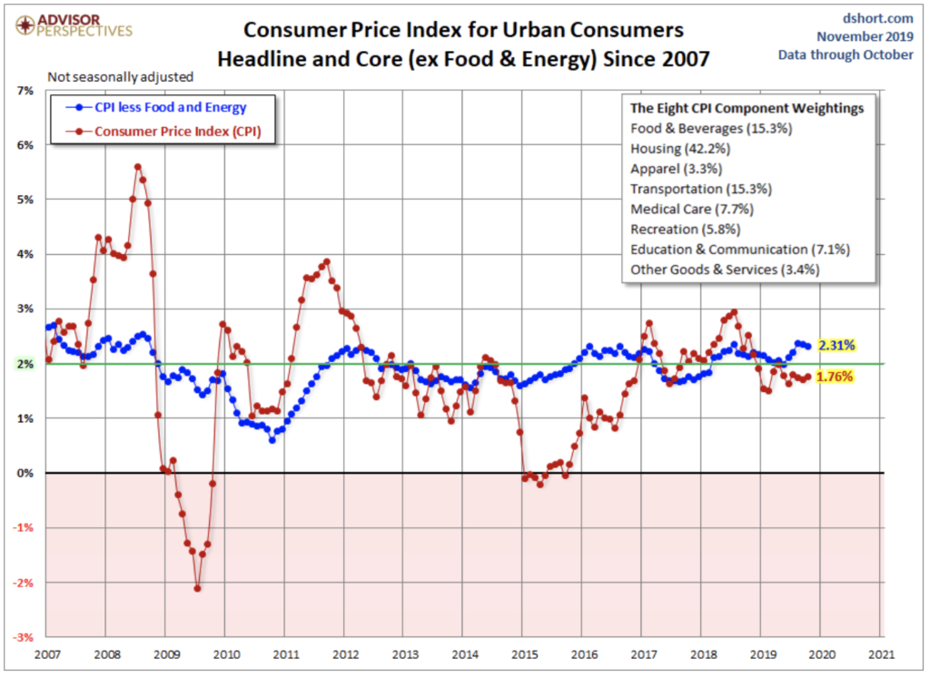
The chart below shows Headline and Core CPI for urban consumers since 2007. Core CPI excludes the two most volatile components: food and energy. We’ve highlighted the 2% level that the Federal Reserve is targeting for inflation, although the Fed traditionally uses the Personal Consumption Expenditure (PCE) price index as their preferred inflation gauge.
Year-over-year Core CPI (the blue line) was above 2% from the end of 2015 through February 2017 only to flip-flop again over the last year or so. The more volatile Headline CPI has spent most of the last five years under the 2% lower benchmark, and much of the volatility in this metric has been the result of broad swings in gasoline prices (more on gasoline here).
For a longer-term perspective, here is a column-style breakdown of the inflation categories showing the change since 2000.
Note: For additional information on the component composition of the Consumer Price Index, see our Inside the Consumer Price Index.”
Source: Advisors Perspectives
One of my weekly dashboard items is an inflation timing model. As you’ll see in the Trade Signals section, inflation pressures remain low—that’s good news. Let’s keep this indicator on our radar for the future, though, as stocks don’t do so well in high inflationary periods (see data boxes in the timing model) and inflation eats into your gross return.
Trade Signals – Low Inflation Regime Remains
November 20, 2019
S&P 500 Index — 3,107
Notable this week:
There are no changes in the signals since last week’s post. One of the signals I share each week in the dashboard section below measures inflation. It’s a Ned Davis Research (NDR) model that consists of 22 individual indicators that has done a pretty good job over the years at signaling the swings in the rate of inflation. The model measures various rates of change in things such as commodity prices, the Consumer Price Index (CPI), producer prices and industrial production. The reason inflation is important to factor into your investment thinking is that, generally, stocks are sensitive to inflation trends — typically performing well when inflation pressures are low and not well when inflation pressures are high.
I’ve made a few yellow highlights in the following chart. The current reading continues to indicate that “Inflationary Pressures are Low.” What is also helpful for investors is that some sectors do well when inflationary pressures are high, such as precious metals, industrial materials, and energy. Others perform better when inflation is low, for example, utilities, financials, and bonds. You can think of this model as both a market timing and a sector selection tool. Please note: the chart below is for informational and educational purposes only. No part of the following presentation should be construed as a recommendation to buy or sell any security.
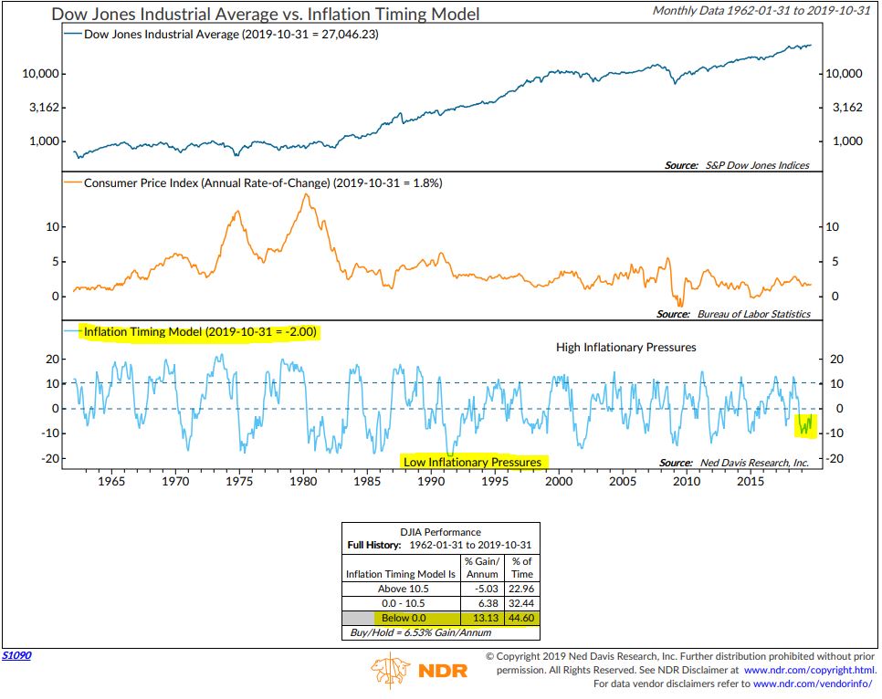
Source: Ned Davis Research (see important disclosure links below)
Further to this week’s Trade Signals, the weight of trend evidence is bullish for equities, high quality fixed income and gold. However, the CMG Managed High Yield Bond Program signal is nearing a sell. The trend in the price behavior in high yield bonds is a good leading indicator for stocks and the economy (in that order). I believe that the price trend in the high yield debt market and funding conditions are the two most important signal charts for us to keep on our radars. While there are many geopolitical and global macro issues that concern me, price and easy money (available credit) signal no immediate worries.
Risk remains elevated – here’s the list: A Probable Sovereign Debt Crisis in Europe, High Yield Debt and Bank Loan Funds, Unmanageable Global Debt Levels, China Risks, Global Trade, Investor Leverage, Aged Economic and Market Cycles, Richly Priced Assets, Investor Crowding into Cap Weight Funds, Underfunded Pensions, Demographics, ZERP and NIRP and Central Bankers Pushing on a String…). Which snowflake trips the avalanche and when remains unknown. Is it a for-sure thing? No. Is it probable? Yes. Thus, while you seek growth, be sure to risk manage your downside. Simple trend following can help.
Despite the large number of global macro risks, “don’t fight the trend” and “the trend is your friend” remains sage advice.
Not a recommendation for you to buy or sell any security. For information purposes only. Please talk with your advisor about needs, goals, time horizon and risk tolerances.
Click here for this week’s Trade Signals.
Personal Note – NYU, PSU, and Thanksgiving
Today, Friday, November 22, 2019, I’m finishing this piece early on an Amtrak train heading to New York City. Mid-morning I’m presenting at the CFA Society of New York’s ETF Synapse Conference 2019. I’m on a panel today with Rich Powers, Vanguard’s Head of ETF Product Management; Sue Thompson, EVP and Head of SPDR Americas Distribution, State Street Global Advisors; Robert Hughes, Head of Nasdaq Investment Solutions, NASDAQ; and Mary Ann Bartels, Head of Technical & Market Analysis at BofA Merrill Lynch Global Research. I’m really looking forward to learning. I’ll be sharing my perspective as a consumer of these firms’ products. And I’ll be taking notes and will share my high-level thoughts with you soon.
On the fun side, tomorrow, my Penn State Nittany Lions face the Ohio State Buckeyes. The Buckeyes are favored by 18 points. The winner will likely make it into the NCAA College Football Playoffs. I hate to admit it, but I’m not sure if there are two better teams out there this year than LSU and Ohio State. One can hope big, and hope big I will—with a cold IPA in hand.
And I just learned that Penn State’s men’s soccer team won last night, advancing to round 16 of the NCAA tournament. The Providence Friars are their opponents, and my dear friend Tony C. just asked if I was interested in a little wager on the outcome of the game—loser buys the next beer. I really want him to foot the bill. I’m not sure if my sons are up for it, but a trip to Penn State to watch the game on Sunday could be fun.
It’s hard to believe Thanksgiving is next week and I can’t wait. Is there a better holiday? The annual Black Friday Golf Scramble at Stonewall is on the 29th. Matt and a good friend are our ringers—Brianna and I round out the foursome. We all tee off from the forward tees and then select the best drive. The back tees make the hole play longer and the forward tees make the hole play shorter. We all hit from that spot and pick the best shot, hit again and pick the best shot, and so forth through the hole. But while there is an advantage to the holes being shorter, the challenge begins on the greens. The course superintendent places the pin (hole) locations in the most challenging spot on each green.
Last year, our team finished 5 under par. Not bad, but we were pretty sure it wasn’t good enough to win. We were shocked, however, when we walked into the pro shop to see the top score at 17 under par. That is 17 birdies out of 18 holes (maybe an eagle in there somewhere). Really? I find that a bit hard to believe. Picture putting to a hole placed on the side of a steep downward slope and on frozen greens. Only thing missing is the windmill and clown’s nose. Someone needs to tell those folks Santa’s watching. Some things are just impossible, like 17 under on frozen greens. Anyway, it’s great to compete. And most important, it’s great to be with the ones you love.
There will be no On My Radar post next week. I will be playing golf… with a very big smile on my face.
Wishing the very best to you and the favorite people in your life!
Happy Thanksgiving! Eat well, drink well, and celebrate!
Warm regards,
Stephen B. Blumenthal
Executive Chairman & CIO

