
Those that follow my personal account on Twitter will be familiar with my weekly S&P 500 #ChartStorm in which I pick out 10 charts on the S&P 500 to tweet. Typically I’ll pick a couple of themes to explore with the charts, but sometimes it’s just a selection of charts that will add to your perspective and help inform your own view – whether its bearish, bullish, or something else!
Q1 hedge fund letters, conference, scoops etc
The purpose of this note is to add some extra context and color. It’s worth noting that the aim of the #ChartStorm isn’t necessarily to arrive at a certain view but to highlight charts and themes worth paying attention to.
So here’s another S&P 500 #ChartStorm write-up!
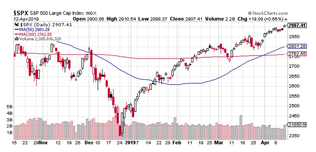
1. S&P500 Levels: First up is a check in on price, very simply this one got featured because it shows the index clearing the 2900 level. This level is important for a number of reasons, but it also brings the market closer to making a new all time high. Breaching levels and new highs are important because it often activates additional sources of buying power as momentum traders come to market, and retail pays more attention… and a sort of capitulation takes hold. Likewise, failure at key levels and new highs can say just as much on the bearish side.
Bottom line: The S&P500 cleared the 2900 level last week, watch what happens next.
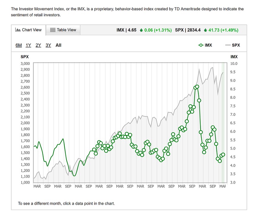
2. Retail Investor Sentiment: Next one is the TD Ameritrade Investor Movement Index. This one adds further to a theme I’ve been talking about a lot in the past couple of months – the light participation by investors, both retail and insto, in the rebound rally. Following a volatile year, and particularly the Dec correction, and with all the negative news flow, investors remain very skeptical on the market outlook, and those who sold at the bottom and sold the initial rebound have in many cases sat on their hands.
This is what I referred to in the previous chart when I said that follow through on the clearing of 2900 and a new all time high may activate this cash on the sidelines through simple bullish capitulation. (but then again, maybe they will be proven right in hindsight, we’ll see!)
Bottom line: Retail investors remain skeptical on the market outlook.
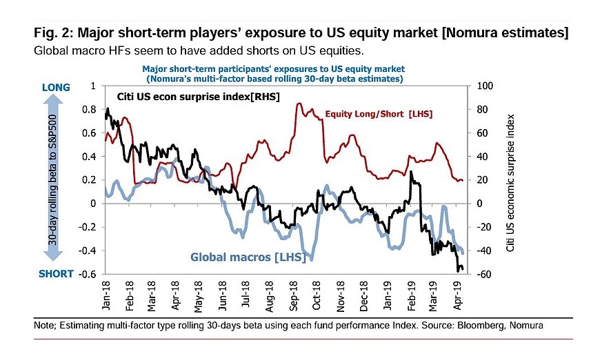
3. Hedge Fund Positioning: This chart provides another angle on that theme, which shows equity long/short hedge funds have been running fairly light exposure (low beta), and global macro funds look to have been short and if anything increasing shorts. Again, maybe they have picked it right, but either way we can say with some confidence that a large cohort of investors have spoken with their feet on their confidence in the market outlook, and many have been left behind through the roaring rally of 2019 (so far).
Bottom line: Hedge funds are running relatively light exposure to US equities.
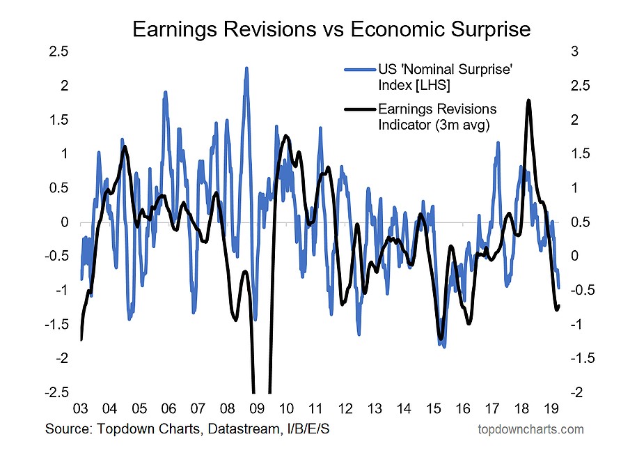
4. US Earnings Pulse:This chart provides another interesting follow-on, it’s what I call the US Earnings/Macro Pulse and shows the pulse of earnings revisions and US economic data flow vs expectations. If you want to point to a single thing that explains why folk have been so bearish/skeptical this is certainly one candidate. Basically the economic data has been disappointing and corporate earnings expectations have taken a dive.
So it’s little wonder then that investors have erred on the side of caution, but it’s precisely these conditions which have created this bearish sentiment (investors are not dumb, there’s clearly been some cause for concern). And probably the key point with this chart is that at some point it becomes “so bad it’s good”.
Bottom line: The slumping earnings/macro pulse may be sending a contrarian signal.
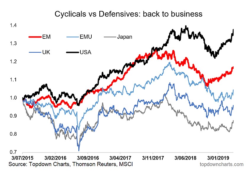
5. Global Cyclicals vs Defensives: As bearish as the previous chart looks at first glance, the next chart of global cyclicals vs defensives provides some cause for optimism. Around the major regions, but particularly USA and Emerging Markets we’ve seen clear green shoots in cyclicals vs defensives (cyclicals tend to outperform when the economy is expanding and risk sentiment is good and/or improving). Maybe we’re getting a false signal here, but when I look across several other leading/high frequency coincident indicators I actually see a number of signs of green shoots in the global economic slowdown, so there may be something to this.
Bottom line: Global cyclicals vs defensives are telling a bullish story.
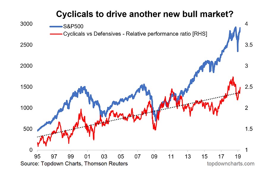
6. S&P500 and Cyclicals vs Defensives: The next chart focuses specifically on US Cyclicals vs Defensives and provides both a longer time frame and shows the relative performance line against the S&P500. There’s an important reason why I have created the chart in this manner. Firstly, it just provides more context overall, but most interesting in my opinion is the 2016-18 period where cyclicals had been driving the new bull market (my view was that this period was basically a whole new bull market after a mini-bear took hold).
Anyway, the thing that sticks out to me now with this chart is that US cyclicals vs defensives is starting to perk-up after a brief slumber or reset (i.e. cyclicals are outperforming defensives again). In a recent note I pondered whether this may be the most important sign of a much greater extension of the rebound into some kind of “echo bull market”. Watch this space.
Bottom line: US cyclicals vs defensives may be driving a new “echo bull market”.
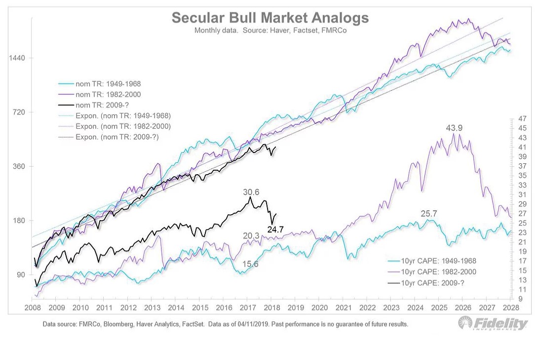
7. Secular Bull Market Analogs: The next one comes from Jurrien Timmer of Fidelity Investments, and he makes a point how basically the secular bull market that began in 2009 could have important parallels to the 1982-2000 and 1949-1968 mega bulls. Again, with the pessimistic backdrop this is not something many people are talking about.
As to how this might happen, well it’s difficult to guess what the drivers might be, and even looking back at these markets – particularly the 80’s/90’s there is disagreement on what the main driver or combination of drivers was. As a starter, we’re still operating in an environment of record low interest rates around the world – and that still has meaningful implications for both valuations (could argue on this angle that on a relative basis just about everything is still cheap), and by making debt more affordable (matters for new borrowing and servicing of existing borrowing).
The other aspect is that we now operate in a world where quantitative easing is the “new normal”, and both in terms of limiting downside by giving policy makers new tools, and through still not completely understood ongoing effects, maybe this is something that ultimately drives the market further in nominal terms.
Again, it’s not something many are talking about, and to be honest if it does happen, we may only be able to recognize and understand/invent the narrative about why it happened in hindsight. So it definitely provides some food for thought.
Bottom line: Under certain analogs, this secular bull market may only be half way through.
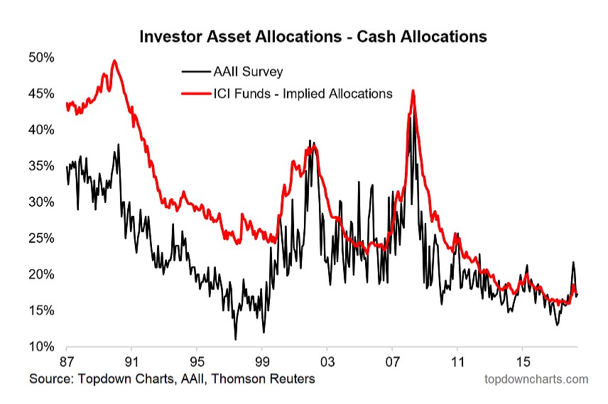
8. Investor Cash Allocations: This chart shows two views of investor cash allocations(the AAII survey of portfolio allocations and an implied allocation based on ICI fund data). The key point is that even after a slight rebound, investor cash allocations remain historically light. Still, if we wanted to explore the argument in the previous chart a little more, you could argue that in a low interest rate environment even 15% is a large (too large?) allocation to cash.
Honestly though, I don’t really buy that, my view is the job of cash is not to earn income but to serve as the most reliable means of capital preservation in a down market/volatile market. Anyway, on a short-term basis we still have some room to move before cash allocations go back down to the danger-sign levels.
Bottom line: Investor cash allocations remain historically low, even after rebounding somewhat.
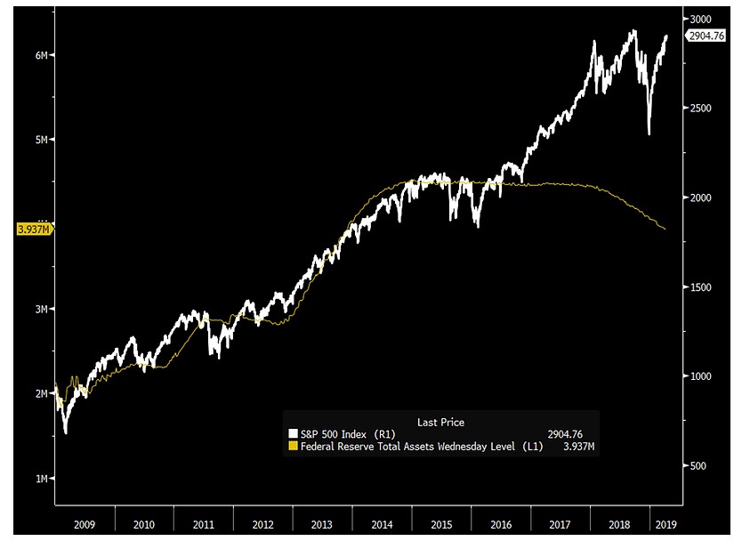
9. S&P500 vs the Fed Balance Sheet: The next chart, supplied by George Pearkes, shows the Fed balance sheet against the S&P500. This is quite a controversial chart, and countless essays could be penned on the various “actually’s” and “yeah, but’s”, so I’ll try to keep it brief and to the point.
Basically some will point to this chart and say the market is rigged, others will point to this chart and say that the 2009-16 period was just spurious, and still others will say that it’s the “alligator’s jaws” and the market will eventually come down to meet the balance sheet. As for me, it’s something I’m aware of, but not part of my core indicators.
As for the reasons for the gap, there’s a few theories (I had a chorus of tweets coming at me on this one!), one is that it never mattered anyway, another is that if you look at global central bank balance sheets the expansion by ECB/BOJ can explain it because in a globally integrated financial system QE in one country spills over across global asset markets. Another take is that the gap is due to fiscal stimulus, or simply an over-confidence thing. I’ll leave you to decide which it is (or which combination of things it is!).
Bottom line: The impact of fed balance sheet expansion remains a controversial issue.
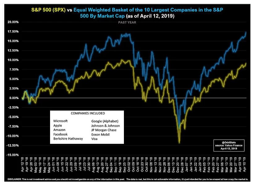
10. The Top 10 vs the S&P500: Final chart is a bit of a fun one from the always clever and often funny OddStats. It shows the performance of the top 10 stocks (equal weighted) by market cap, and the punchline is that if you owned the top 10 you would have not only replicated the market, but even bettered it significantly. On a longer time frame it looks even more interesting. Of course, knowing what those 10 stocks are is easier said than done, interesting though.
Bottom line: The largest 10 stocks of the S&P500 beat the market.
So where does all this leave us?
This week there
- Sentiment
On sentiment we saw how retail investors and hedge funds have been running fairly light exposure despite the roaring rebound so far. We also saw though how the crash in the earnings/macro pulse may be a key driver behind this skepticism.
- Cyclicals
On cyclicals vs defensives we saw how globally there are signs of green shoots, and mused on the possibility that the revival in US cyclicals vs defensives might drive a new “echo bull market”.
- Big bulls
On big bulls, we saw how a little-talked-about theory postulates or at least highlights how it’s possible that we’re only half-way through the current secular bull market.
- Red herrings
On red herrings we note the still heavy debate about the Fed balance sheet and its impact on markets, and noted what happens if you just buy the 10 biggest stocks.
Summary
Overall, it seems easy to paint a fairly bullish picture. Sentiment remains pessimistic/skeptical and positioning is light. Although this is against a backdrop where a genuine deterioration has been seen in the earnings/macro pulse, you could argue that it’s already in the price (or at least already reflected in sentiment). Add to this the green shoots in cyclicals vs defensives both domestic and abroad, and the breaking of 2800 and now 2900, it looks entirely possible that an echo-bull market is taking hold… and it may well be part of a larger and longer secular bull market.
See also: Weekly S&P500 #ChartStorm – 7 April 2019
Article by Top Down Charts

