
Those that follow my personal account on Twitter will be familiar with my weekly S&P 500 #ChartStorm in which I pick out 10 charts on the S&P 500 to tweet. Typically I’ll pick a couple of themes and hammer them home with the charts, but sometimes it’s just a selection of charts that will add to your perspective and help inform your own view – whether its bearish, bullish, or something else!
The purpose of this note is to add some extra context beyond the 140 characters of Twitter. It’s worth noting that the aim of the #ChartStorm isn’t necessarily to arrive at a certain view but to highlight charts and themes worth paying attention to.
Klarman 2017 letter on
So here’s the another S&P 500 #ChartStorm write-up!
1. The Floor and The Ceiling: First up is the same number 1 chart from last week, with the distinctive pair of lines: the down trend line in the blue and the as yet still upward sloping 200-day moving average. Basically this is the equivalent of the market getting backed into a corner, or to use another cliché – the spring is coiling. And when it breaks either one of these lines it will probably keep going – this is one of the best and mos practical uses of technicals as defining objective risk management levels and triggers.
Bottom line: The market has been backed into a corner and will soon lash out.

2. Korean Peace Summit: Speaking of being backed into a corner, the Korean peace summit was probably the most positive (and bullish) story of the week (decade?). Should things go smoothly with the Trump-Kim summit too it will steadily erode at least some geopolitical risk premium, so on balance it is a bullish development. But as Sentimentrader points out in the chart below, the timing is… “interesting”.
Bottom line: The last two inter-Korean summits took place around major market peaks.
3. Speculative Futures Positioning: This chart shows something I have been talking about previously – how the substantial net-long speculative futures positioning has hardly budged throughout the correction. This may just be a rotation among traders (some squaring up while others buy the dip), but either way it shows there has been very little in the way of resets on this indicator.
Bottom line: Speculative futures positioning remains substantially net long in the S&P500.
4. Stock Market Margin Debt: Speaking of leverage, the next chart shows the build up in stock market margin debt. There’s not much more to add on this one except that it remains still very close to a record high.
Bottom line: Margin debt remains close to a record high.
5. Total Net Stockmarket Leverage: The next chart shows a more aggregate, but also netted out view of US stockmarket leverage. This one not only includes net-margin debt, but also net leveraged ETF assets under management, and net speculative futures positioning. Over the past circa 5 years there has been a $400B build up in leverage, which by any measure is substantial. As I noted elsewhere, leverage like this can quickly evaporate, and trigger a price cascade, so it is a background feature worth noting.
Bottom line: Overall stockmarket leverage remains near record highs.
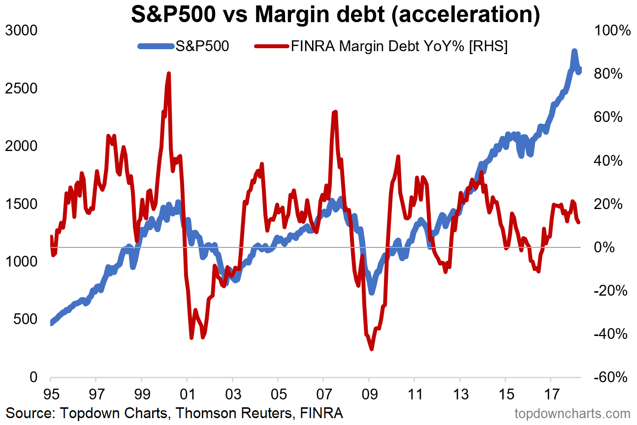
6. Margin Debt Acceleration Indicator: Back on margin debt, this chart transforms the absolute level into a timing indicator. Simply it is acceleration/deceleration in growth which triggers the signal. Basically the danger signs are when you get excessive acceleration or excessive deceleration. We did not see excessive acceleration during the last phase of the bull market, but we are now starting to see deceleration – albeit not excessive at this stage. It’s certainly one to keep an eye on.
Bottom line: Margin debt acceleration provides a practical view on margin debt levels.
7. Market Leadership Indicator: This somewhat peculiar indicator shows the proportion of sectors that have outperformed 2 months in a row. Basically it is tracking “leadership”. Or in other words, the concentration of price movement. For example if the indicator is high it means there is broader leadership, but if it is low it means the leadership is concentrated in fewer sectors (e.g. look at the dot-com peak where it was all tech and telcos). When leadership is particularly concentrated it can be a sign of vulnerability in the market, and certainly can reflect frothy conditions in the sectors that drive the indicator to extremes.
Bottom line: Market leadership has become relatively concentrated.
8. S&P500 Operating Earnings Growth: This one provides a check in on the pace of earnings growth. At the time of the chart’s posting, about 25% of companies had reported earnings, and at present S&P 500 operating earnings are up 24% YoY, which interestingly enough is the highest growth rate in over 7 years. So we can certainly talk about whether future earnings growth is going to be as good (high bar) or not, but for now this is some pretty strong numbers.
Bottom line: Operating earnings growth is looking solid.
9. Corporate Capex Growth: This chart took me by surprise. It shows a surge in corporate capex (capital expenditure) growth. As Bloomberg notes, this actually reflects companies seemingly allocating gains from tax cuts to expansion and investment rather than just showering cash on investors through buybacks and dividends. But thinking more broadly it probably makes a lot of sense as for a long time companies have been putting off capex and just trying to make do with old equipment and existing capacity. But if you look at measures of labor market capacity and industrial capacity things are running fairly tight, so it actually does make sense that companies should be investing to expand productive capacity.
Bottom line: Corporate capex growth appears to be surging.
10. S&P500 Market Cap Weight by Ticker Code Letter: Last one is a bit of a fun chart from Bespoke Investment Group, it shows the market cap weighting in the S&P500 by letter (first letter of ticker symbol). Turns out there is a lot of concentration in the A’s (also C, G, M). That’s about all I will say on that one.
Bottom line: Market cap weight by letter of stockticker is concentrated in the A’s.
So where does all this leave us?
This week there are probably 3 themes…
1. Red-lines
Just one on this really, but worth highlighting on its own – the first chart which shows 2 very important red lines for traders as the market gets backed into a corner.
2. Top Signs
Somewhat in jest is the Korean summit chart, less in jest is the market leadership chart, and straight up serious is the various leverage charts which show little reset and substantial commitment.
3. Corporate Financials
On the financials, earnings growth looks solid so far, and corporate capex is surprisingly strong.
Summary
Overall it’s a continuation of the themes whereby the market looks late cycle and various signals and signs of a top can be pointed to, yet equally we can point to solid fundamentals. This juxtaposition creates a conundrum for investors, and with leverage heavy the stakes are high. I think the first chart is a neat microcosm of this juxtaposition, and arguably it is a visual representation of two battling groups of investors – on the top side it’s the ones looking at the vulnerabilities and late cycle signals, and on the bottom side it’s the ones focused on the fundamentals. The battle lines are drawn. I know where I stand – what about you?

