
Those that follow my personal account on Twitter will be familiar with my weekly S&P 500 #ChartStorm in which I pick out 10 charts on the S&P 500 to tweet. Typically I’ll pick a couple of themes and hammer them home with the charts, but sometimes it’s just a selection of charts that will add to your perspective and help inform your own view – whether its bearish, bullish, or something else!
The purpose of this note is to add some extra context beyond the 140 characters of Twitter. It’s worth noting that the aim of the #ChartStorm isn’t necessarily to arrive at a certain view but to highlight charts and themes worth paying attention to.
So here’s the another S&P 500 #ChartStorm write-up!
1. S&P500 Price Chart: First up is a look at a couple of key lines for the S&P500 price chart – the most notable is the downward sloping line as a series of lower highs have been registered. The second is the 200-day moving average, which so far has proven a “floor” to prices. The third, not shown, is the line which would show up around 2575, and if drawn would trigger most technical analysts to recognize a descending triangle pattern. The usefulness of triangle patterns like this are for setting clear lines in the sand to detect a breakout (in either direction). So keep an eye on these lines and levels in the days and weeks ahead.
Bottom line: Keep an eye on those lines in the sand.
Is This The End Of Correlation Between Inflation and Unemployment?

2. The S&P500 vs Treasuries: This chart shows the S&P500 and IEF – a treasuries ETF. The point of showing it against this ETF is that it basically shows you the path of bond yields (inverted – since bond prices move inversely with bond yields). In late January/early February we saw the surge in bond yields coincide with the first major correction in a long time. What was more rare or notable was the fact that both bonds and stocks got sold-off. And for some it triggered memories of 1994, where a sustained and substantial selloff in bonds also made life difficult for stocks. And with the 10-year treasury yield on the verge of breaking out (my view is that it can definitely trade into the 3s, but will probably stop at about 3.5%), there’s more to this chart than you might initially think.
Bottom line: Bonds are starting to selloff again, and they could take stocks with them.
Down In February, Odey Sees Market Crack Coming… Again
3. S&P500 and China: Again using an ETF for another piece of “intermarket” analysis, this time ASHR – an ETF on China A Shares. It shows ASHR pulling away to the downside, and while there’s no reason these two should trade in lock step, it is interesting given how important the Chinese economy is and of course given also the context of the trade skirmish or trade war. It pays to keep an eye on these type of intermarket charts because negative price action in pockets of the market which reflect broader macro themes can sometimes offer an early warning.
Bottom line: Chinese stocks are stumbling, and suggest short term downside risk.
Hedge Funds Decimated Last Week: Goldman Sachs
4. Another Analog: Before saying anything on this, it’s important to caution that analog charts have the possibility to deceive just as much as they have the possibility to add insight. And they can of course deceive without any trace of ill intent. Anyway, the chart shows the course of the market since Trump was elected, with the same plotted for JFK. The line of thinking is that there are some political parallels e.g. cold-war revival, etc. Personally I am skeptical, but the chart stood out as I went on my search for notable charts for the week!
Bottom line: The JFK-Trump stockmarket analog suggests caution.
5. Yield Curve: The flattening of the yield curve is getting attention once again, this time as the 10’s minus 2’s spread breaks below the 50bp mark. But as I noted in the latest weekly report, this is quite normal and very much to be expected as the business cycle matures. What’s more, the chart below from Liz Ann Sonders shows that actually when the yield curve drops below 50bps the subsequent market action can actually be quite positive, and at the very least can be described as benign. There will come a time to worry about the maturing of the business cycle, but it doesn’t seem to be the time just yet.
DB: Yield Curve Flattening Is A Good Thing!
Bottom line: Don’t worry (yet) about the yield curve flattening.
6.Earnings/Macro Pulse: Keeping on the topic of macro currents, the earnings revisions momentum indicator (combination of earnings revisions ratio and change in forward earnings), and “nominal surprise index” (combination of inflation + economic surprise indexes) both still look fairly decent. Certainly nothing like what it looked like in 2015/16 where the twin corrections at that time reflected genuine and well-founded concerns about the growth outlook. At this point the earnings/macro pulse is still solid, and thus underpins the outlook for stocks, at least on the economic cycle and earnings front.
Bottom line: The earnings/macro pulse still looks good.
7. Earnings and Valuations: This interesting pair of charts, shared by Rodney Forrest on Twitter, shows the course of forward earnings and the level of valuations across a couple of key markets. For the S&P500, the earnings picture looks solid, and valuations are in line with the 20-year average, and slightly higher than the others. S&P500 valuations were on the high side in early January, but a reset has since occurred. Not cheap, but not expensive either.
Bottom line: The earnings picture looks good and valuation benign.
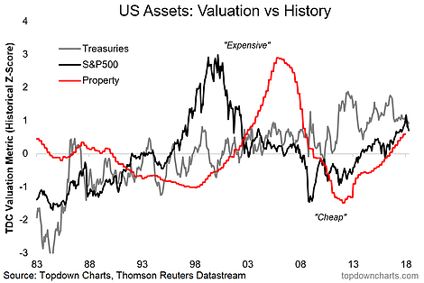
8. US Asset Valuations: This chart shows valuation metrics for some of the major asset classes (treasuries, the S&P500, and residential property). The key point is that they’re all on the expensive side. None of them have quite made it to the lofty altitudes previously reached by stocks in 1999/2000 or property in 2005/06, but to have all 3 at this level is unprecedented. As I noted elsewhere, this chart in the context of quantitative tightening presents a “brave new world” for investors.
Bottom line: Valuations are on the expensive side across the major asset classes.
9. Cash Deployment: This chart shows the trend in cash usage by S&P500 companies across time, with estimates for 2018. It shows a marginal yet continual move toward returning cash to shareholders (Dividends, Buybacks) rather than investing for growth (M&A, R&D, Capex). With cash flow set to rise thanks to the tax changes it’s going to mean additional buying flow from corporates on buybacks, and further solid growth in dividends – both of which are short-term positive for the stock market.
Bottom line: S&P500 companies are set to return more cash to shareholders this year.
10. Average Company Lifespan: This intriguing chart from Innosight shows the average lifespan of an S&P500 company across time. There is a clear trend (and cycle). The cycle seems to map to the market/business cycle (makes sense), and the trend probably maps to globalization and technological innovation. Aside from being an interesting representation of disruption and creative destruction, it also again goes to highlight how indexes are constantly changing and constantly evolving creatures – for passive investors this can be a good thing (rotating into rising industries and out of sunset industries), but it also means the nature of the index can changed notably over time.
Bottom line: The average lifespan of an S&P500 company is set to reach a record low.
So where does all this leave us?
This week there’s probably 2 main areas of interest:
1. Cautions and Warning Signs
In this I would lump the first chart with the key levels (and hence caution around the downside levels and lines), and the two intermarket charts where China stocks and a further selloff in bonds could create some turbulence for the S&P500, and then finally there’s also the JFK-Trump stockmarket analog.
2. Macro, Earnings, and Valuation
In this bucket there’s the healthy and normal flattening of the yield curve as the business cycle matures, the positive earnings/macro pulse chart, the valuations and forward earnings picture (benign and good respectively), and yet the valuation conundrum as the 3 major assets lie on the expensive side.
Summary
This week the S&P500 concluded trading more or less in the middle of the range, and in many respects could be described as stuck in the middle as short-term risks and news/noise continue to weigh, as does the negative price action on sentiment more broadly… yet the earnings/macro picture remains decent. You could easily describe the market as being at a cross roads, or a fork in the road – and going back to the first chart with the key levels and lines, I’m left deferring to Yogi – “when you come to a fork in the road, take it.”
See also: Weekly S&P500 #ChartStorm – 15 Apr 2018

