
Those that follow my personal account on Twitter will be familiar with my weekly S&P 500 #ChartStorm in which I pick out 10 charts on the S&P 500 to tweet. Typically I’ll pick a couple of themes to explore with the charts, but sometimes it’s just a selection of charts that will add to your perspective and help inform your own view – whether its bearish, bullish, or something else!
Q4 hedge fund letters, conference, scoops etc

The purpose of this note is to add some extra context and color. It’s worth noting that the aim of the #ChartStorm isn’t necessarily to arrive at a certain view but to highlight charts and themes worth paying attention to.
So here’s another S&P 500 #ChartStorm write-up!
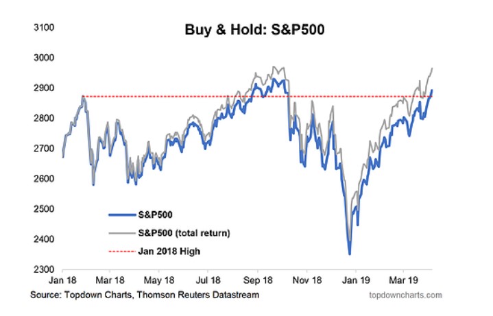
1. S&P500 Buy & Hold and the Jan 2018 High: First up I thought it would be quite interesting to highlight how the S&P500 just this last week reclaimed the January 2018 highs. You might be wondering: “why would he pick the Jan 2018 high? the market peaked much later in the year” and that’s true. But there’s a couple of things going through my mind on this.
January 2018 was when the global economic and earnings pulse peaked out, and for a lot of global markets e.g. emerging and developed ex-US, this was the peak. Basically the market was running on fumes from then on. The other thing is that it was around January where longer term measures of sentiment peaked e.g. the Euphoriameter – so it’s like the point of peak optimism and hype, and is a likely juncture where new investors began entering the market.
So with that context, the reclaiming of the heights now seems a bit more interesting, and indeed it’s not far off making a new all time high. So those who bought back in Jan 2018 and actually held (how many would have made it through the volatility??) would be back in black now. Goes to show that sometimes bear markets are just as much about time as distance.
Bottom line: Those who bought at the Jan 2018 high are now only just back in black.
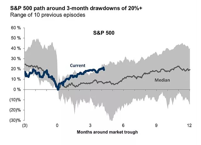
2. The 20% Drawdown Roadmap:The next chart from Volatility Quant shows where the S&P500 is tracking against the path of the average of the 10 most recent 20%+ drawdowns. It’s a useful chart in that it kind of provides a playbook for the rebound. Of course, past performance is no guarantee of future performance, and past ranges are no barrier to entirely different patterns. That said, it is at the top end of the range, so some might argue it’s gone too far (and others might argue it’s actually a good thing because it’s a sign of strength).
Bottom line: The rebound is broadly following the 20%+ drawdown playbook.
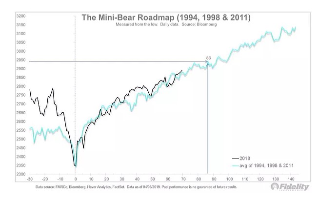
3. The Mini-Bear Roadmap: An excellent follow-on from the previous chart, this one by Jurrien Timmer of Fidelity Investments presents more of a conditional/filtered view of the rebound analog. He calls it the mini-bear roadmap, (good title!) and basically it’s a composite of the last 3 non-recessionary bear markets. And it’s basically going right to plan…
Bottom line: The market is following the mini-bear recovery roadmap.
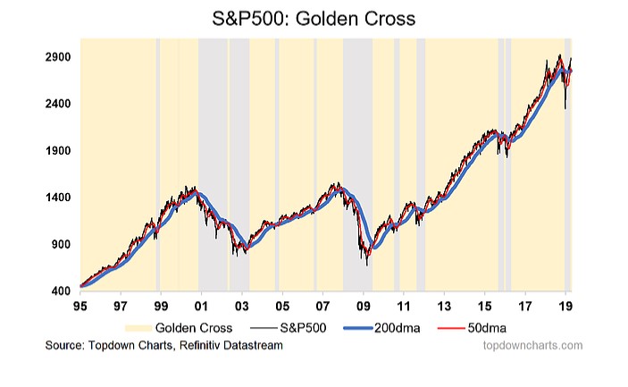
4. S&P500 Golden Cross Signal: Next one shows how the S&P500 has nailed the golden crosssignal. I wrote a note on this on the blog last week, but to summarize, a golden cross is when the 50 day moving average moves above the 200 day moving average. This signal is designed to identify the major trend (i.e. whether the market is in an uptrend/bull market).
As you can see with the chart there are a few false signals, so it is by no means infallible, indeed, along with the benefits there are a number of limitations (e.g. it will give a false signal in a ranging market, and during a false dawn bear market rally). But there are equally many and significant periods where the signal worked well.
Question I am interested in is whether it will be a catalyst to stem the tide of negative sentiment, outflows, and light positioning. I will be watching my monitors closely for confirmation there.
Bottom line: The S&P500 is now in golden cross mode.
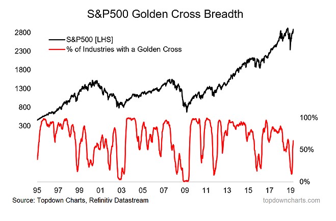
5. S&P500 Golden Cross Breadth: Next chart takes quite a different angle on the golden cross analysis and uses a breadth approach. I am a big fan of applying market breadth analysis techniques to other indicators rather than price, and this is a good example.
As you can see there was a big washout in this indicator where the proportion of industries of the S&P500 with a golden cross fell to a 10 year low. The pattern of total collapse and sharp recovery is a very bullish signal and looks more like a correction than a bear market.
Bottom line: The breadth of golden crosses itself has presented a bullish pattern.
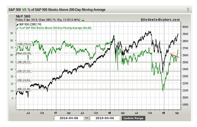
6. Breadth Breakout: This chart is both adding to the bullish technicals evidence as well as providing a follow-up to what was a running chart in recent editions of the weekly charts. I had previously noted how there was a bearish divergence signal with 200-day moving average breadth (a series of lower short term highs) and the index (a series of higher short term highs).
I noted how while this is generally a bearish signal, it can resolve to the upside, like it has now. The breadth indicator has broken out to a new high, and is basically a sign of improving underlying strength (just as the previous breadth chart is).
Bottom line: Bearish breadth divergence has resolved to the upside with a breadth breakout.
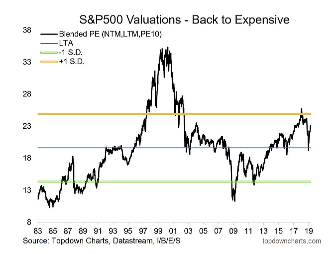
7. S&P500 Valuations: Next graph should be familiar for regular readers – it’s my own chart and it shows the blended PE (which is basically a compromise between the strengths/limitations of 3 different PE ratios: the PE10, forward PE, and trailing PE).
In the chart storm on Twitter I quipped that I wonder how long it will take before we can go back to worrying about how high valuations are! As you may recall throughout the 2017 bull market a lot of participants had been pounding the table on valuation, in the short term they were right, and to be fair around late 2017/early 2018 I had also began taking a more cautious approach given high valuations in the US and globally. But 2018 provided a big reset to the valuation picture.
It’s not back at the extremes yet, so there is certainly scope for additional re-rating from here. Again, this is the challenge of late cycle investing: you can’t buy because it’s cheap, and yet you can’t really sell because it’s super expensive, and to add to that there’s all sorts of mixed signals on the macro pulse. Anyway, it’s one of my favorite and key charts to watch.
Bottom line: Valuations have rebounded but there is arguably still scope for re-rating.
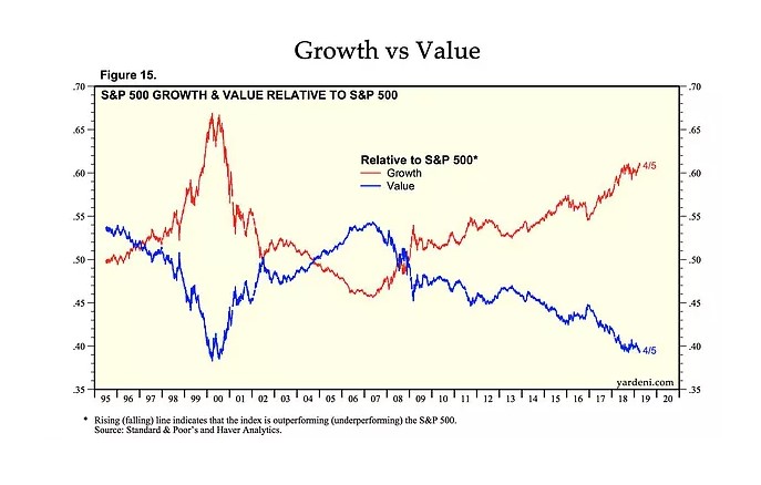
8. S&P500 Value vs Growth: This chart shows something which I have written about and tracked for quite a while: the dismal performance of value vs growth. Basically “value” as a style has almost consistently underperformed against the S&P500 (it has also by the way even more accentuatedly underperformed against growth).
There’s a few things I would highlight with regards to this persistent trend. First, on my analysis value vs growth is more trend-reverting than mean-reverting, so while value may well get its day in the sun, I would bet betting on trend-reversion and not mean-reversion. And the other thing is that if you think about what these terms actually represent – “value” = the cheapest stocks. Sometimes cheap is cheap for a reason, or not really “cheap” when you factor in growth.
The growth/momentum stocks are often (not always) the next big thing in terms of structural change. For instance think about typewriters vs the personal computer – typewriters may get a rebound when hipsters start buying for irony, but basically it’s a sunset industry (the growth aspect) so it should be cheap… and it may be that no price is too cheap (except if it falls below the value of the realizable hard assets).
Anyway, the point is be cautious of value for value’s sake, but at the same time be alert to extreme overshoots because even if mean-reversion is off the table it doesn’t mean some degree of trend-reversion may come into play.
Bottom line: Value has near-consistently underperformed vs the market (and growth).
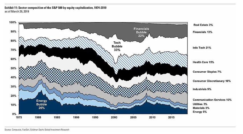
9. S&P500 Market Cap Composition: This interesting, somewhat geologically inspired chart shared by David Schawelshows the evolution of the market cap representation of the various sectors of the S&P500. Note, last year the GICS review split a chunk of tech out into the newly named “communication services” sector (formally known as telecoms).
An interesting aspect of this chart is how you can see the clear development of sector-driven bubbles e.g. the energy bubble in the early 1980’s and the tech bubble 2000, and later financials (arguably also commodities around 2010). There’s not really any super-obvious candidates for the same kind of situation as those examples right now, but it does provide a good lay of the land.
Bottom line: It’s worth keeping tabs on the changing sector composition of the S&P500.
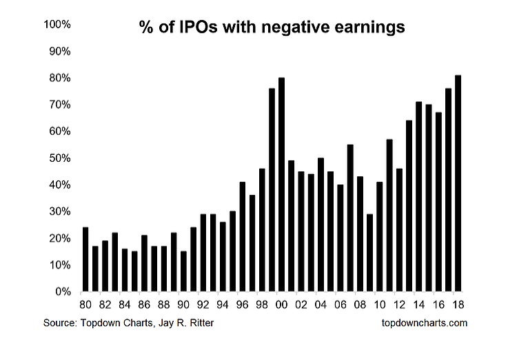
10. Proportion of IPOs with Negative Earnings: Final chart is an oldie but a goodie, which shows the proportion of IPOs undertaken during 2018 which had negative earnings. What makes it so interesting is that it just nudged out 2000 to make an all time record high. It certainly would drive many to make comparisons between now and the dot-com frenzy, but there are a few stats worth noting… because it is different (but similar) this time.
Firstly, there was 134 IPOs in 2018 (477 in 1999, 381 in 2000), second the median age in 2018 was 10 years (5 years in 1999 and 6 in 2000), third Tech IPOs accounted for 28% of all IPOs in 2018 (78% in 1999 and 69% 2000), fourth Biotech IPOs rose to 43% in 2018 (2% in 1999 and 15% in 2000) and of all Biotech IPOs fully 100% had negative earnings.
So while there are many similarities there are also many differences and it is not really a repeat, certainly nothing like the *frenzy* of the dot-com bubble. It is still remarkable though, and probably is indeed still a sign of the maturity of the cycle.
Bottom line: 2018 saw a record high proportion of IPOs by companies with negative earnings.
Summary
This week, aside from some of the generally interesting charts, featured a set of rather bullish looking technical charts (breadth breakout, golden cross, mini-bear rebound roadmap, reclamation of the Jan 2018 highs, scope for re-rating on valuations). While there’s still a lot of mixed signals on the macro/earnings pulse front, and we are in one of the most challenging parts of the business/market cycle, for now the short-term outlook has a distinct bullish hue to it.
See also: Weekly S&P500 #ChartStorm – 31 March 2019
Article by Top Down Charts

