
UPFINA’s Mission: The pursuit of truth in finance and economics to form an unbiased view of current events in order to understand human action, its causes and effects. Read about our mission here.
Q1 hedge fund letters, conference, scoops etc
Labor market data has been mostly good, although there have been a couple negative readings. Specifically, the NFIB small business survey and the Conference Board consumer confidence index both show the labor market is strong. Also, the employment index in the manufacturing and non-manufacturing ISM PMIs rose. Finally, jobless claims in the week of June 1st were 218,000 which matched the prior reading; claims are near a historic low in relation to the size of the labor market. The two negative labor market reports of late were the May ADP private sector report and the Challenger Job Cut report. The May ADP report could have been a one time event, but the Challenger report isn’t because there have been a few bad monthly reports.
Spike In Job Cuts
As you can see from the chart below, the 10 month sum of yearly job cut growth is at the highest point in this expansion.
teasing out the trend in job cuts: up pic.twitter.com/6HaTWKgBoi
— Bill Hester (@billhester) June 6, 2019
Job cut announcements are supposed to lead the labor market, although you can see they didn’t spike until halfway through the last recession. Specifically, in May job cut announcements were 58,577 which was an increase from 40,023. Year to date job cuts are up 39% compared to last year. There have been 289,010 cuts in 2019. Tech firms had the most layoffs in April. Retailers closing stores have had the most layoffs in 2019. Layoffs at industrial firms and auto firms have been increasing. The layoffs at auto firms makes you question the blip higher in vehicle sales in May.
Strong NFIB Numbers
The May NFIB jobs report gets at what we mentioned earlier in this article, namely small businesses are hiring workers at a fast pace. This is in direct contrast with the ADP report that stated small businesses created -52,000 jobs in May. As you can see from the table below, there was a 5% increase in the percentage of small businesses saying there are “few” or “none” qualified workers for the job openings they have.
The NFIB Small Business Jobs Report published today said 54% of firms in May reported few or no qualified applicants for the positions they were trying to fill (up five points). Nearly one if four firms (24%) said they plan to raise employee compensation (up four points). pic.twitter.com/TVxg5NcrDQ
— Jeoff Hall (@JeoffHall) June 6, 2019
A net 21% of small businesses are planning to hire workers. That’s near the cycle high. The average increase in workers per firm is 0.32 which is also near the cycle high. Firms looking to hire workers are paying up as the net percentage of firms with higher compensation plans and that have actually raised compensation are 24% and 34%. The good news for employers is productivity increased 3.4% so unit labor costs fell 1.6% in Q1.
Less Declines In Earnings Estimates
Keep in mind, that we use S&P 500 earnings data from FactSet and The Earnings Scout. Therefore, the results don’t always match. That’s similar to how the Markit and ISM PMIs don’t match. As you can see from the chart below, according to FactSet, earnings estimates in the first 2 months of Q2 fell less than average which is great news. They fell 2.1% which is better than the 5 year average decline of 2.5%.
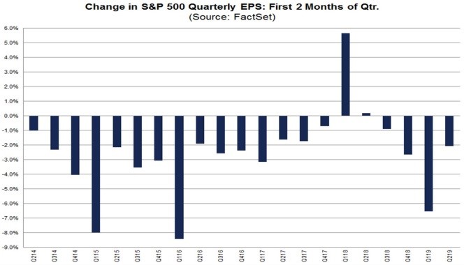
The 10 year average decline is 2.2% and the 15 year average decline is 3.1%. This quarter was better than all averages. The worst 2 sectors were materials and industrials which had their estimates fall 7.3% and 6.9%. The best sector was energy which had its estimates rise 7.7%. Maybe they shouldn’t be rising because oil prices have cratered in the past couple weeks. WTI oil hit a 5 month low this week.
The data from The Earnings Scout is slightly different, but it shows encouraging signs lately. The estimate for Q2 earnings growth fell from 2.04% on April 1st to -0.10% on June 1st. The good news is in the first 6 days of June, estimates only fell to -0.23%. Even better, the estimates for Q3 earnings growth went from 2.29% to 2.25%. Estimates aren’t falling much because not many firms reported results at the start of June and possibly because some analysts think the Fed will become more dovish. At this point of the year, we must turn our attention to Q3 earnings estimates because the guidance firms are now putting out affect that quarter. Guidance is everything for investors.
Chart Crime: Corporate Debt Quality
Chart crimes are when data is misleading. That can be because the data is manipulated in some way or simply because it leads investors to the wrong conclusion. No one knows the future, but we do know the context of present information. A chart can be correct for the wrong reasons. We care about the truth on this website, not about making speculative forecasts.
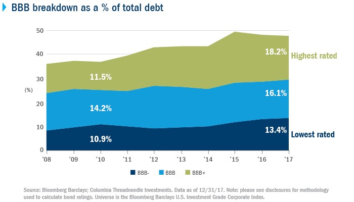
The chart below is the chart crime. As you can see, the percentage of BBB corporate bonds increased above the percentage of AAA-A debt. That leads you to believe corporate debt quality is a huge problem.
Something that hasn’t happened before: the share of BBB-rated debt in the U.S. corporate bond market has eclipsed the proportion of AAA/AA/A debt. Via Bernstein: pic.twitter.com/uWK6uJCn64
— Tracy Alloway (@tracyalloway) June 5, 2019
One obvious issue you can see with this chart is debt quality wasn’t shown to be problematic prior to, during, or after the financial crisis even though it clearly was. The chart doesn’t have a good track record.
Debt Quality Isn’t A Disaster
We need to look at the details of this issue to show why debt quality is not a disaster. BBB bonds are in 3 categories, BBB+, BBB, and BBB-. As you can see from the chart below, the growth in BBB+ is the highest. That means BBB on average is safer than usual.
Source: Columbia Management Investment Advisers
Furthermore, even though the banks are better capitalized, they are rated lower now. As we know, the banks were rated too high prior to the financial crisis. Citi is responsible for 14% of the growth in BBB debt from December 2010 to December 2017.
This isn’t a mass problem that means the entire corporate debt market is about to crash. 40% of the growth is from banks which are actually well capitalized. 19% of the growth is from AT&T and 14% is from Verizon. They were downgraded in 2015 and 2013. It’s likely that most people who saw the chart above didn’t know that Citi, AT&T, and Verizon caused 47% of the increase in BBB debt. Finally, GM and Ford each represent 7% as they were upgraded in 2015 and 2012.
Conclusion
We showed positive and negative labor market reports. The job cut report is one of the few negative readings on the labor market in 2019. We also used two separate purveyors of earnings data to review how EPS estimates have changed in the past couple months. Finally, we showed why the idea that corporate debt quality is much worse this cycle may not be so accurate. Corporate debt quality isn’t terrible.
Article by UpFina

