
By now you should have seen our best and worst charts of 2018, and the “2018 People’s Choice Charts“, so here’s a follow-on post which looks at a selection of “honorable mentions”.
Q3 hedge fund letters, conference, scoops etc
Basically it’s the charts I think that are worthy of mention but not quite fitting in the other categories of our big End of Year Special report which we sent out in December. These charts were both very useful and insightful when they appeared last year, and I think will prove important to keep tabs on as the new year unfolds and the risk vs return balance rapidly shifts….
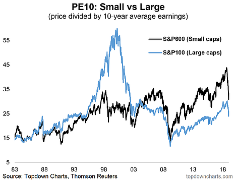
- US small cap stock valuations hit a record high in 2018… before being sent right back down to earth.
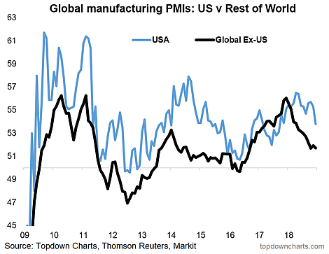
- US vs the world: a window of divergence looks to be closing, and this could be key for USD.
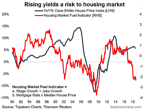
- Can US housing take higher interest rates? History says no…
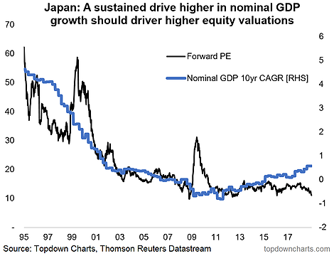
- Japanese equities look cheap, especially as on some measures Japan’s economy looks to have turned the corner (Abenomics starting to work).
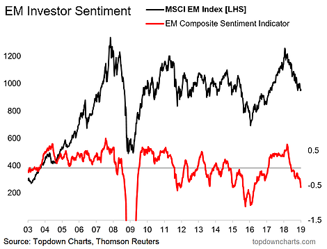
- EM investor sentiment indicator – not quite the same level of panic and abandon as 2009 or 2016, but it is in the zone of contrarian bullishness.
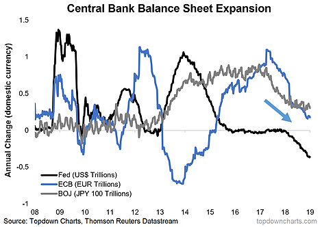
- The completion of the grand monetary policy experiment: QE-to-taper-to-QT, already this has had a wide-reaching impact on global markets, and this newly established tool of central banks should be thought of as a wildcard (particularly as it can both be turned off and back on…).
For more and deeper insights on global economics and asset allocation, and some more good charts you may want to subscribe to the Weekly Macro Themes.
Click through for free look or a trial.
Article by Callum Thomas, Top Down Charts

