
This is the first of a 10-part blog series where I will go through each of the charts from the 10 Charts to Watch in 2019. The purpose is to add some extra comments and context around the charts, as well as to explain some of the finer details of the indicators.
Q3 hedge fund letters, conference, scoops etc
First up is the “Deflatometer” chart. This chart tracks the breadth of three key financial/economic metrics to present a factual and timely gauge of economic deflation around the world. Compare and contrast the 2004-07 boom years with the 08/09 bust, For that matter, compare and contrast the pre- vs post- financial crisis periods. The damage done by the financial crisis can be seen lingering during the post-crisis stagnation.
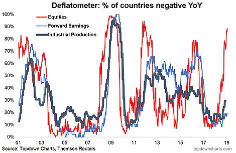
Into the specifics, this indicator tracks the proportion of countries (as many countries as we can get data on) that are experiencing negative YoY growth in the various metrics [i.e. “deflation” or contraction/decline]: equities = main stockmarket benchmark, forward earnings = consensus estimates of the next 12-months earnings, and industrial production.
Turning back to what I wrote in the 10-charts to watch in 2019 article, it sums it up well:
“…as I write, over 80% of world equity markets are in “deflation” (price negative YoY%), the risk here is that we see the black and blue lines turn up (proportion of countries seeing forward earnings and industrial production contracting on an annual basis), and if they do it will probably leave us all feeling a little black and blue, because when it comes to economic deflation, what we’re really talking about is the risk of a global economic recession. Keep this chart front of mind and top of your radar this year.”
My base case is that we *don’t* see a global recession, and hence that deflation risks are overstated, and hence that the equity market selloff is/was overdone and beyond what’s reflected in economic/fundamental reality. Naturally, if the facts change I’ll need to change this opinion, but I believe just as investors were too optimistic at the start of 2018, many are simply too pessimistic as we get stuck into 2019. There’s a little more to it than that, but I’ll leave it here for now.
In any case, this is a chart I will continue to refer back to this year, so stay tuned for updates!
For more and deeper insights on global economics and asset allocation, and plenty of good charts you may want to subscribe to our institutional research service.
Click through for free look or a trial…
Article by Top Down Charts

