
Today, we’re sharing an essay from our friend Dr. Richard Smith. Richard is a Ph.D. in math and has developed a set of tools and strategies that help your portfolio remain profitable – no matter what’s happening in the markets.
[REITs]
Q2 hedge fund letters, conference, scoops etc
And today, Richard’s sharing what he believes is the most important chart in investing…
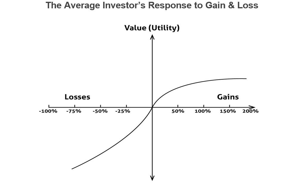
Today I’d like to share with you what I believe to be the most important chart in investing.

Kind of simple, huh?
Deceptively simple.
This chart captures what I believe to be one of the most important challenges that all investors must overcome in order to really succeed in the markets – the tendency to prefer our losers over our winners.
What do I mean by “prefer”?
The chart above shows how we respond to market gains and losses.
The vertical axis, is what behavioral economists call “value” or “utility”.
I like to think of it as the emotional impact of our gains and our losses.
As our gains get bigger, the emotional impact of those gains tapers off. If we get a 100 percent gain, that’s fantastic. If we get a 200 percent gain, you know, it’s great but, emotionally, it’s not twice as great as a 100 percent gain.
On the other hand, when it comes to losers, as losses increase (to the left) the impact of those losses doesn’t taper off in the same way that the impact of the gains tapers off.
As losses get bigger, the emotional impact or our attachment to those losses, intensifies.
If we get a 25 percent loss, that hurts. But if we have a 50 percent loss it hurts a whole lot more. You have a 75 percent loss, it’s really a killer.
As losses grow, they become all-consuming. We get very attached to those losing positions. We can’t let go of them.
That’s why I say that many investors prefer their losers… because they hold on to them.
Maybe they’ll even double down on those losses to try to get back to “break even” quicker.
I can’t tell you how many times I’ve heard people say, “I’ll get out when it gets back to break even.”
If you ever hear yourself say, “I’ll get out when it gets back to break even,” it’s time to get out now. It’s a sign that, regardless of what happens with the stock, your mind isn’t in the right place about it.
Benjamin Graham, the father of value investing and mentor to Warren Buffett, once said, “The investor’s chief problem and even his worst enemy is likely to be himself.”
That certainly rings true for me.
Many investors, after getting burned a few times, realise that taking big losses is a really bad idea.
Not only is it tough on your portfolio but it’s tough on you psychologically. It beats you up and discourages you from taking advantage of future opportunities.
That’s why many investors quickly agree with the idea that you’ve got to cut your losers.
If we refer back to our original chart, we might say that this more “experienced” type of investor can get his or her behavior chart to look like this:
This “intermediate” level of investor has stopped the bleeding by learning to limit losses.
Few investors ever truly master the art of staying in their winners
There’s a famous saying – I think that it was by John Maynard Keynes – that goes, “Markets can remain irrational longer than you can remain solvent.”
That’s true! Financial markets regularly go places that no one expects them to go.
The key to life-changing gains in the stock market is to make that market madness work for you instead of against you – turning our original chart on its head so that it looks like this:
Come to think of it, I guess that I have to take back what I said earlier… THIS is the most important chart in investing.
To the growth of your wealth,
Richard M. Smith, PhD
Founder & CEO, TradeStops.com

