
“Corrections happen during growth-rate cycle slowdowns, they don’t require a recession.” – Lakshman Achuthan, Economic Cycle Research Institute
Q1 hedge fund letters, conference, scoops etc
On Sunday afternoon, I fly to Dallas to attend the 16th annual Mauldin Economics Strategic Investment Conference (SIC). Last year, I presented on market valuations and probable future returns. Valuations were high and probable returns were expected to be low. Not a new story if you are a regular OMR reader. That story hasn’t changed as you will see in the data I share with you today.
It’s been a little over a year since last year’s conference and with little change in the “overvalued” stock market story, I wondered about returns since then to now. So I went to Morningstar’s website and here is what I found. The State Street SPDR S&P 500 ETF (symbol “SPY”) is up 2.79%.
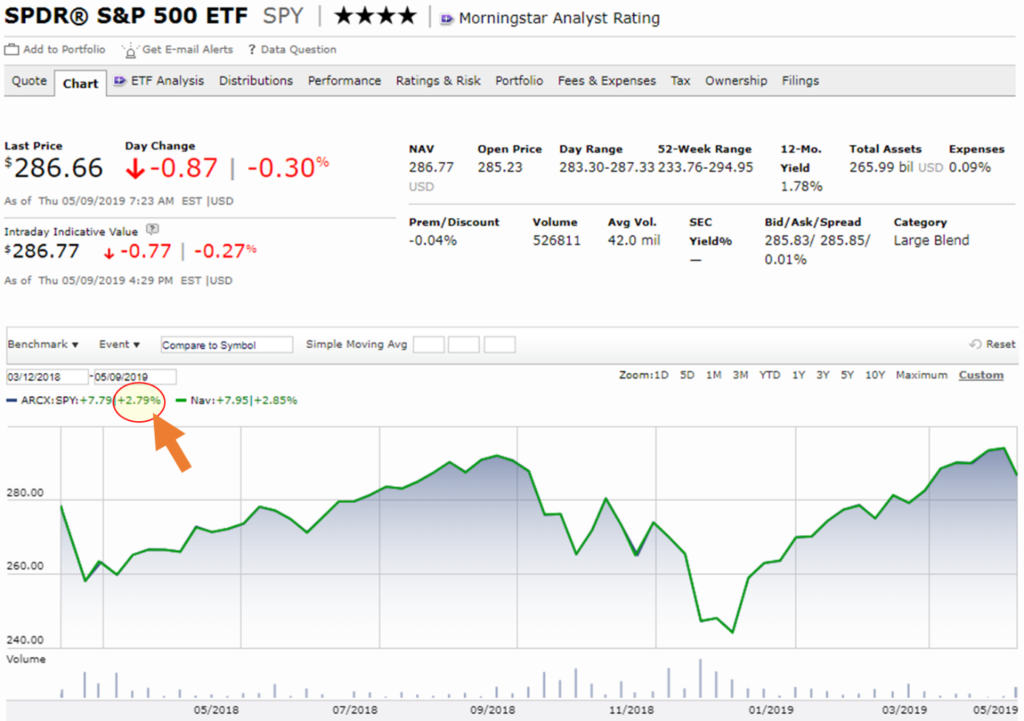
Source: morningstar.com
And, as you are well aware, that ride to 2.79% got bumpy late last year. Of course, your client might point to the 2019 gains and say, “Ha! Not so fast, Steve.” My point is that the roller coaster ride we’ve been on since last year’s conference is likely the ride we will be on until we solve the debt and underfunded pension problems. Bottom line: Valuations remain high (as you’ll see below) and forward real returns over the coming 5, 7, 10 and 12 years range between -3% to +3% when a 2% inflation rate is factored in. Worse, if the solution(s) are inflationary.
At this year’s conference, I’ll again argue that our starting conditions matter, the price we pay for something matters and that valuations can tell us a great deal about the returns we are likely to receive.
Yesterday, I was on a preparation call with my co-panelists, Peter Boockvar and Lakshman Achuthan. Peter is going to talk about just how sensitive the economy is to movements in interest rates and he’s going to tie economic numbers, such as autos and credit cards to the change in monetary policy (e.g., when QE1 ended and how much we felt. Same with QE2 and QE3 and what we are seeing again today). Everything is related to what the Fed is doing… everything is related to the cost of money.
Lakshman will present on whether we can have recessions when the Fed is providing liquidity. His firm has been looking at cycles for decades. Their basic finding is that even when expansions last a long time, they still eventually end. He’ll show us where we sit in the current cycle. I’ll be sharing my favorite recession watch charts and will moderate our panel discussion. You’ll find those charts below.
Both Peter and Lakshman are prominent economists. Peter is the Chief Investment Officer of Bleakley Advisory Group, a $3.5B wealth shop. Lakshman leads the Economic Cycle Research Institute (ECRI), a firm famous for predicting the economy. Both are frequent media guests. The IMF said, “ECRI has had a very stellar record. They’ve been making pretty bold calls and going against the conventional wisdom. So far their record has been one of the most impressive, and has been written up in the press as well as talked about in policy circles.”
Grab a coffee and find your favorite chair. This week, let’s take a quick look at the April month-end valuation data (still richly priced) and you’ll find the most current recession data as well. Good news! No sign of U.S. recession in the coming six to 12 months. Though the global picture continues to deteriorate and, of course, the geopolitical risks are rising.
I am really excited about the conference next week. David Rosenberg, Dr. Lacy Hunt, Louis-Vincent Gave, Bill White, former President George W. Bush, Liz Ann Sonders, Carmen Reinhart, Felix Zulauf, George Friedman, Dr. Michael Roizen, Mark Yusko and Howard Marks. I feel like a kid in a candy store. I’ll be taking notes and sharing with you over the coming weeks. Stay tuned.
If you’d like to follow the conference on Twitter, here are a few resources:
Follow me @SBlumenthalCMG, Peter Boockvar @pboockvar, John Mauldin @JohnFMauldin, David Rosenberg @EconguyRosie. You can follow the conference in general using the following hashtag: #SIC2019
I’ll be taking notes and sharing with you over the coming weeks. Stay tuned.
♦ If you are not signed up to receive my free weekly On My Radar e-newsletter, you can subscribe here. ♦
Follow me on Twitter @SBlumenthalCMG
Included in this week’s On My Radar:
- Market Valuations and Coming Returns
- High Global Recession Risk, Low U.S. Recession Risk (for now)
- Trade Signals – Percentage of Investor Money in Equities Near Record High
- Personal Note – Happy Mother’s Day
Market Valuations and Coming Returns
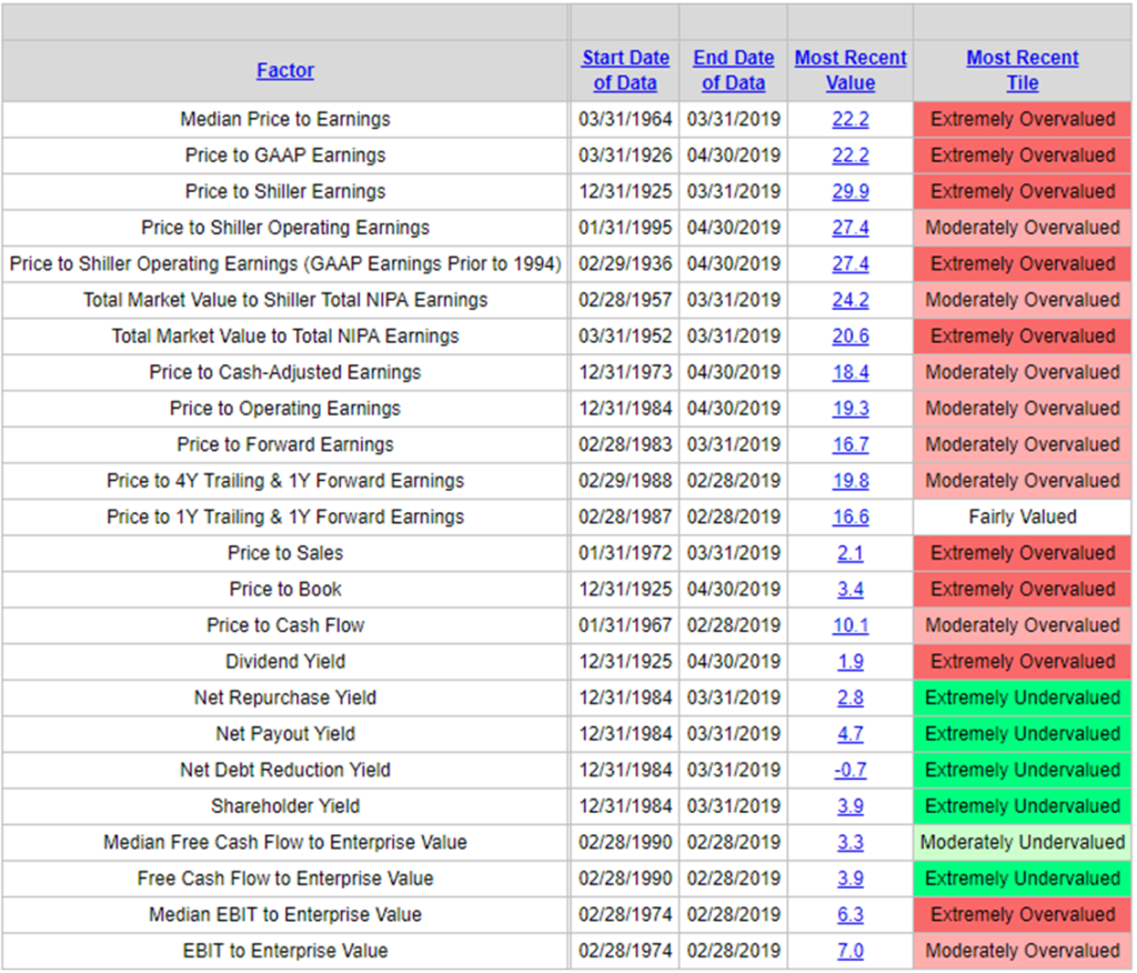
Source: Bloomberg Barclays Indices, Bloomberg Finance LP, Bureau of Labor Statistics, Department of Commerce, Fed, NDR, Robert Shiller, Irrational Exuberance, S&PDJ Indices, Standard and Poor’s
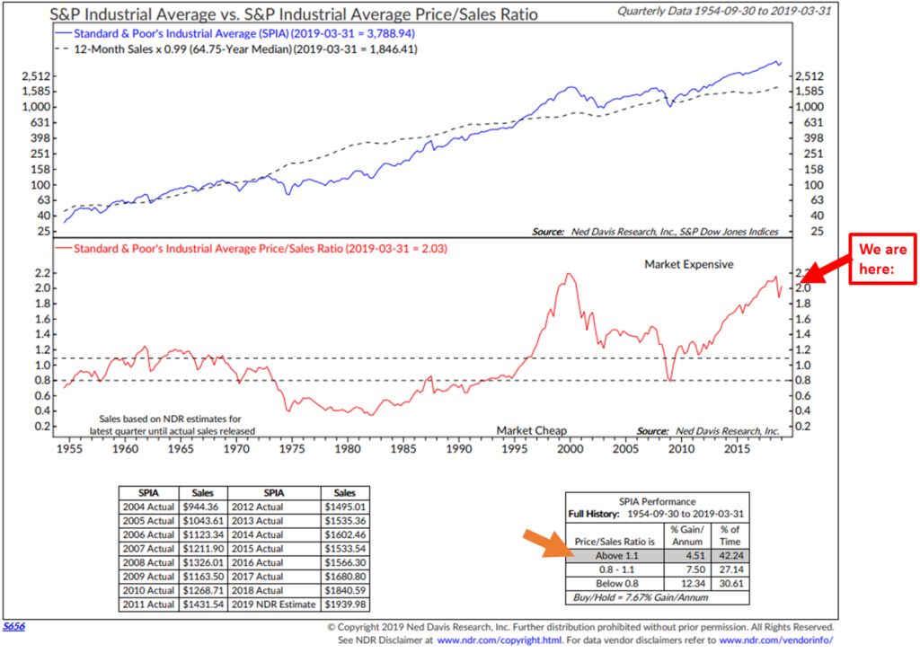
Price to Sales:
Bottom line: At 2.03 times sales, this valuation metric is almost as high as it was in 1999 and sits just off the second highest “Market Expensive” level since 1954. Note annualized returns (Orange arrow bottom section).
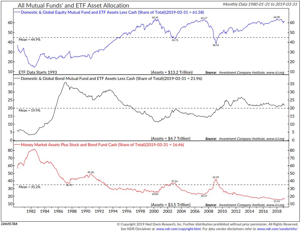
These high valuations are coming at a time when investors are heavily invested in stocks. What this next chart is telling us is that individual investors are overweight equities.
- In 1999, just prior to the great tech wreck, investors had 63.65% allocated to equity funds and ETFs as a percentage of total.
- In 2007, 63.17% was allocated to the equity category.
- In early 2018, a record 64% was allocated to the equity category. We currently sit at 61.58%. What this means is investors are once again uber-bullish on equities and we should heed the warning.
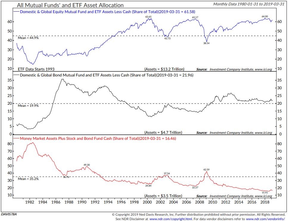
* Note, too, the near-record low level allocation to money market funds. More defense than offense. I remain focused on a disciplined downside risk management game plan. Simple rules can help.
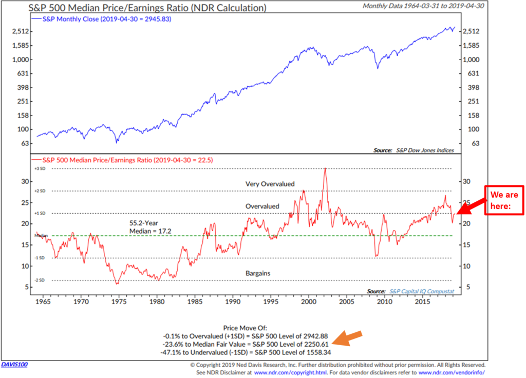
Median P/E:
What this next chart tells us is that “median” P/E is in the “Overvalued” zone (if you take all of the 504 companies that make up the S&P 500 Index and rank their trailing 12-month Price to Earnings ratio from highest to lowest and select the P/E in the middle, you get the median P/E). This chart plots the median P/E each month going back to 1964 (red line in the middle section). The average over the last 55.2 years is 17.2. NDR calls that “Median Fair Value.” You can see that the red line swings from time above and below the 55.2-year median (the dotted green line in the lower section).
From a handicapping perspective, I like the data in the lowest section in the chart. Currently, to get to a point that the market is fairly priced, a 23.6% correction from the April close (2,945.83 on the S&P 500 Index) is required. That would be a much better “starting condition” then where we sit today… “Overvalued.” The getting will get really good if we get down to the “Undervalued” zone on the chart. That will require a 47.1% correction. I’m suggesting we might see that level in the next recession. For now, stay wary as the market remains richly priced.
I normally show coming 3-, 5-, 7-, 10- and 12-year return forecasts. Let’s pass on that this week. The story hasn’t changed.
You’ll find the latest equity and fixed income market trend signals in Trade Signals. First you will see commentary on recession risk and then you’ll find the link to click through to see the equity market charts.
High Global Recession Risk, Low U.S. Recession Risk (for now)
“What’s the message the stock market is sending in rocketing to record highs, outside of loving the Powell put kicking in. What’s the bond market saying with the sharp decline in bond yields, outside of responding to the Powell shift. I tried to reconcile by saying stocks are betting on a rebound in the global economy (with 40% of S&P 500 revenue sourced from overseas) in coming quarters while Treasury yields were focused on the current slowdown and being suspect of that recovery.
I’ll say this that if we get higher tariffs this week and talks break down between the US and China, you can kiss that hoped for global economic rebound goodbye.”
– Peter Boockvar
I’ll be pressing Peter on this subject next week. As for the global economy, recession is looking highly probable. Next are my favorite recession watch charts. The first looks at the global economy (likely in recession) and the next several look only at the U.S. economy (all clear for now).
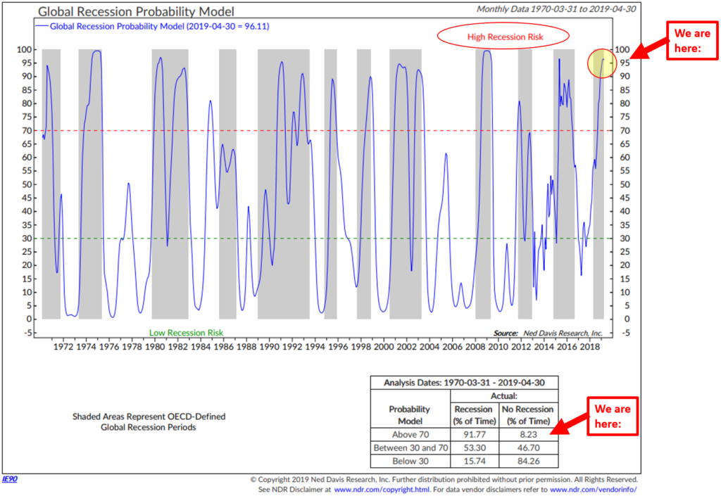
Global Recession Probability Indicator – High Recession Risk
- First, focus in on the blue model line. It plots the probability of recession based on leading indicators from 35 different countries (non-U.S.). The current reading is 90.94, meaning there is a 90.94% probability that we are in a global recession.
- Note the red dotted line. Note the grey shaded bars that show periods in which the OECD said there was global recession (something known more than six months after the fact).
- Bottom line: When the blue line rises above the red dotted line, the global economy was heading into or was already likely in recession. A global recession has likely started, which is unfavorable for global equities.
- Finally, focus in on the data box in the lower right section of the chart.
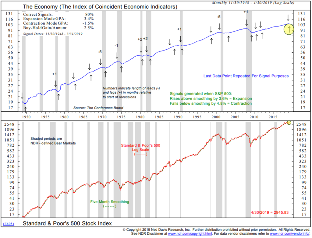
The Economy Based on the Stock Market Indicator – Low U.S. Recession Risk
- Focus on the up and down arrows. Economic expansion signals (up arrows) are generated when the S&P 500 Index rises by 3.8% above its five-month smoothed moving average line. Economic contraction signals are generated when the S&P 500 Index falls by 4.8% below its five-month smoothed moving average line.
- Current signal is for “Contraction.” The most recent recession signal occurred on December 31, 2018. See down arrow upper right hand side of chart (yellow highlight).
- Note the 80% “Correct Signals” in the top left corner of the chart. This process has done a good job at signaling prior to recessions. Not perfect but pretty good.
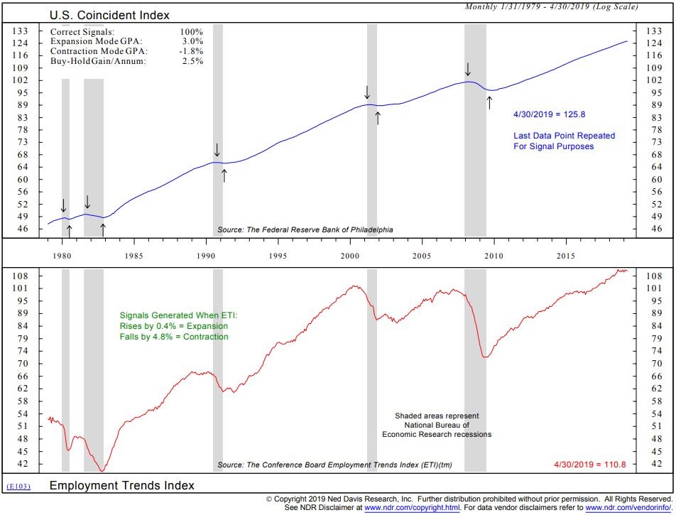
Recession Probability Based on Employment Trends – Low U.S. Recession Risk
- Focus in on the up and down arrows. Down is a recession signal. Up is an expansion signal.
- Expansion signals are generated when the Employment Trends Index rises by 0.4% from a low point.
- Contraction signals are generated when the index falls by 4.8% from a high point.
- Current signal indicates expansion. Last signal date in 2009.
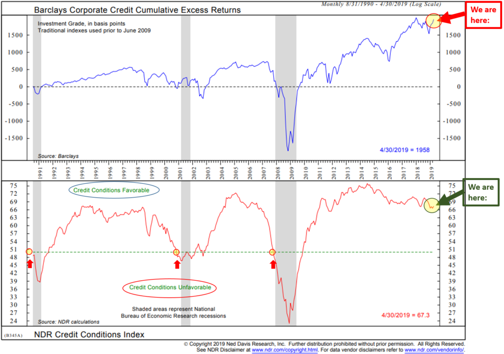
Credit Conditions – Recession Indicator – Low U.S. Recession Risk
- Focus in on the lower section of the chart. A drop below the green dotted line has preceded the last three recessions. A relatively small data set but the idea is that when lending tightens up “Credit Conditions Unfavorable,” recession tends to follow. Grey bars indicate periods of recession.
- Currently, lending conditions are favorable.
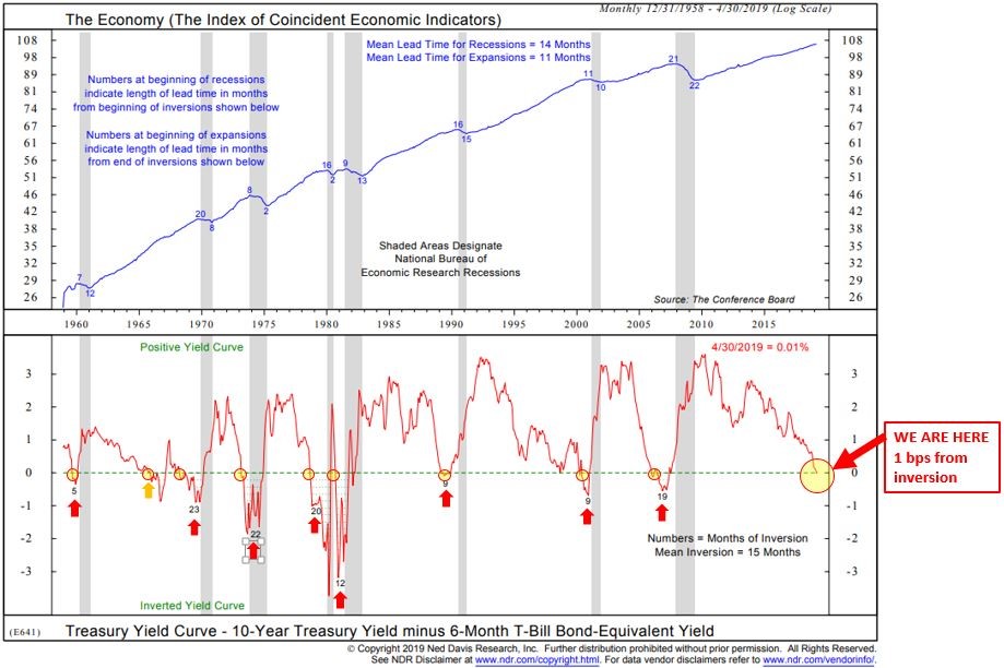
U.S. Economy vs. Yield Curve – Low U.S. Recession Risk
- Watch for a drop below the green dotted line.
- Such drops below 0 is what is known as an inverted yield curve. It is when the six-month Treasury Bill yield is higher than the longer-duration 10-year Treasury Note yield.
- An inverted yield curve has preceded every recession since 1958 (lower section of chart).
- No current signal of U.S. recession but nearing inversion.
- Note that once the yield curve inverts, recession follows about a year later.
I’m keeping an extra close eye on the NDR Credit Conditions chart. I believe that when funding dries up, the rubber will meet the road. Defaults will spike.
This next chart plots the price trend of the PIMCO High Yield Bond mutual fund. The solid blue line is a simple moving average price trend line. The trend in the HY market is about to change (note in the upper right where the daily price trend is about to drop below the moving average trend line). I believe that important information is embedded in price behavior. The price trend in the high yield bond market will lead the NDR Credit Conditions Index… meaning when the trend changes, we should take note.
Further, when the Credit Conditions Index turns negative and when the price trend in the high yield bond market is down, look out. That’s when defaults will spike. The strong will survive and the system will reset. That’s when we should all get aggressive with our allocations. It will feel so bad, it will be good. Hold that thought in mind.
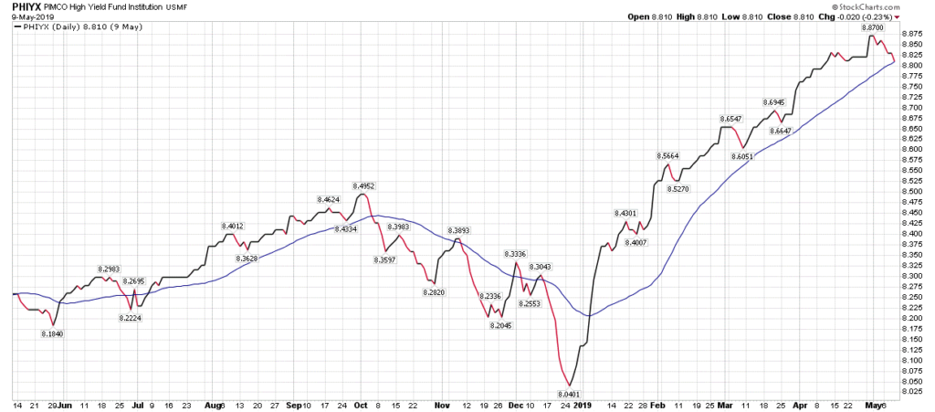
Source: StockCharts.com
I’ve been trading the trends in the HY bond market since the early 1990s. For what it’s worth, we moved to short-term Treasury Bills today (May 10, 2019). Not a recommendation for you to buy or sell any security. Just a data point. The trade could turn out to be a whipsaw or it could turn out to be the beginning of something greater. As a trader, I’m emotionless – and following my process. I’ll adjust accordingly.
For more on what the trend signals are telling us about the equity and fixed income markets, you’ll find a signal dashboard in the Trade Signals section immediately below. Note that Trade Signals is posted every Wednesday afternoon. Therefore, today’s HY sell signal will not be reflected in that post.
Trade Signals – Percentage of Investor Money in Equities Near Record High
May 8, 2019
S&P 500 Index — 2,879
Notable this week:
I’ve been looking at market valuations this week and will share an update with you in this coming Friday’s On My Radar. One chart stood out to me and I thought I’d share it with you today (focus in on the percentage investors are allocated to in terms of equity exposure, bond exposure and money market exposure and compare to prior periods of time):
Here’s how to read the Ned Davis Research “All Mutual Funds’ and ETF Asset Allocation” chart:
- The top section plots the percentage allocated to U.S. Domestic and Global Equity MFs and ETF assets since 1980. As of March 31, 2019, 61.58% of money is allocated to this category.
- The middle section looks at the percentage allocated to bond MFs and ETFs over time.
- The bottom section looks at the percentage allocated to money market funds over time.
Bottom line: Investors are overweight equities. In 1999, just prior to the great tech wreck, investors had 63.65% allocated to equities funds and ETFs as a percentage of total. In 2007, 63.17% was allocated to the equity category. In early 2018, a record 64% was allocated to the equity category. We currently sit at 61.58%. What this means is investors are once again are uber-bullish on equities and should heed the warning. Note too the near-record low level allocation to money market funds. More defense then offense. I remain focused on a disciplined downside risk management game plan. Simple rules can help.
As for simple rules: you’ll find this week that the major trend indicators remain bullish, specifically the U.S. equity market and U.S. bond market (high grade and high yield). For example, next is a look at the “Golden Rule” applied to the DJIA from 1900 to present. Note all of the gains have occurred when the 50-day Moving Average is above the 200-day Moving Average.
Click here for this week’s Trade Signals.
Important note: Not a recommendation for you to buy or sell any security. For information purposes only. Please talk with your advisor about needs, goals, time horizon and risk tolerances.
Personal Note – Happy Mother’s Day
We’ll be celebrating Susan on Saturday night with a big cookout in our backyard. She is coaching Sunday evening and I’ll be heading to Dallas. The weather has been somewhat iffy lately but Saturday is looking to be in the high 60s with no rain. That’s better than it’s been. I’m thinking steaks, a fire in the fire pit, cold IPAs in hand and the wine cellar is looking healthy: California Cabernet, Italian Barolo and my favorite French Bordeaux.
Wishing you a wonderful Mother’s Day. There is no one on the planet more important than mom. Hold your glass high and give her all your love.
Have a great Mother’s Day weekend!
Best regards,
Stephen B. Blumenthal
Executive Chairman & CIO

