
As part of Merk’s in-house research we regularly evaluate a consistent set of charts covering the economy, equities, fixed income, commodities and currencies. The aim is to keep our eyes open and to look through the noise of the headlines, avoiding the distractions of sensationalized click-bait. In sharing this content, we offer a cross-check to your own thinking and aim to add value to your own process.
[timeless]
Q1 hedge fund letters, conference, scoops etc, Also read Lear Capital: Financial Products You Should Avoid?
We invite you to download a copy of the slide deck (PDF); or to view the video:
U.S. Equity Market Chart Book
S&P 500 Valuation Indicator
Aggregate Equity Allocation Proxy (From Fed Z.1 Report) and S&P 500 Subsequent 10 year annualized Returns
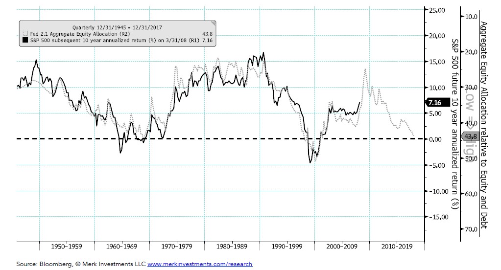
Analysis: If history is any guide, this chart suggests annualized S&P 500 returns (w/o dividends) might be close to 0% over the next ten years. The grey dotted line is the market value of US equity divided by the total market value of US equity and debt, which is used as a proxy for aggregate equity allocation. The data comes from the quarterly Federal Reserve Z.1 report. At 43.8% the equity allocation is relatively high right now. I’d likely get positive on the longer term outlook for the S&P at an allocation below 30%, which would likely only be after a substantial bear market in the index.
Business Cycle Backdrop
Leading Economic Indicators (LEI) Index and the S&P 500
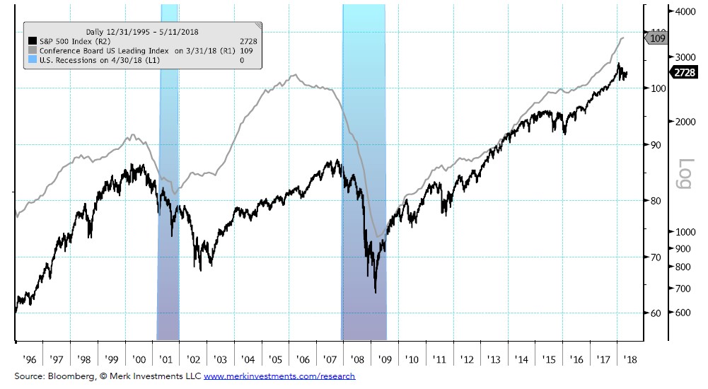
Analysis: LEIs continue to trend higher, historically a positive sign for stocks
I’d get incrementally negative on the outlook for the S&P if the LEI Index began trending down YoY while the S&P was at or near bull market highs
Earnings Backdrop
S&P 500 Trailing 12-month Earnings per Share and the S&P 500
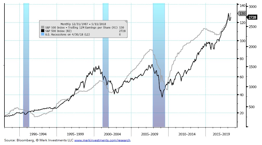
Analysis: S&P 500 earnings continue to grow. Factset’s latest forecast for 2018 earnings growth is 19.2%, higher than the forecast at the time of the last high in the index (1/26/18). On one hand: reported and expected earnings continue to climb, on the other hand: recent earnings growth may be due in part to oneoff factors like the recent tax cuts. Also, as expectations climb there is an increased chance that earnings disappoint in the quarters ahead. I’d get incrementally negative if the trailing 12-month earnings move sideways/down. It’s worth noting that this framework may be more of a coincident or confirmatory rather than a leading indicator with respect to a major market top.
Global Growth Backdrop
Large Economy Manufacturing PMIs (Purchasing Managers Index) and the S&P 500
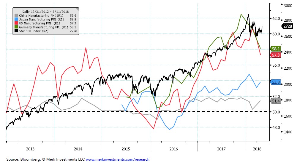
Analysis: US, German, and Chinese manufacturing PMIs ticked lower. Japanese PMIs ticked up.
I’d get incrementally negative on the S&P outlook if any of these PMIs fell below 50
U.S. Financial Conditions
Chicago Fed National Financial Conditions Index and the S&P 500
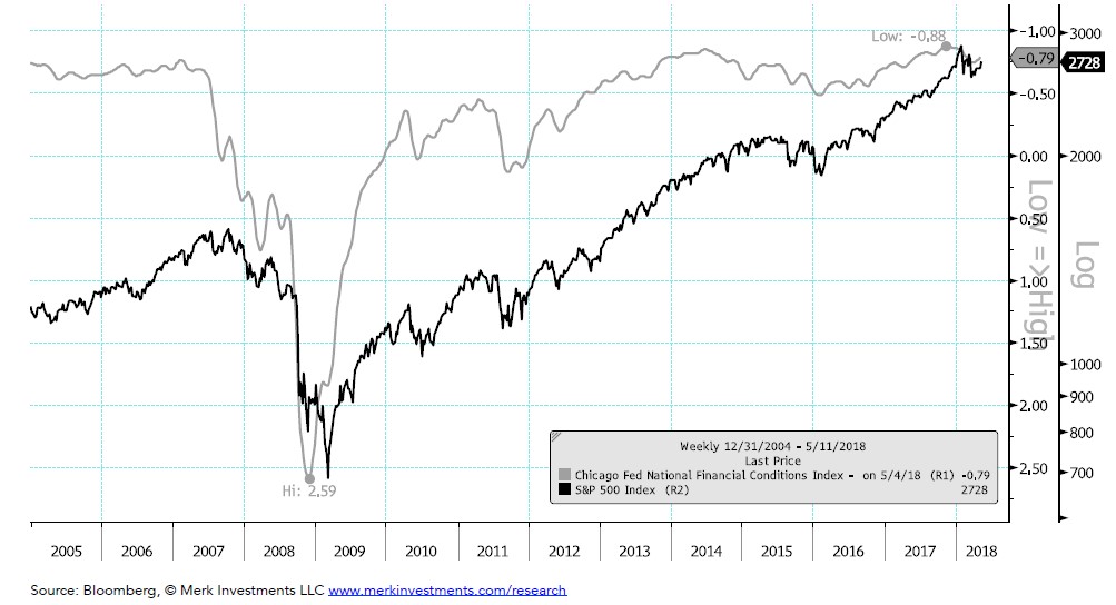
Analysis: Financial conditions have eased slightly since last month’s report
I’d get incrementally negative on the outlook for the S&P if conditions moved through the -0.50 level
Market Breadth
Percent of S&P 500 member stocks above their 200d Moving Averages at New Bull Market Highs
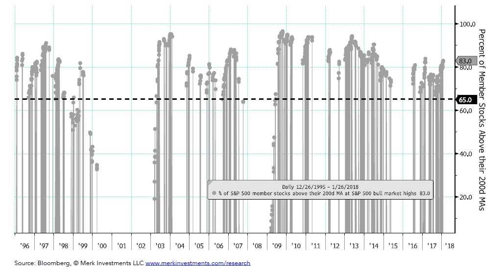
Analysis: Breadth at the previous high (1/26/2018) was at 83%, historically breadth has been weaker at major market tops.
Said differently, the breadth on 1/26/18 was not indicative of a major market top
I’d get incrementally negative on the outlook for the S&P if the S&P made new bull market highs with breadth below 65%
Market Sentiment
Percent that are Bullish (bulls / bulls+bears) and S&P 500
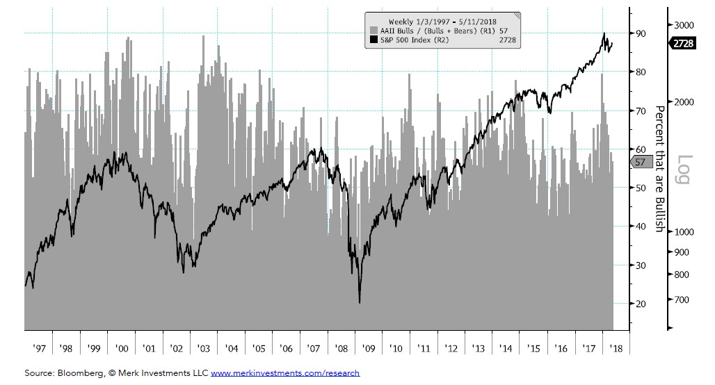
Analysis: Bullishness is currently near the long term average,
In my view this chart should be looked at from a contrarian perspective,
Given that sentiment is near the average my current interpretation of this chart is neutral
I’d get incrementally negative with sentiment above 70
Margin Debt
Margin Debt and S&P 500 (top panel), 12 month change in Ratio of Margin Debt / S&P 500 (bottom panel)
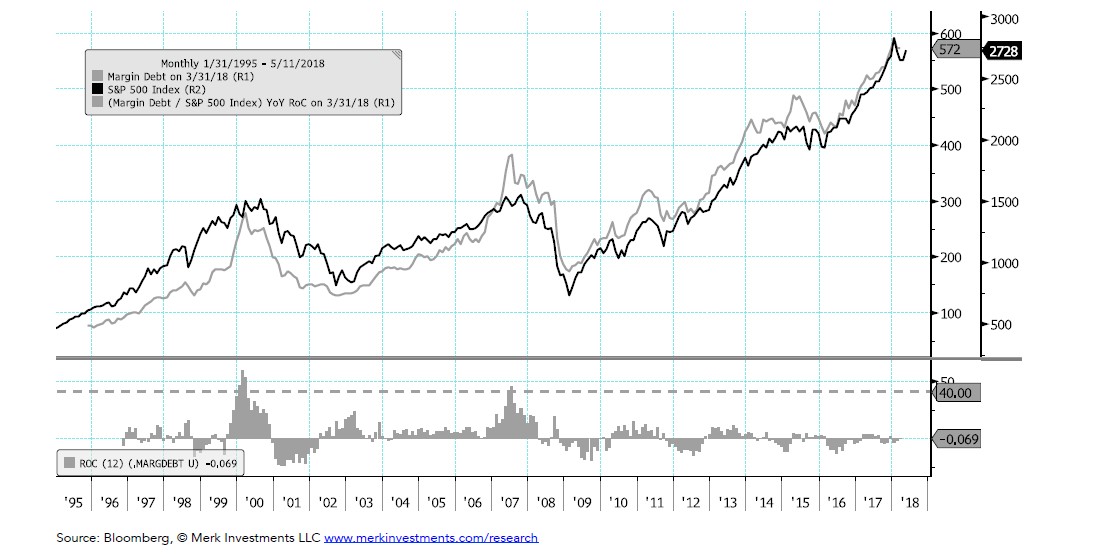
Analysis: Margin debt is not rising relative to the stock market (bottom panel), perhaps supportive of the idea that the bull market has further to go. I’d get incrementally negative on the outlook for the S&P if YoY RoC of the ratio (bottom panel) moved above 40.
See the full PDF below.
The investing audience should view this content in the context of their individual investment process, time-horizon, and goals.
|

Merk Investments® LLC is an investment advisor registered with the Securities and Exchange Commission (“SEC”). This does not mean that we are sponsored, recommended, or approved by the SEC; or that our abilities or qualifications in any respect have been passed upon by the Commission or any officer of the Commission.
Article by Axel Merk, Merk Investment

