
This week it’s the US Dollar Index. Unless you’ve been living under a rock (or maybe that saying should be updated – unless you’ve been living out of range of wifi), you will have noticed 2 key things about the US dollar index: 1. The US dollar bull market seemed to end at the end of 2016; and 2. A violent short-squeeze kicked off in April.
[REITs]
Q1 hedge fund letters, conference, scoops etc, Also read Lear Capital: Financial Products You Should Avoid?
But while I certainly would agree that it has all the classical signs of a short-squeeze, I would be quick to point out that there may be a little more to it than that. The chart of the week comes from a report on the outlook for the US dollar (which also dealt with the implications for crude oil prices). The chart shows my composite yield support indicator for the US dollar against the DXY, with a substantial gap… “the alligator’s jaws”.
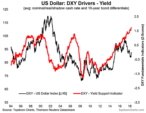
That yield support indicator includes the signal from 10-year bond yield differentials, and a combination of nominal, real, and shadow policy rate differentials. So it provides a broad and signal-intensive view of the direction and magnitude of yield support for the US dollar. Coming out of such a large price adjustment, and a situation where futures positioning had moved from crowded longs to crowded shorts, when you add in the chart above it makes you think that this could be more than just a short squeeze.
There have been a number of occasions in history where the US dollar goes through a turning point, and the does make the transition between bull vs bear market… but in the process has a substantial “last laugh” move. And I think that there is a real risk that what we are seeing now is the initial stages of precisely that kind of move.
Follow us on:
LinkedIn https://www.linkedin.com/company/topdown-charts
Twitter http://www.twitter.com/topdowncharts
Article by Callum Thomas, Top Down Charts

