
Welcome to the Weekly S&P500 #ChartStorm (by email!)
Q3 2021 hedge fund letters, conferences and more
The Chart Storm is a weekly selection of 10 charts which I hand pick from around the web (+some of my own charts), and then post on Twitter.
The charts focus on the S&P500 (US equities); and the various forces and factors that influence the outlook – with the aim of bringing insight and perspective.
Hope you enjoy!
p.s. if you haven’t already, subscribe (free) to receive the ChartStorm direct to your inbox, so you don’t miss out on any charts (you never know which one could change the whole perspective!)
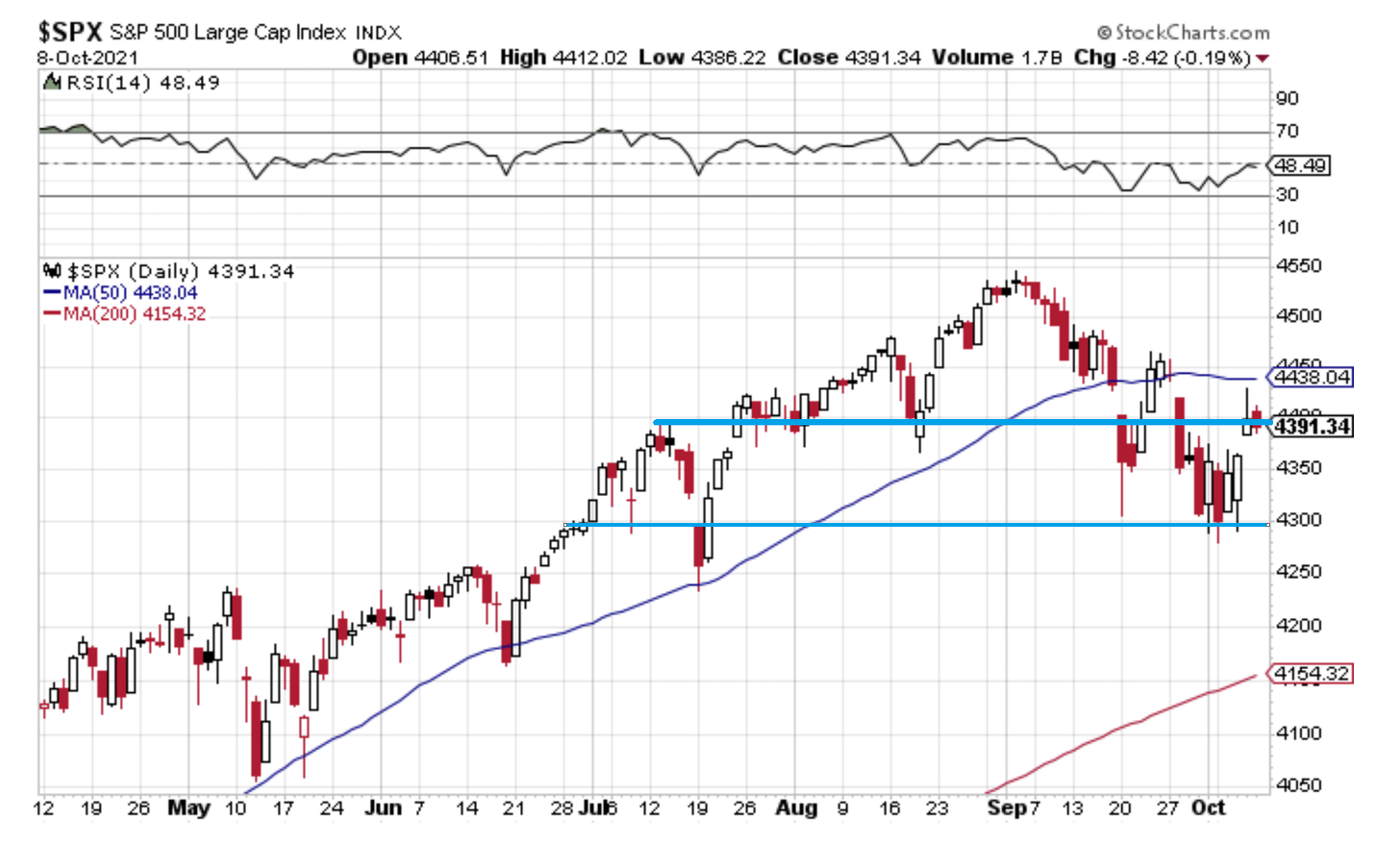
1. S&P500 — the lines in the sand: For much of the past year just focusing on the 50-day moving average was enough as the market reliably bounced off that moving target. But at this point it can’t even hold that 4400 level – to me that is the more important objective in the immediate term. Reassuringly though it is at least holding onto the 4300 level, for now. As far as I’m concerned, those two levels are the key triggers/guideposts for the next big move.

Source: @Callum_Thomas
2. FinTwit Activity: This chart appears to show a surge in tweet activity by “Finance Twitter“ — it confirms what I intuitively/qualitatively know: the timeline tends to be busier when markets are going down. Is there information in this? Seems to be, but late-2018 provides a good example of how surges in this indicator can portend a deeper fall to come, vs a panic bottom.
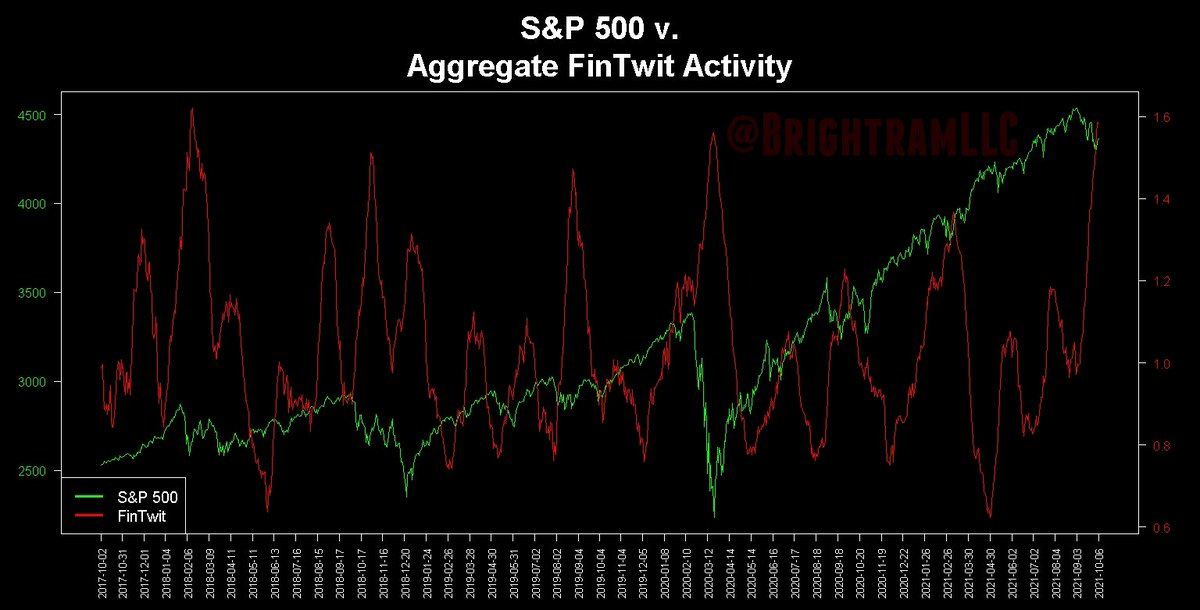
Source: @BrightramLLC
3. Investor Movement Index: According to TD Ameritrade “Equity exposure in TD Ameritrade client accounts increased in the September period. The IMX moved slightly higher to 8.66 (up 3.34%) in September, as clients used the pullbacks from all-time highs to purchase equities.” … who can blame them? Buy the Dip has been the standard operating procedure for much of the past year. Thing perhaps to focus on though with this chart is how stretched sentiment is.

Source: TD Ameritrade IMX
4. Stocks vs Bonds: This particular stocks vs bonds ratio looks to be breaking out after an initial attempt a few weeks back. Clearly bonds are at a turning point (Fed tapering + covid case tapering, not to mention sentiment/technicals), and with stocks going sideways for now this has set things in motion. The issue will be how fast bonds move, as at a certain point if bond yields move too far too fast it will derail stocks. For now though, I would say on balance it’s a positive macro/market sign.
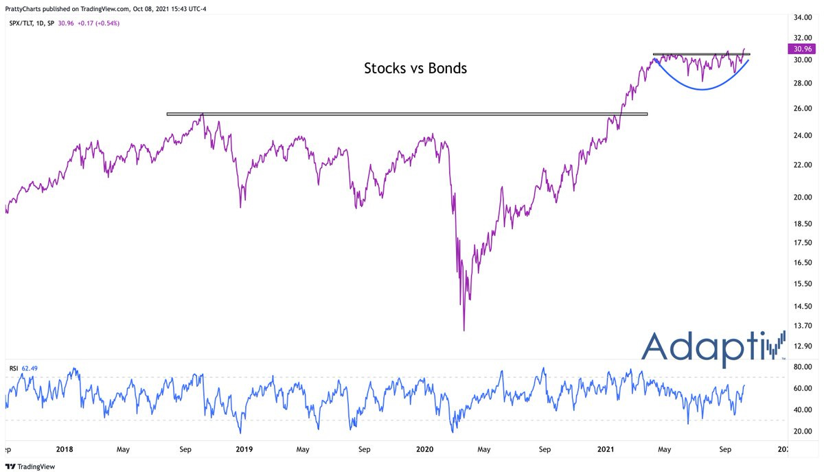
Source: @PrattyCharts
5. Yield Curve and Financials: Another bond market indicator – the yield curve has begun to steep again as 10-year yields price in better growth/inflation/sentiment and the Fed continues to insist on no rate hikes any time soon. Typically this is good news for financials; particularly notable as the sector attempts to breakout to new highs.
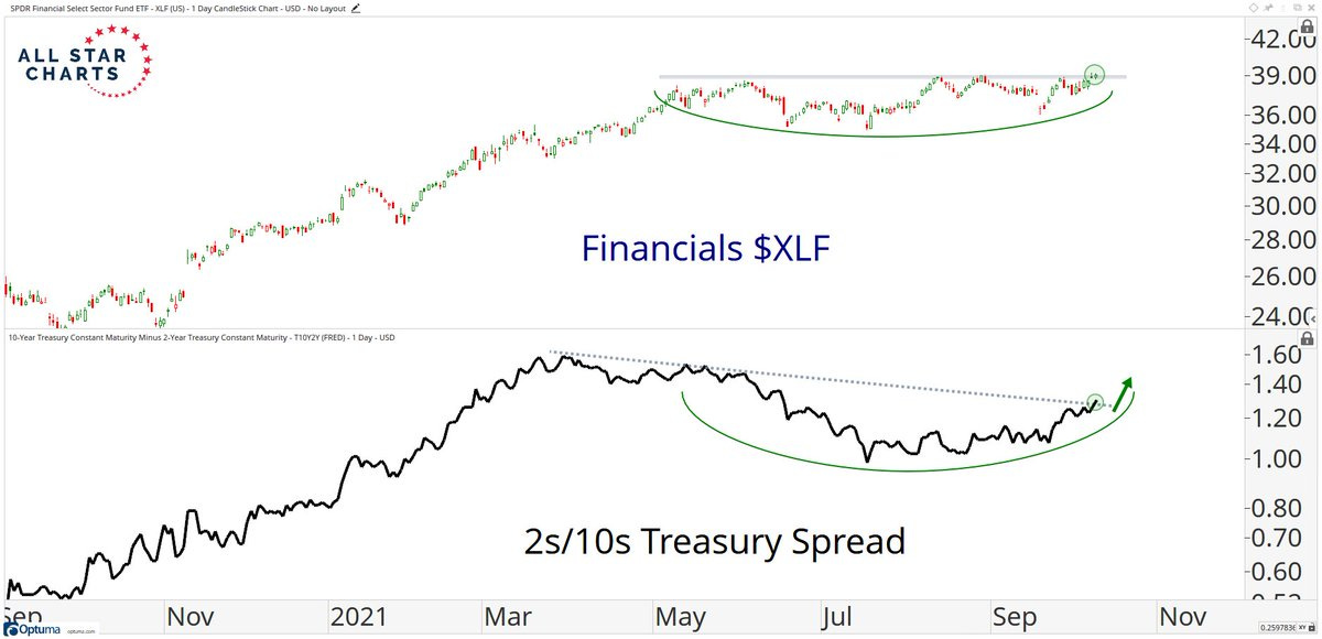
Source: @sstrazza
6. Thoughts on “Cyclical Value“ and “Defensive Value“: Things are starting to look up for “Cyclical Value“ (energy & financials), which is in line with the previous couple of charts and the big moves in energy commodities. I would say though that defensive value probably has to wait until later in the cycle…
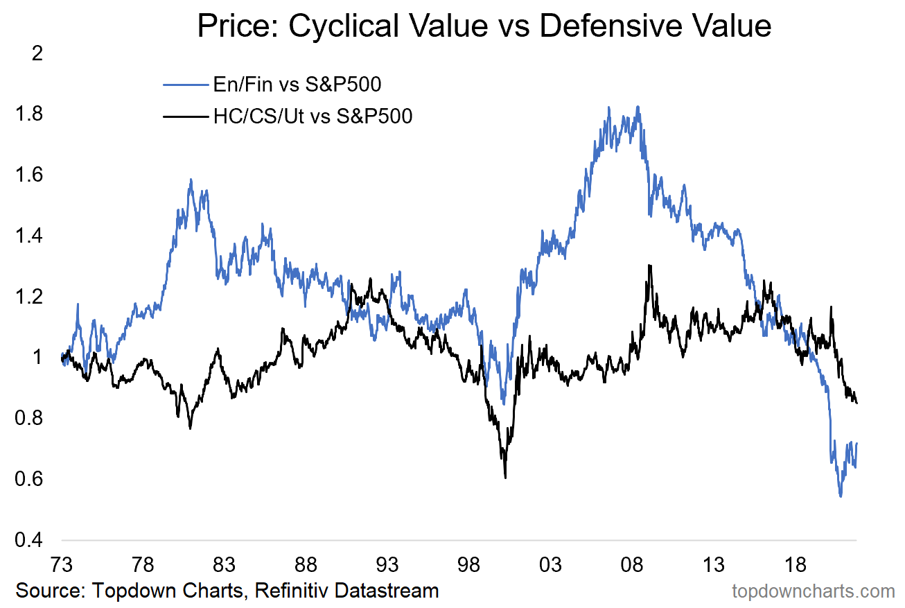
Source: @topdowncharts
7. Speaking of Defense (the other kind)… This one kind of surprised me to see how US Aerospace & Defense has been lagging behind – despite all the Cold War 2.0 sabre rattling and the increasingly apparent emergence of a new space race. Very interesting stuff, and at least one thing interesting in that chart is a prospective double-bottom.
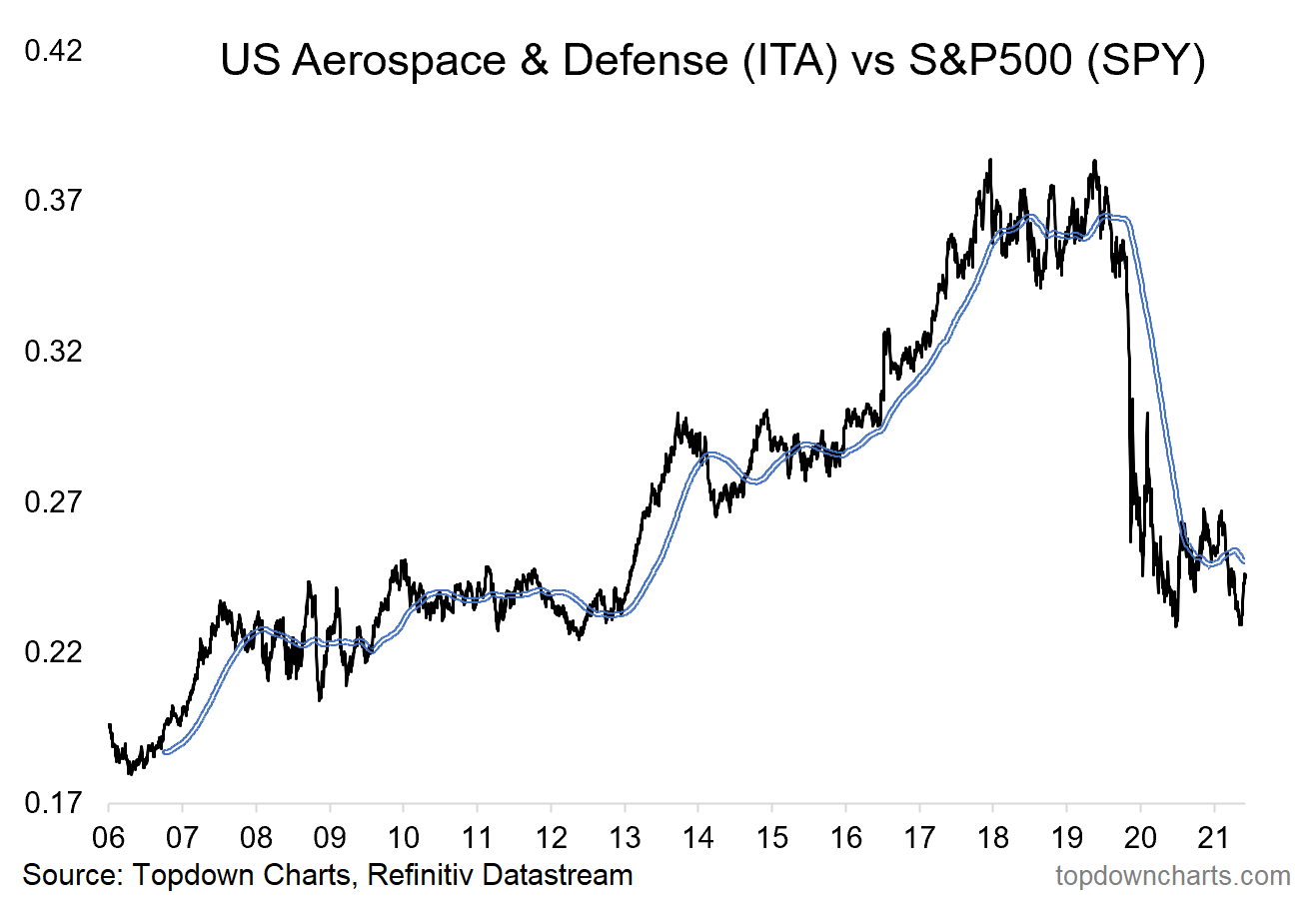
Source: @topdowncharts
8. Dividends: A new ATH in dividends is on the cards; according to Howard Silverblatt “dividends are back, as record earnings, sales, and margins have permitted companies to return to the business of returning shareholder wealth.”
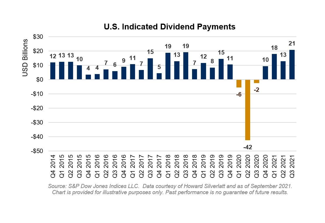
Source: @sherifa_issifu
9. Stick a Fork in FAANG: With global corporate tax hikes in the pipeline (a possible end to global “tax arbitrage“ [or insert other euphemism for tax avoidance!]), increasing regulatory risk, eye-watering valuations, and now… an apparent lower high in their market cap weighting: Look out below (or alternatively look out besideways – i.e. maybe they don’t drop but just meander along for a while).

Source: @SarahPonczek
10. New Paradigms in Valuations: Here’s a very interesting line “Are the traditionalists being too cautious? Some well-known Grahamites, after all, considered the market full valued as far back as two years ago. Clearly, something is going on that the old analytical concepts cannot account for.” — that comes from an article in 1987. You heard the same things during the dot-com bubble, and very similar words more recently. We never learn. Never.
Source: Today in 1987!
Thanks for following, I appreciate your interest!
oh… that’s right, almost forgot!
BONUS CHART >> got to include a goody for the goodies who subscribed.
US Profit Margins: following a disastrous global pandemic and widespread supply chain issues, US economy-wide profit margins are… at a 10-year high.
Specifically what the chart shows is US corporate profits before tax (with IVA and CCadj) as a percentage of GDP.

Clearly a lot has gone right for corporates: very easy and cheap financing, wage subsidies and other fiscal economic-life support measures, and a stimulus-fueled (and reopening-driven) economic rebound. Some of these things will be hard (won’t happen) to replicate going forward.
Indeed, most signs point to very tight labor markets and rising wage pressures as global supply chain blockages send prices skyward (and prompt many to rethink how they even arrange their supply chain e.g. reshoring, etc). Shorter-term energy costs are rising as well, and I think it’s likely we’ve already seen the low point in interest rates, and of course global tax rates.
So it seems likely this rebound in profit margins will be short-lived.
—
Best regards,
Callum Thomas
SPONSOR: ( …he’s me!)
My research firm, Topdown Charts, has a new entry-level Substack service, which is designed to distill some of the key ideas and themes from the institutional fund manager service to provide the same high quality insights at a more accessible price.
Give it a try and let me know what you think
Article by TopDownCharts

