
Regular readers might recall back at the start of the year I published my 10 Charts to Watch for 2021. The number 2 chart showed the global backlogs indicator, I noted:
Q4 2020 hedge fund letters, conferences and more
“(the issue of backlogs) has 2 key implications: upside risk to inflation, and a likely spike in activity as firms attempt to clear backlogs and restock inventories”
I thought it would be timely to take a look at this topic and expand a little bit because it is having such an important impact across a number of the key markets.
Also, I recently took the chance to survey my followers on LinkedIn and Twitter to see what the thinking was around how long these supply chain/logistics/backlogs issues would take to clear… consensus is it will be *at least* a 6-month thing, with around 50% of respondents seeing it staying with us through to 2022.
That’s pretty significant, especially given the impact this issue is already having on pricing pressures, commodities, and perhaps even other markets…
The Chart
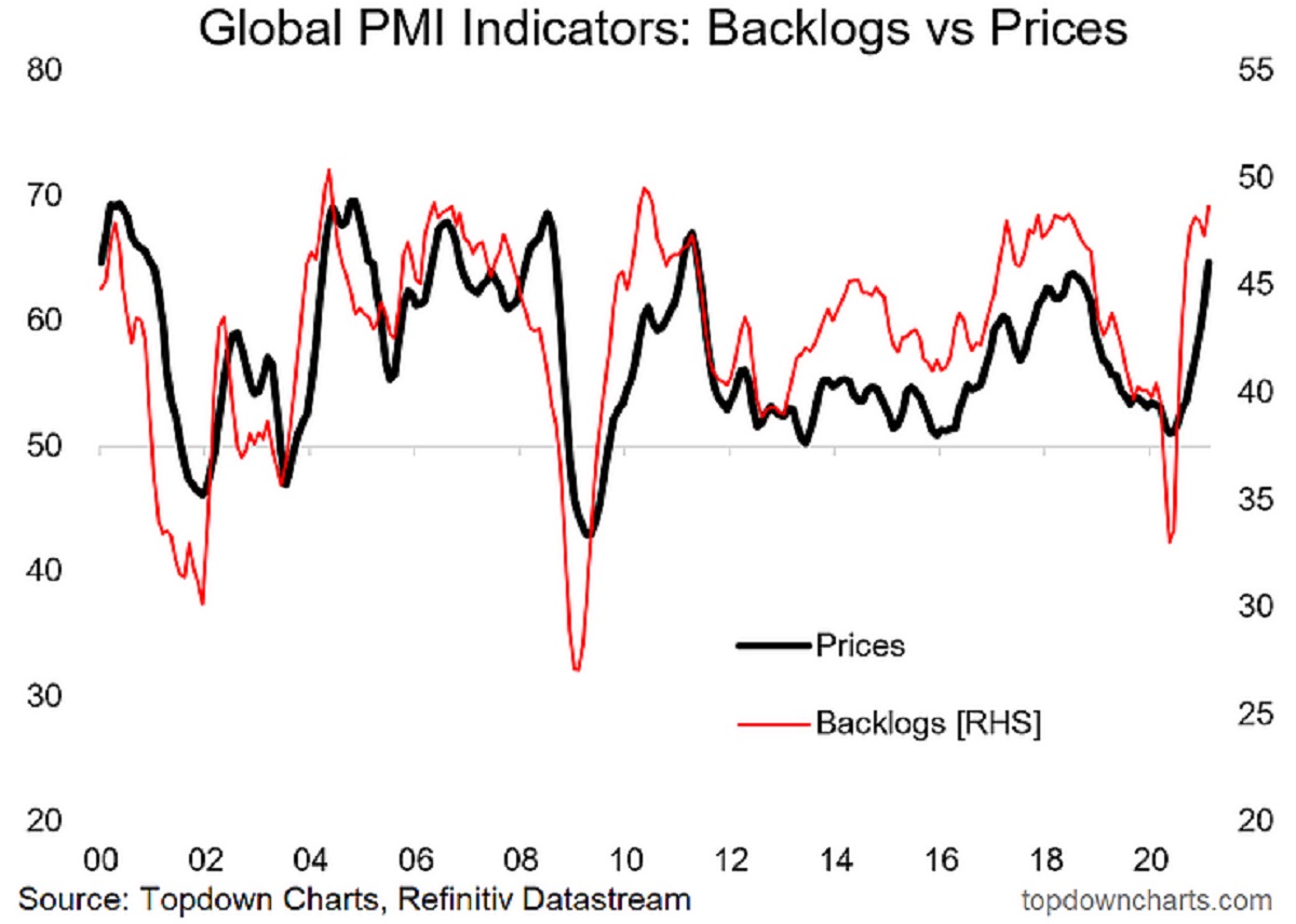
Here it is: the chart shows the global composite indicator for backlogs – which is mapped out against the pricing pressure index (both are based on the global PMI data). There is a very clear historical linkage where surges in backlogs tend to be followed by a surge in pricing pressure. This time is no different.

Not being satisfied with one data point, I decided to make a composite Google search trends indicator [looking at terms such as: shipping delay, out of stock, restocking] to seek confirmation (or otherwise), and indeed, we can see that there remains heavy interest in this topic… which we can construe that people are at least interested in this issue – but likely also are increasingly impacted by it.
But wait… what are we even talking about and how did this happen?
It’s a multi-faceted issue with lots of moving parts, but at a high level: basically we turned the global economy off almost all at once, and then slowly and partially turned it back on. We also poured a bunch of stimulus onto the global economy and forced increased demand for certain goods (healthcare, electronics, plastic screens, etc).
Naturally factory operations were sort of stop-start, and logistics channels got clogged up as the new-normal set in. The end result is inventory shortages, long wait-times for fulfilment, lots of “out of stock” signs, and as we know from ECON101: with demand up and supply down …upward pressure on prices.
Impact on Markets
First off, in terms of the prices indicator, pricing pressure and commodity prices are more or less synonymous as the chart below shows. Indeed, pandemic disruption has had a meaningful impact on commodities on the supply side: lockdowns have impacted on production and operations, credit dislocations of last year and uncertainty on the outlook disrupted capex plans, and shipping shortages have pushed up costs (and end prices). I think it’s fair to say that across commodities there is a certain premium in the price due to the impact of this issue.
But onto everyone’s favorite market: US treasuries, we find some clear (and logical) linkages… Up until early last year, there was a tendency for US 10-year treasury yields to walk a similar path to the global PMI price indicator (which makes sense in so far as pricing pressures reflect demand (growth) and inflation – two of the key fundamental macro drivers of bond yields).
Following the covid-crash… and in particular the global monetary policy push, which saw the big QE central banks revive their bond buying programs (and dozens of new initiates for large scale asset purchase programs across developed and emerging markets). The combination of extremely depressed risk appetite and massive-scale global bond purchase programs by central banks drove a (temporary?) break in the relationship in the chart.
But as bond purchase programs have begun to taper (most programs were front-loaded), risk appetite has returned, fiscal stimulus has stepped up, and importantly: backlogs have created pricing pressures… the US 10-year treasury yield has begun to return to its old habits.
While the term “transitory” no doubt comes to mind in terms of pricing pressures and backlogs – and they fundamentally are temporary issues – as the surveys indicated: this issue could be with us for a while. So it’s fair to say that there may still be plenty of runway for bond yields to head higher yet.
The other thing is, as I’ve outlined extensively in my reports to clients, inflation upside risk is a much bigger and wider story than the issue of backlogs (although it is part of the story). But that’s a topic for another day.
Summary and Key Takeaways
The pandemic has created turmoil across the global supply chain and the resultant backlogs are putting clear upward pressure on prices. This is immediately obvious in commodity markets, but perhaps a less obvious impact is the upward pressure this is starting to put on bond yields.
It’s important to approach macro and markets with an open mind on emerging issues like this because while we can leverage data and past linkages, we really don’t have any true parallels to the current environment in recent history.
Hope you enjoyed this post, I am continuing to do a lot of work on this and related issues so be sure to follow for further updates and insights.
Best regards,
Callum Thomas
Head of Research and Founder of Topdown Charts
Follow us on:
LinkedIn https://www.linkedin.com/company/topdown-charts
Twitter http://www.twitter.com/topdowncharts
Article by Top Down Charts

