
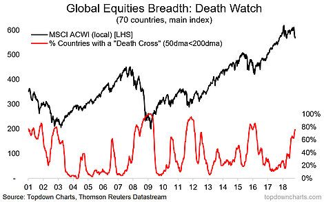
One relatively obscure technical chart pattern, known ominously as the “death cross”, has caught my attention recently. The reason is, if you look across the 70 countries we monitor, almost 80% of markets have seen this omen light up. So, what does it mean for global equities? Read More…
Q3 hedge fund letters, conference, scoops etc
Looking for deeper insights? Try taking a free trial of our institutional research service
Article by Top Down Charts

