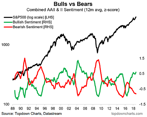
This is one of my old favorite charts. It looks at the combined, smoothed longer-term trend in investor sentiment from the AAII survey and the II sentiment surveys. The last time I really talked about this chart was back in 2016 when the twin corrections drove a big reset in sentiment, where bulls got washed out and bearishness became popular again. But now all we’re seeing is more and more bullishness and less and less bearishness – with very little reaction to the correction in the S&P500 earlier this year.
[activistinvesting]
Q2 hedge fund letters, conference, scoops etc
This is not the type of thing you see at the *start* of a bull market, it’s the type of thing you see towards the later stages of a market cycle. In other words, when you get an extreme build up in positioning and emotion across investors, it leaves them vulnerable to a shakeout should their optimistic expectations be disappointed against.
Article by Top Down Charts

