
Following is just a short note with some things I’m looking at in the market and what I want to see before we start getting more aggressive on the long side.
Q3 hedge fund letters, conference, scoops etc
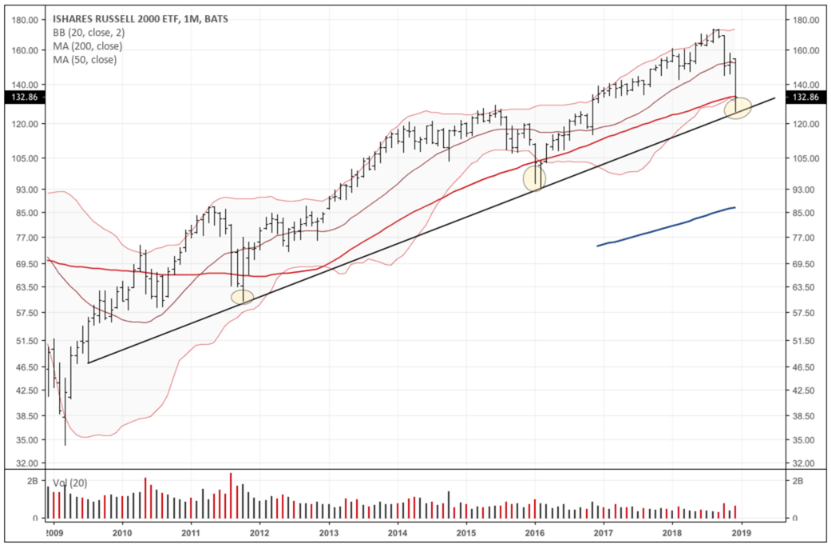
First, the Russell small-cap index is knocking up against major support this week in its long-term trend line, 50mma (red line), and lower Bollinger Band (chart below is a monthly). We should see more of a bounce here but I’m skeptical it will hold and am looking for a further move lower — I’ll show you some of the reasons why, below.
One of the big ones is the stubbornness in the II Bull/Bear sentiment data to budge. We’ve talked about this chart quite a bit over the last few months, so I won’t continue to beat a dead horse. But II sentiment provides the highest signal to noise out of all the sentiment data, imo. And the failure to see capitulation on this size of a selloff in the market, tells me this move lower most likely isn’t over.
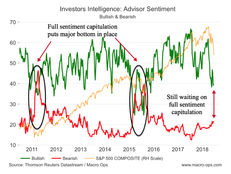
Now we don’t NEED to have a full capitulation sentiment reset for a bottom to be in. But it’d give me a lot more confidence to be aggressive on the long side if we did.
Besides sentiment, here are a few other things that I want to see to confirm that a new uptrend is starting.
Druckenmiller often talks about how “the market is smarter than he is and so he listens to the signals of the market” to figure which side of the trade to be on. One of the things he pays close attention to — and we at MO do as well — is the trend in cyclical versus defensive stocks.
Check out the chart below which shows cyclical versus defensive stocks (orange line) and the S&P in blue. When the orange line is trending up, it means that cyclical stocks are outperforming defensive sectors. This means that investors are moving to more risk-on positioning as their perceptions of future economic growth become more optimistic. And when the orange line trends lower it means that investors are becoming more defensive in their positioning and more pessimistic on the market outlook.
Now we want to see the trend in cyclical vs. defensive confirm that of the broader market. When it doesn’t, it often means that the market’s internals are shifting and there’s likely a major change in trend coming, as we can see in this chart.
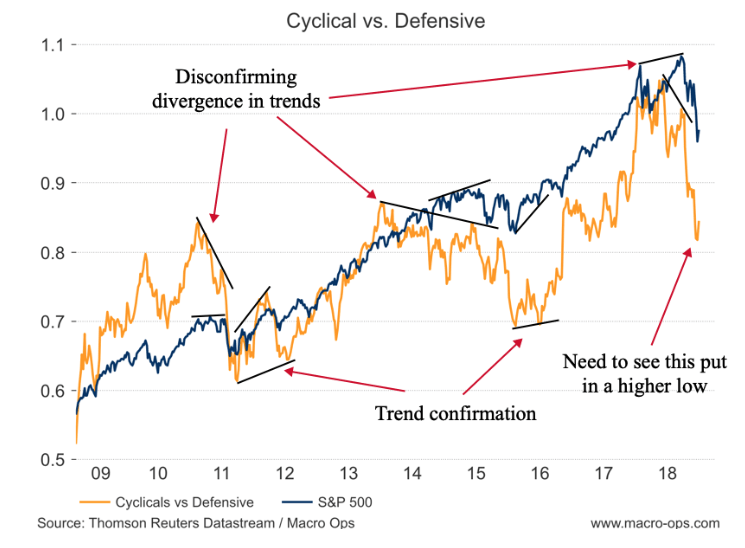
We want to see this orange line (cyclical vs defensive) put in a higher low in order to signal a shift in market internals and confirm that a bottom is in.
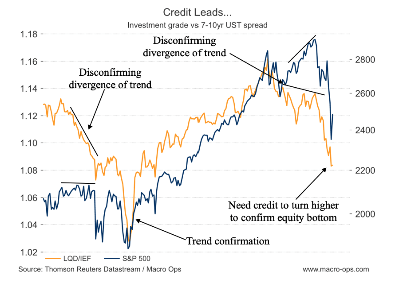
In the hierarchy of traders, bond traders tend to be the most well informed. This is why moves in credit almost always precede large trend changes in the equity market. Similar to the market bottom in early 2016 we want to see the orange line (investment grade bonds relative to USTs) confirm a bottom is in by moving higher. Without this, it’s unlikely any stock rally will have legs…
The below chart is my take on the late Marty Zweig’s Breadth Thrust indicator. It’s simply the 10-week moving average of all NYSE advancing issues divided by advancing plus declining issues: ADVN/(ADVN+DECN).
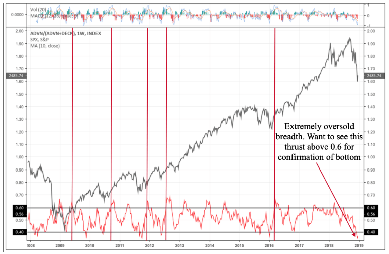
For a true confirmation of a breadth thrust and thus an indication that the market move higher is likely to have legs, we want to see the indicator (red line) dip below 0.4 (lower horizontal black line) and then quickly thrust above the 0.60 level (upper horizontal black line). The vertical red lines show past instances when this indicator has been tripped. Each marks the end of a major down move and the beginning of a major advance.
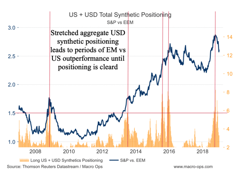
An important question is which markets will lead the next advance: the core (US) or periphery (EM)? I shared this chart in one of our more recent MIRs which shows the aggregate total long USD synthetic positioning in the futures market. Large orange spikes indicate that traders are crowded long USD assets. We can see that when this spike crosses above the red horizontal line, emerging market stocks typically enter a period of outperformance against the US.
We saw one of our largest long USD positioning spikes this last October. And ever since EM stocks have been outperforming, but the positioning has dropped and though still a bit elevated is getting close to a neutral level.
This brings us to our next chart which shows gold (gold line) overlaid on a AUDUSD chart (black line). I’ve written about in the past (link here) about how gold often leads the dollar at turning points. Similar to using market internals like cyclical vs. defensive sectors for confirming/disconfirming signals, we need to pay attention to the trend in gold when it diverges from the inverse trend in the dollar.
The recent divergence between gold and the dollar (AUDUSD) is worth noting. What this tells me is that it’s odds on that we see a sizable dollar selloff in the coming weeks. This view is also in line with the long synthetic dollar positioning that still needs to be worked off.
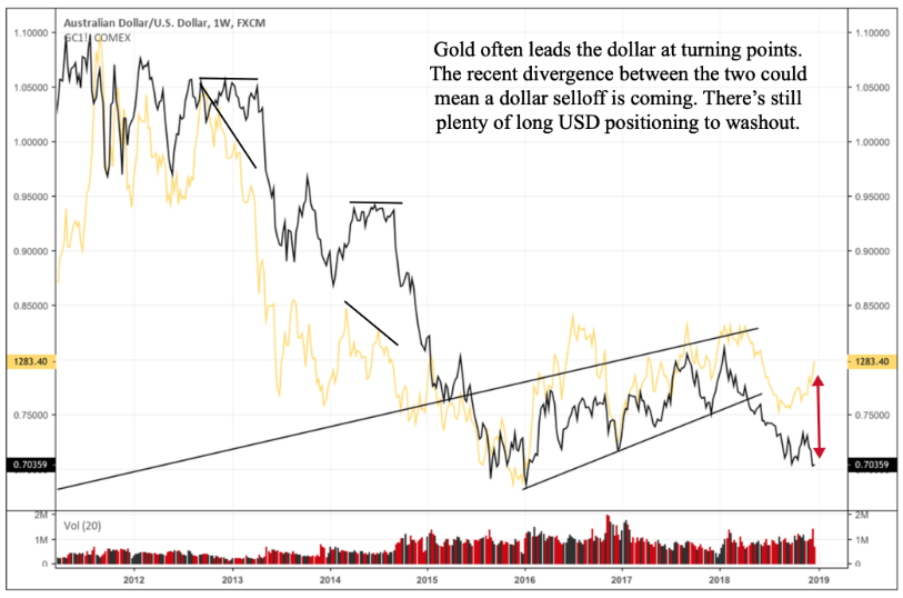
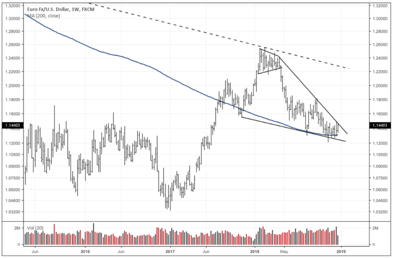
I’m ultimately bearish on gold and bullish on the dollar and would view this move as a tactical short-term one. But due to the tight coiling action in the EURUSD (which makes up more than half the trade-weighted USD basket) it seems as though a sharp move is possible.
I’m not sure what the catalyst is going to be; maybe more noise about a US/China trade deal or a dovish turn from the Fed when the FOMC next meets at the end of January. But it looks to me like we may first see more continued EM outperformance, coupled with a dollar selloff, and precious metals staying bid before the dollar finds a bottom and the US stock market really starts taking off.
Article by Alex, Macro Ops

