This is the fifth of a 10-part blog series where I will go through each of the charts from the 10 Charts to Watch in 2019. The purpose is to add some extra comments and context around the charts, as well as to explain some of the finer details of the indicators.
Q4 hedge fund letters, conference, scoops etc
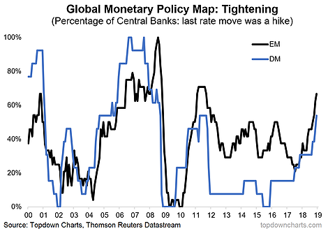
This time we look at one of my “global monetary policy map” charts. I like to keep tabs on global trends by aggregating data and monitoring breadth across countries. It’s been an approach that has helped at major turning points, and the below chart provides a really interesting example.
It shows the proportion of central banks whose last interest rate decision was an increase. I decided to split the indicator into 2 cohorts (emerging markets and developed markets) because it helps add color on the differing dynamics across the two groups, and insight with regards to the equities allocation stance.
Now onto the interpretation. Basically what the chart shows is that rate hikers went from a minority in 2017 to the majority by the end of 2018. Indeed, 2018 was an incredibly rare year in that from May-Dec there were no rate cuts undertaken by the central banks we monitor, and indeed there were over 50 rate hikes across the year for the 37 banks in our database.
The Fed takes most of the press and attention when it comes to monetary policy decisions, but it shouldn’t be lost that globally there was a big move towards policy tightening through 2018. So it shouldn’t be surprising that this global pivot in policy would drive a bit of market ‘indigestion’. Indeed, one of the key themes right now is the transition for central banks from suppressors of volatility in previous years, to now being sources of volatility.
With question marks around the growth outlook it’s likely that central banks will err on the side of pausing and like the Fed, probably move to a slower rate hike path… at least for a while. As for EM (since we’ve covered it a few times now: i.e. PMIs, relative performance, cyclicals vs defensives), the tighter policy settings are not helpful for EM risk assets, but I would highlight that EM equity valuations have adjusted significantly, and EMFX was severely punished last year – leaving it cheap on our metrics now. In other words, it’s in the price now.
So as central banks around the world continue the policy normalization process, it’s important not to lose sight of this late-cycle headwind, as arguably it was a major (if not *the* major) underlying driver of the global equity market correction last year.
And thus the global monetary policy experiment continues, and now we get to find out in real time if the global economy and financial system can finally survive going off of ‘life support’.
For more and deeper insights on global economics and asset allocation, and plenty of good charts you may want to subscribe to our institutional research service.
Click through for free look or a trial…
Article by Top Down Charts

