
Something very interesting is happening right now in global equities, and most people have probably missed it.
Q3 2019 hedge fund letters, conferences and more
A set of unique indicators have put in some rare signals that are usually only seen at the start of a bull market.
That’s right, you heard me: it looks like a new bull market is underway in global equities.
This flies in the face of the current conventional wisdom that the global economy is heading into recession, so it’s a bold statement.
But as I’ll outline in this article, as important as it is to keep an eye on the historical hard data, it’s equally important – perhaps more so, especially at turning points, to listen to price (and to figure out the right indicators at the right time).
As regular readers will know I often use more traditional indicators like valuations, earnings momentum, monetary conditions etc, but technicals form an important part of my overall toolkit and help with rounding out ideas and addressing that critical issue of where the rubber hits the road: timing.
And for those of you wondering, “why global equities?” quite simply because most of my clients are multi-asset investors, and while there’s always a lot of moving parts, for asset allocators it’s often the case that global equities account for the dominant contribution to portfolio risk and return. So it’s something I spend a lot of time on.
For global equities I am a big fan of using market breadth analysis. But as you might expect, I take a slightly different approach…
I run the analysis at a country level (across 70 countries in total). I find this type of approach can give you an early lead on developing trends as those countries at the leading edge begin to stand out first (or indeed, on the risk side as issues begin to flare up and spread).
So I think you’ll find this approach particularly interesting, not to mention the conclusions…
But enough on the preamble, it’s time to look at some charts!
- Number of Countries Making 52-week New Highs
This indicator rose to almost a 2-year high (a 22-month high to be precise). This is simply a count of the number of countries that are trading at a 52-week high. At 15 countries (for reference it’s a mix of EM and DM countries) it’s a strong showing, and the pattern to watch for here is basically a period where there is a dearth of new highs, followed by a sudden upswing, and interestingly enough the threshold seems to be about 15. In short, it’s a classic bull market commencement signal, and we saw this at the start of the last 3 cyclical bull markets (2009-11, 2012-15, 2016-18).
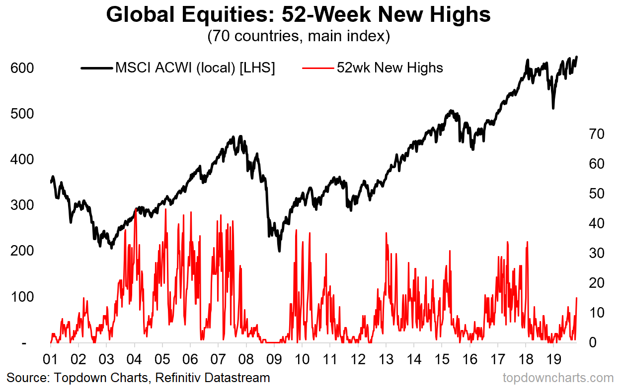
What to watch for: any good student of the markets will know that no indicator is infallible, so the thing to watch for here is follow-through. Ideally we want to see more countries making new 52-week highs; basically for the strength to spread across markets and to maintain.
- The 20% Rule (aka proportion of countries in a bull market)
This unusual indicator tracks the proportion of countries whose main equity benchmark is up 20% or more vs its respective 52-week low. Why would this be interesting?? Very simply, it is a crude approximation of the number of countries in a bull market, where 20% is the (albeit somewhat arbitrary) rule of thumb for whether a stock index is in a bull market. We can debate about whether or not this is a good definition of a bull market, but let’s just call it a best-guess proxy. Again, with this indicator you basically want to see it collapse, and then turn up (like now) to signal a major market bottom and subsequent bull market in global equities. And at this point 27% of countries are in a bull market on the 20% definition (up from just 4% at the low). This chart served me well in building conviction on my bullish global equity call in 2016, so it’s something I’m watching closely now.
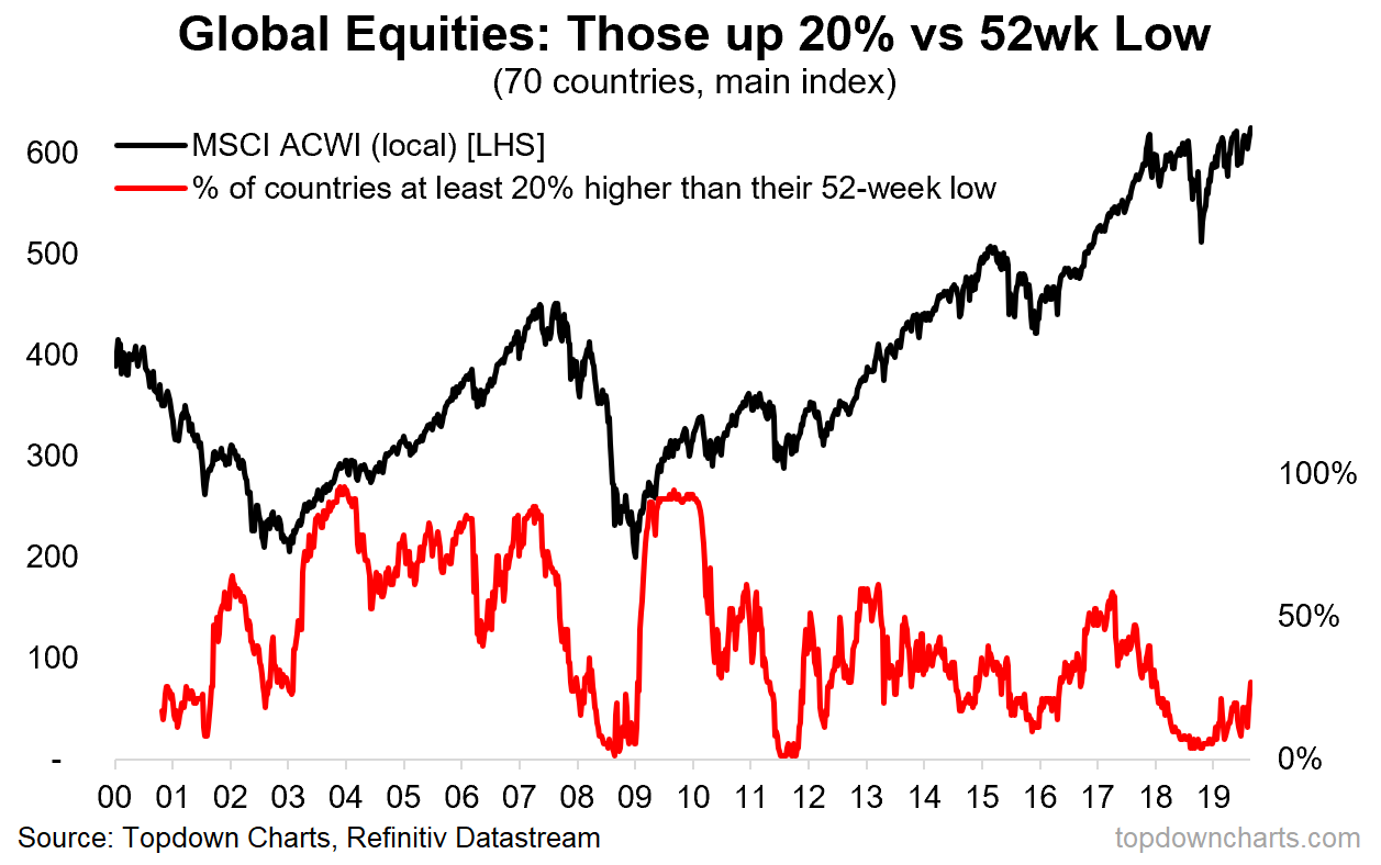
What to watch for: again, we want to see follow-through i.e. more countries triggering the rule and driving that red line higher.
- Thinking Positive…
This one tracks the proportion of countries whose main equity benchmark is positive on a year-on-year basis. It’s very much a similar picture to the other two charts, but this one I think is even more interesting given how at its worst point back in January it was only matched by the financial crisis and the Eurozone debt crisis. What’s also interesting is how it has crossed up through that key threshold – basically sounding loud and clear a signal that a new bull market is underway. But also worth highlighting here on this chart is firstly, that the MSCI All Countries World Index [ACWI] actually made a new all time high last week, and also worth highlighting is how dismal the performance of the MSCI ACWI *excluding USA* has been (the grey line) — indeed when you look at this chart, the idea of a new bull market coming after this mini-bear/ranging market starts to make a little more sense.
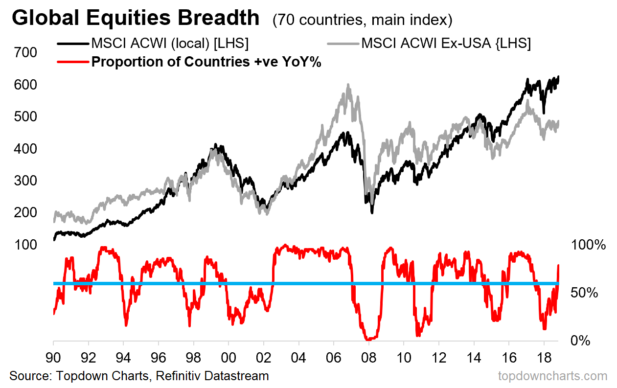
What to watch for: basically we’ve already got the main thing to watch for, and that’s the indicator crossing that threshold after falling to a washout/capitulation point.
Final Thoughts and Bottom Line
Bottom line: based on 3 different breadth indicators for global equities, we have seen a clear and classic picture of a new cyclical bull market getting underway.
But I also want to make passing reference to the rest of my analysis (I was recently on the road and talked through this with clients), which in essence is entirely consistent with the message from the breadth indicators that we are in about to enter a new bull market.
On my metrics in absolute terms global equities are not expensive (slightly cheap), and indeed relative to bonds the equity risk premium actually looks pretty good. Add to that the fact that fund manager/institutional investor positioning remains fairly light (based on surveys, anecdotes and actual data from custodian accounts) as well as a clear reset in earnings expectations, sentiment is arguably contrarian bullish. And perhaps most important of all, the global monetary policy pivot is clear, material, and reinforces my core view that we see a rebound/re-acceleration in the global economy heading into 2020 (call it a late-cycle extension). In other words, it’s not just the technicals (and the implications of this analysis extend across asset classes).
Article by Callum Thomas, Top Down Charts

