

Spoiler Alert: Not Even Close
It seems obvious to so many that interest rates drive the value trade. After all, growth stocks have much longer-dated cash flows than value stocks and thus should be a “longer duration” asset and move more with longer-term interest rates, right? “Growth (or often just ‘tech’) stocks soar on plunging interest rates” (or vice versa) has become a common wise-sounding observation in the last few years. In fact, this is all taken as an axiomatic given in countless pundit and press observations. However it’s not nearly that simple, and mostly it’s just not true.
My colleagues actually demonstrate that this relationship is more ambiguous and complicated than the above logic suggests. I’m going to take this on too, but in a simpler fashion, perhaps due to the wisdom of age, but also perhaps due to the atrophy of mathematical ability that comes with age.
Let’s first just look at some empirics. Below is the rolling five-year monthly correlation of the Fama-French value factor (HML) returns for the U.S. with the contemporaneous change in the U.S. 10-Year Treasury yield.
Q2 2022 hedge fund letters, conferences and more
Rolling 60-Month Correlation of HML-Devil with the Change in the 10-Yr Treasury Yield
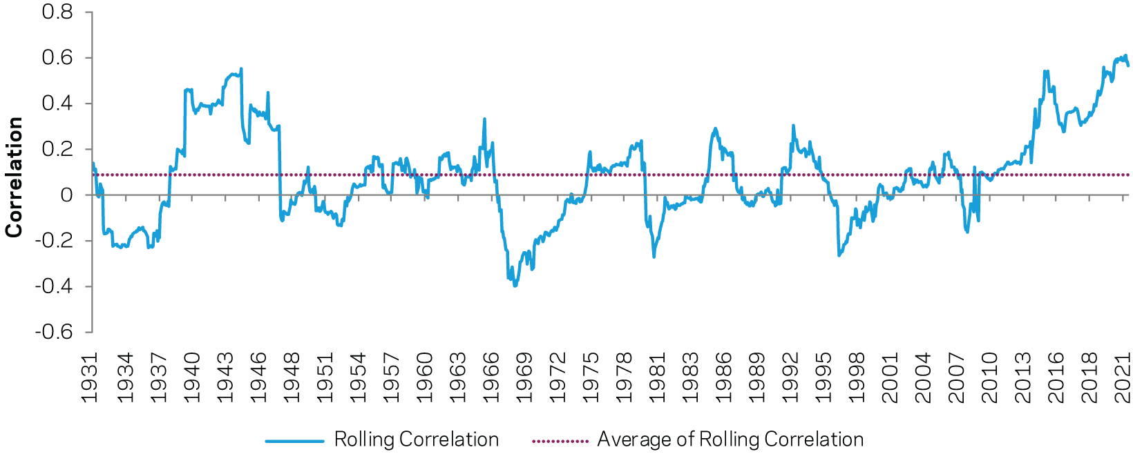

The average correlation is quite trivial (around 0.10), although (like every time series ever) rolling subperiods vary. In particular the most recent five years has seen quite high correlations between the value factor and interest rates, bouncing around the highest ever observed and economically significant. Of course this recent trend greatly influences pundit comments, as many implicitly see their job as explaining to you why what has been happening will now happen forever and was actually really quite obvious before it happened.
For those who prefer scatterplots, the below plots the monthly return to HML-Devil (y-axis) versus the monthly change in the 10-year Treasury yield (x-axis) from 1950-2022. The blue dots are 1950-2017, while the red dots are the last five years (with trend lines for both added). The song remains the same.
HML-Devil vs. Changes in the 10-Year Treasury Yield
1950-2022
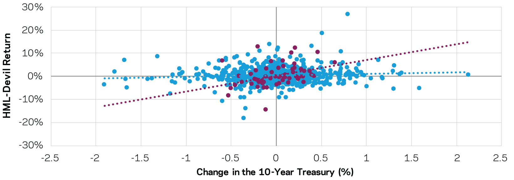

Basically, there’s grist for both sides’ mills here. Long-term there is very little evidence that the return of the value factor is anything other than trivially correlated to changes in interest rates. But, in more recent times the correlation has been strong and in the direction hypothesized: when rates go up, value tends to do better and vice versa. Now we have to ask whether this correlation makes sense.
Well, in a word, no. A lot of it comes down to growth assumptions. By definition, growth stock investors believe their portfolio (or individual stocks or even stonks, whatever the h**l those are) will outgrow value stocks. And they’re right. On average, using our very diversified global value factor to sort stocks, the expensive ones outgrow the cheap ones by about 4% a year over the next five years. Actually most of that comes in the first two years where the majority of any predictability seems to reside. After five years it’s certainly a push (no steady excess growth in year six onwards).
But that doesn’t seem to be what most growth investors are hoping for. It seems, particularly if you, like me, think we’re in a bubble, that growth investors are all trying for unicorns. That is the gray line in the graph below on the left. That’s 10% growth per year for 50 years. What growth investors, if they’re buying a very diversified portfolio of the expensive stocks, actually historically get is excess growth like the graph on the right (4% a year faster for growth than value for the next five years, then equal thereafter). You have to look at the scales of the y-axes to really appreciate the juxtaposition.
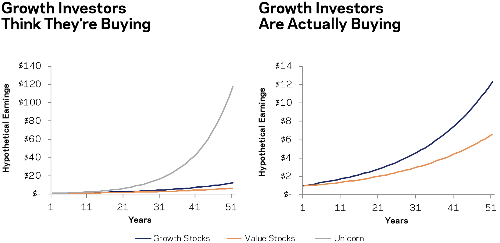

I’m not going to address the possibility of growth investors ex ante identifying something like the gray line. That’s not my field. Rather, I focus on value versus growth portfolios that investors like us (and many other systematic investors) actually implement. The value factor we’ve used throughout my many blogs on this topic, and which the 4% per annum extra growth for expensive versus cheap over the next five years15 is based on, is long and short about 750 stocks a side around the world attempting to match industries (so it’s really a separate long/short strategy for each industry). To expect the gray line from such a portfolio, or anything like it, is cray-cray.
So why is this relevant to interest rate sensitivity? Well, we can calculate the “duration,” which is bond math for how much the value of the investment changes for every 100 basis point move in rates. A duration of 10 years means that a 100 basis point fall in rates would, to a linear approximation, lead to a 10% increase in market value.
If all three investments are assumed to have equal long-term expected returns (IRRs here as we’re doing bond math) the “duration” of the growth portfolio (blue line) is 0.4 years longer than the duration of the value portfolio. If you think that’s trivial, you are correct.
Now, under these same assumptions, the duration of our unicorn portfolio is about 10 years longer than either value or growth (which, as just said above, have nearly the same duration). That’s still not as large as many might think, but it’s starting to matter. Again, that’s not the case we’re discussing here. Very diversified industry-matched long-short value strategies ain’t gonna look like a unicorn.
So why is the duration difference so small between value and growth, when we are assuming 4% per annum faster growth on expensive stocks for five years leading to more than a 20% total growth advantage over the whole five years? Well, quite simply, near-term growth, if it’s going to level off, hardly moves duration. Imagine that you expected 1,000% extra growth over the next year for expensive versus cheap stocks, but then equal growth thereafter. Well, you’d certainly pay a premium for that growth (a different issue than interest rate sensitivity), but it would hardly change the duration at all. Think about right after the giant one-year growth. The time-weighted average present value of future cash flows at that point is the same for the cheap and expensive portfolio, as they are going to grow the same going forward. The expensive one just started from a higher base. It is not the level of earnings that affects duration, it is the time shape, and the only way to really affect the time shape enough to seriously move duration is to make assumptions of large and extremely long-lasting (way more than 5+ years out) growth differentials that historically do not exist.
While not a proof, I’d point to the near non-existence of a correlation between value versus growth and interest rates over the long term as at least evidence very consistent with my math showing the durations of the two portfolios are simply not that different. In other words, when the empirical results line up with the math and concept, it’s likely you are on to something (or, in this case, on to disproving something) and any short-term changes, especially if unmet by changes in the math or assumptions, are therefore likely chance.
Frankly, the assumption of so many pundits who state, when value versus growth has been trading correlated to interest rates and they desperately need something to say, that it makes perfect sense as growth cash flows are much longer dated, is just wrong. They should stop repeating this easy, facile, mistaken and misleading observation. I predict as much success in my effort to change the dialogue here as I normally achieve!
So, why has value versus growth been trading the way it has in recent times? Put simply, I don’t know. Correlation, like fertilizer, happens. But that won’t stop me from taking a guess. If we’re in a bubble, then many must be assuming their growth portfolio is more like the unicorn example above than what real life has ever delivered.
If they believe that, it then follows they also believe growth stocks are considerably longer duration than normal relative to value stocks (recall that the unicorn was the only way to get any decent duration difference, though even there it’s less dramatic than many assume). Thus, if we are in a bubble, the very same bubble driving price differentials could rationally (rationally in the sense of consistent logic only after very irrational assumptions about growth) be expected to cause value to trade more correlated to interest rates than usual. Thus, a duration effect could arise from investors’ (temporarily exaggerated) belief in long-term growth differentials, even if only near-term growth differentials are likely to materialize. In other words, the very high (tech bubble level) prices being awarded to growth versus value stocks, and the realized correlation of value versus growth and interest rates, could easily be the same bubble showing up in different ways. That, or random chance – everyone’s least favorite explanation, but often the right one.
Now, if something is trading a certain way, then on average it will continue for a while. Thus, while there are no guarantees, I expect this correlation to be around for a bit. But given that it’s likely either random or based on the same bubble reasons driving super wide value spreads, this all means that upcoming rate moves can affect the path of when (assuming I’m right about value spreads and the future!) value wins, but not whether it will win.
One last thought. I do not find that low interest rates justify super cheap value versus growth prices (it actually doesn’t seem to be a particularly close call). But I don’t argue with the idea that a forty-year bond rally (particularly in real rates) has raised equity prices. It just shouldn’t change relative equity prices (diversified value versus diversified growth) more than a tiny bit, if at all.

