
Power Corrupts. PowerPoint Corrupts Absolutely. – Edward Tufte, Yale Professor Emeritus
Q2 hedge fund letters, conference, scoops etc
Data visualization sits at the intersection of science and art. Having all the information in the world readily available at our fingertips doesn’t make it easier to communicate. It makes it harder. In Storytelling with Data, Cole Nussbaumer Knaflic shows us what she’s learned turning data into pictures and stories over six years teaching her own data visualization course at Google. This is a simple, fun, modern day version of Edward Tufte’s The Visual Display of Quantitative Information aimed at making each of us better at sharpening our message and communicating our story clearly.
We initially compiled the notes below for internal use as they are comprised largely of our own highlights exported from the book. The majority of these highlights are specific guidelines and examples which we found helpful. The data, graphs, and images from the book can be found here. For the full story and all of the context around each example, we highly recommend reading the book in its entirety. We purchased hard copies for our entire team so that Cole’s lessons are always readily accessible on our physical desktops. You can purchase your own copy here.
The Importance Of Context
Exploratory analysis is what you do to understand the data and figure out what might be noteworthy or interesting to highlight to others. When we’re at the point of communicating our analysis to our audience, we really want to be in the explanatory space. Too often, we err and think it’s okay to show exploratory analysis when we should be showing explanatory. After undertaking an entire analysis, it can be tempting to want to show your audience everything, as evidence of all the work you did and the robustness of the analysis. Resist this urge. A few things to think about:
- What background information is relevant or essential?
- Who is the audience? What do we know about them?
- What biases do they have that might make them supportive or resistant to our message?
- What data is available that would strengthen our case? Are they familiar with it?
- What are the risks? What factors could weaken our case? Do we need to address them?
- What would a successful outcome look like?
If you had a limited amount of time or a single sentence, what would you say? Putting a significant constraint on the message can help you boil the overall communication down to the single, most important point. You have to really know your stuff; you have to know the most important pieces as well as what is not essential. When you’ve articulated your story clearly and concisely, creating content for your communication becomes much easier.
Storyboarding is perhaps the single most important thing you can do up front to ensure the communication you craft is on point. It establishes a structure – a visual outline – for your communication. Don’t start with PowerPoint. It’s too easy to go into slide mode without thinking about how the pieces will fit together and end up with a massive deck that says nothing. Start low tech. Use a white-board, post-it notes, or pencil and paper.
Choosing An Effective Visual
If you are wondering, What is the right graph for my situation?, the answer is always the same: whatever is easiest for your audience to read. Create your visual and show it to a friend. Have them articulate the following: where they focus, what they see, what observations they make, what questions they have.
Simple text. When you have a number or two that you want to communicate, think about using the number itself. The fact that you have some numbers does not mean that you need a graph.
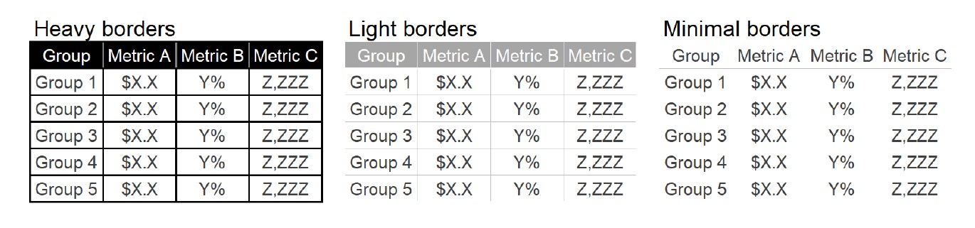
Tables. Using a table in a live presentation is rarely a good idea. As your audience reads it, you lose their eyes and ears. When you do need a table, let the design fade into the background. Don’t let borders or shading compete for attention. Let the data stand out.
Graphs. Types of graphs fall into four categories: points, lines, bars, and area.
- Points.
- Lines. Line graphs are most commonly used to plot continuous data.
- Bars. Where information is organized into groups, bars are the go-to graph type for plotting categorical data. Bar charts should be used because they are common. They are easy to read because we know what to expect. It is important that bar charts always have a zero baseline, otherwise, you get a false visual comparison.
- Vertical bar chart. Be careful adding multiple series of data as it becomes more difficult to focus. Also, be aware that spacing in bar charts creates a visual grouping that makes relative order of categorization important.
- Stacked vertical bar chart. Use cases are limited and can quickly become overwhelming.
- Waterfall chart. Useful for pulling apart the pieces of a stacked chart or to show a starting point, increases, decreases, and the resulting endpoint.
- Horizontal bar chart. This is the go-to graph for categorical data because it is extremely useful to It’s especially useful if category names are long as the text is written from left to right.
Areas To Be Avoided
- Avoid most area graphs. Our eyes have difficulty attributing quantitative values to two- dimensional space.
- Pie charts are evil. And whatever you do, don’t use 3D. Nothing good can come of this. 3D skews our numbers, making them difficult or impossible to interpret or compare. Pie charts are hard enough to read as it is. Consider replacing the pie chart with a horizontal bar chart organized from greatest to least or vice versa.
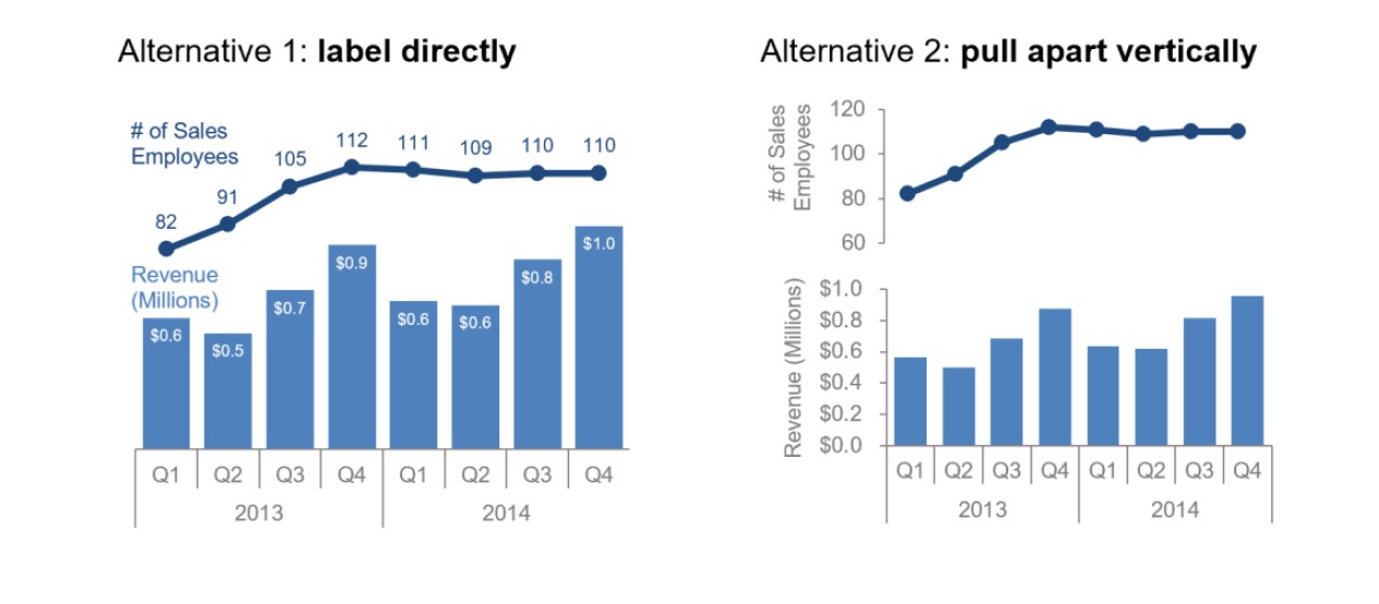
- Secondary axis is generally a bad idea. Instead, think about 1) labeling the data points on this axis directly; or 2) pull the graphs apart vertically and have a separate y-axis for each, but leverage the same x-axis across both.
Clutter Is Your Enemy!
Every single element you add to the page takes up cognitive load on the part of your audience. Identify anything that isn’t adding value and remove those things. Clutter makes visuals appear more complicated than necessary and when visuals feel complicated, we run the risk of losing our audience.
Gestalt Principles Of Visual Perception
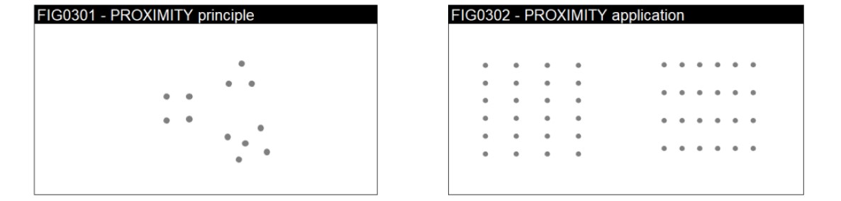
In the early 1900s, the Gestalt School of Psychology created principles of visual perception to understand how individuals interact with visual stimuli and perceive order in the world around them.
- Proximity. We think of objects that are close together as belonging to part of the group.
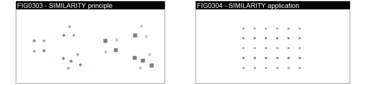
- Similarity. Objects that are of similar color, shape, size, etc. are perceived as part of a group.
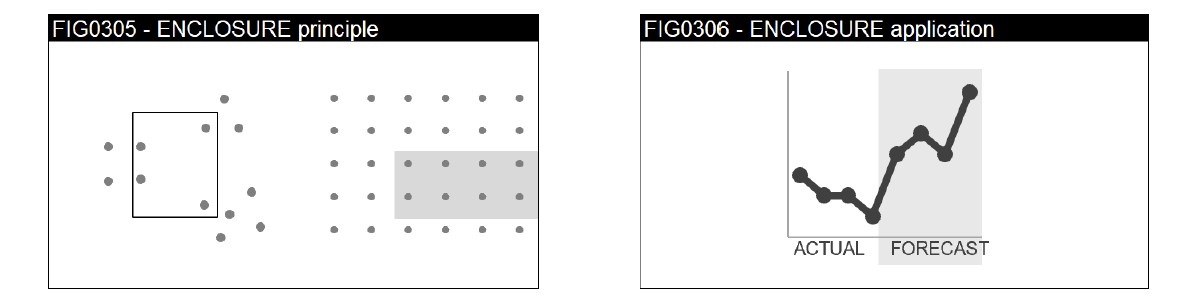
- Enclosure. We think of objects that are physically enclosed together as belonging to a group. Light background shading is often enough to draw a visual distinction within our data.
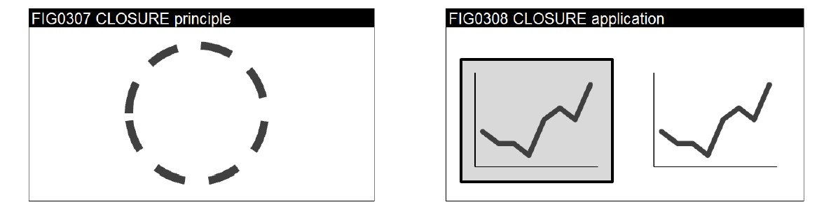
- Closure. We perceive a set of individual elements as a single, recognizable shape. When parts of a whole are missing, our eyes fill the gap – i.e. we can remove borders and background shading and graphs still appear as a cohesive entity (and data stand out more).
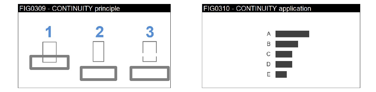
- Continuity. When looking at objects, our eyes seek the smoothest path and naturally create continuity even if it may not explicitly exist. Stripping away unnecessary elements allows our data to stand out more.
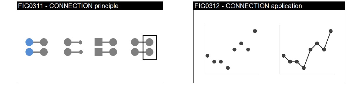
- Connection. We think of objects that are physically connected as part of a group. The connective property has a stronger associative value than similar size, color, or shape.
Visual Order
When design is thoughtful, it fades into the background so that your audience doesn’t even notice it. When it’s not, your audience feels the burden.
- Alignment. The decision to either left or right justify text should be made in the context of the other elements on the page. The goal is to create clean lines of elements and white space.
Without visual cues, your audience will start at the top left of the page and move their eyes in a “z” shape across the page as they take in information. Because of this, text on most tables and graphs should be upper-left-most justified, so the audience will get the details that tell them how to read the table or graph before they get to the data itself.
- White Never add data for the sake of adding data. White space is visual communication is as important as pauses in public speaking. White space can be used strategically to draw attention to the parts of the page that are not white space.
- Margins should remain free of text and visuals.
- Resist the urge to stretch visuals to take up all available space.
- Think about how you can use white space strategically for emphasis.
- If there is one really important point, consider making it the only thing on the page.
- Contrast. Clear contrast can signal where to focus attention. The lack of clear contrast, on the other hand, can be a form of clutter. “It’s easy to spot a hawk in a sky full of pigeons, but as the variety of birds increases, that hawk becomes harder and harder to pick out.” In other words, the more things we make different, the lesser the degree any of them stand out.
Note how the effective use of contrast, on the right chart below, makes it a much faster, easier and just more comfortable process to get the information.
Step-By-Step Decluttering
- Remove They are unnecessary. Think about using white space instead.
- Remove If they are absolutely necessary, make them thin and use a light color.
- Remove data They add cognitive load to process data that is already depicted.
- Clean up axis labels. Get rid of trailing zeros; abbreviate months,
- Label data directly. Leverage the principle of proximity and put labels next to the
- Leverage consistent Make labels the same color as the data they describe.
Focus Your Audience’s Attention
Preattentive attributes can be used to direct your audience’s attention where you want them to focus. They can also be used to create a visual hierarchy of elements to lead your audience through the information you want to communicate in the way you want them to process it.
Note how your eye is drawn to the one element within each group below that is different than the rest. You don’t have to look for it because our brains are hardwired to quickly pick up differences we see in our environment.
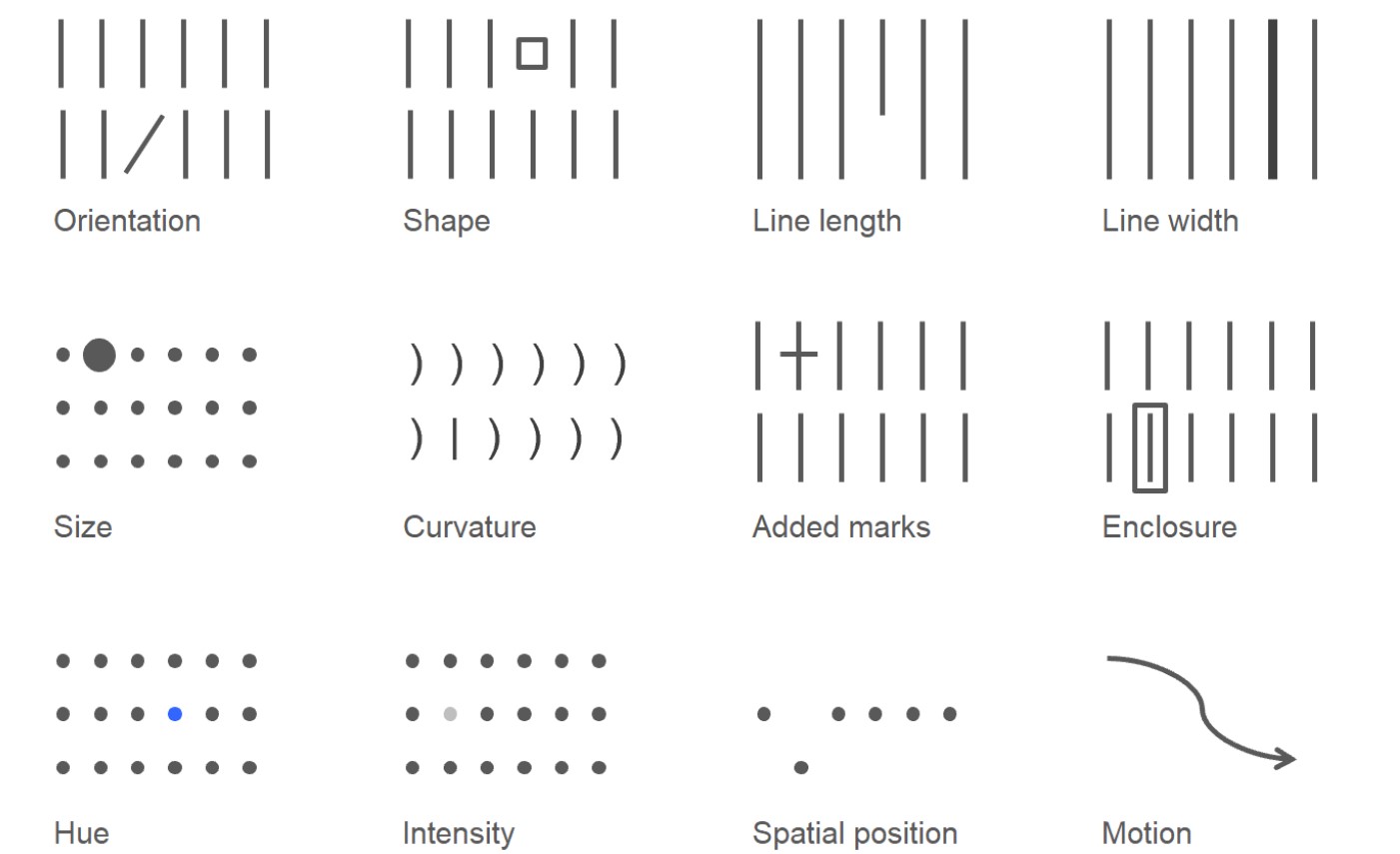
Without any visual cues, when we’re confronted with a block of text, our only option is to read it. But preattentive attributes employed sparingly can quickly change this. Observe how leveraging preattentive attributes changes the way you process the information.
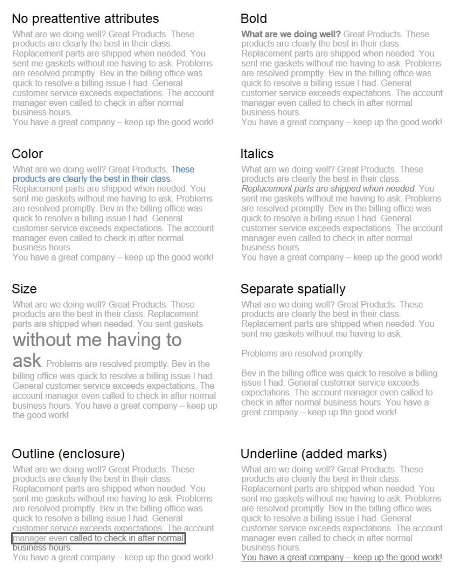
We can also employ preattentive attributes to create a visual hierarchy in our communications, establishing implicit instructions indicating how to process the information. We can signal what is most important that hey should pay attention to first, what is second most important, and so on. We can push necessary but non-message-impacting components to the background so they don’t compete for attention. This makes it easier and faster to take in the information provided.
Various attributes draw our attention with differing strength. For example, a bright blue will draw attention more than a muted blue. Both will draw more attention than a light grey.
Thoughtful use of color and text is one way we can focus the story. In live settings, repeated iterations of the same visual, with different pieces emphasized to tell different stories, or different aspects of the same story can be an effective strategy.
The most important preattentive attributes when it comes to focusing your audience’s attention are size, color, and position on the page.
- Size matters. Relative size denotes relative importance. Don’t let your design choices be happenstance. They should be the result of explicit decisions. One way to do this is to start by pushing everything to the Then decide what to bring to the forefront or highlight.
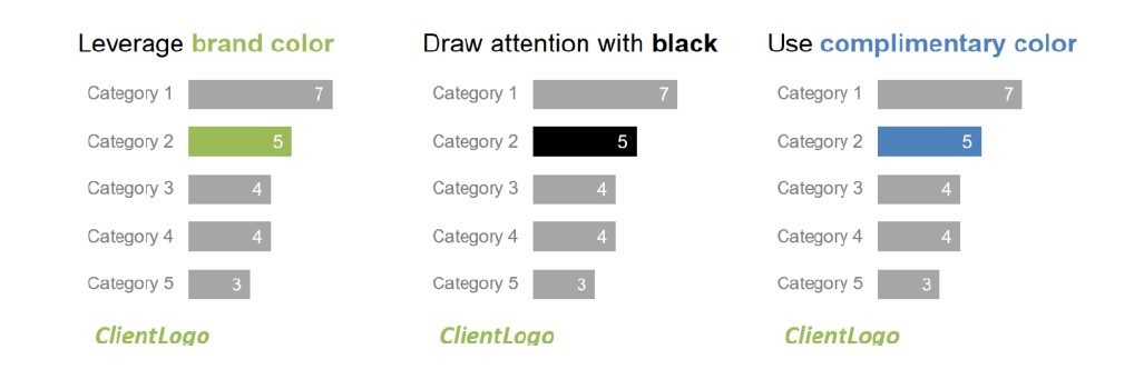
- Color is one of the most powerful tools you have for focusing Resist the urge to use color for the sake of being colorful. Use it sparingly. Use a base color and a single highlight color. Grey is a better base color than black because it allows for greater contrast.
- Use color sparingly. Too much variety prevents anything from standing out. There needs to be sufficient contrast to make something draw your attention.
- Use color consistently. Your audience will take time to familiarize themselves with what color means once and then assume the same details apply throughout the rest of the communication. Don’t confuse them by changing your use of color.
- Be thoughtful of the tone. Color evokes emotion. Consider the tone you want to set with our broader communication and chose a color that reinforces it.
- Leverage brand colors. Identify one or two brand colors to use as your highlight cues and keep the rest of the color palette relatively muted with shades of grey.
- Position on the page: put the most important thing at the Don’t make your audience wade through other stuff to get to it. In data visualization, think about which data you want your audience to see first and if rearranging the visual accordingly makes sense. Be mindful of how you position elements on a page and aim to do so in a way that will feel natural for your audience to consume. Work with them. Not against them.
Think Like A Designer
Form follows function. Think about what you want your audience to do with the data (function) and then create a visualization (form) that will allow for this with ease. Good design fades into the background unnoticed.
Highlight The Important Stuff
Only highlight a fraction of the overall visual – at most 10% of the design. Note that preattentive attributes can be layered. Use the following guidelines:
- Bold, italics and underlining: Use for titles, labels captions and short word sequences to differentiate elements. Bolding is preferred because it adds minimal noise while clearly highlighting
- CASE and typeface. Uppercase text in short word sequences is easily scanned which works well with titles, labels and
- Color is an effective highlighting technique when used
- Size is another way to attract attention and signal
Eliminate Distractions
The decision of what to cut can be even more important than what to include. Consider clutter and context. Consider what is critical and what is not. Identify unnecessary, extraneous or irrelevant items or information. Determine if things are distracting from the main message. You know you’ve achieved perfection, not when you have nothing more to add, but when you have nothing to take away.
- Not all data are equally Use your space and your audience’s attention wisely. Get rid of noncritical data and components.
- When detail isn’t needed, summarize. You should be familiar with all the details. But that doesn’t mean that your audience needs to be.
- Ask yourself: would eliminating this change anything? Resist the urge to keep things because they are cute or because you worked hard to create them.
- Push necessary, but non-impacting items to the Light grey works well here.
Don’t Overcomplicate
The more complicated it looks, the more time your audience perceives it will take to understand, and the less likely they are to spend time to understand it. Some tips to keep it simple:
- Make it clean and Use a consistent easy-to-read font.
- Use straightforward Simple language over complex; fewer words over more.
- Remove complexity. Favor simplicity over
Text Is Your Friend
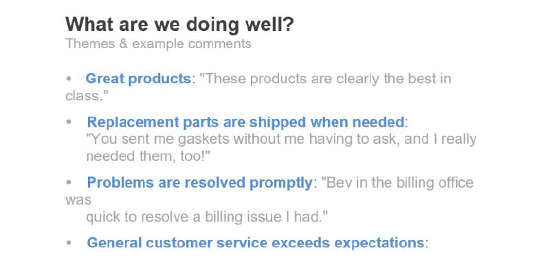
Thoughtful use of text ensures that your data is accessible. Use it to label, introduce, explain, reinforce, highlight, recommend, and tell a story.
- Every chart needs a title. The absence of titles causes your audience to stop and question what they are looking at. Instead, label explicitly so they can use their brainpower to understand the information, rather than trying to figure out how to read the visual.
- If there is a conclusion you want them to reach, state Leverage preattentive attributes to make those words stand out.
- If useful, annotate important or interesting points directly on a graph. A few words can make data so much more accessible.
Aesthetics
Is it really necessary to make it pretty? YES. People perceive more aesthetic designs as easier to use. Thoughtful use of color, alignment and white space are components you don’t notice when well done.
- Be smart with Color should always be an intentional decision.
- Pay attention to Organize the page to create clean vertical and horizontal lines.
- Leverage white space. Preserve margins. Don’t stretch graphics to fill space or add things just because you have room.
Lessons In Storytelling
The most beautiful data visualization runs the risk of falling flat without a compelling narrative to go with it. We can use stories to engage our audience in a way that goes beyond what facts and conventional rhetoric can do. Stories are what tie information together. How to write with style:
- Find a subject you care
- Do not ramble. Keep it
- Have the guts to
- Sound like
- Say what you meant to
Don’t communicate for yourself. Communicate for the audience. The story is about them. Not about you. Keep your audience top of mind. Think about what will resonate with them. Make the information specific and relevant to your audience. Keep it simple. Edit ruthlessly. Be authentic.
When it comes to structuring the flow of your presentation, create the headlines first. Think about the order you want your audience to experience your story. This structure can help create a logical order to follow. Make each headline the title of your slides or sections in a report. The path should be clear to you. If it isn’t, it certainly won’t be clear to your audience.
Turn This Into A Story
You have to have a solid understanding of what you want to communicate before you craft your communication. Once you have The Big Idea and Three Minute Story articulated, you can start to think about what narrative flow makes sense and how to organize your deck.
One way to do this is to include a slide at the beginning of your deck that bullets the main points in your story. This will be your executive summary that says to your audience at the start, “here’s what we will cover in our time together.” Then organize the remaining slides to follow this flow. At the end of the presentation, repeat this: “Here’s what we covered.” Telling your audience how you are going to structure your presentation, can make you and them more comfortable. It helps them know what to expect.
Tactics for presenting a clear story:
- Horizontal logic. The idea here is that you can read just the slide title of each slide and these snippets alone tell the overarching story you want to communicate.
- Vertical logic means all information on a given slide is self-reinforcing. The content reinforces the title and vice The words reinforce the visual and vice versa.
- A fresh Once you’ve crafted your presentation, give it to a friend. Ask them what they pay attention to, what they think is important, and where they have questions.
Case Studies
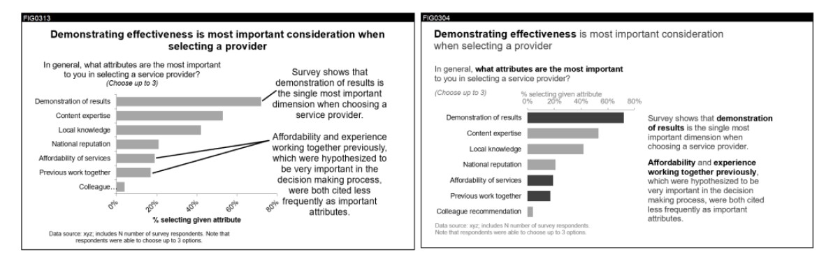
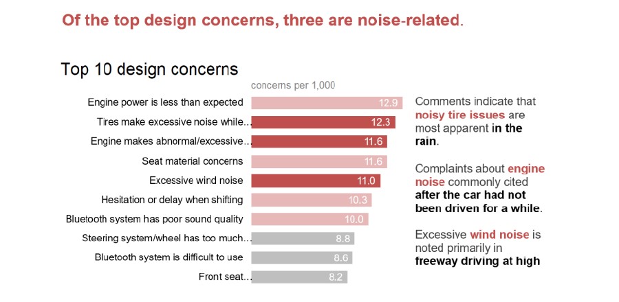
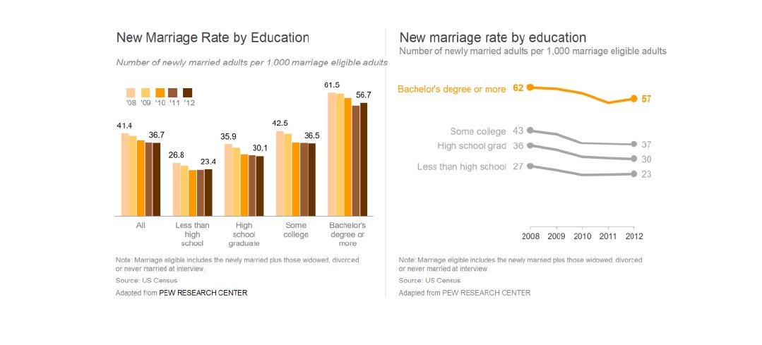
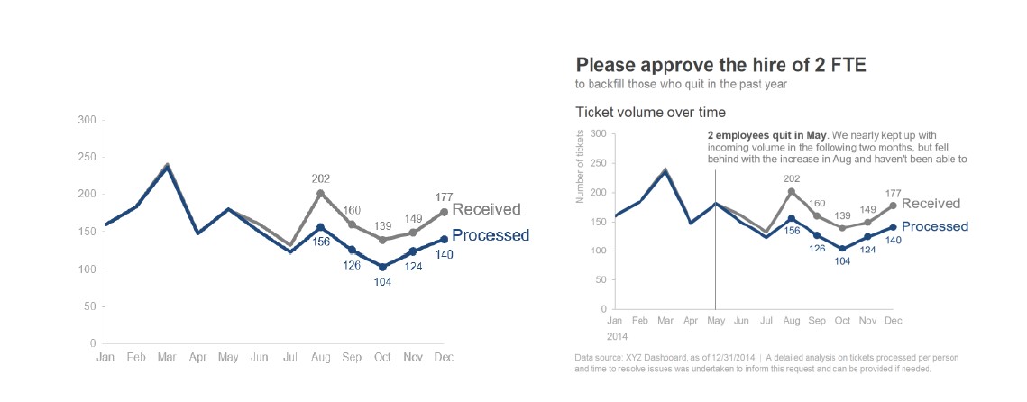
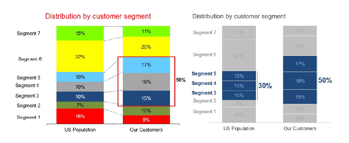
There should be logic in the order that you display information. A single visual can tell a number of different stories and focus on different aspects of the same data set. We can leverage order, color, position, and text to draw our audience’s attention to what we want them to see in the graphic. Bold colors and callout boxes help highlight specific features.
When presenting content live, you want to walk your audience through the story, focusing on just the relevant part of the visual. But the version that gets circulated needs to be able to stand on its own; i.e. you only want to circulate the final comprehensive, annotated version.
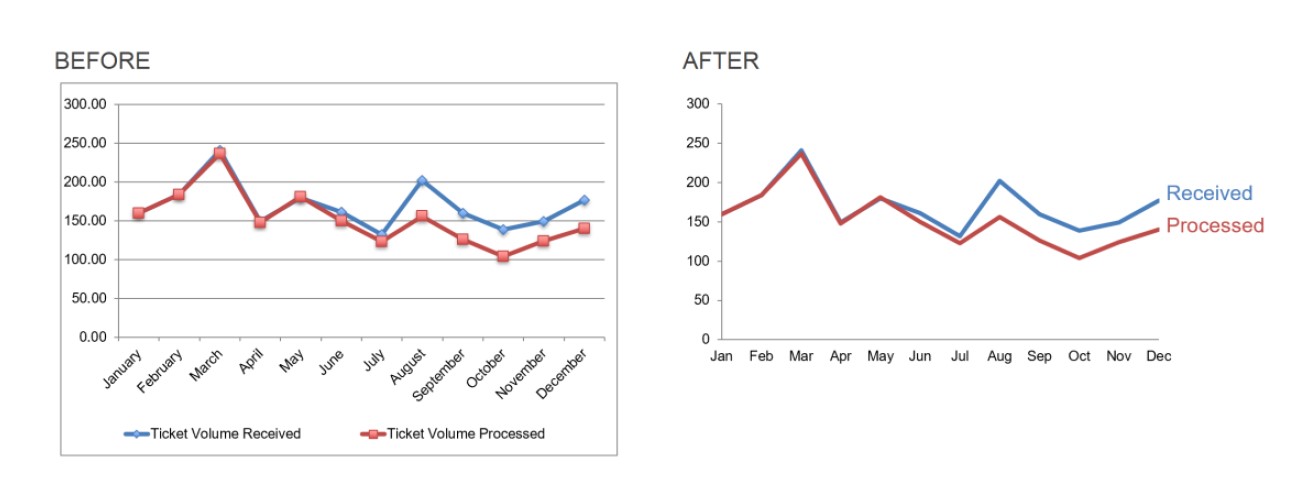
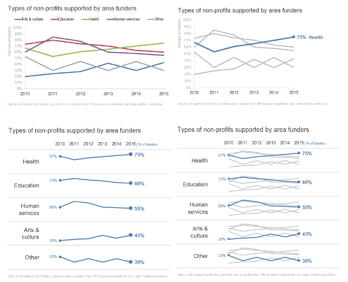
Avoiding The Spaghetti Graph
The typical spaghetti graph is such a mess that it makes it extremely difficult to concentrate on a single line due to all of the crisscrossing with so much competing for your information. A few strategies for creating a better visual sense of the data are: emphasize one line at a time; separate the graphs spatially; combine both approaches.

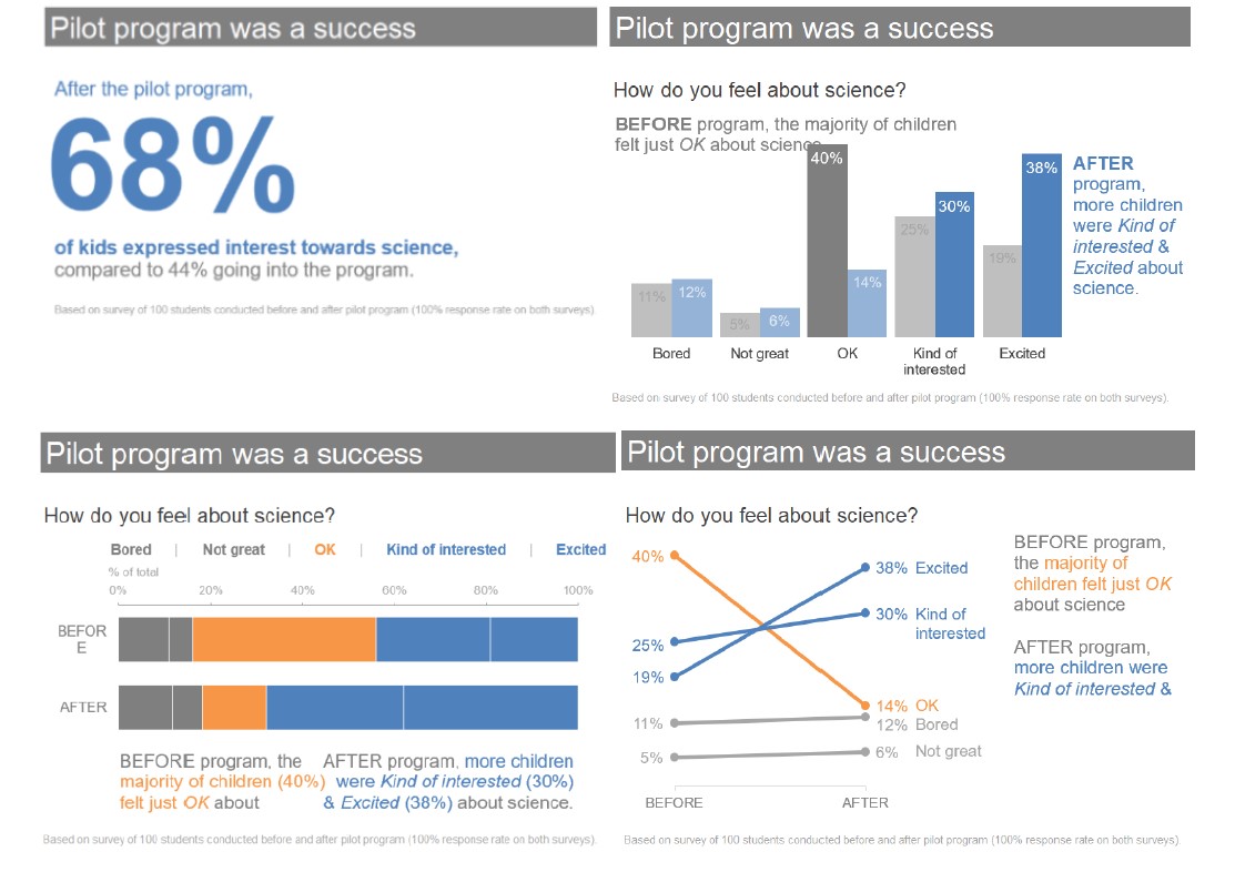
Alternatives To Pies
- Show the numbers directly.
- Use a simple bar graph.
- Use a 100% stacked horizontal bar
- Use a slopegraph.
When you find yourself in a situation where you are unsure how to proceed, pause to consider your audience. What do you need them to know? What story do you aim to tell them? Often, by answering these questions, a good path for how to present your data will become clear.
Once you’ve reached the point of needing to communicate, there should be a specific story or point that you want to highlight rather than let your audience draw their own conclusions.
Final Thoughts
- Learn your tools You don’t need fancy tools to visualize data well. So don’t let your tools be a limiting factor when it comes to communicating effectively. Pick one and get to know it best. The best way to learn is to do it.
- Iterate and seek feedback. You must iterate to get from early ideas to final solution. Start with a blank sheet of paper. Brainstorm without the constraints of your tools. Sketch out potential views to see them side-by-side and determine what works best. Then create a version of the graph, make a copy of it and make a single change. Determine which version looks better, then make another copy. Continue preserving your latest “best” version and making minor tweaks to iterate toward your ideal
- Devote time to storytelling with It takes time to do all of this well. After collecting and analyzing the data, it’s tempting to throw it into a graph and call it “done.” But if we don’t spend adequate time on this final step – communicating our data – we risk losing the greatest impact. This is the only part of the entire process that your audience actually sees.
- Seek inspiration through good examples. Imitation is the best form of We learn by emulating experts. If you see a visualization you like, pause to reflect on what makes it effective and save a copy to your visual library.
Recap
- Understand your context. Build a clear understanding of who you are communicating to, what you need them to know, how you will communicate it, and what data you will use.
- Choose an appropriate visual Let the relationship you want to show guide the type of chart you choose.
- Eliminate clutter. Identify elements that don’t add informative value and remove them from your visuals. Leverage the Gestalt principles to understand how people see data visually.
- Focus attention where you want it. Employ preattentive attributes to signal what’s important and draw attention to where you want your audience to look.
- Think like a Highlight the important stuff, eliminate distractions and create a visual hierarchy of information.
- Tell a Craft a story with a clear beginning, middle and end. Consider the order of your narrative and use the power or repetition to help your story stick.
Additional Reading & Resources
- How to Lie with Statistics
- The Visual Display of Quantitative Information
- The data, graphs, and images from the book can be found here.
- Cole Nussbaumer Knaflic’s Google Talk, “Storytelling with Data” can be found here.
Article by Broyhill Asset Management

