
“I’ve missed more than 9,000 shots in my career. I’ve lost almost 300 games. Twenty-six times I’ve been trusted to take the game-winning shot and missed. I’ve failed over and over and over again in my life. And that is why I succeed.” – Michael Jordan
Q3 hedge fund letters, conference, scoops etc
The test of the February lows held. It’s been bumpy to say the least. The bottom line is that unless economic conditions worsen, history suggests the downside risk is about 20%. Recession Bears vs. Non-Recession Bears. It looks like this: on average, bear markets that have overlapped with U.S. recessions have been more severe with a median decline of 36% lasting approximately 17 months. Non-recessionary bear markets have a median decline of 23.3% lasting approximately seven months. It is important to get in front of recession cycles (see OMR’s Critical Tipping Points – A Dashboard of Indicators) as they are only known in hindsight.
Recessions are defined as two consecutive quarters of negative gross domestic product (GDP) growth. Since equity markets are forward looking, the markets’ price behavior can help us see recessions before they start. That’s just the indication the ACWI (All Country World Stock Market Index) gave us post its early January 2018 peak.
A global bear market? Yes. A U.S. bear market? Not yet and unlikely over the next six-plus months. I’ve probably hit this topic a bit too much over the last few weeks, however, it is so important for us to get right. Historically, there have been one or two recessions in the U.S. every decade since 1950. Prior to the tax cuts and repatriation of offshore corporate cash, I felt (best guess) 2018 a probable target for recession. However, there has been and continues to be no sign of U.S. recession. That’s good news. With the recent break higher in interest rates and how that impacts the record high debt, I’m now in the Q2 2019 recession camp. I may be wrong. Data dependent, as they say.
But it’s clear that the business cycle is aged and, as you’ll see in the updated valuation charts below, the market is richly priced. The combination of high debt and rising interest rates, the trigger to the current sell-off, is a potent mix so we carefully step forward with eyes wide open. Bottom line: Looking like a “Non-Recession Bear…” Downside risk is around 20%.
Twenty percent is doable, though it will stimulate some fear. The math to recover such a loss, while stressful, is manageable and such non-recessionary recoveries tend to be quick. Minus 50 to 60% is not doable for most everyone, even if your buy-and-hold math friend tells you he can weather the storm. Thirty-four years of experience in the markets tells me he probably can’t. Age 25, no big deal. Age 65, very big deal. Different calculus for pre-retirees and retirees and that’s where most of the investible money sits.
Aged U.S. Business Cycle, Rising Rates, High Valuations
There are several things I believe you and I should keep a close eye on:
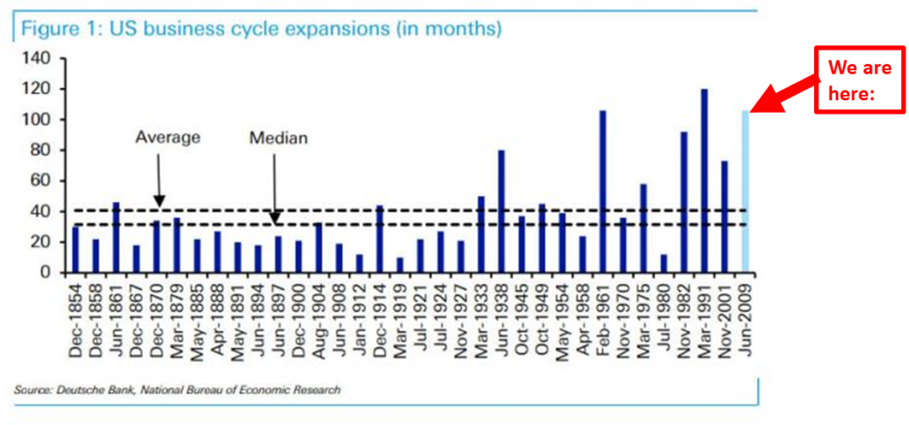
First, is the aged U.S. business cycle as you can see in the next chart (the red “We are here” annotation).
- Bottom line: The U.S. sits in the second longest business cycle expansion in history. Surpassing, 2001-2007, 1961-1970 and challenging the 1991 to 2001 expansion.
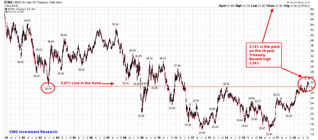
Second, rising interest rates.
- As you can see in this next two charts, rates are moving higher.
- The break above the 3.07% Line in the Sand on the 10-year Treasury was tested and rates are moving higher again.
- Bottom line: Given the record high level of debt, a small rise in rates is problematic.
10-year Treasury Note Chart
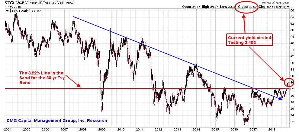
30-year Treasury Bond Chart
- The break above the 3.22% Line in the Sand on the 30-year Treasury was tested and rates are moving higher again.
Third, peak valuations.
- They are high by almost every measure. You’ll find the current valuation charts when you click through below.
- Bottom line: Expensive.
Recession vs. Non-Recession Bears. Matters!
Is the top in? Maybe. I still have this “melt up” theory in the back of my mind. No evidence, just theory. At the very least, I suspect a frustrating zig zag period is likely ahead. We are late stage. Sell the rallies versus buy the dips. Buy the dips is better suited post the next recession. Unless you’re my kids’ ages… Dad advises to save a lot each year and dollar cost average until you reach your 50s. Double up when everyone else is panicking. Like 2008-2009, that’s when the market will give you the most bang for your hard-earned money.
As a quick aside, most mornings Susan and I wake early. She makes us coffee, puts on some peaceful morning music and we sit next to each other in our favorite chairs. I just love that time of day and love the down time with Susan before our day gets crazy. Research on laptop, coffee in hand, Susan and a peaceful start to the day. We were talking about my business challenges, my great team, disruptions and risks. Frankly, I’ve been struggling with a few things. With perfect timing, Susan read to me the Michael Jordan quote (shared with you above). “…Twenty-six times I’ve been trusted to take the game-winning shot and missed. I’ve failed over and over and over again in my life. And that is why I succeed.” Susan’s message to me, “Take the shot!”
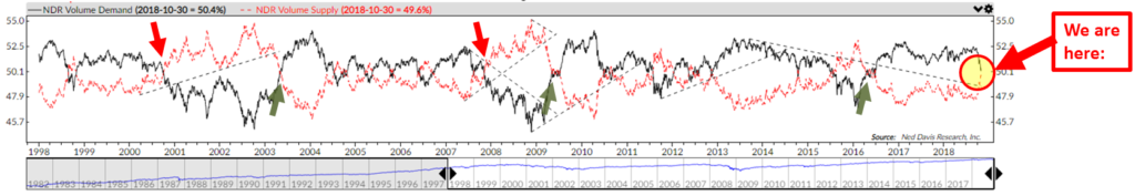
Grab a coffee and find your favorite chair. You’ll find the latest valuation charts and do click through to the Trade Signals section if you haven’t done so before. For example, I post a chart each week in Trade Signals that looks at the number of buyers versus sellers looked at by measuring up volume versus down volume. Note the yellow circle in the next chart. Then take a look at prior periods when volume demand (buyers are represented by the black line) declined below volume supply (sellers are represented by the red line). More sellers than buyers (red arrows) or more buyers than sellers (green arrows). Matters! Overall, a pretty good indicator that I find helpful in my work.
♦ If you are not signed up to receive my weekly On My Radar e-newsletter, you can subscribe here. ♦
Follow me on Twitter @SBlumenthalCMG
Included in this week’s On My Radar:
- Valuation Charts
- Trade Signals – Short-term Bottom Appears in Place
- Personal Note
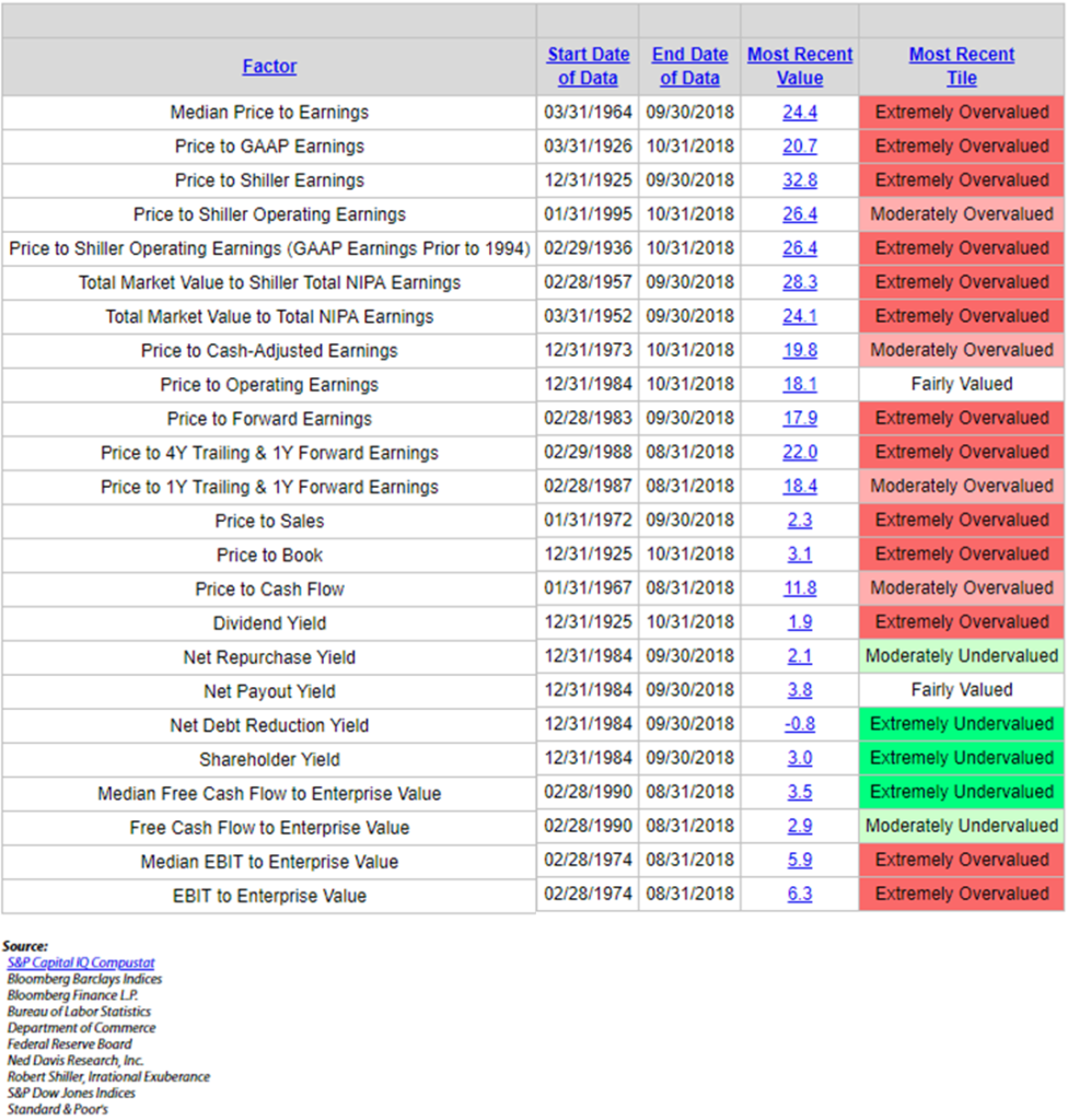
Valuation Charts
Let’s start with the big picture and then move to a few specific charts.
Green is good, red is bad.
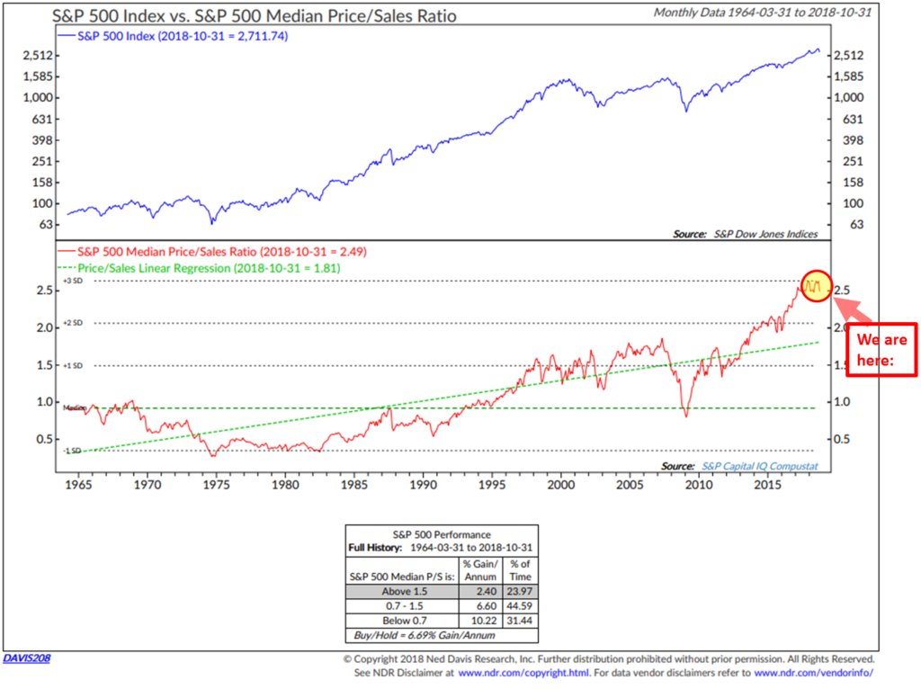
Price-to-Sales Ratio – At 1999 peak level
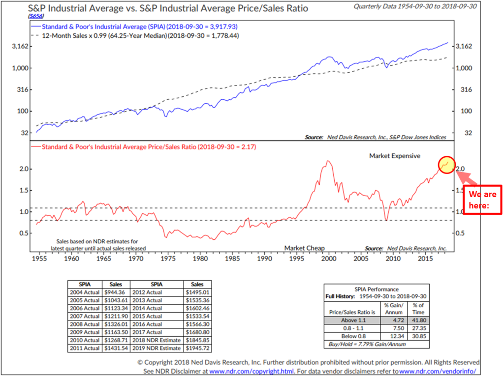
However, if you look at the “median” price/sales ratio (median takes the price/sales ratio of the one stock out of the roughly 500 in the S&P 500 Index with the price/sales ratio in the middle.
Median Price-to-Earnings Ratio – One of my personal favorites: lower but still “Overvalued”
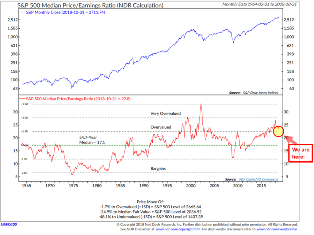
Note the lower section of the above chart. Need a decline of -24.9% to get to “Median Fair Value.” That is not an unreasonable target. -48.1% to get to “Undervalued” is a more likely scenario in recession.
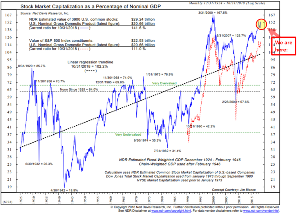
The Buffet Indicator – Stock Market Cap as a Percentage of Nominal GDP
Here’s how to read the chart:
- Simply compare the current level of the blue line to the blue line peak in March 2000. Second highest level since 1924.
- The Red line tracks the value of the S&P 500 companies. Simply compare the current level to the level in March 2000. Same picture.
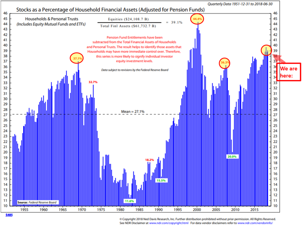
Stocks as a Percentage of Household Assets
Here is how you read the chart:
- Note the red “We are here” arrow. That’s the current percentage of stocks households own as a percentage of their financial assets.
- The other yellow circles highlight prior market tops: 1966/67, 2000 and 2007.
- Bottom line: investors are heavily invested in stocks. How much more capital do they have to buy stocks and drive prices higher. That’s the point of this chart.
- Note the green percentage numbers at the bottom. A combination of losses and panic selling drove exposure to stocks way down. A much better entry point at the black dotted line that runs through the middle of the chart.
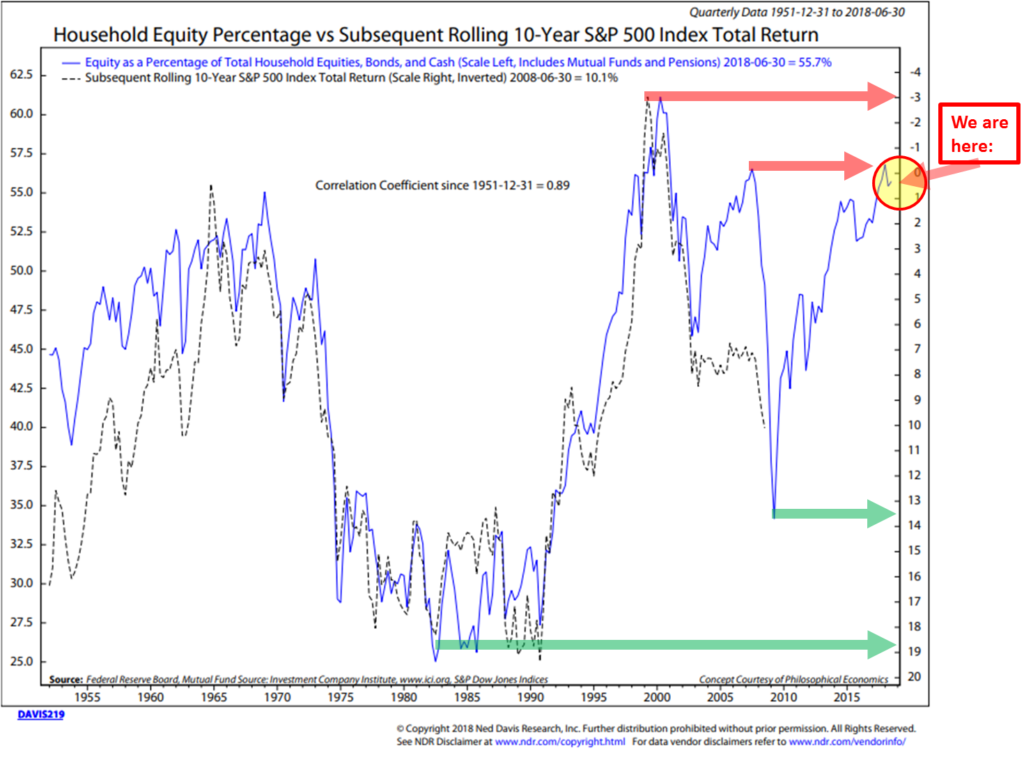
Household Equity Percentage vs. Subsequent Rolling 10-Year S&P 500 Index Returns.
Here is how to read the next chart:
- OK, hang with me on this one: The yellow circle (“We are here” arrow) show the current percentage (roughly 57% invested in equities, including pensions). The blue line tracks the percentage. It is telling us to expect a 0.50% annual return over the coming 10 years.
- The top red arrow plots the level in 2000. That was the highest exposure households had to equities ever. Note the dotted black line. That line plots what actually occurred over the subsequent 10 years.
- What is important is the high 0.89 correlation of the black line to the blue line over time (data back to 1951).
- The green arrows show the opportunity that presented in 2009. Note that the black line stops in the middle of 2008 because we just don’t yet have the actual 10-year return data yet. The point in 2009 was an outstanding buying opportunity because most people panicked out, sent shares prices south and created room for them to come back in and bid prices higher over the next up cycle. That is now already happened.
- Bottom line: Investors are largely all in – expect low 10-year returns from today’s fully invested starting conditions.
There are a number of other metrics I can share. I’ll note that I had lunch on Thursday with Joe Kalish from Ned Davis Research. Joe’s view is that the current low interest rates still justify further upside in the markets. He also said that there are few signs of excessive investor speculation. That euphoria buying that is a common sign of market tops. I agree to that point and we both agree that rising rates are not good for asset prices. A scare that has the market currently offsides.
Trade Signals – Short-term Bottom Appears in Place
October 31, 2018
S&P 500 Index — 2,717
A short-term technical bottom appears to be in place. Risk remains high: the secular bull is aged, overvalued, interest rates are rising and we have a different Fed in charge. And it is probable that a global recession has started (we won’t know officially for six months… two negative quarters of global GDP growth). See here. On the good news front, there is no immediate sign of recession in the U.S.
From a technical perspective, the large-cap, mid-cap and small-cap indices have all tested their February 2018 lows. Recall the sharp correction earlier in the year. A few weeks ago I said, “A test of the February 2018 lows is probable prior to a year-end rally. No guarantees of course… just my two cents. I’m sticking to my indicators/risk-managed process and diversifying to trading strategies. The Ned Davis Research CMG U.S. Large Cap Long/Flat Index remains in a buy, the Zweig Bond Model and the CMG Managed High Yield Bond Program remain in sell signals. The CMG Beta Rotation Strategy is currently invested in low beta utilities, the CMG Opportunistic All Asset Strategy is in cash, the CMG Tactical Equity Strategy is also in cash and the CMG Mauldin Smart Core Strategy is overweight cash and underweight equities and fixed income.” The lows have been tested. Let’s hope we see a year-end rally.
The next three charts show the test of the February lows. Source: StockCharts.com
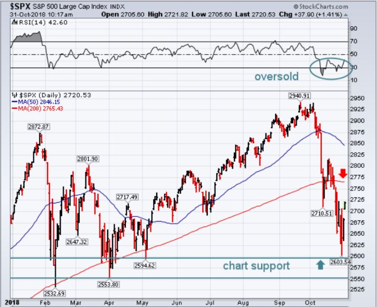
Explaining the chart:
“The S&P 500 bouncing off the top of a support zone marked by two horizontal lines drawn under lows formed between February and May. Its 14-day RSI line (top box) is also rising from oversold territory below 30 (see circle). The fact that the RSI formed two rising bottoms over the last couple of weeks is another positive sign. So is the fact that trading volume on yesterday’s price rebound showed a big increase. That’s a welcome change from the recent tendency for volume to drop on higher prices. All of which supports the view that a short-term bottom is probably in place.
The question now is how far can it go? That may be determined by a couple of overhead resistance barriers. The first one is its falling 200-day moving average (red arrow). The second barrier is the peak formed a couple of weeks ago at 2816. The SPX needs to clear those two barriers to reverse some of the chart damage suffered during the month of October. Seasonal trends should also turn more supportive as we enter the month of November.” From John Murphy at StockCharts.com
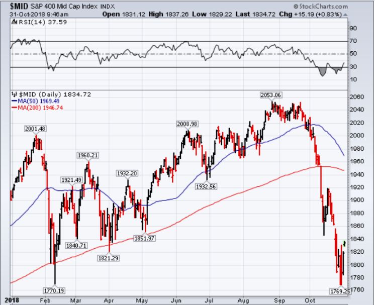
I suspect we’ll see a rally to the 1920 level in mid-caps… testing the now down-trending 200-day MA line (red). A down-trending line is bearish. It is probable a cyclical bear market has begun. We are seeing deterioration across small caps as well. Here is a look at the Russell 2000 Small Cap Index.
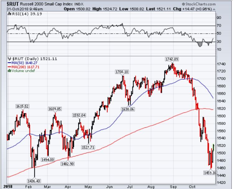
Aged, overbought and overvalued conditions do not make for good current initial starting conditions. Stay risk minded with game plan in place. Trade Signal Charts with explanations follow below.
Click here for this week’s Trade Signals.
Important note: Not a recommendation for you to buy or sell any security. For information purposes only. Please talk with your advisor about needs, goals, time horizon and risk tolerances.
Personal Note
Weekend plans… Not a bad idea!
Hope you were able to be around some young people on Halloween. A few photos from days past. Little did I know then that they’d all attend Penn State. They are wearing the jersey of their cousin, Joey Suhey, who was a Penn State running back. Their Uncle Matt was also a running back at Penn State and went on to success with the Chicago Bears. Matt was the fullback in front of Walter Payton. Aunt Donna was a cheerleader at Penn State. Cousin Alison also graduated from Penn State. OK, our whole family is PSU nuts. Go Lions!

One year Susan’s youngest, Kieran, was Jesus for Halloween.

And Brianna (right side) and her roommate this year.

This year Kieran was a boxer and I’m pretty sure Tyler, Matt, Connor and Kyle found a party or two at their respective schools. I remember walking around campus on Halloween night as if it were yesterday. Great fun! Both jealous of and happy for them at the same time.
A conference in Denver next Monday through Wednesday and then to Georgia for some golf on November 11 and 12. New York follows on November 14. If you are an advisor-client, we are planning a lunch event on November 14 in Manhattan where John Mauldin and I will present on “The Great Reset” and investment positioning. We’re also planning a similar dinner event for individual investors that evening. We’ll be sending an email with information shortly.
Wishing you and your family a happy weekend!
♦ If you are not signed up to receive my weekly On My Radar e-newsletter, you can subscribe here. ♦
With kind regards,
Steve
Stephen B. Blumenthal
Executive Chairman & CIO

