
Last week we published the 2018 End of Year Special Edition of the Weekly Macro Themes report – a summary of some of the best, worst, and most notable charts of 2018 (and the ones to watch in 2019).
Q3 hedge fund letters, conference, scoops etc
This article brings you a look at what I think is one of the most important sections of the report, simply called: “Charts That Worked”.
Basically it’s a summary of the best calls and charts of the year – either where the chart itself nailed the case (long/bullish or short/bearish) or where it was a major piece of the puzzle in a key investment or macro call. It’s an important exercise to go through, not only from a performance standpoint, but also because it helps shed light on some of the key themes and moving parts for global markets in the year ahead.
Keep an eye out for part 2 of this article – the other side of the coin (the worst charts!), or download the report and check it out for yourself. Also check out the “2018 People’s Choice Charts“.
Format note: each chart has a comment on the chart, the date when it first appeared, and a quote from the original report which it appeared in.
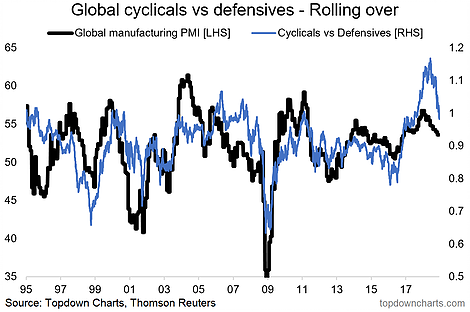
- Global cyclicals vs defensives – I highlighted this with regards to the risk that it posed to global equities given that cyclicals had been driving the new bull market and the way the relative performance line got so stretched (particularly vs the global PMI). Turns out this was a key chart from a risk management standpoint.
(19 Jan 2018)“the way in which the cyclicals vs defensive relative performance line is trading with regards to the global manufacturing PMI. In this case performance looks stretched vs the economic cycle indicators, something worth noting.”
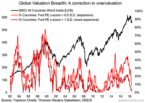
- Call it luck or foresight, I published this unique chart in last year’s end of year special and again in the first edition for the year – global equities peaked about a week or so later. Equally notable is how it has now fully unwound.
(12 Jan 2018) “Similarly, more and more countries are showing up as expensive on a forward PE basis (actually, the same proportion as at the 2007 peak, and prior to the 15/16 mini-bear).”
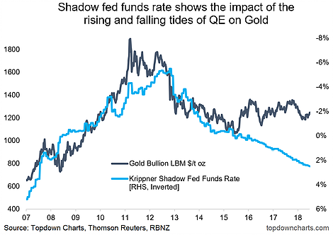
- Bearish gold: the call was based on a number of factors including valuation, technicals, and sentiment, but also key was the charts of real interest rates and shadow rates.
(30 Mar 2018) “The divergence between gold prices and real interest rates and shadow policy rates is becoming increasingly precipitous. It’s a classic case of “one of these is wrong”, and given the lingering political/geopolitical risk, and recent drive up in uncertainty/volatility, it’s fair to speculate that a big part of this gap is largely down to risk demand, i.e. sentiment, and that is something which can flip quickly.”
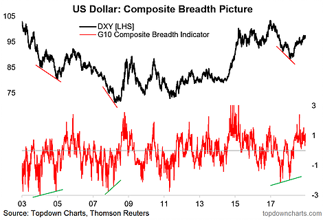
- Thanks to multiple factors, but in particular this breadth chart, I managed to pick the bottom in the US Dollar Index early this year.
(23 Feb 2018) “From a short-term timing standpoint, the chart showing bullish breadth divergence is an interesting one. This set-up has appeared 2 times in recent history and presaged about a 10-point move in each instance – that is something which would catch folk by surprise. Particularly when you think about where net speculative futures positioning is. So maybe dollar bull market has one last laugh in it.”
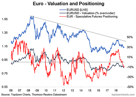
- Came near perfectly close to picking the top in the EURUSD with this classic chart.
(23 Feb 2018) “What a difference a year makes. Late 2016 the EURUSD saw crowded net-shorts and significant undervaluation (not to mention bullish divergence against the RSI). Fast forward to today and there are crowded speculative longs, more neutral valuations, and a looming clash with the downtrend line (and bearish divergence against the RSI!). While it’s very early days, the latest flash PMI readings show a tentative change in leadership between the Eurozone and USA.”
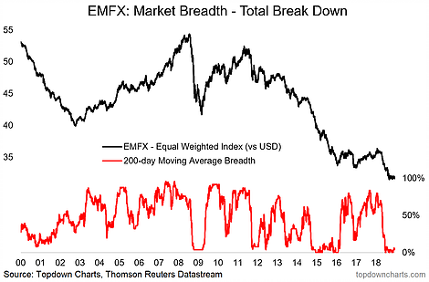
- Establishing coverage of EMFX this year, I identified in aggregate: overvaluation, narrowing interest differentials, and bearish technicals, this happened to be just before things got really ugly for this corner of the market.
(27 Apr 2018) “Moving in to technicals, 200-day moving average breadth appears to be breaking down, after what looks like a bearish breadth divergence (higher highs on price vs lower highs on breadth).”
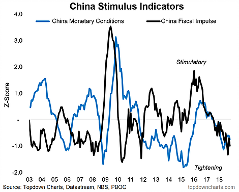
- The China Slowdown: for me it looked fairly obvious that China’s economy would slow this year, albeit perhaps not as far/fast as I might have thought. The key drivers were an expected softening in the property market (wrong: see chart B.1.), weaker export growth, and policy settings going from tailwind to headwind.
(2 Mar 2018) “Given the stimulus indicators have moved from stimulus being a major tailwind to now at least less of a tailwind, if not a slight headwind, the case for a slowdown seems to be in place.”
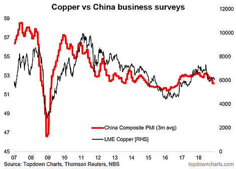
- Closely related to the China call was the switch to a bearish call on copper. Added to that was slight overvaluation, challenging technicals, inter markets (divergence against copper stocks and Chinese bond yields), and stretched bullish sentiment/positioning.
(2 Mar 2018) “A logical next stop from the China macro picture is a taking stock of the outlook for copper. Given the tendency for copper prices to trade in line with the macro pulse in China (see chart of China PMI vs copper), any possible slowdown in China – even if a soft-landing – casts shadows on the Copper price outlook [makes sense given China accounts for around 50% of global demand].”
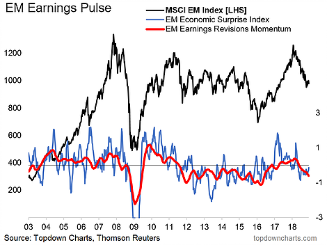
- Emerging markets – “Tactically Cautious”. After being initially optimistic on EM in 2018 due to relative value, it started to become clear that EM risk assets were in trouble as the USD strengthened and EM macro indicators began to rollover, my only regret on this one is not catching it earlier and with more conviction. When facts change, act accordingly.
(18 May 2018) “The composite EM risk sentiment index has rolled over from extreme complacency, and the EM composite OECD leading indicator looks to have topped out. The risk is that the move in risk pricing goes further and weighs on the macro front, where you can see the EM economic surprise index and earnings revisions momentum indicators have already rolled over.”
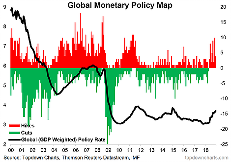
- A key theme for 2018: the turning of the tides in global monetary policy.
(12 Jan 2018) “Even as the world’s major central banks have had to step away from interest rates as the key policy tool, there are some clear trends at a global level. With some notable exceptions, the predominant action since 2012 has been interest rate cuts. This story is starting to come full circle in developed economies, and emerging markets likewise look close to the end of their current wave of easing.”
For more and deeper insights on global economics and asset allocation, and some more good charts you may want to subscribe to the Weekly Macro Themes. Click through for free look or a trial.
Article by Top Down Charts

