
Last week we published the 2018 End of Year Special Edition of the Weekly Macro Themes report – a summary of some of the best, worst, and most notable charts of 2018 (and the ones to watch in 2019). This article brings you a look at an interesting section of the report: “The 2018 People’s Choice Charts”. In this post we look at the 5 most popular charts we tweeted this year as ranked by views and engagement. I’m sure you along with our Twitter followers will find the charts interesting and insightful – of course if you think we missed one that should be included please get in contact.
Q3 hedge fund letters, conference, scoops etc
Also, keep an eye on our Twitter account as we’ll be posting updated versions of these charts shortly [n.b. these charts are not updated to the latest (to help explain why folk were so interested in them at the time)]
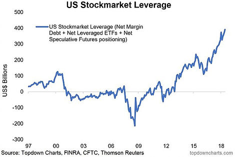
- This one raised a lot of eyebrows – a combined view of leveraged bets on US stocks… close to half a trillion in leverage added by traders in the past 5 years. The unwind however has begun.
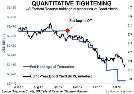
- Another one to raise some eyebrows… we can debate about the best way to display the series in this chart (i.e. level vs rate of change), but the key point is that it appears as though the commencement of quantitative tightening was a key catalyst to the push higher in bond yields (shown inverted), which makes intuitive sense.
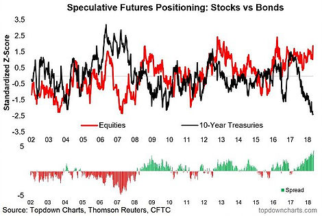
- Speculative positioning – a double bet. This chart showed extreme net-longs in equities, and big net-shorts in bonds… sort of a compound bet.
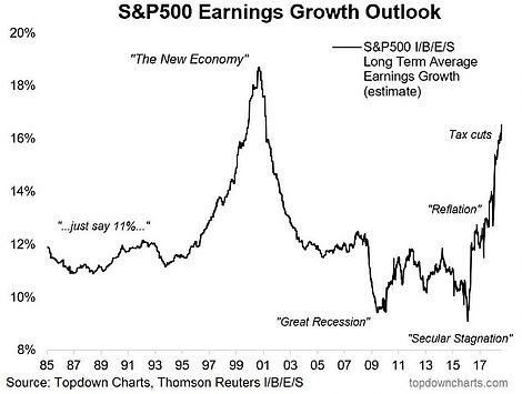
- The I/B/E/S consensus long term average earnings growth for the S&P500 – could say there was some excitement on the outlook.
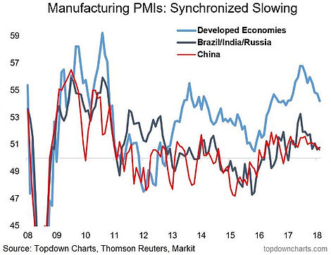
- It quickly became apparent as the year went on that we were entering into a synchronized softening of growth momentum globally. Time will tell if this is just a late-cycle growth scare or something more sinister…
For more and deeper insights on global economics and asset allocation, and some more good charts you may want to subscribe to the Weekly Macro Themes. Click through for free look or a trial.
Article by Callum Thomas, Top Down Charts

