
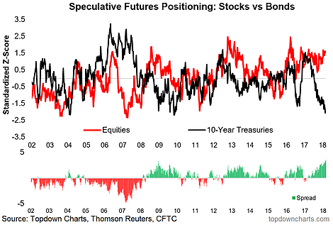
As I was updating my various charts and models, something weird caught my eye. This peculiar chart shows speculative futures positioning in equities (aggregated across all US index futures) and bonds (US 10 year treasury futures)… and most notably, the spread between them. With bond traders the most crowded short in recent history, the spread between bonds vs equities positioning is at an extreme.
[timeless]
Q2 hedge fund letters, conference, scoops etc
So what? Let’s break it down: if traders are short bonds they expect yields to rise (which usually happens as a result of higher growth and inflation outcomes), and if traders are long equities they expect stocks to go up (which similarly hangs on a supportive growth backdrop). So basically what we’ve got here is traders doubling down on a view that growth and inflation heats up even further from here. They may be right. But if they’re wrong, there will be a lot of scrambling to cover positions (aka the long awaited return of market volatility). So if you’re looking for latent pressure building up in the markets, you’ve found it in this chart.

Article by Callum Thomas, Top Down Charts

