
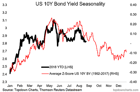
I was going through my fixed income strategy models and there were a number of really interesting charts, but I thought this one in particular was worth sharing. It shows in the red line the average pattern of movement in the US 10 year government bond yield by business day across the year (for the period 1962-2017). For clarity I have used the average z-score of yields through each year in order to standardize them and make the movement in yields comparable (you can’t really use percentage change or even basis point change because of the big change in yields across time).
[timeless]
Q2 hedge fund letters, conference, scoops etc
Anyway, the key point of this chart is that the 10 year treasury yield has been trading more or less in line with its historical seasonal pattern so far this year. It’s important to note that there are many exceptions to seasonality, and it’s entirely possible that the pattern breaks down, but if it holds then we should expect bond yields to fall through much of the remainder of the year. This would be a non-consensus move, which makes it even more interesting…

Article by Top Down Chart

