
“What we anticipate seldom occurs; what we least expect generally happens.”
Benjamin Disraeli
We’ve been talking about a 3% yield on the 10-year Treasury as a line in the sand. It may well be. The important technical number is 3.07%. A break higher and 4% is not out of the question. Inflation is picking up, the Fed remains on the rate hike path and higher rates are causing the equity markets some indigestion. And well it should… all assets are priced off of the risk-free rate.
Today, let’s take a look at the 3.07% “line in the sand” for yields. The 10-year Treasury touched 3.03% earlier this week and currently sits at 2.96%.
Klarman 2017 letter on
- Bitcoin
- the danger of Chinese leverage
- Discipline while value investing in bubby times
- Value investing is not dead
- Radicalization of politics
- Dangerous FAANG valuations
The Financial Times put it this way:
Something has changed. For most of the past decade, the US government bond market — the most important financial market in the world — was etherized by loose monetary policy. The yield on the two-year bond, the short-term rate investors watch most closely, was flat on its back at 1 per cent or below. Meanwhile, the 10-year yield drifted sleepily from 4 per cent to 2. (It bottomed at 1.36% in July 2016)
Both yields did wake up a bit in late 2016 as recovery took hold and quantitative easing wound down. Last year, though, both rates started rising fast. This overall pick-up was easy enough to explain: it coincided with a big fiscal stimulus, in the form of the Republican tax bill, coming into view. If the economy is running hotter, inflation expectations rise, and rates rise with them. Yet short and long rates did not rise at the same rate. The short end rose faster — a pattern that has persisted since.
There is nothing mysterious about the higher short rates. The Federal Reserve has signaled its intention to keep raising its target rate, effectively forcing the matter. The question is why the 10-year yield has stayed stubbornly below 3 per cent, even as, in recent weeks, the two-year yield has kept climbing. With the tax cut on its way, employment strong, and a growing federal deficit guaranteeing lots of bond issuance for years to come, one might expect long yields to keep pace.
The last time the difference between long and short yields was so small was before the financial crisis. An inverted yield curve — short rates higher than long — is not far away. In the past, this has been a recession indicator. (Source)
I recently signed up for David Rosenberg’s “Breakfast with Dave” daily research letter and loved what he had to say a few days ago. He wrote:
I have been saying for some time now that pundits would be dismissing the flattening of the yield curve, as they do every cycle. And it is hilarious to hear them say ‘oh, well, it hasn’t inverted yet, and when it does we will have a 12 to 24 month lag to get ready for the hit to the economy and the stock market.’ My eyes just roll. As if you need an inverted yield curve anyway to generate heightened volatility and market anxiety. The curve didn’t invert in 1987. Nor did it in 1997-98. Nor did it in 2002/03.
None of these periods treated the long-only investor very well, if memory serves me correctly. The Up & Down Wall Street column in this weekend’s Barron’s is all about the yield curve and cites an analyst who claims that central bank manipulation and a surplus of money looking for safe yield is why the curve has flattened. I should add that the topic is so mainstream now that maybe it doesn’t matter as much anymore — classic Bob Farrell Rule #9…
The rule states, “When all experts agree – something else is going to happen.”

More from David:
This is such nonsense. The curve has flattened because the markets have taken on a different view of this new Federal Reserve — not just that Jay Powell in fact is not a Janet Yellen clone, but the entire new make-up of the voting FOMC membership is considerably more hawkish than a year ago. This is why the curve has flattened — it’s about the Fed and the fact that since last Fall, the yield on the 2-year T-note has gone from around 1% to 2.4%.
The yield curve typically steepens when the Fed is easing and it flattens when the Fed is tightening — so why is everyone so surprised? And while the 10-year yield has lagged, as it always does, even all the manipulation in the world by the ECB and BOJ and all the institutional demand did not stop the 10-year note yield from making it to a new four-year high. Maybe the cyclical inflationary pressure, and the rise in market-based inflation expectations to a new high for the cycle at 2.2%, is a better match.
Surely this has to have the Fed on watch seeing as their target is 2%. And there is no sign that inflation expectations are coming down anytime soon, though they will in the next recession but let’s face it the secular deflationary forces are now on the back burner as they were in 1993-94, 1999-2000, and 2004-07.
In the meantime, the curve has begun to steepen a little bit, and this is because the bond market is signaling moderate inflation. As are the commodity markets, and recall in the latest set of FOMC minutes that they are showing signs of getting passed through to higher prices more effectively than wages are. If you don’t see late-cycle inflation pressures percolating in the system, and what that means for interest rates across the curve, then you really didn’t spend much time analyzing last week’s Philly Fed index for April. It’s all there.
For such an overleveraged economy, whose outstanding nonfinancial debt load has surged from $27 trillion at the peak of the last credit bubble to $50 trillion today, it actually is less about the shape of the curve and more about what rising rates along the entire curve will do to debt-servicing capacity, aggregate demand growth, and defaults and delinquencies.
At least $100 billion of incremental debt servicing charges are coming our way this year and next, and this is where the problem for the economy is going to come from, not merely whether the yield curve inverts or not.
At the same time, we have tremendous policy confusion at the moment. An incoherent foreign policy for one. Trade wars are here to stay and we saw a record number of references to such frictions and to tariffs in the latest Fed Beige Book. The level of White House interference is equally without precedent, whether open lamenting about oil prices (never mind that it was extremely high global crude prices that sparked the shale industry in the USA), criticizing various CEO’s, or Peter Navarro incredibly saying he is ‘puzzled’ that the Fed has ‘announced three rate hikes before the end of the year.’
This is a sign of the White House pressuring the Fed, and the last time this happened, if I have to remind you, was with Nixon and Burns back in the early 1970s. Go back to your history books and see how well that turned out for the economy and the markets — both paid a price that lasted nearly a decade. And I also have to express considerable disappointment with Larry Kudlow following in the president’s footsteps of putting people down who disagree with the Administration — ‘never believe the CBO’ he said in an interview late last week. Are there any credible economists around who don’t have bulging fiscal deficits as part of their forecasts?
I love the crisp way he throws a punch!
The biggest bubble of all time is in the bond market. Rising interest rates will increase costs and pinch budgets. 3% is one thing, we could see 4% or 5%. Such a move will push us into the next recession. And stagflation anyone? Possible.
As a quick aside, last week I shared my favorite recession watch indicators with you. One of those is an “inverted yield curve.” Currently, none of the indicators are signaling recession.
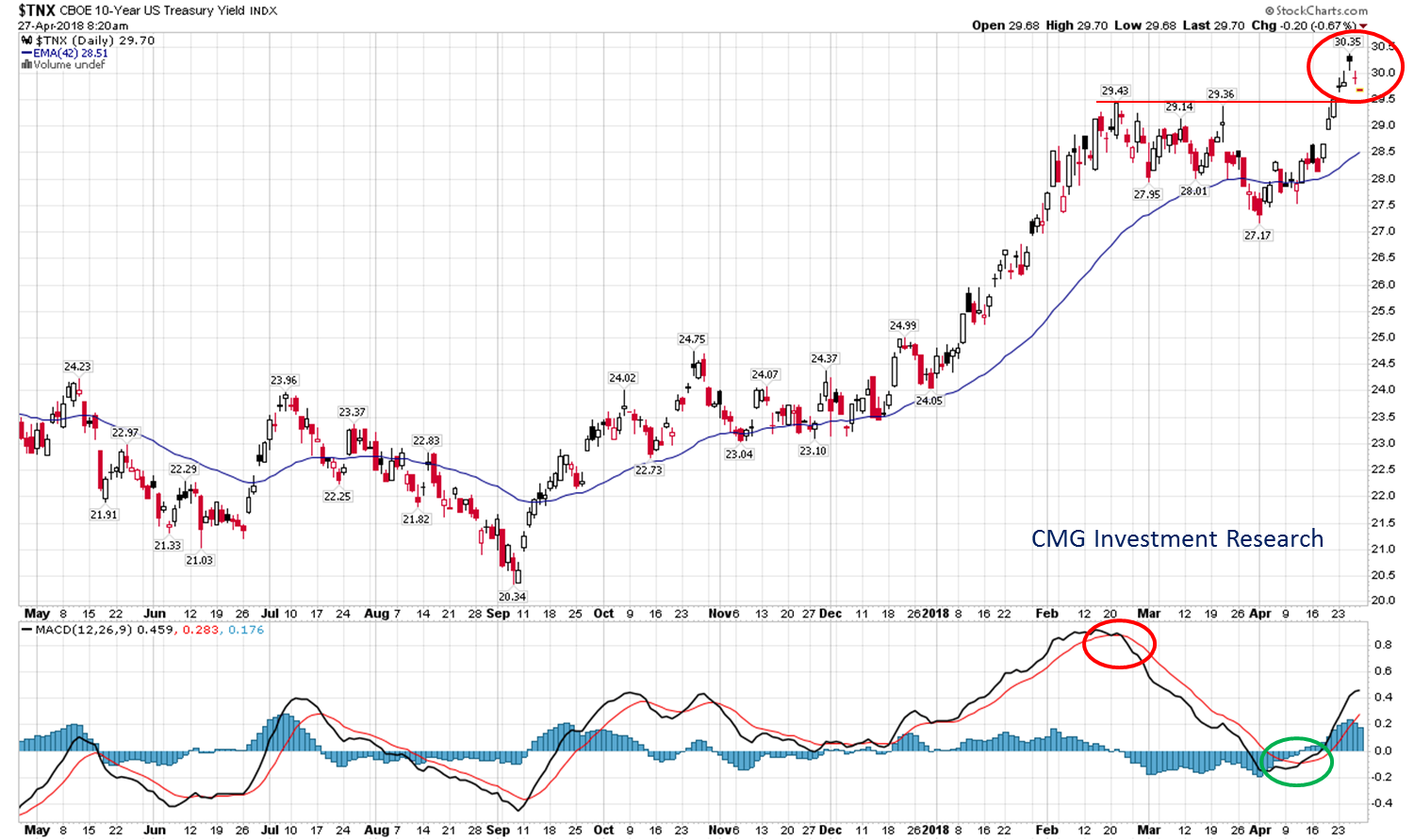
Following are three interest rates charts. All plot the yield on the 10-year Treasury, but they look at different time frames to give us better perspective.
Here is how you read the following chart:
- Red circle upper right show the current yield the 10-year Treasury.
- It hit a four-year high of 3.035% two days ago.
- The solid red line shows the prior two highs. Note the break higher in yield above that line. Technically speaking, that’s an important upside break out.
- The bottom section shows a green arrow and a red arrow. The green arrow shows the recent uptrend signal (signaling higher yields) as measured by something called MACD. The red arrow shows the prior downtrend signal.
- Bottom line: The current trend is rising yields.
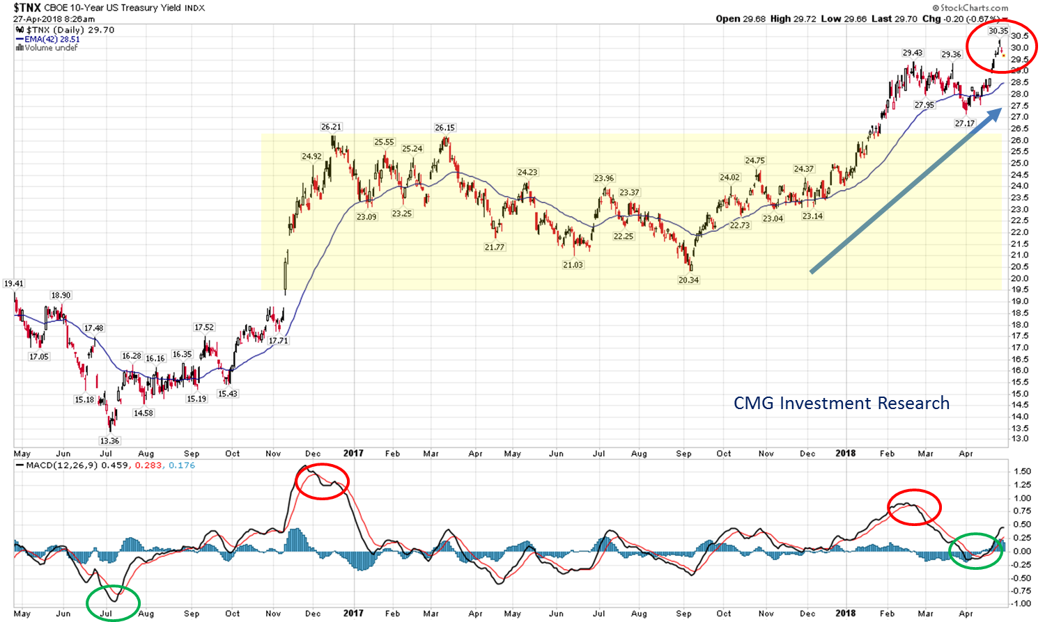
The next chart looks the period from May 2016 to present:
- Yellow shaded area shows the chop and recent break you above the late 2016 and early 2017 highs.
- And the recent breakout – red circle.
- Bottom line: Trend in yields is higher.
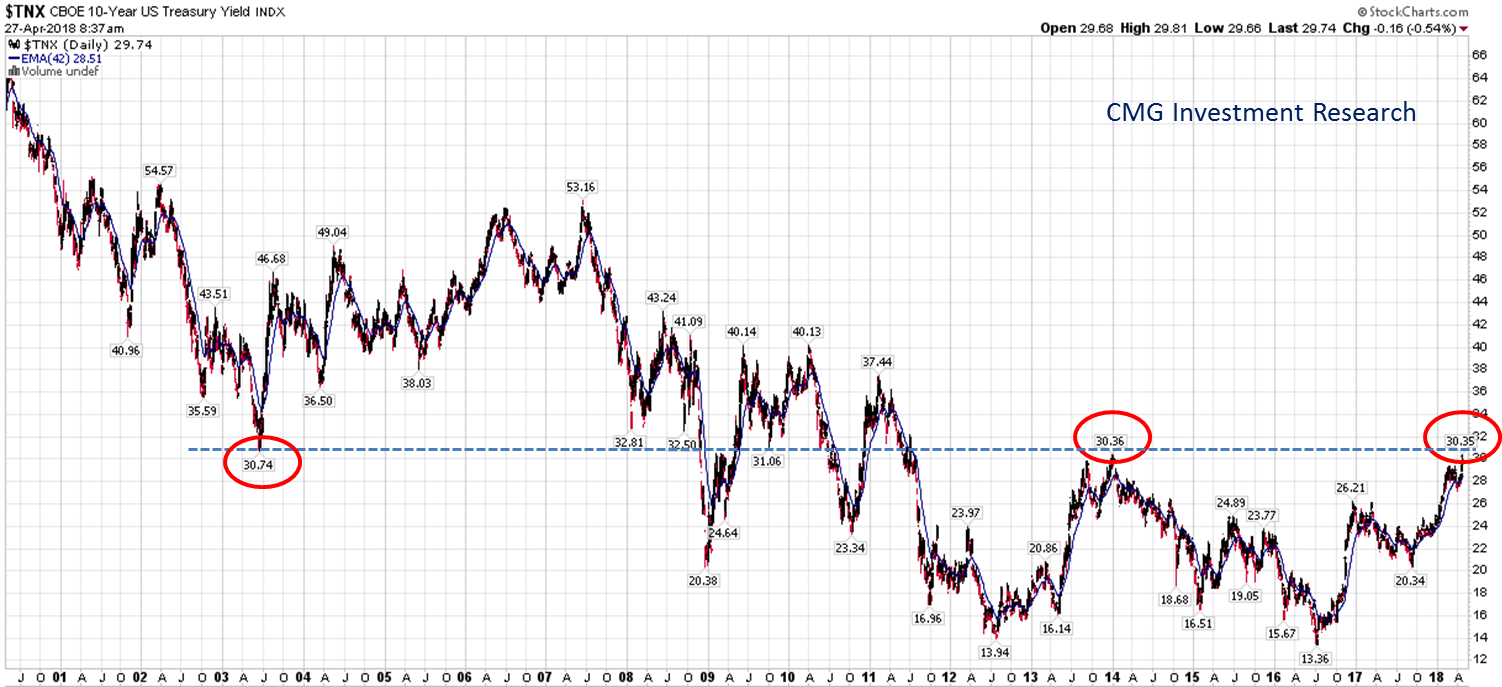
This next chart looks at the trend in yields from 2000 to present.
- Red circles show the 2003 low in yield.
- The blue dotted line crosses that 2003 low and the 2014 and most recent yield highs.
- Bottom line: The trend in yields is up.
“What we anticipate seldom occurs; what we least expect generally happens.” Let’s keep a close eye on the 3.07% line in the sand. Ned Davis famously said, “Listen to the cold bloodless verdict of the market… that is what price-based indicators accomplish.” Grab a coffee and find your favorite chair. The balance of the post is short. You’ll find a look at the performance of various markets around the world and a short discussion on margin debt and how it may impact you and me.
♦ If you are not signed up to receive my weekly On My Radar e-newsletter, you can subscribe here. ♦
Included in this week’s On My Radar:
- A Look at World Market Performance
- Margin Debt is an Indicator
- Trade Signals — No Significant Changes from Last Week’s Post
- Personal Note — Bullish on Penn State and West Chester University
A Look at World Market Performance
I enjoyed reading a summary of performance posted this week on Advisor Perspectives. Following is some of that copy taking a look at 2018 performance, 2009 to present performance, 2007 to present performance and 2000 to present performance.
“Three of eight indexes on our world watch list have posted gains through Monday, April 23, 2018. The top performer this year is France’s CAC 40 with a gain of 2.37%. In second is India’s BSE SENSEX (India) with a gain of 1.89%. In third is Hong Kong’s Hang Seng with a gain of 1.12%. Coming in last is Shanghai’s SSE with a loss of 7.23%.”
2018 Performance
Here is an overlay of the eight world indexes illustrating their comparative performance in 2018.
Here are all eight world indexes sorted by YTD:
A Longer Perspective – March 2009 (post Great Financial Crisis bottom) to present
The chart below illustrates the comparative performance of World Markets since March 9, 2009. The start date is arbitrary: The S&P 500, CAC 40 and BSE SENSEX hit their lows on March 2009, the Nikkei 225 on March 10, the DAXK on March 6, the FTSE on March 3, the Shanghai Composite on November 4, 2008, and the Hang Seng even earlier on October 27, 2008. However, by aligning on the same day and using a log scale vertical axis, we get an excellent visualization of the relative performance.
Here is the same visualization, this time starting on October 9, 2007, the closing high for the S&P 500, a date that is approximately the mid-point of the range of market peaks…
October 2007 (last cycle bull market peak) to present
For a longer look at the relative performance, our final chart starts at the turn of the century, again indexing each at 800 for the start date.
January 2000 to present
- S&P 500 Index total return 83.5%.
- Cumulative performance of 83.5% over 18.33 years works out to be +3.367% annualized.
- That awesome return is only if your brother didn’t sell out at the bottom and miss a big portion of the two post-recession recoveries.
- Over the same period, the India market performed best with a 540.9% return. There is often a bull market somewhere.
Notable too is the Japanese market (Nikkei) returned just 16.2% since January 2000. If you were to take the performance back to 1990, it would be negative for nearly 28 years. A lost three decades… it looks like this:
Nikkei 225 Stock Index 1990 to present
Nikkei 225 Stock Index 1950 to present
Some market cycles are better for buy-and-hold investors. Some are better for traders. Who in Japan thought that the party was over in 1990? Negative total returns for 28 years. Imagine that retirement experience.
Expense, aged and over-leveraged as you’ll see next. My two cents – the period ahead will favor traders and active management… not long-term buy-and-hold investors.
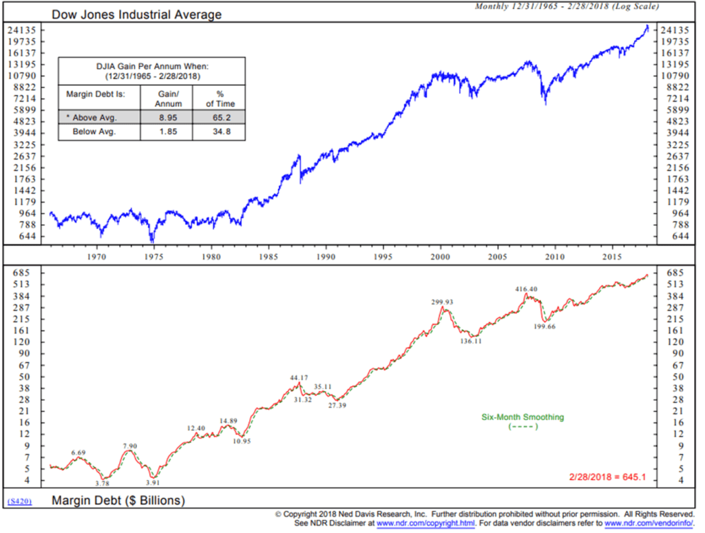
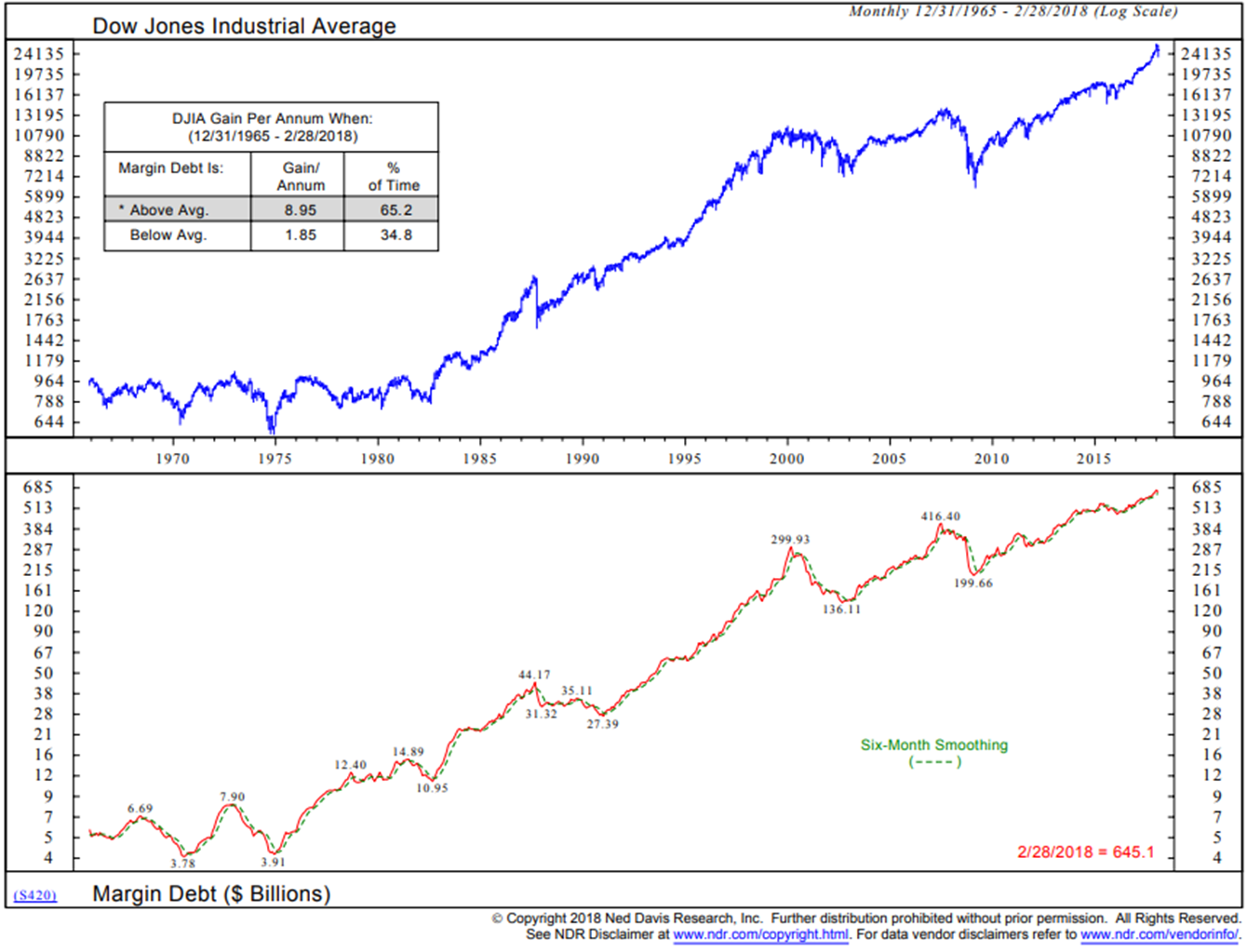
Margin Debt is an Indicator
One of the charts I look at each week is margin debt and the DJIA. Margin debt can be good for the market when investors are borrowing more and buying stocks. Simply put, more money is used to buy stocks. It’s a bad thing for the market when it is going down. More selling pressure.
One way to create a signal indicator is to track the trend in margin debt. Is it increasing (uptrend) or is it decreasing (downtrend)? How to read the next chart:
- Focus in on the lower section – the red line is a plot of the monthly NYSE margin data through February 2008. The blue line is a six-month smoothed moving average of the same data.
- When margin debt declines below the smoothed trend line (blue), a sell signal is generated. Margin debt is unwinding. That means there is strong selling pressure.
- As you’ll see in the following charts, margin debt is at a record high. Can you imagine the amount of selling pressure when that unwinds?
- One of the reasons markets dislocate at times is tied to the forced unwinding of leverage. When margin calls kick in (forced selling occurs) and as would-be buyers see this and back away… markets crash.
- It’s why price behavior at market bottoms tend to “V” bottom and price action at market tops tend to roll over slowly.
- Note the returns “DJIA Gain Per Annum When” the current margin level is above the dotted green smoothing line. Note the 2001 and 2008 sell signals.
- Bottom line: Margin debt is higher than its six-month trend line. Bullish for stocks.
For some reason I do not yet understand, the NYSE stopped publishing margin debt at the end of February. FINRA publishes a margin debt number and I’m working on putting that data stream into a similar trend-based trade signal. For now anyway, as you’ll see in this next chart, margin debt (as measured by FINRA) is just off a record high.
Here is how you read the chart:
- The orange line is the six-month smoothed moving average trend line. Here we used an exponential smoothing that simply puts more of a premium on the recent data.
- The blue line tracks the FINRA margin data. Concern grows when the blue line crosses below the orange line.
- Bottom line: Currently in a buy signal – uptrend.
Next is a different look at margin debt.
Here’s how to read the chart:
- The red area plots margin debt.
- Note the current level in comparison to February 2000 and June 2007 – we are far more leveraged into stocks today.
- Also note the lack of margin debt in September 2002 and late 2008 early 2009.
Bottom line: Margin debt is off the charts. When the next great selling wave begins, expect the unwind to be bigger than 2001/2002 and 2000/2008 market corrections. Markets are a function of buyers and sellers and when excessive leverage is forced out of the system (margin calls), would-be buyers back away. That’s how crashes occur… and how great opportunity is created.
Next is a similar look but with the margin debt inverted on the chart. I like how they say “Fed Bubble?”
Finally, despite all the discussion about the risks that sit in the system today (aged bull market, record overvaluations, end of QE, excessive leverage, rising rates, etc.), the intermediate trend signals for equities remain moderately bullish. Though I’ll add a quick side note, we are seeing our shorter-term trend and momentum-based trading strategies de-risk. You’ll find the latest trend charts and CMG positioning information when you click on the link in the Trade Signals section that follows.
NOTE: NOT A RECOMMENDATION TO BUY OR SELL ANY SECURITY. SEE IMPORTANT DISCLOSURES AT THE BOTTOM OF THIS LETTER.
Trade Signals — No Significant Changes from Last Week’s Post
S&P 500 Index — 2,635 (04-25-2018)
Notable this week:
No significant changes in trade signals this week. The Ned Davis Research CMG U.S. Large Cap Long/Flat Index remains at an 80% large-cap exposure signal (down from 100%). The 13-week trend line vs. the 34-week trend line remains on a “buy” signal. Volume Demand continues to be greater than volume supply, which supports a bullish posture. The CMG Managed High Yield Bond Program currently remains in a “buy” signal.
Click HERE for the latest Trade Signals.
Important note: Not a recommendation for you to buy or sell any security. For information purposes only. Please talk with your advisor about needs, goals, time horizon and risk tolerances.
Long-time readers know that I am a big fan of Ned Davis Research. I’ve been a client for years and value their service. If you’re interested in learning more about NDR, please call John P. Kornack Jr., Institutional Sales Manager, at 617-279-4876. John’s email address is jkornack@ndr.com. I am not compensated in any way by NDR. I’m just a fan of their work.
Personal Note — Bullish on Penn State and West Chester University
Boston is up next. Susan’s youngest son has league games Saturday and Sunday. His team is really fun to watch (16-year-olds) and the way U.S. soccer is progressing, many of the games involve some long-distance travel. But fun it will be and I’m really looking forward to the time with him.
Son, Kyle, surprised us with great news Wednesday night. He walked into the room dressed in Penn State gear and announced his decision to attend Penn State in the fall. I am so over-the-top, all things crazy about Penn State that I really tried to keep my two cents out of the decision. Though I failed at that plan several times. Needless to say, I am really excited (and relieved).
Steve, Kyle and son, Matt, on FaceTime just after Kyle shared the news.
My father graduated from Penn State in 1958 and he and my mom settled in the area. Dad became an accountant. Mom was an artist. As a young boy and sports fanatic, I attended as many PSU sports events as I could. Of course, football was big, but Dad would take us to volleyball, gymnastics, soccer, basketball and, surprisingly, one of my favorites was wrestling. Only football and basketball charged for admission. The town is nicknamed Happy Valley and has a Midwestern niceness kind of feel. I swear they must spike the water.
I’m going to have to add Kyle to my office PSU wall (though, of course, he’d be added anyway). I look at some of the young pictures on the bookcase and can’t believe how quickly time has passed and how much the kids have grown. Brianna graduated in 2015 (photo on the left of the TV), my dad’s Phillies cap and a picture with me and the Nittany Lion is on the far right back in 1982. The days of big hair and short shorts. Ugh.

And, of course, the office wouldn’t be complete without this:

OK, you get the point. I’ll stop.
Further great news came yesterday morning when Susan’s son, Conner, announced his decision to study biology at West Chester University. The kid is off-the-charts smart and we are really excited for him. The university is about 15 minutes from our house and sits in one of the cutest towns around. I’m already looking forward to meeting him for lunch. Really looking forward to seeing what the kids will create for themselves.
And I’ll be holding up a big glass of red wine tonight as several big business initiatives are ready to take flight. More on that soon. So I’m checking in with you feeling happy. It was a good week for me and I sure hope it was a happy week for you as well. Enjoy your weekend!
Wishing you the very best!
♦ If you are not signed up to receive my weekly On My Radar e-newsletter, you can subscribe here. ♦
With kind regards,
Steve
Stephen B. Blumenthal
Executive Chairman & CIO
CMG Capital Management Group, Inc.

